Zen Brushwork in Lettering Design
Tools of the Trade
Tools of the Trade
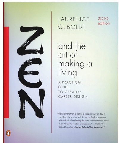
When the art director at Penguin USA called to ask me to write the word "Zen" for a book called "Zen and the Art of Making a Living" it couldn't have come at a better time. I was at that very moment sitting on my meditation cushion in a corner of my office contemplating The Emptiness after finishing several advertising campaigns, and I had nothing on my calendar. Although I felt cold terror at the prospect of this little three-letter word, a word that conjured centuries of calligraphy masters in their robes and sandals not to mention the three sensei I had studied with, I said "Sure." And then I said to myself, as I gathered up a dozen brushes and pens and stacks of paper, "It can't be any harder than that other three-letter word, "new."

At that time I was still grinding my own ink, using a traditional inkstone. Now for most brushwork I use Moon Palace Ink which I get from John Neal Books, although I sometimes grind ink from a stick and mix it with liquid for certain very absorbent papers. The ink must be tested out many times to see how black it is, blotted and tried on different papers, with different brushes, as each one gives a different effect. I also use pens, which give a different character entirely.
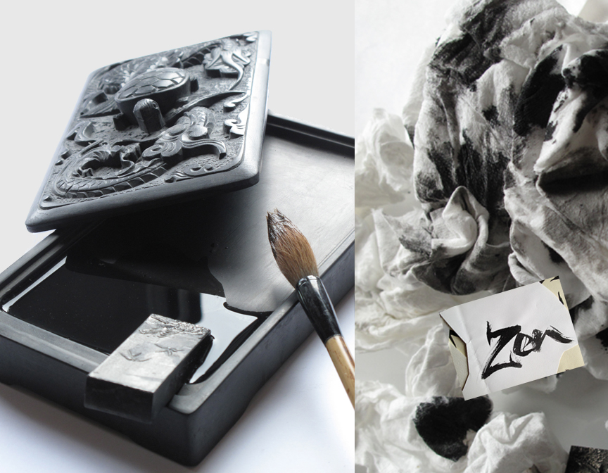
Inkstone and traditional sumi ink
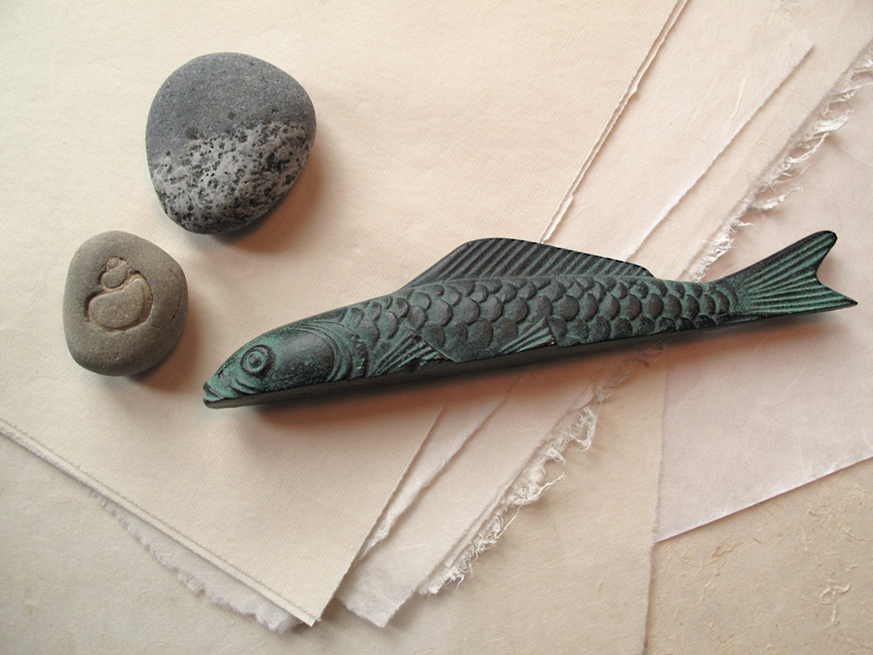
Stones and metal weight used to keep fragile rice paper from lifting
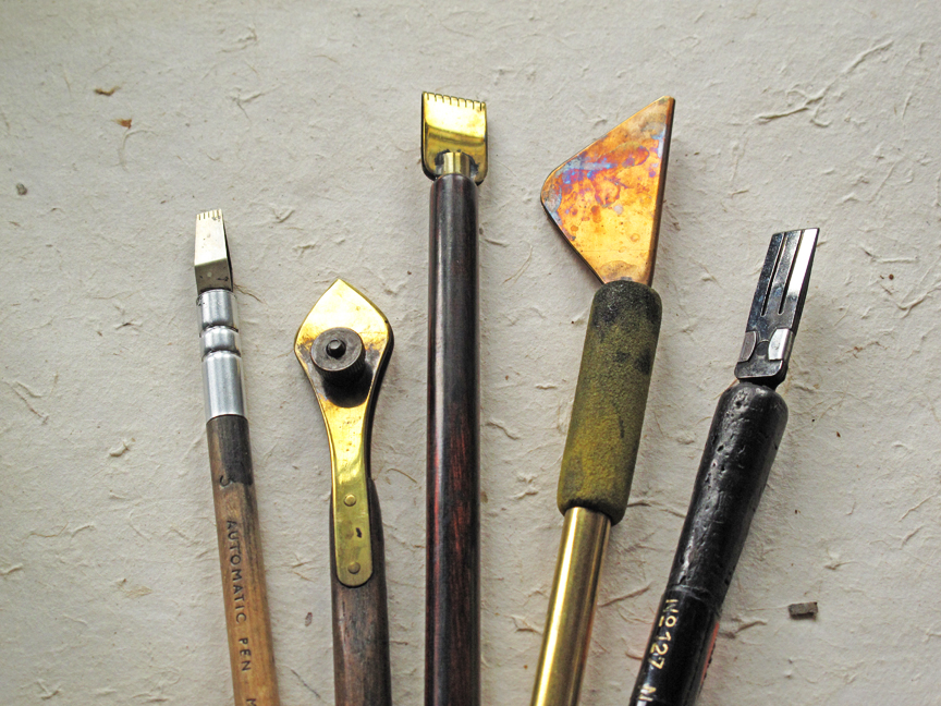
Automatic pen, oldstyle ruling pen, edged pen, new ruling pen,steel brush

As I work I am designing in the moment with the gesture of the brush. I try to remain intuitive and kinesthetic, feeling the drag of the ink and the paper and experimenting with the invisible element of calligraphy: time. How fast or slow you move the brush completely transforms the stroke. Design, however, includes inconvenient facts like the resemblance of a "Z" to a "2" and psychological factors: should the word feel elegant and disciplined? artful? playful? ordinary? I keep all of this into account as well as the history of Western calligraphic forms and the basic styles of shodo. The final style that was chosen for the title is based on a hybrid of "bone and "clerical" styles of Chinese calligraphy. The book is now in its fifth printing, but has kept the same title design throughout.
To see part two of Zen Brushwork, with examples of how the same skills and techniques can be applied to brand design and advertising visit my blog, Alphabet Roadtrip.
All photography and lettering samples © Iskra Design www.iskradesign.com
All photography and lettering samples © Iskra Design www.iskradesign.com


