
A Logo Design Project Inspired by the Street
This month I had the opportunity to use my obsession with street art in a logo design for a client. Seven large ad agencies had recently merged to form a new agency called Sandbox. One of the original seven, GA Communications, wanted to create a specific look for its community outreach division that would express the attributes of its internal culture. Among the ideas given as reference: "Collaborative, Creative, Fun, Social and Confident." A logo for the name, "Orange" had already begun in-house, based on a standard script font. It was close to what they were looking for, but it didn't feel distinct or proprietary and the design team wanted to see a new approach reflecting the energy and creativity of graffiti. I was also asked to make a little movie or otherwise document my process.
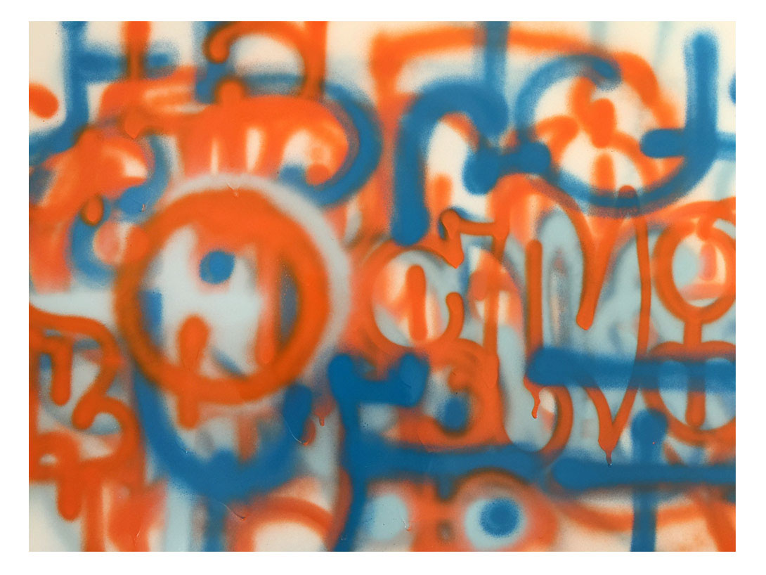
Photographing the street is one of my favorite ways to spend my time, and in my archives I have thousands of pictures of graffiti, abandoned buildings and the shredded poetry of telephone poles. I knew there was a good chance that the final logo would end up being quite conservative, but this project seemed like the ideal opportunity to open things up and go wild. I did a photo shoot looking for everything orange on the street. I experimented with many media, ranging back and forth between the different languages and moods of graffiti. This was heaven.
Photographing the street is one of my favorite ways to spend my time, and in my archives I have thousands of pictures of graffiti, abandoned buildings and the shredded poetry of telephone poles. I knew there was a good chance that the final logo would end up being quite conservative, but this project seemed like the ideal opportunity to open things up and go wild. I did a photo shoot looking for everything orange on the street. I experimented with many media, ranging back and forth between the different languages and moods of graffiti. This was heaven.

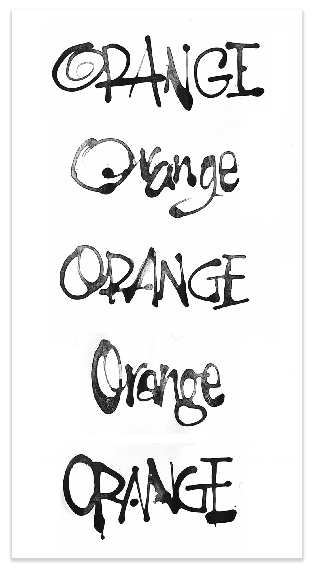
I started out with black ink, working quickly to find new twists on the fonts that had been sent as reference.


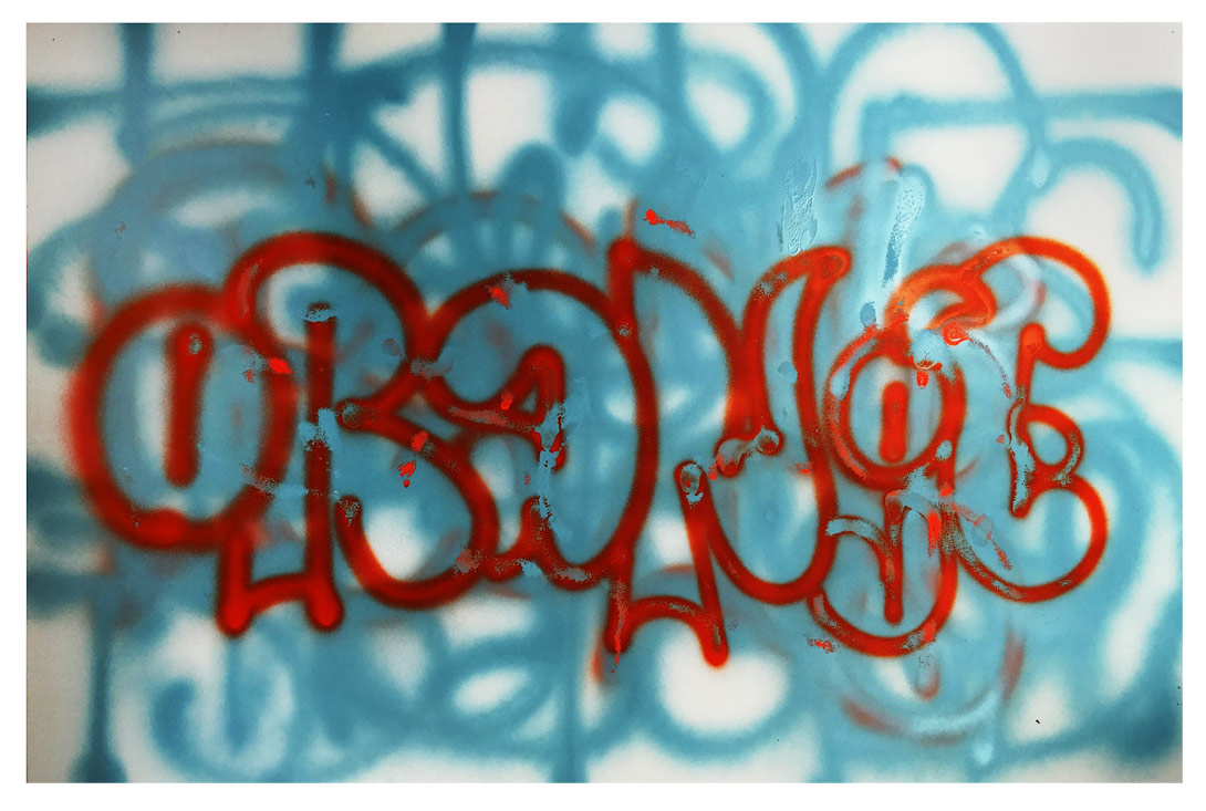
Switching things up I started working with actual orange, what a concept! With colored ink and paints the weight of pigment in the water makes for a different feeling in the brush and leads to subtle differences in how the letters emerge.


To start this project I went out to study walls for a day. I think I have fallen in love with balloon letters. They are insanely creative and all kinds of design problems get solved in an instant on the fly with a spray can. Even if you are trying to be a bad#ss you can't really convince anybody if you use this style. Balloon letters are fundamentally friendly and silly. The world could use a lot more of that.

The final choice of style came down to these two. On the top, dry brush on watercolor paper, and the lower one, pen and ink on offset paper. After many iterations to finesse legibility the lower one was chosen. The influence of graffiti is very faint, but I hope some of the spirit of adventure can be read between the lines.

I used many different papers and tools for this project, including spray cans (Montana.) I love the technique but it nearly killed me so please send me your cards and letters with suggestions for a non-toxic (archival?) spray paint.
To see more of my process in the studio visit me on Instagram and Facebook.Or check out my complete portfolio on my website at IskraDesign.com.


