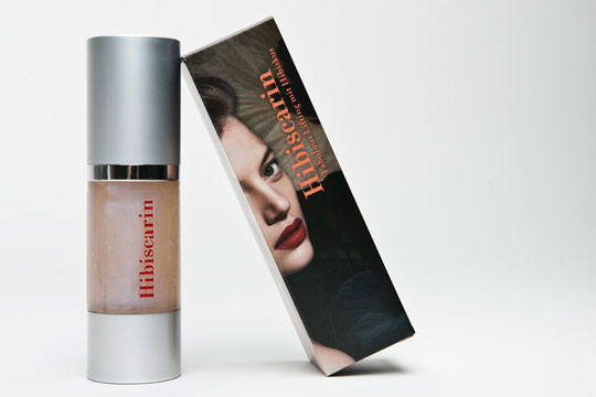
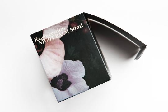
Hibiscarin
Packaging & Web design
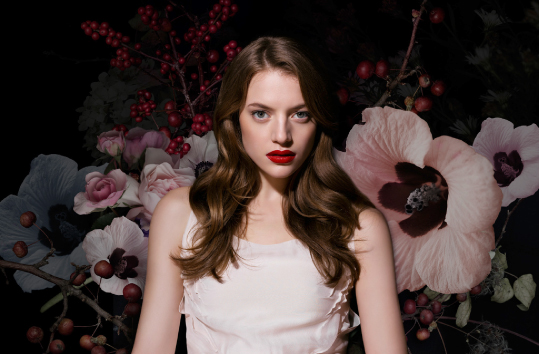
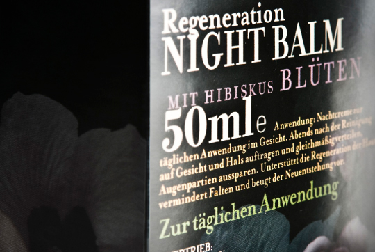
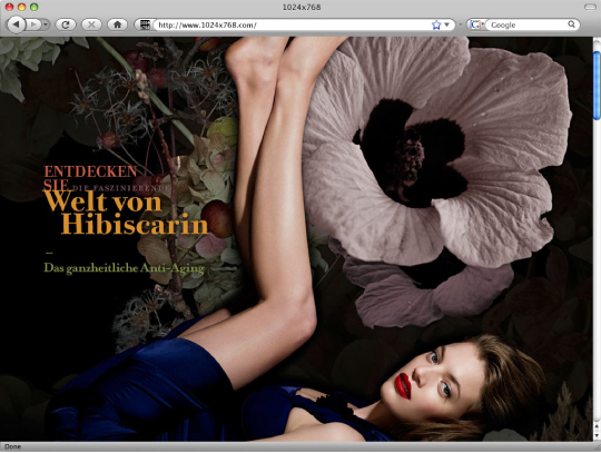
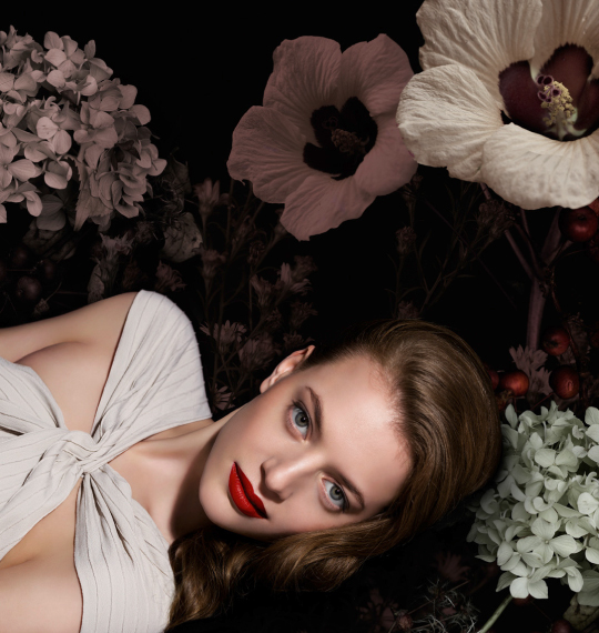
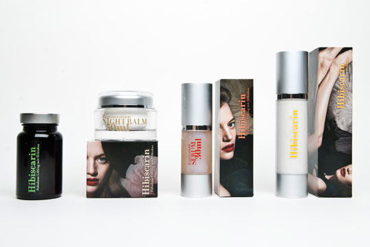
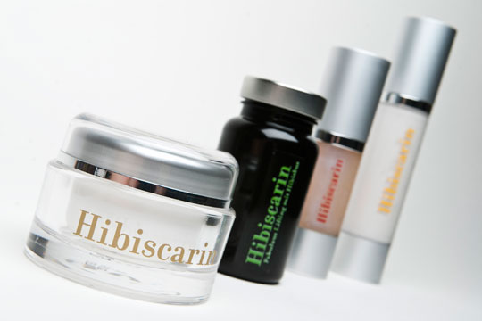
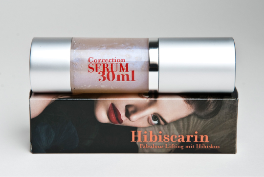
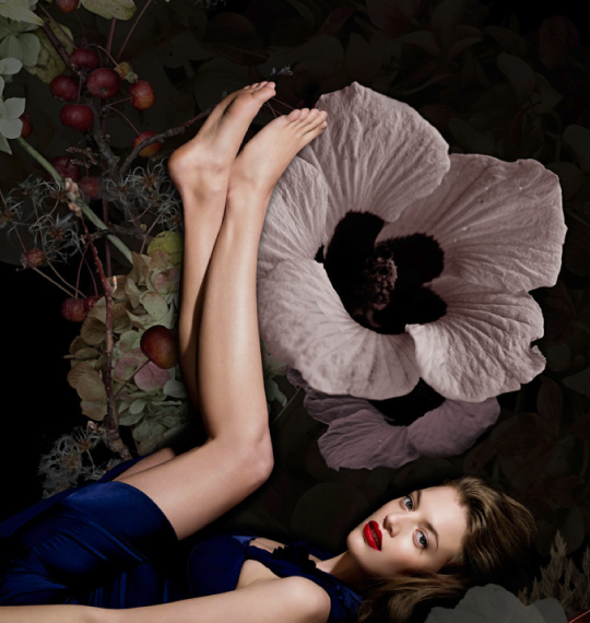
The packaging of the skin care line stands out from the mostly white and shiny aesthetics of the beauty industry. Like a baroque painting, the image, showing a model and an enlarged Mexican hibiscus bloom, captures the essence of beauty. The reference to Mexico manifests itself in express give colours.


CREDITS
Client: Hibiscarin E.U.
Creative direction: Albert Handler
Art direction and graphic design: Nora Obergeschwandner
Strategic advice: Kirsten Ives
Project management: Simone Kovac
Photography: Joachim Baldauf
Product photography: Joachim Baldauf, Marion Luttenberger
Client: Hibiscarin E.U.
Creative direction: Albert Handler
Art direction and graphic design: Nora Obergeschwandner
Strategic advice: Kirsten Ives
Project management: Simone Kovac
Photography: Joachim Baldauf
Product photography: Joachim Baldauf, Marion Luttenberger


