For a while now I have been planning on setting up a web based store for my own branded merchendise (I even went as far to say that I would be setting it up in February/ March 2013) turns out a little more work and thought were needed.
I either needed some form of investment to produce items and throw them onto a store and hope people wanted what I was selling, or to go out and hand make products at a low to nil cost and and bring in my own investment from any returns, stressful and worrying stuff to all plan and work out, with schedules, workloads and bugeting.
Luckily for me I came across a contest in which first prize was 50 screen printed shirts, that would be the perfect footing for me, so this project is the creation of that piece.
It started as a suprising amount of my work does, sat in the office, waiting for the bloody Mac to finish faffing around with its beach ball of death, armed with a biro and sketching away. My brother and I had been playing Soul Calibur in the nights before this, so its not too suprising that theres influence from Sigfried Schtauffen in there.

I was pretty happy with the concept so after work I rushed home from the office, jumped into my home office and started digitally sketching it up, this time trying to keep it a little neater. It was fun searching through swords and gauntlets to find decent reference for the piece, definately want to do somemore armour stuff in the future.
I think this was the point where I walked away, had a coffee, returned to the screen and realised I didn't like alot of the pieces within the sketch, the spikes looked immature and just wern't working and the skull needed fixing. Back to more reference!

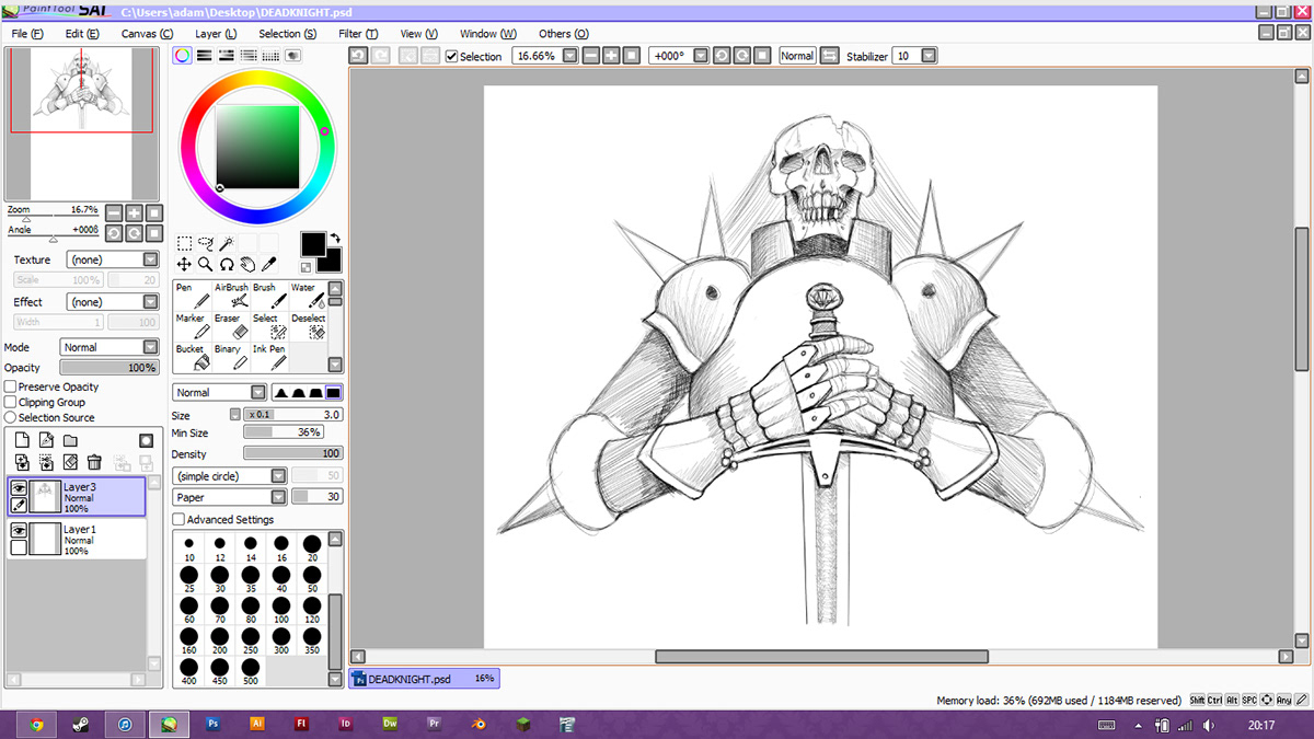
I forgot to save an inbetween stage here so we admittedly have a gap, but im not sure that we are missing too much really. Here is the inked sketch with bitmap shading, This is my initial aid for colours but by the end of the project the black line layer becomes redundant and is deleted. (Only if im working on a print onto black)

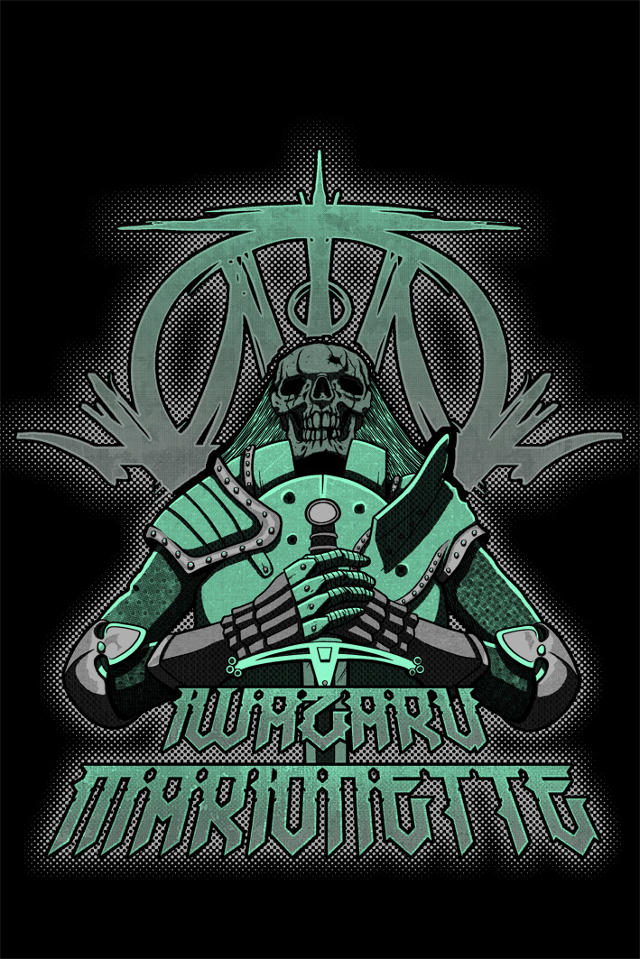
Here I started to fiddle with colours and effects and started dressing up the font. A few people watching me work on this actually commented on the fact that I flick through the colours as I work alot. They could watch, look away for a second, look back and ive completely changed it up. I think for me this is attributed to a short attention span! I lose interest in a piece very quickly and I find certain colours easier to work with (Hence all the green, purple, pink and now turqoius!) If I cycle the colours every now and then it helps keep me focused and maybe catch out a mistake that I was overlooking before.
The colour switches make no difference to the end result of the print as I end up with 2 bitmap colour layers that I can litterally mess around with untill Im happy with the colour scheme.

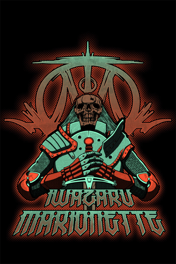
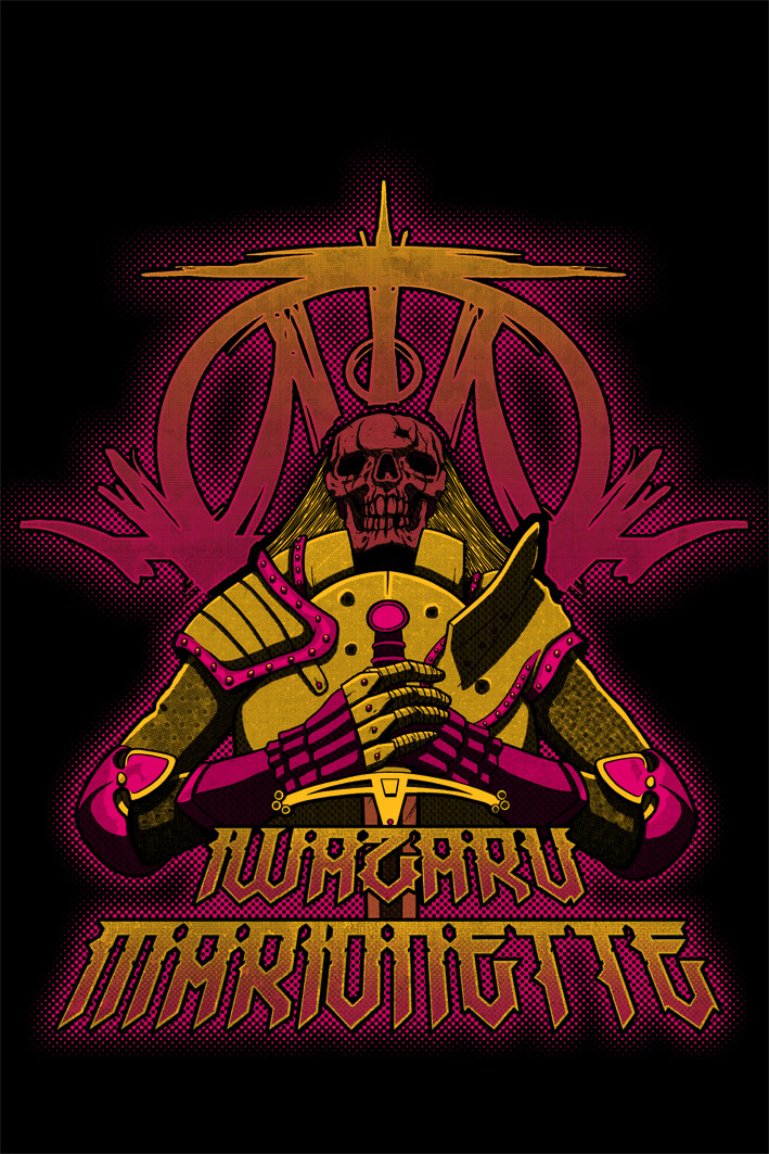
Speaking of colour schemes! Heres the final piece and a couple of colour variants, Im happy-ish with the result, I played around with a few things in the colouring that I have avoided in the past and they have worked to varying degrees so im excited to experiment further in the future and whack some of the mistakes into shape.


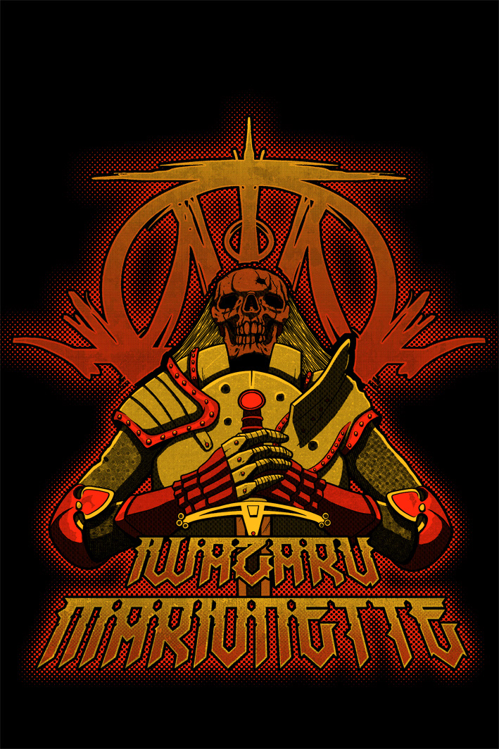
And here we have it! The final design and roughed up onto a shirt, im very happy with how that mock up looks but it IS a very small Jpeg so only time will tell if it works as a printed design.
Ive entered it into the contest now and after one day of voting im pretty excited to say im actually leading the pack! We still have 3 more days of voting and anything can happen in the next half hour as they say.


