In this project for the User Experience & User Interface Design course at EDIT, we were asked to design a website for a fictional brand named “Kramer’s Pizza Joint”.
Kramer's first opened as a small pizzeria in Brooklyn, New York and then slowly started to grow in and outside the USA, though always keeping its unique character. This pizza joint is a place where people feel like they're in a local business – and not a huge franchise restaurant. Kramer’s is famous for allowing clients to fully customize their pizza with all kinds of seasonal ingredients available.
The atmosphere of the restaurants is very relaxed, targeting a diversified audience. It is an aesthetically interesting space where creativity is encouraged and the staff members are very easy going.
The company wanted to take some of this experience online, giving their customers the chance to order a pizza on their website with the same uncountable possibilities of choice and customization they would have at a Kramer's physical restaurant.
Initial phase

The project's first brief included an introduction to Kramer's brand identity and a list of steps to follow in this initial phase.
We started by doing a comparative assessment between two competitors, analysing a few preponderant parameters both on a UX and UI perspective, in order to start strategically defining how our website should – and should not – be. We took these points to create a couple of user stories that allowed us to have a sense of how the proto-personas could be using the website in different scenarios. With that in mind, we were finally in position to build our first site map.
At the same time, we were also doing some research and came up with a few ideas on how to differentiate our website. First, in terms of navigation, we decided that clients would have 3 ways of choosing their pizza: a regular pizza, a fully customized pizza or a surprise pizza. Another idea we came up with while doing the user stories was to include a feature that allowed the person who is ordering to share the bill with their friends, in case of a group meal.
As we were trying do define what we wanted for our website, we interviewed people outside the class that were not designers, always following the same script, and then we analysed the results. We came to some conclusions and ended up creating our persona: something – or rather, someone – who would be on our minds from this point on.
Having our persona defined, we built a map of their experience throughout the process of ordering a pizza on our website, to evaluate how they would think and feel at each step of the journey. At the same time, we refreshed our site map and drew a task flow diagram, in order to understand how all the interactions and different paths could be made, from the moment the users land on the website until they have some delicious pizza in their hands.
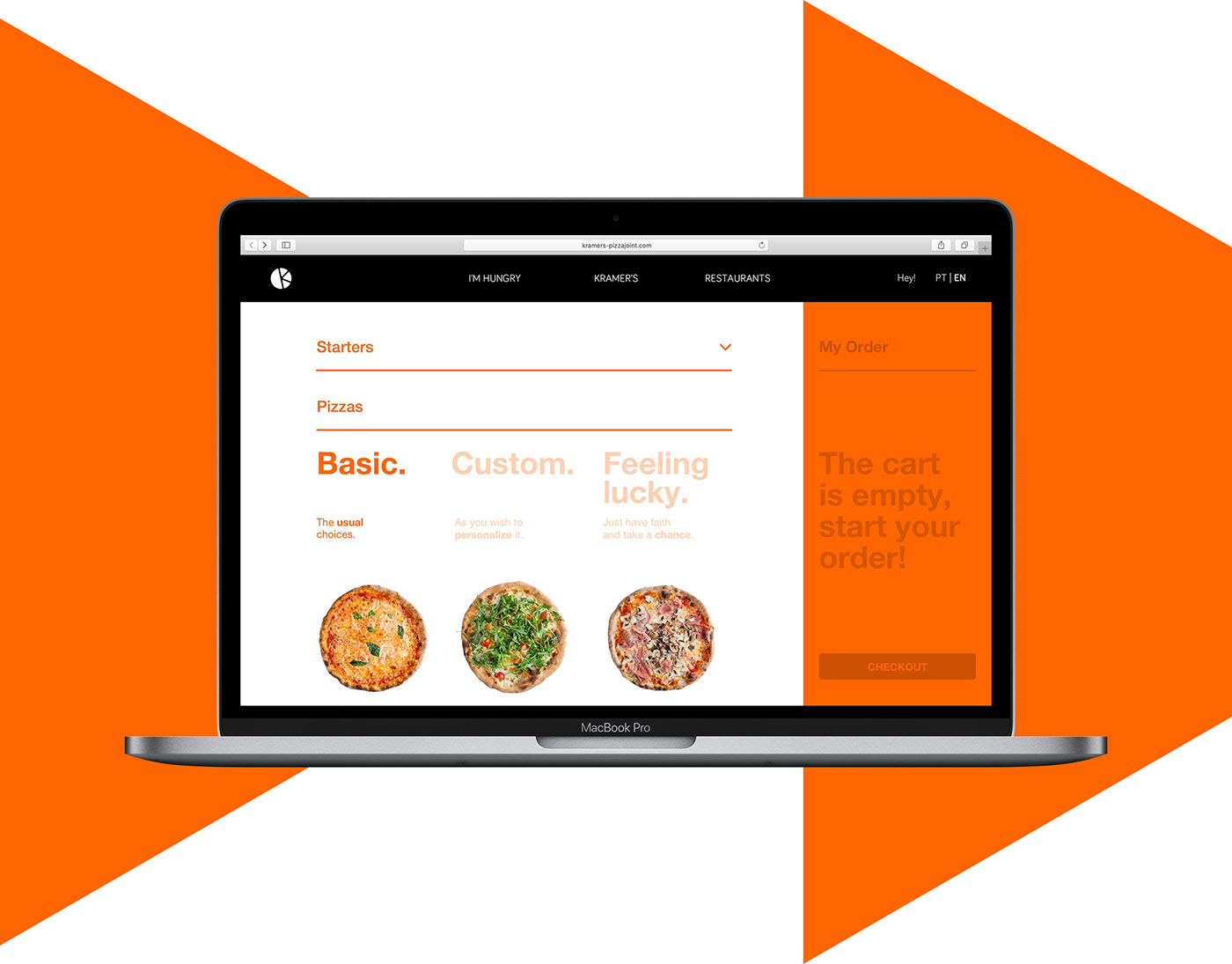
After all this, we had a clear vision of our three-ways-of-getting-a-pizza system. Here's how it works:
• the first one is the “Basic” option, where a normal pizza is chosen from a list of different standard pizzas – similar to what you'd expect in other pizzerias;
• the second is the “Custom” option, a blank canvas with no name and no ingredients selected, waiting for the users to discover and choose as they please;
• the third one is the “Feeling lucky” option, for more adventurous costumers who would be receptive to any random combination of ingredients.
At this moment, with all the work we had already done, we intensified our research and started drawing some early sketches on paper, to visually define what we had been thinking so far. This took us to the next phase – the wireframes for Desktop and Mobile versions.
Wireframes
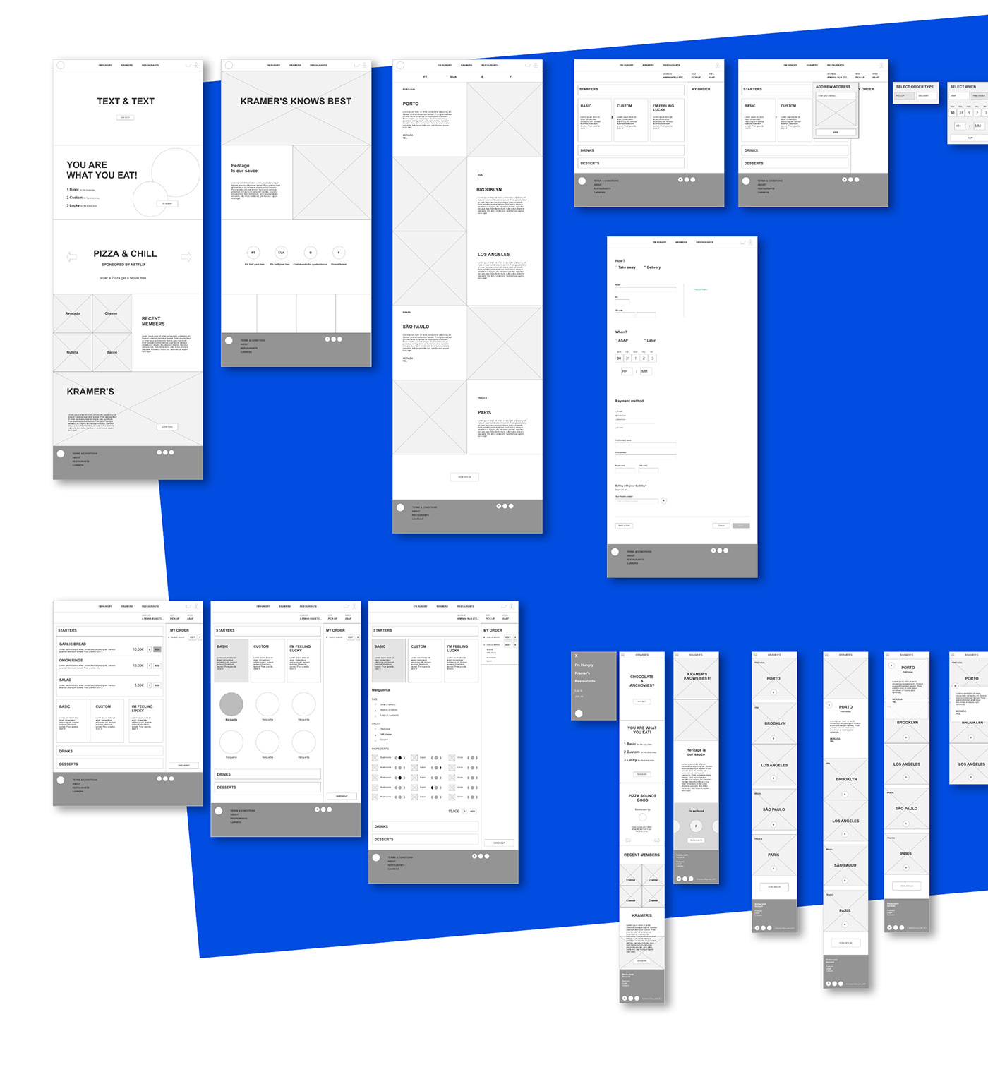
On this phase we designed wireframes for Desktop and Mobile.
After the prototypes were ready, we submitted them for user testing. This allowed us to collect useful tips that helped us improve our work and proceed to the next phase – UI design – with something very similar to what would be our final flows.
Visual Language
When we finally stepped into UI design – the longest phase with a lot of iterations – we ended up choosing something playful and visually elementary, hoping that it would fit the brand and the kind of product they sell.
We knew early in this process that we wanted visual clarity and not the usual things we saw on their competitors. During this UI phase, the visual style we created met the necessity of clarity we had in pages with a lot of interactions and also made it possible to appeal and communicate in a way we thought appropriate, being the Kramer's website.
Although Communication Design and Copywriting were not our main tools to focus on this project, we made an effort to set up a language that would get to Kramer's customers in a funny, relaxed, easy going way.
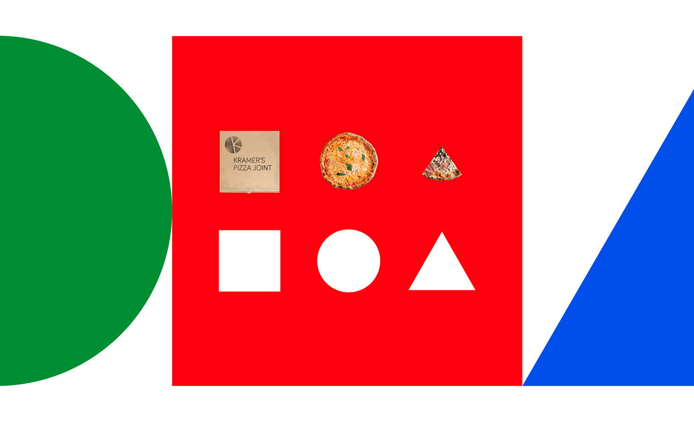
We decided to use basic solid colors and simple geometric shapes in a playful mood, in order to evoke the diversity of pizzas Kramer's allows people to create. We did everything flat, clean, almost without gradients or shadows. The typography – Helvetica Neue mostly, using Regular and Bold – is very straightforward and functional, although we kept the funny mood by changing colors a lot of times.
Desktop
Home, Kramer's and Restaurants pages
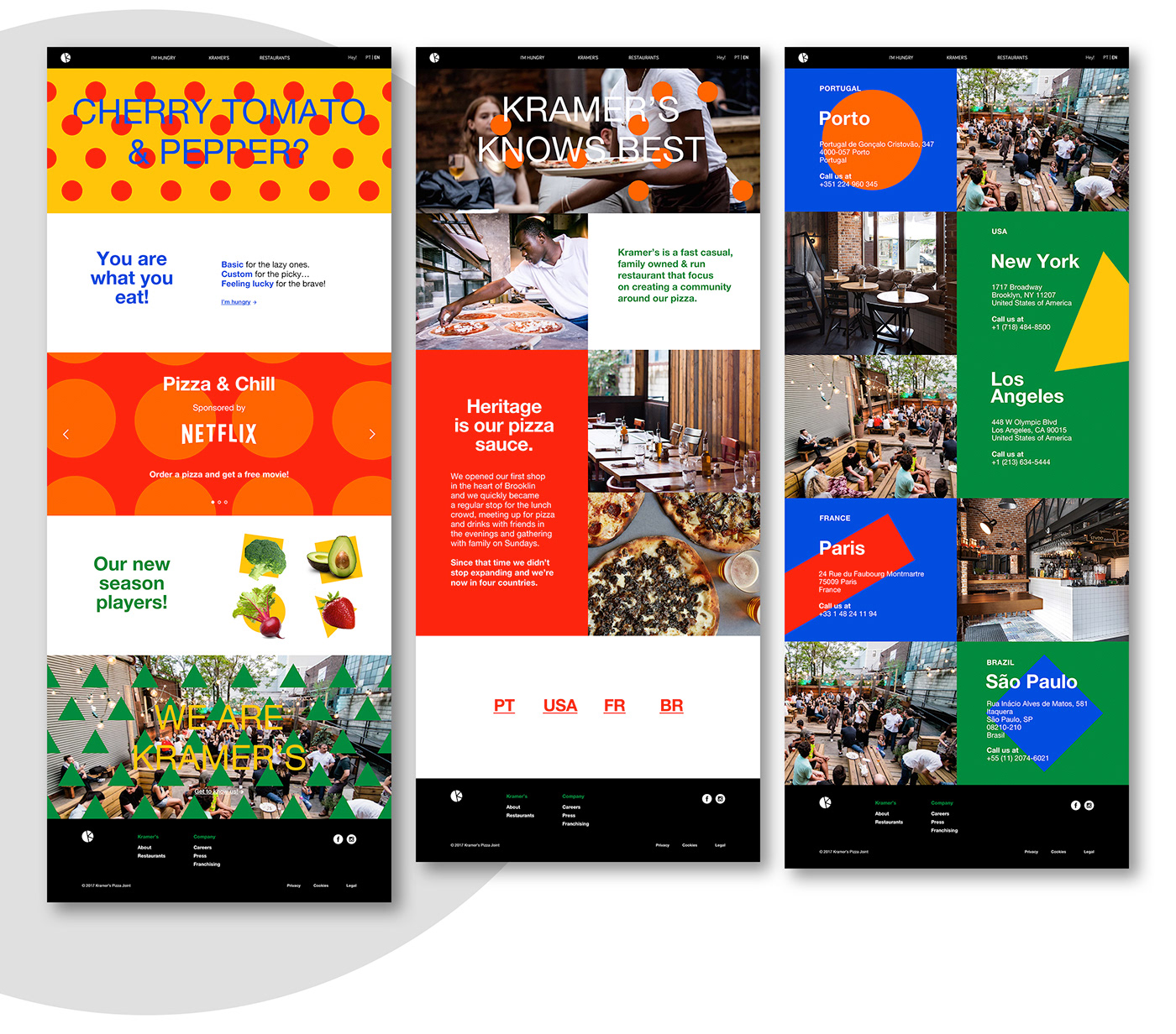
New Visit, New Suggestion
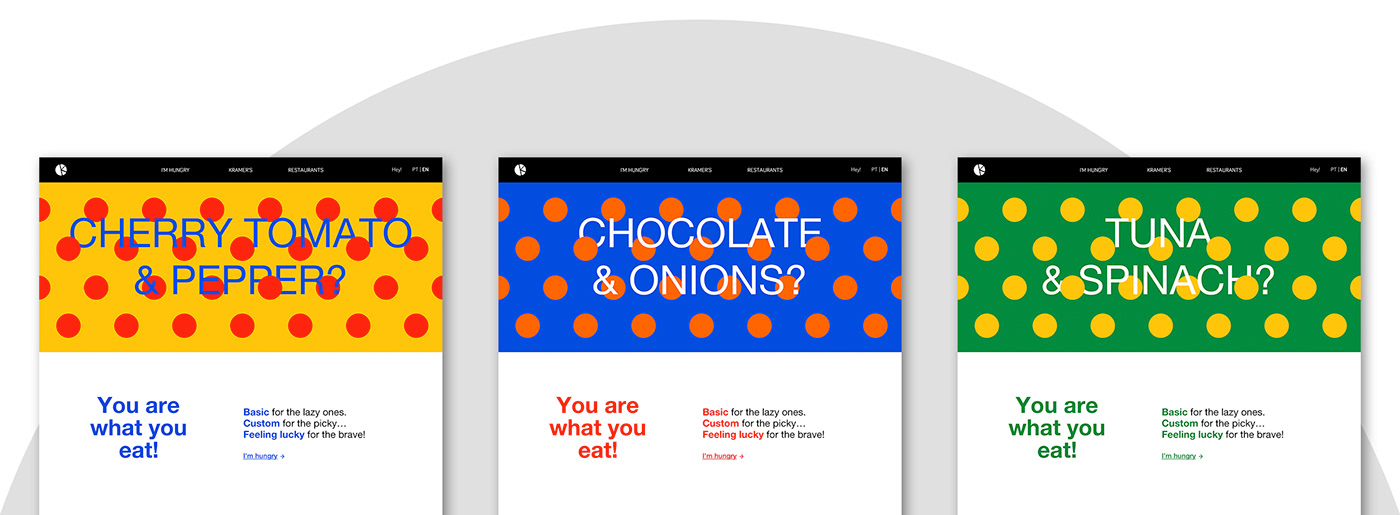
Following the idea of a place where you can be creative and make your own pizza, combining ingredients in the craziest way you can think, we decided to open the homepage with a dynamic banner that would randomly suggest a combination of two ingredients. Bellow it, the customer is introduced to the concept of the tree ways of choosing a pizza.
This whole section changes every time the user lands or reloads the homepage. The banner itself changes its colors and ingredient suggestions; bellow the banner, the copy and the directional link stay the same, but the color also varies.
The banner links to the “I'm hungry” page, where people can then choose and order food.
Use of Color
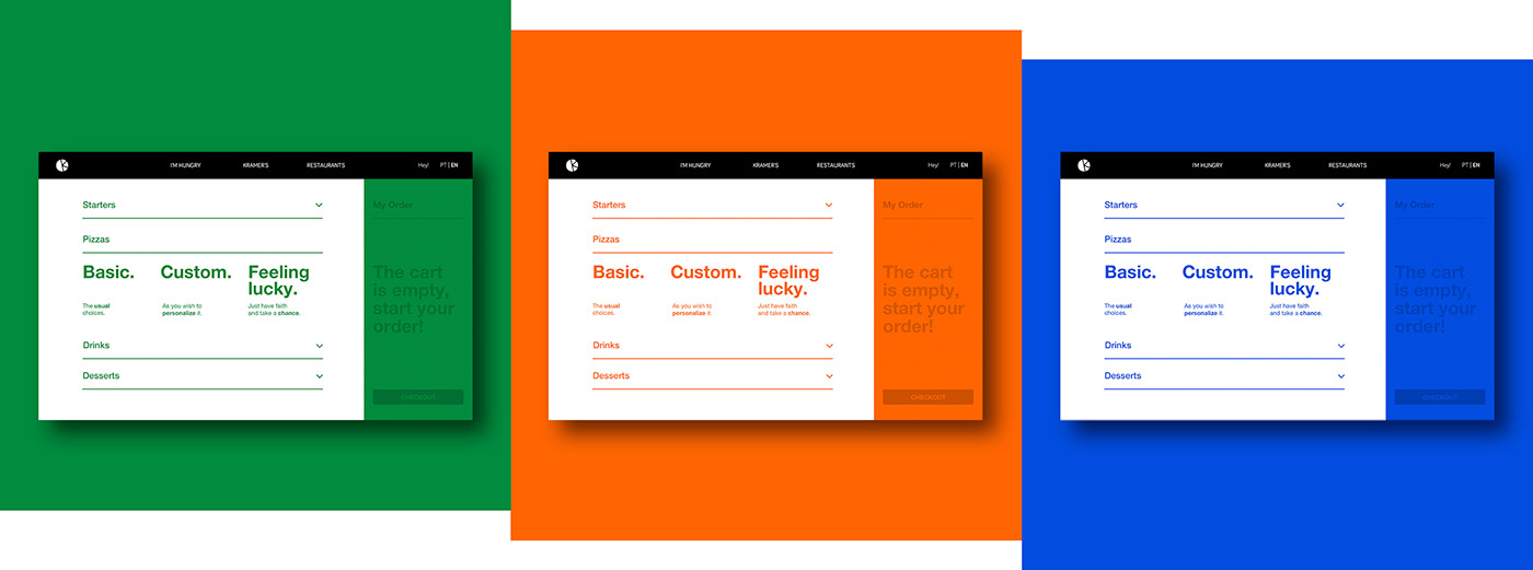
When the customer is choosing a pizza, during the checkout or in other contexts of complex interactions, the layouts of those pages and components are more controlled, more serious and more focused on hierarchy, clarity and functionality. Despite these different contexts, we wanted to keep the visual experience rich and fresh for the user, so we defined a system of three colors that work well in those layouts and that change every time a customer gets on it, so that it always feels the same without being exactly the same.
3 Ways of Ordering a Pizza
A quick look at three different flows when a customer gets to the point of choosing a pizza via “Basic”, “Custom”, or “Feeling lucky”.
1. Basic
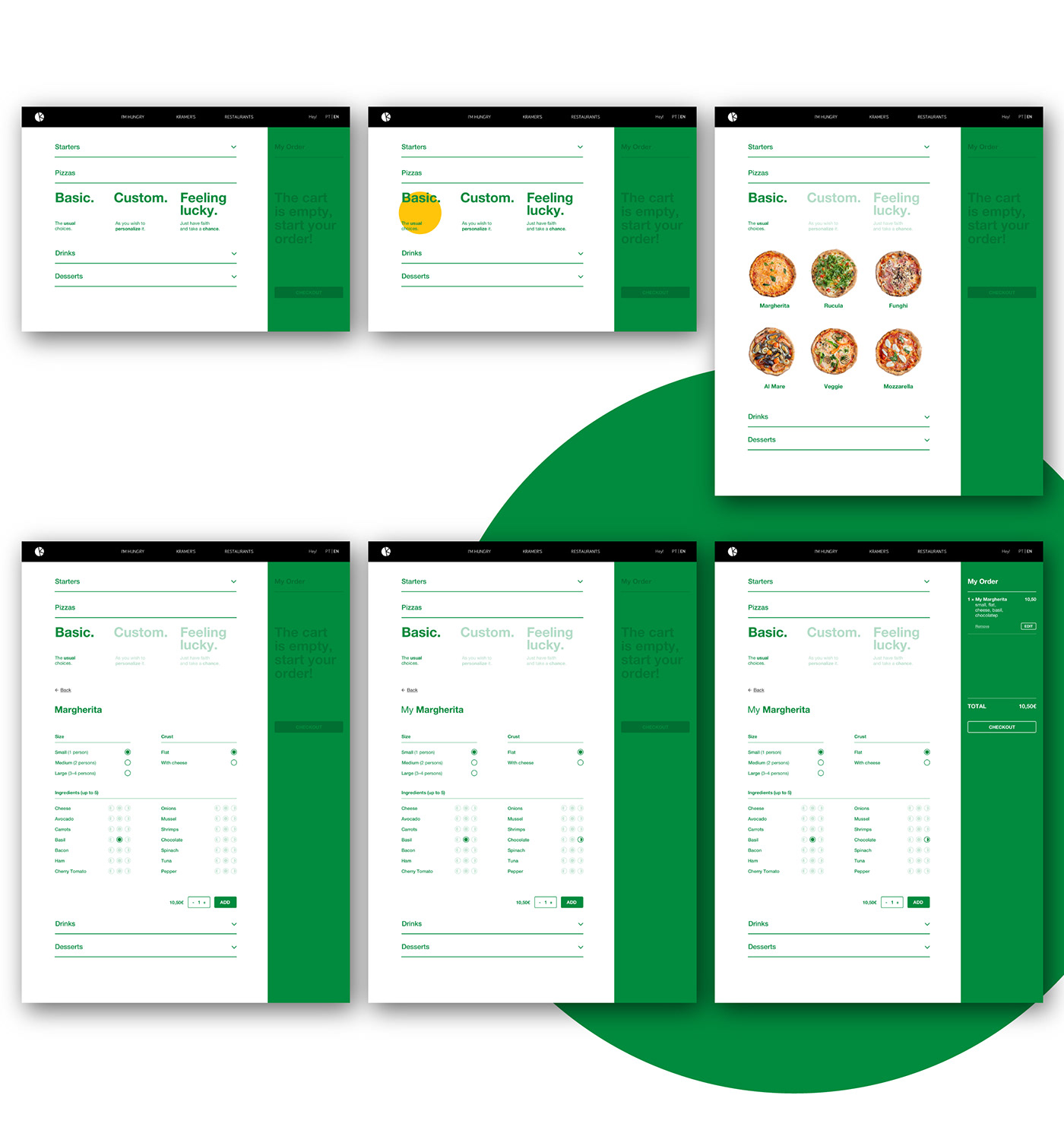
If the person selects “Basic”, the page presents a list of pizzas with their names and photos. After selecting one of those, the page shows the pizza's name with all its characteristics (already selected by default), this time with no photo. The reason for not having a photo at this point is because at that moment the client can freely customize the pizza – and if that happens the photo would no longer correspond to the pizza they would get. That's also why, from the moment any change is made, the name changes to “My [pizza's name]” – a simple way of labelling that pizza as customized by the client.
On the “Ingredients” section of the list, it's always possible to choose for each topping to be spread on just one half or on the whole pizza, so that it's more flexible for those who wish to share a pizza but are not a perfect match on every single ingredient.
2. Custom
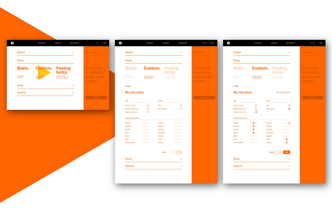
In the second scenario of choice – “Custom” –, when the person wants to create a pizza starting from nothing, the layout ends up being very similar, but instead of a pizza's name we read “My own pizza.”. All the potential characteristics are unselected, waiting for the user to decide. After the user does the minimum required selections, the price changes from zero to the respective value and the quantity selector and the “Add” CTA button switch from disabled to default status. Also, an option shows up to save that untitled pizza to the user's favorites. If the user decides to save the pizza on the favorites list and is not logged in, the system asks for login or registration.
3. Feeling lucky

When a customer decides to give it a try and selects “Feeling lucky”, the layout feels identical once again, with “My random pizza!” instead of a pizza's name. The characteristics are already chosen but if the person is not happy with the surprise result, there's an option “Shuffle it again!” that loads a different random combination.
Checkout & Tracking the Order

Desktop Overview

Prototype

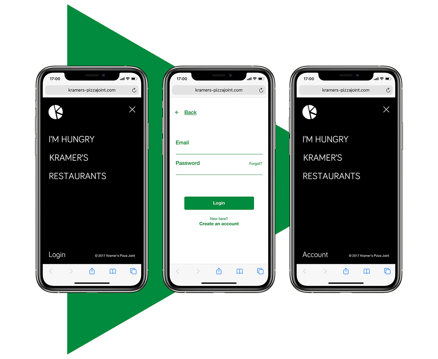
Mobile

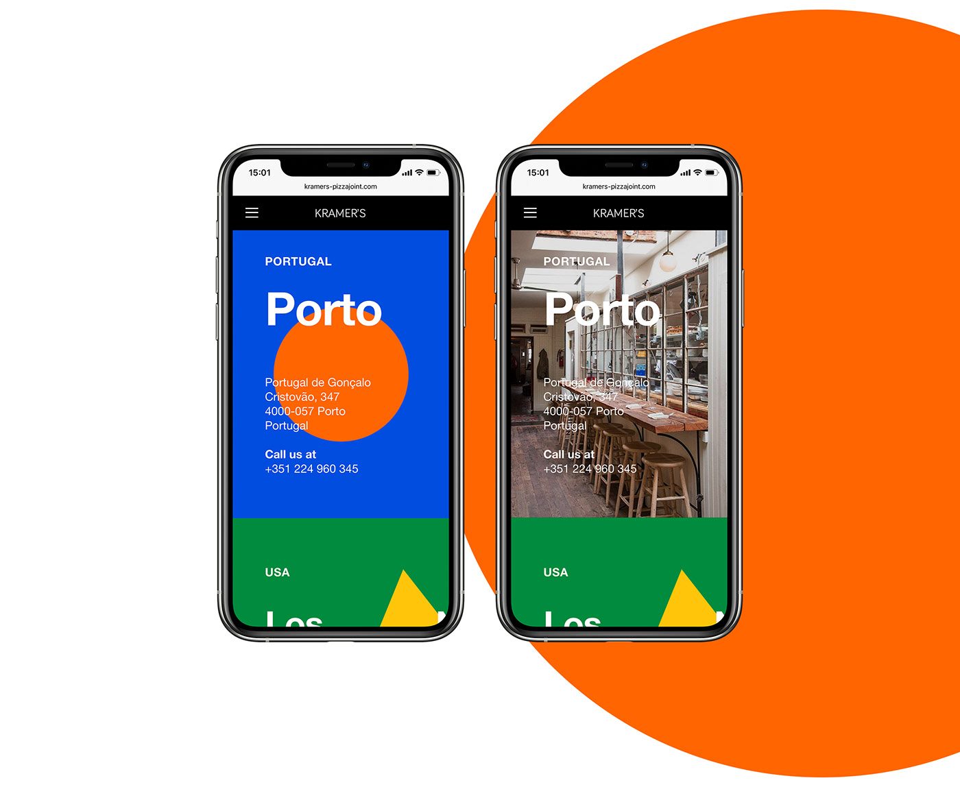
Home, Kramer's and Restaurants pages

Website Menu & User Access
Ordering a Pizza

A few interactions
Tapping the background to show the photo
Opening the Cart panel

Opening the Tracking panel
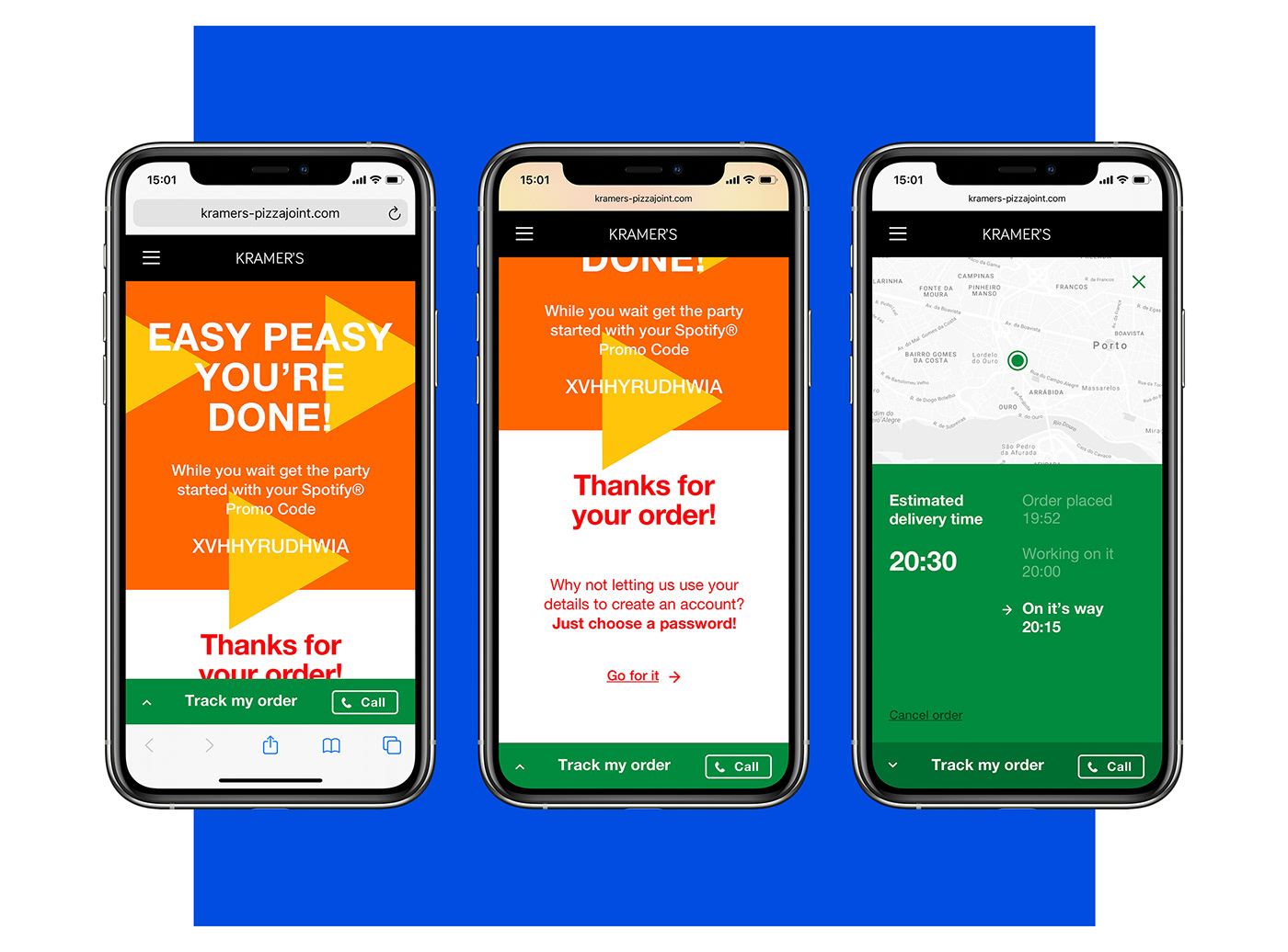
Checkout & Tracking the Order

Mobile Overview

Style Guide
Below, a few samples from the style guide.

–––
Project for the User Experience & User Interface Design course at EDIT. Porto
Project for the User Experience & User Interface Design course at EDIT. Porto
Digital product: e-commerce website
Client (fictional): Kramer’s Pizza Joint
Client (fictional): Kramer’s Pizza Joint
Designers: João Alarcão & Pedro Campeã
Tutors: André Covas, Catarina Garcia and João Lima
Tutors: André Covas, Catarina Garcia and João Lima
2018


