


FIBARO
Rebranding & brand design standards
As the FIBARO smart home brand was growing and gaining new business partners and customers, its visual identity needed to grow as well. With the renewed brand identity we wanted to make sure that the core of the brand identity was kept, but the visuals pushed the FIBARO brand forward.
Our main task was to redesign the brand without losing it's future-forward core. We redesigned FIBARO and created detailed guidelines for implementing the new brand identity within and outside the company.


Systemic design.
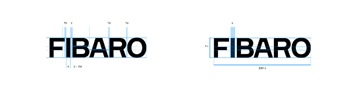
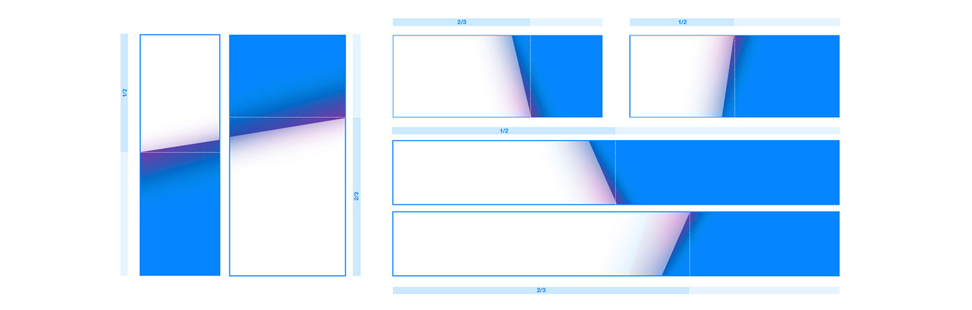
FIBARO needed a systematic approach towards layouts and basic design system. The main goal was for it to be clear, easy to use and understand, since it needed to be implemented across design and non-design teams. It also needed to cover various media and formats.
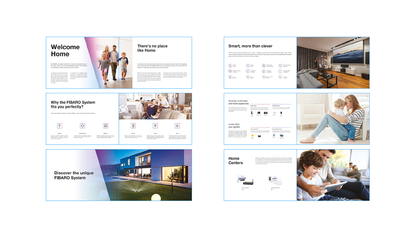
The most effective solution was to create modular design with clearly described blocks which are needed to create a comprehensive branded content. These blocks include: white slant, gradient underneath it, typography style and product placement. Scaling of the slant is also described to ensure proper use on different formats.
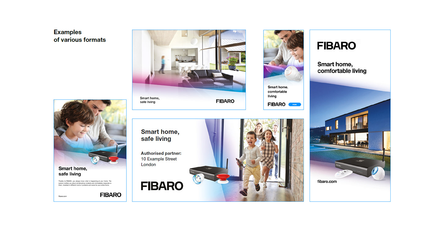
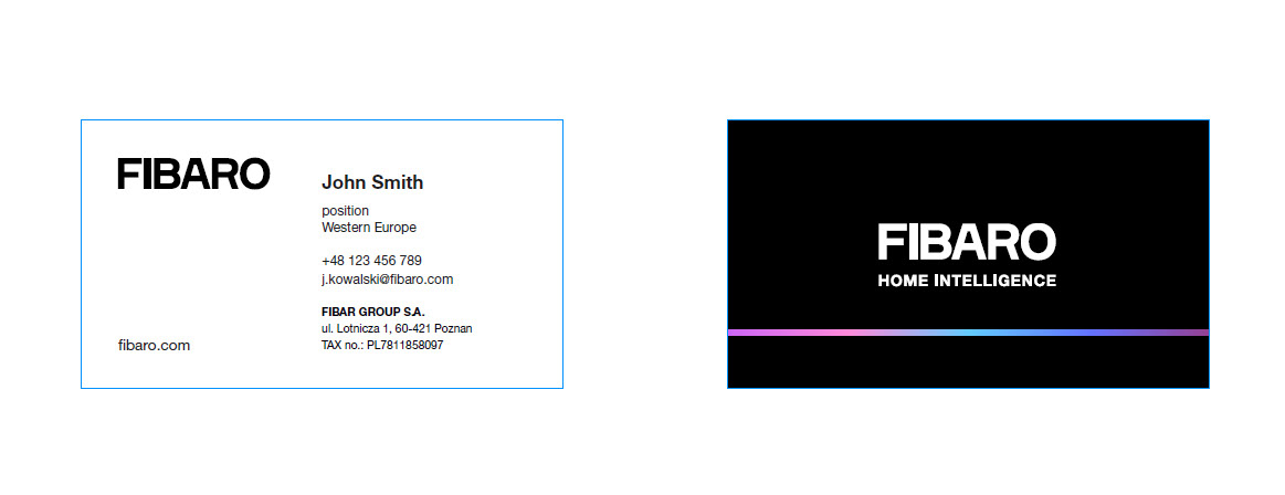
Different formats using the same basic components are key elements which ensure brand consistency. FIBARO brand design standards describe the logo and other graphics' placement in detail.
Use of the slant and gradient on a format
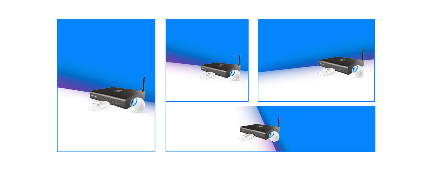
Placement of products on a format

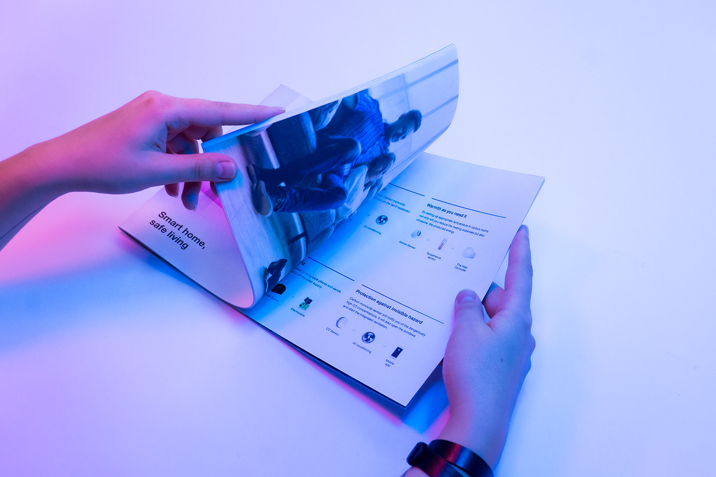
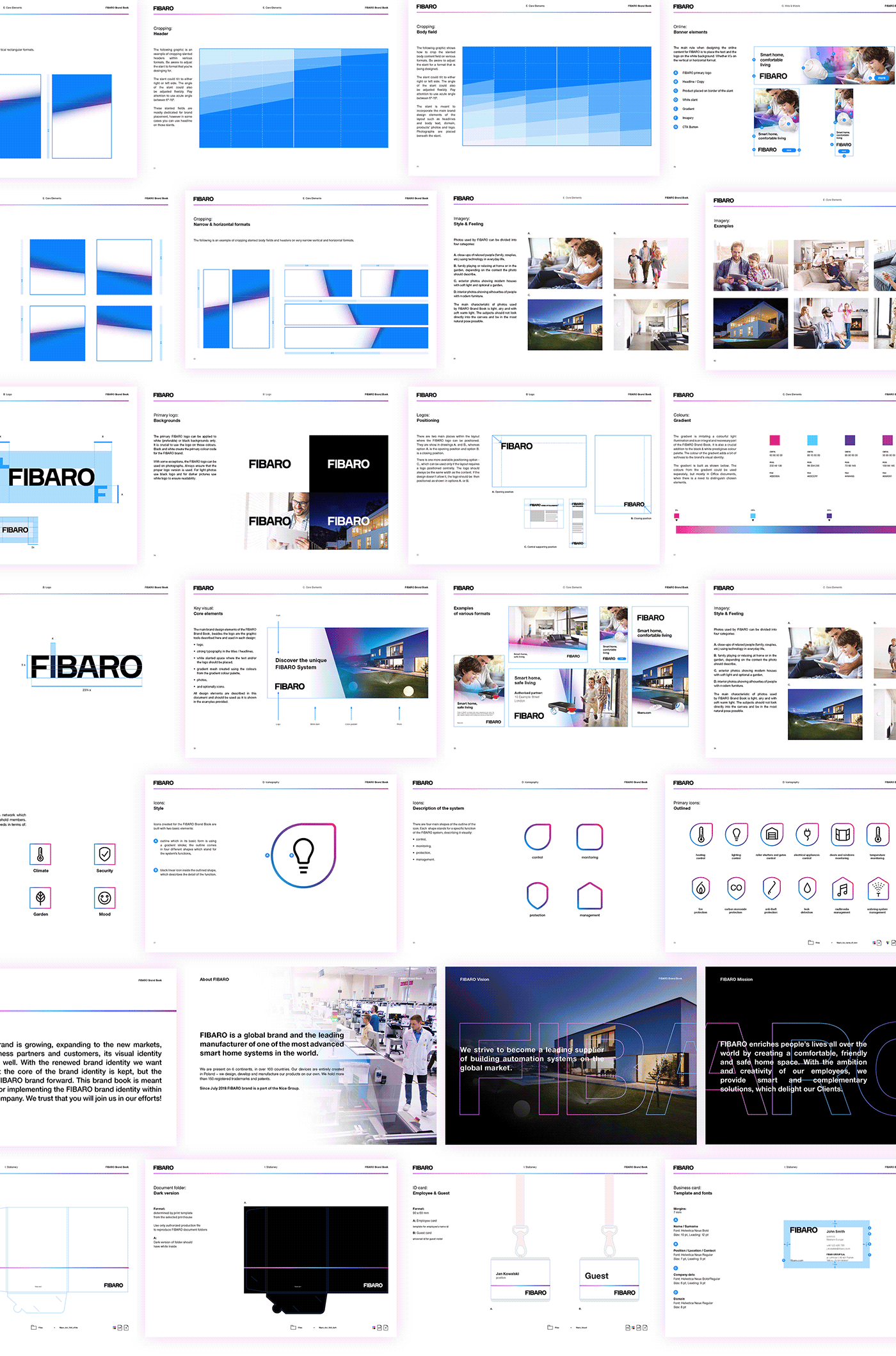
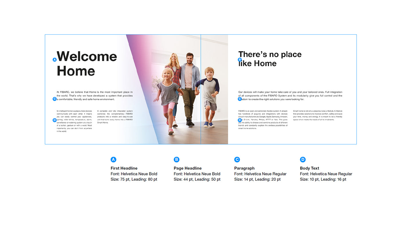
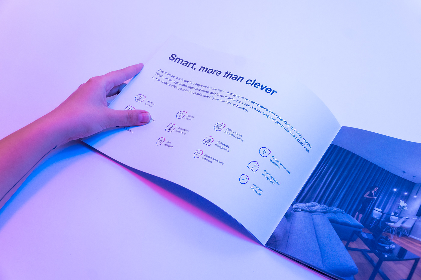
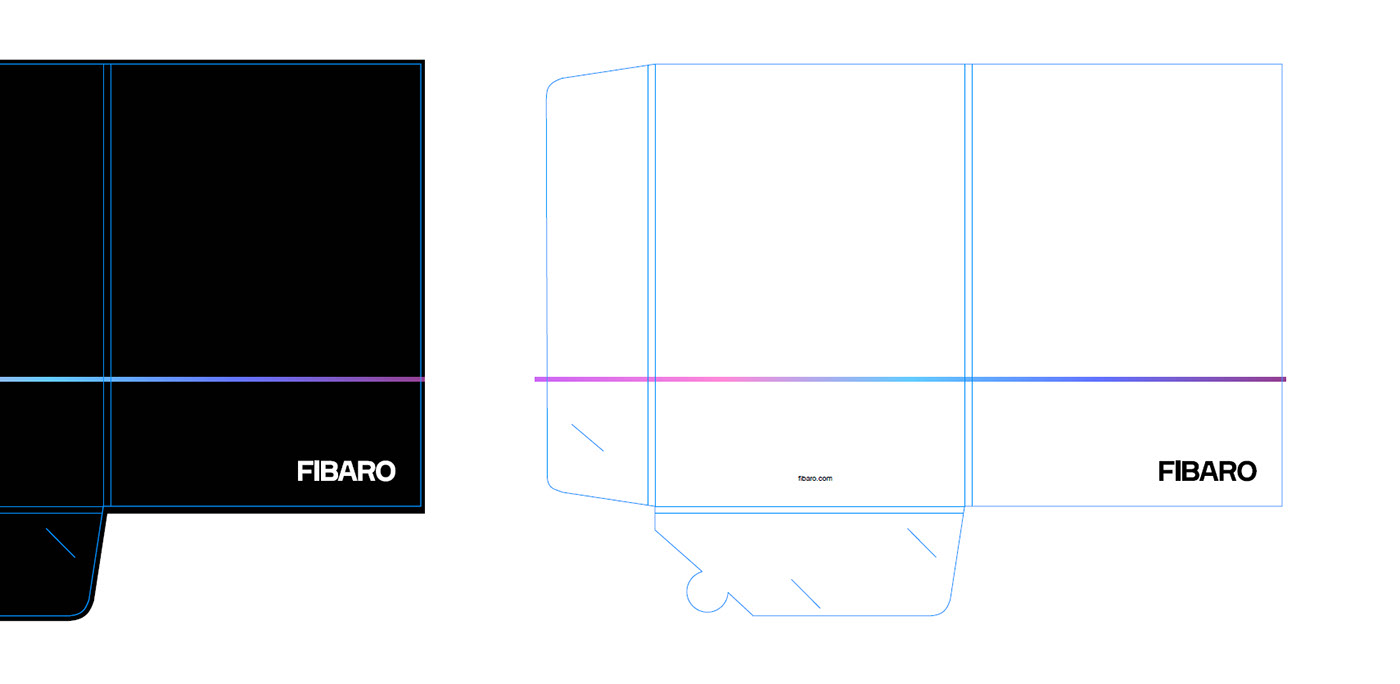
The main carrier of the brand design elements was the folder which included all the available brand design elements, not only these, described above, but also icons and product photos. Here we used not only the layouts, but also typography styles which are described in brand design guidelines.
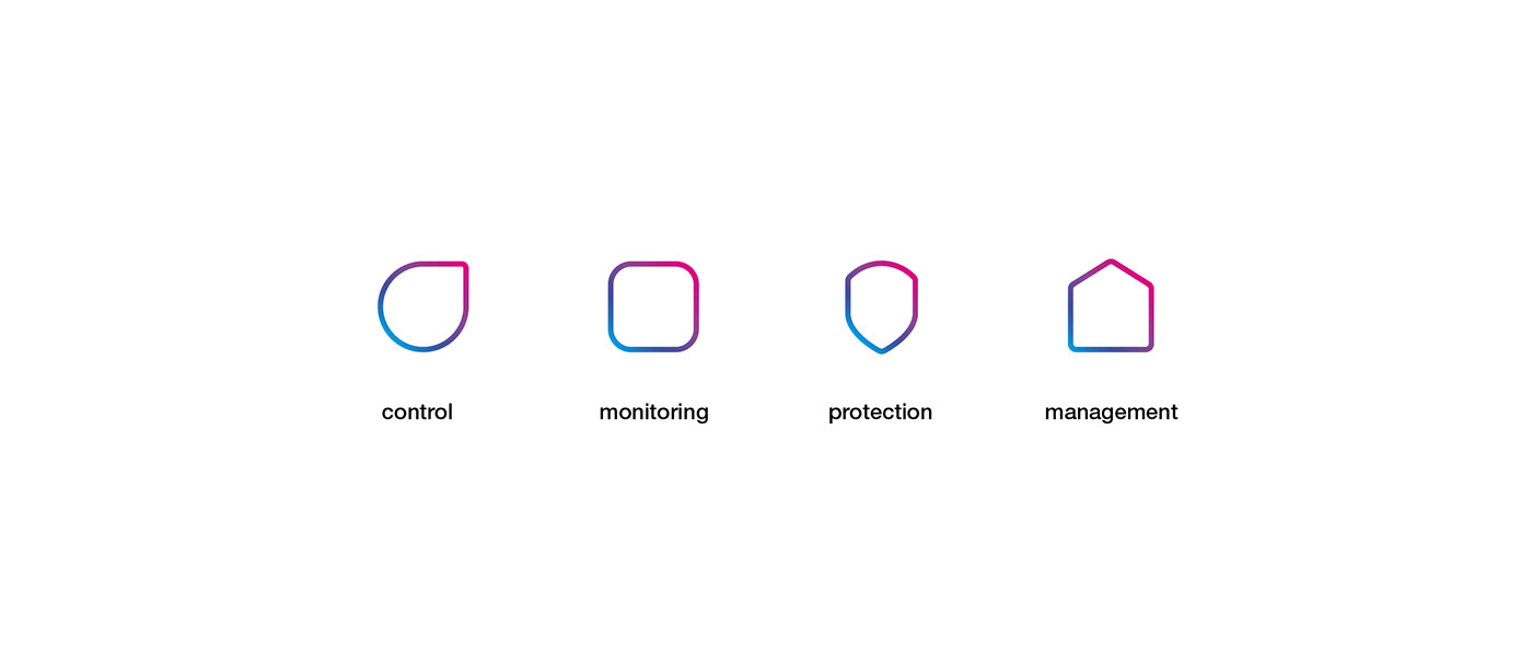
Icons' design system.
As part of the rebranding process we designed a system of icons, which would serve as the main tool of visually describing products' functions. The icons are divided into four groups, with the main element of a gradient frame defining the category. This solution enables the designers within the company to use the system by placing any outlined icon within the shape and create consistent branded content.

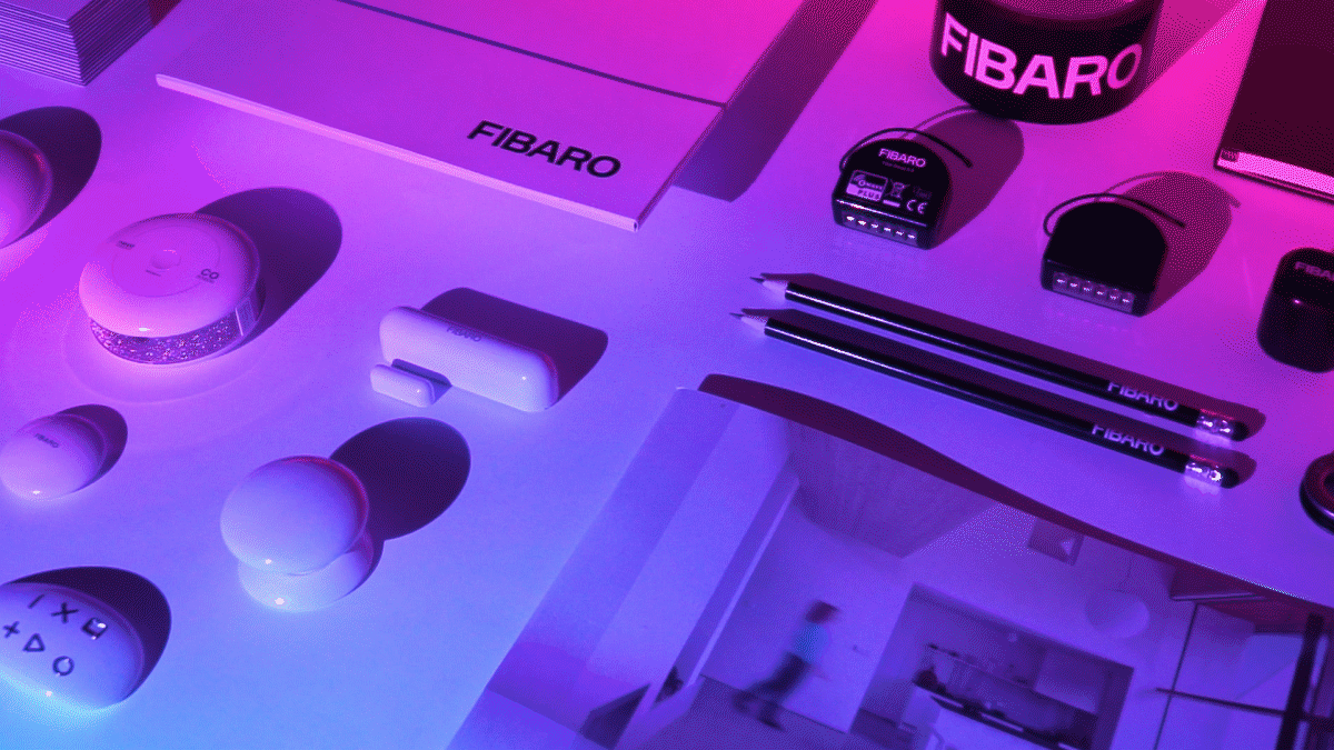
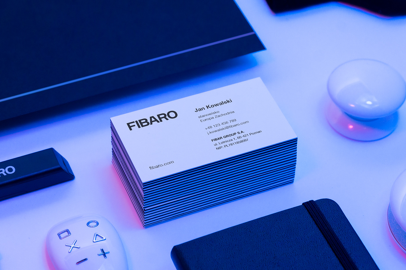
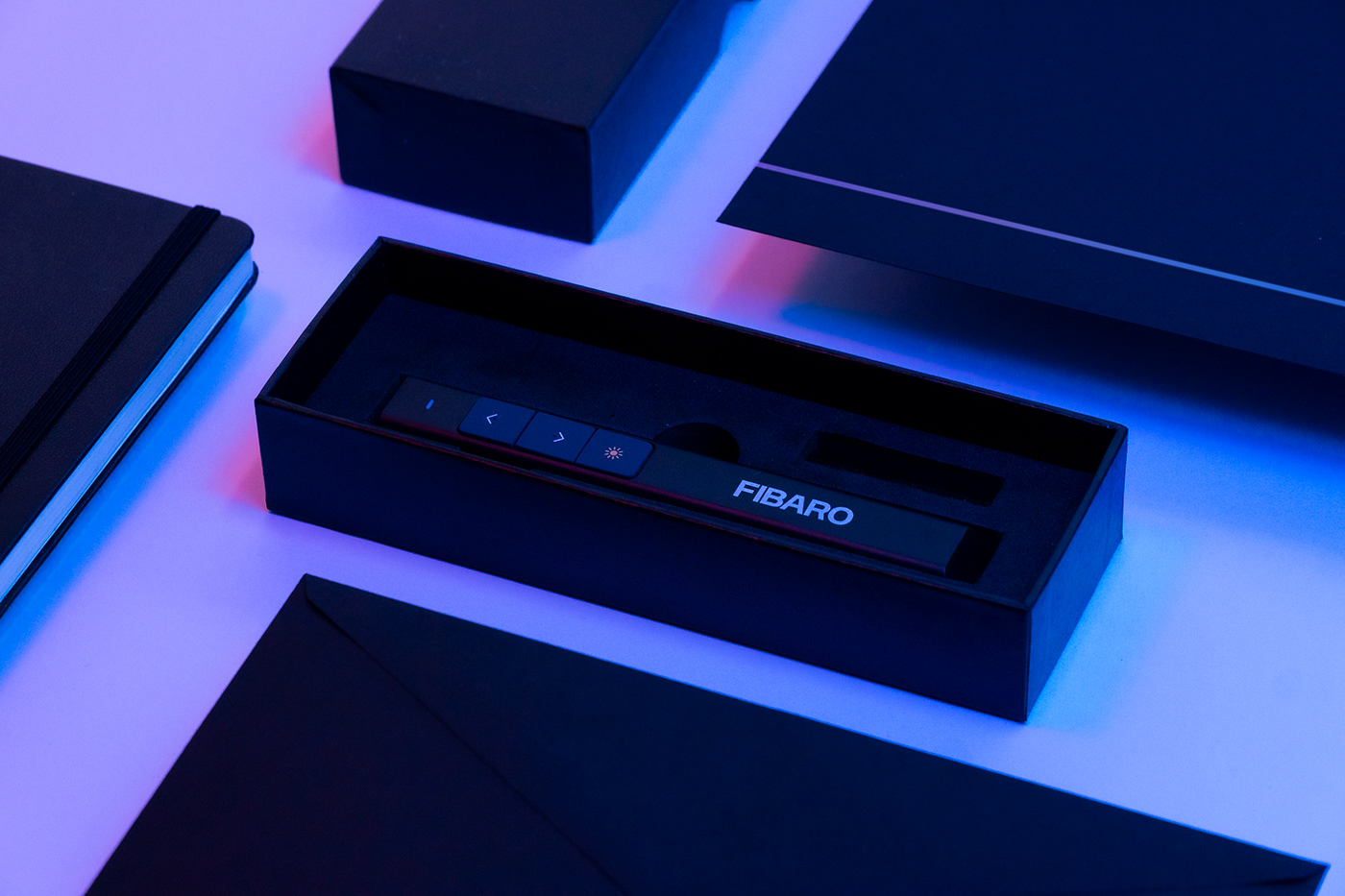
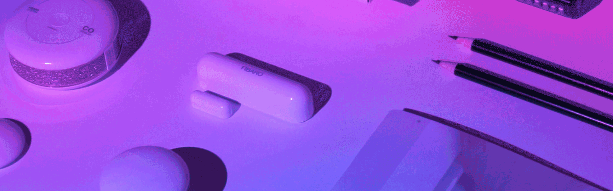
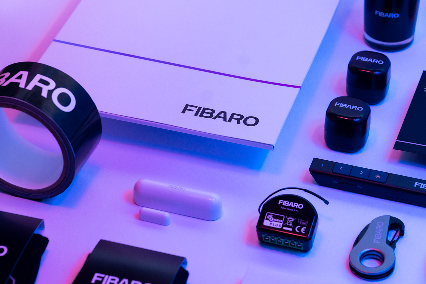
Examples of brand identity in use.
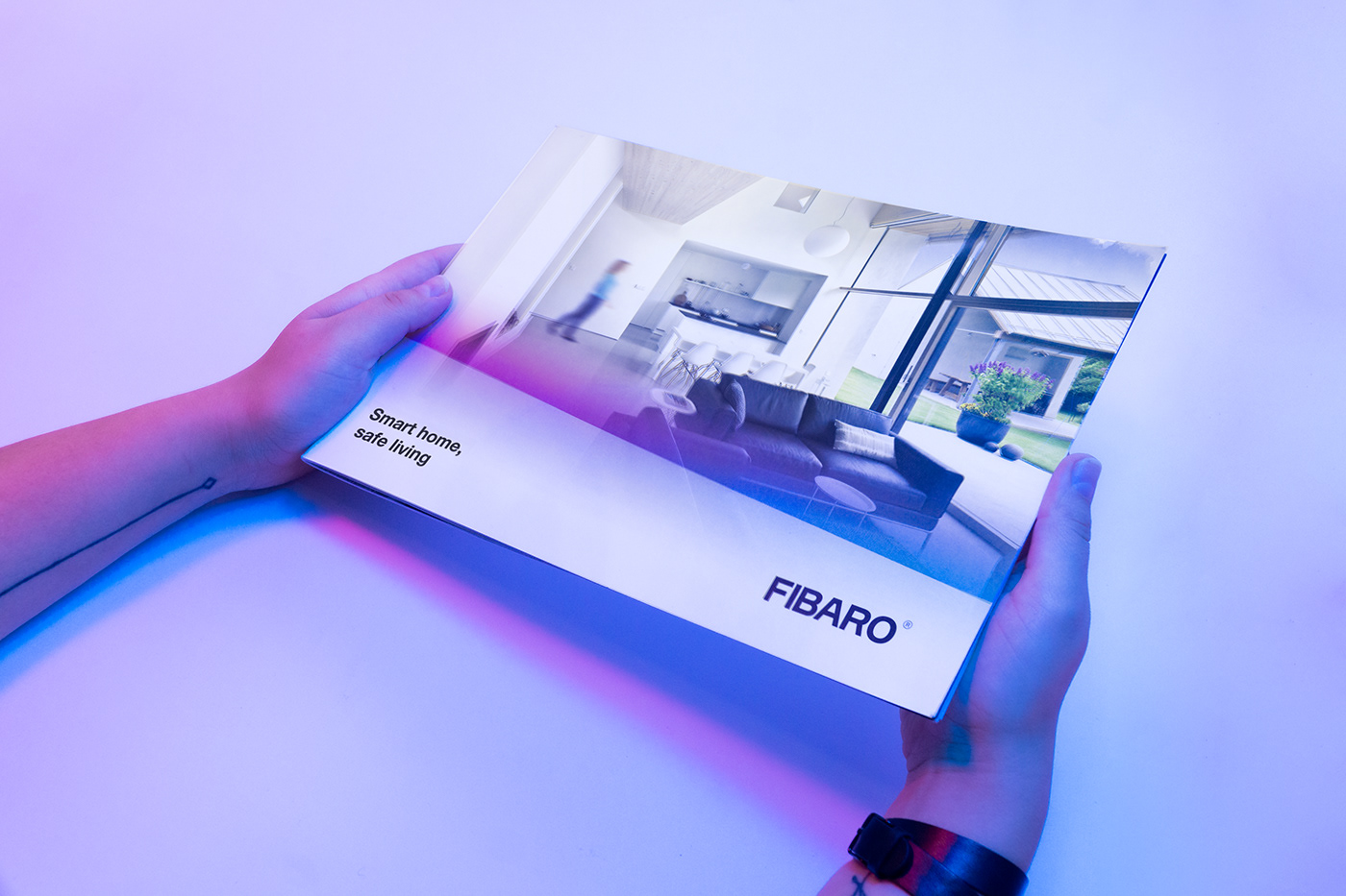
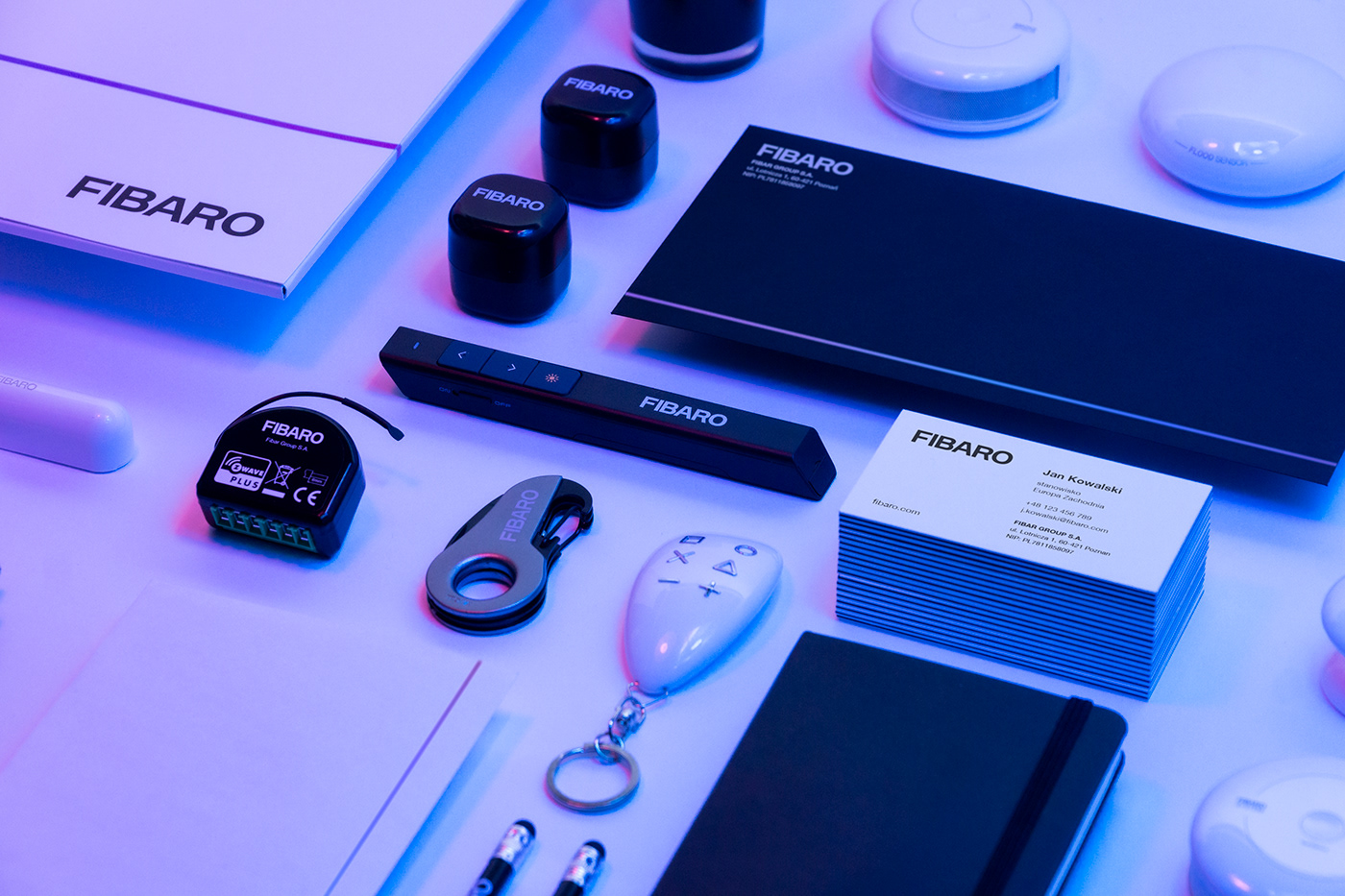
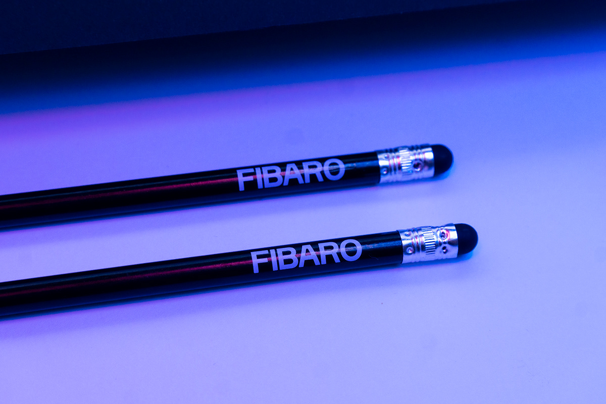
FIBARO uses a lot of printed materials and other branded materials in its communication. These materials carry core brand identity values and brand visuals. FIBARO also offers branded gadgets to its partners, distributors and installers. We used a different, simpler approach towards

Credits:
Brand design & Direction: Kuba 'Enzo' Rutkowski & Natalia Żerko / Kommunikat
Graphic design: Mateusz Krasnodębski
Branding photos: Marek Palczewski & Natalia Żerko
Animation: Dominik Robakowski


