


2018
STUDIO ASENSÒ
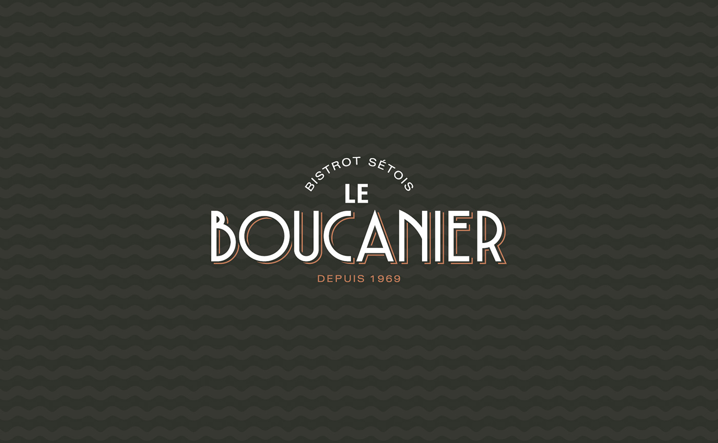
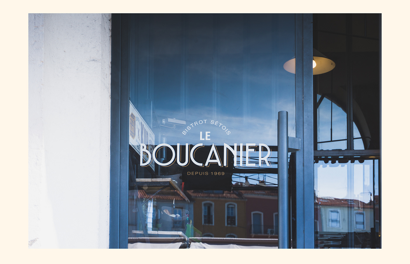
Le Boucanier
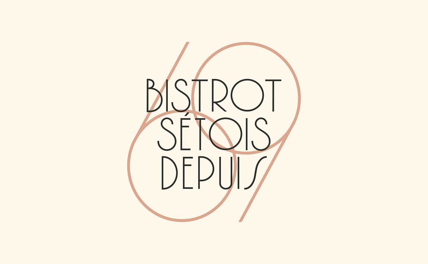
Bistrot Sétois depuis 1969
BRAND DESIGN
—
Introduction
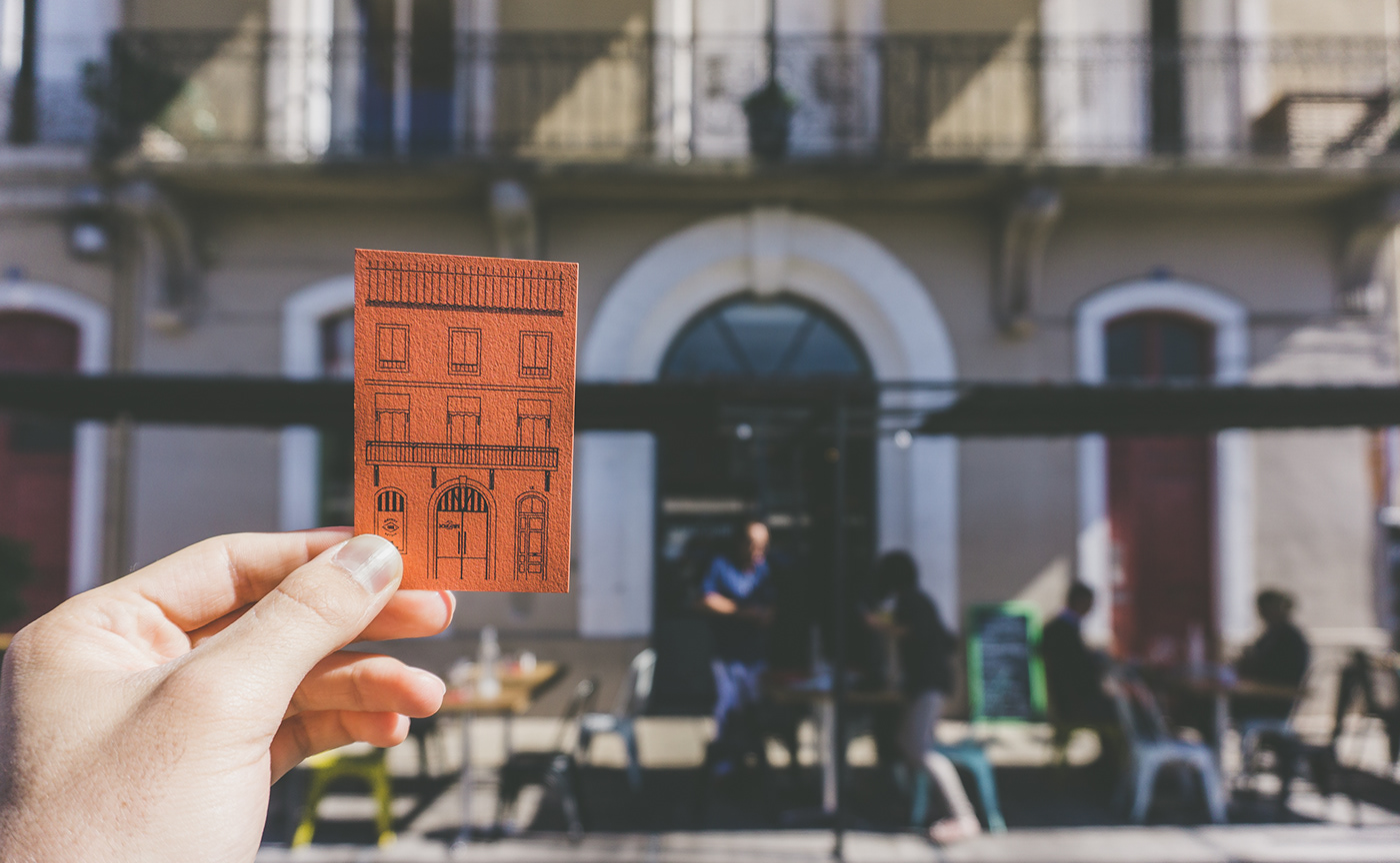
[EN] Located in Sète, the first French fishing port in the Mediterranean, also called "the Venice of Languedoc", Le Boucanier is a typical pub or "bistrot" of that city.
Le Boucanier was founded in 1969 by Arlette and Léon Chalaux, and it quickly became the go-to pub because of its theme nights and other great shows. Located on the Aspirant Herber wharf, next to the canal, this place experienced several lives, from being a club, a cabaret or piano bar to finally becoming a pub known for its good food.
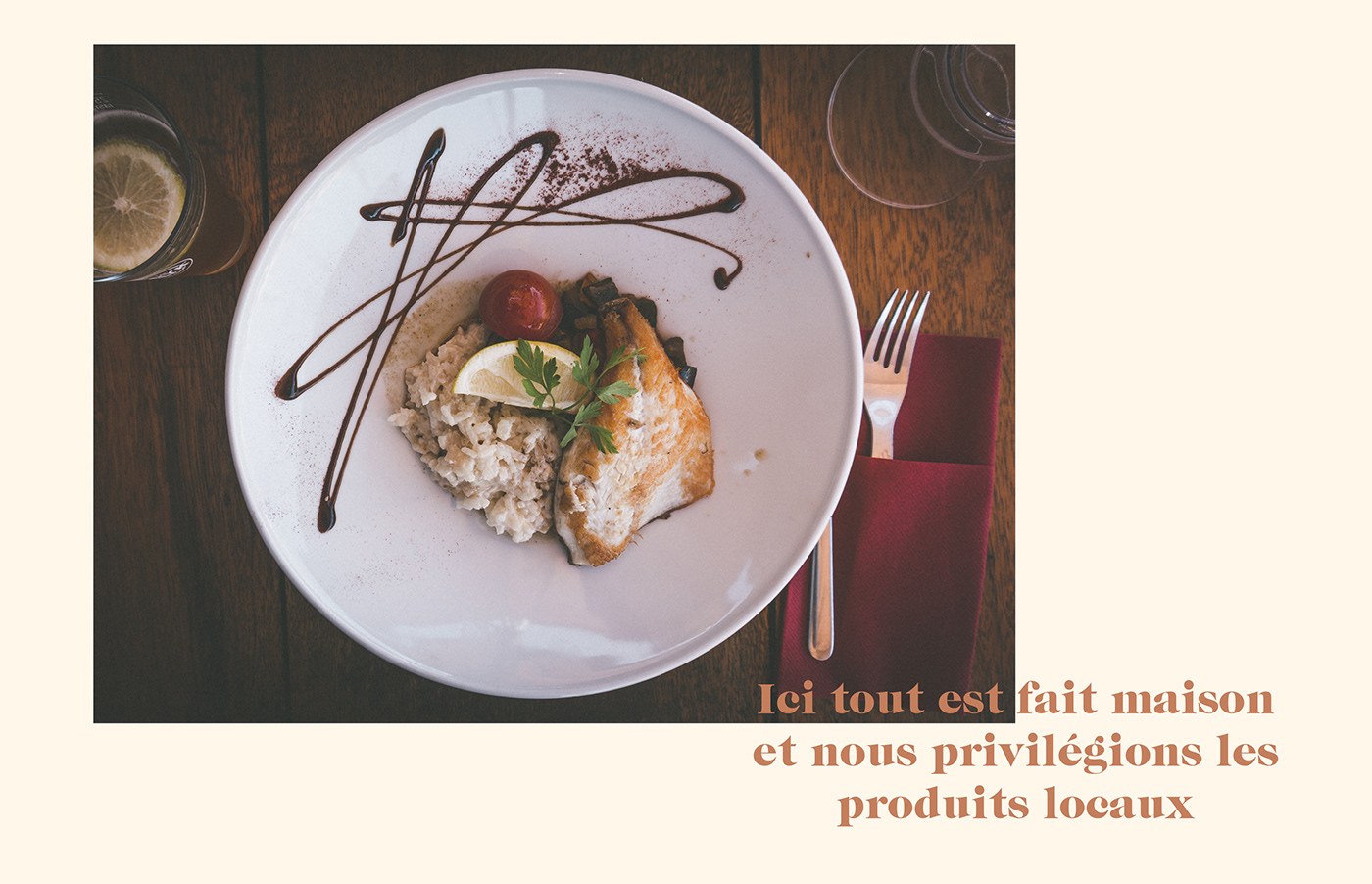
In 2017, Nicolas Jean and François Domingues acquired this magnificent and history charged place. They redesigned the pub's menu, aiming to highlight local craft products, they created a new wine list, loaded with beautiful local references, and thus logically wanted to rework the visual identity of the place to restore its reputation and acclaim.
[FR] Situé à Sète, le premier port de pêche français en Méditerranée, aussi appelée « la Venise du Languedoc », Le Boucanier est le bistrot Sétois par excellence.
Créé en 1969 par Arlette et Léon Chalaux, Le Boucanier est devenu un lieu incontournable des sorties sétoise pour ses soirées à thèmes et ses formidables spectacles. Situé sur le quai Aspirant Herber, à proximité du canal, l’établissement a connu plusieurs vies, celui de dancing, de cabaret ou encore de piano-bar pour enfin devenir un bistrot réputé pour sa bonne table.
En 2017, Nicolas Jean et François Domingues ont fait l’acquisition de ce magnifique lieu chargé d’histoire. Après avoir repensé la carte du restaurant en valorisant les produits locaux et artisanaux, et après avoir créé une nouvelle carte des vins généreuse chargée en belles références locales, ils ont souhaité retravailler l’identité visuelle du lieu afin lui rendre ses lettres de noblesse.
—
—
Concept
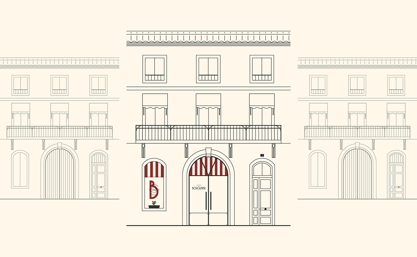
[EN] AN AUTHENTIC PLACE
The new visual identity had to reflect the pub's values, like simplicity and authenticity, while enhancing the experience you would get in this timeless place, an experience that echoes the old France. Le Boucanier is first of all a typical French pub, one with a marble countertop, wooden chairs and a creaky wooden floor, a place from which emanates a warm and popular atmosphere, where glasses of red wine stand next to salty "apero" peanuts.
[FR] UN LIEU AUTHENTIQUE
La nouvelle identité visuelle doit porter les valeurs d’authenticité et de simplicité de l’établissement, tout en valorisant l’expérience de ce lieu hors du temps, celle du bistrot-canaille et de la France d’autrefois. Un restaurant typique fait d’un comptoir en marbre, de chaises bistrot en bois et d’un parquet massif qui grince lorsque l’on se déplace, le tout dans une ambiance chaleureuse et populaire ou les verres de rouge côtoient les cacahuètes de comptoir finement salées.
—

—
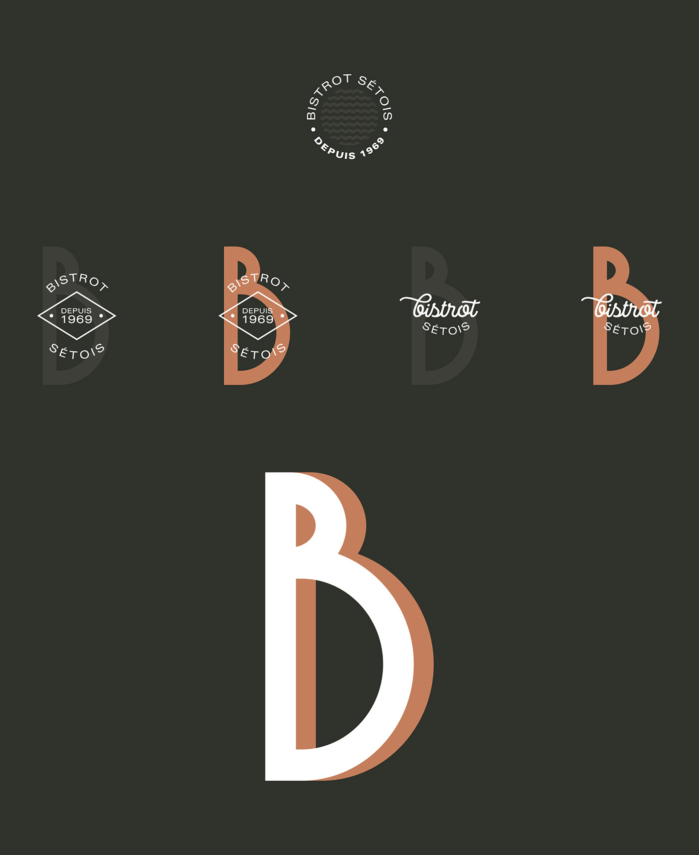
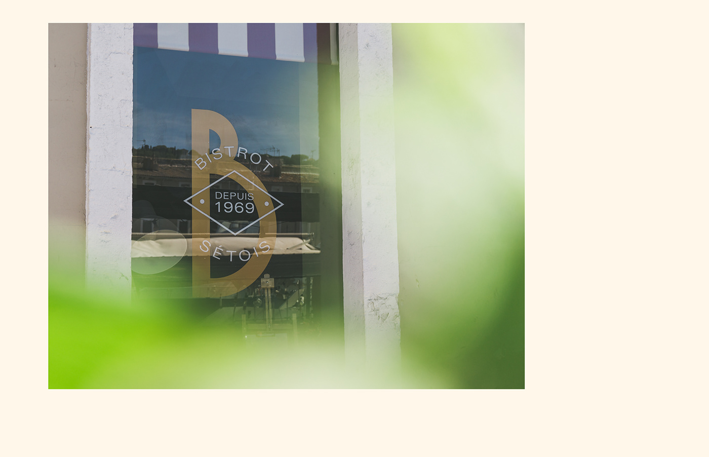
[EN] INSPIRED BY ITALY, AND BY ART DECO
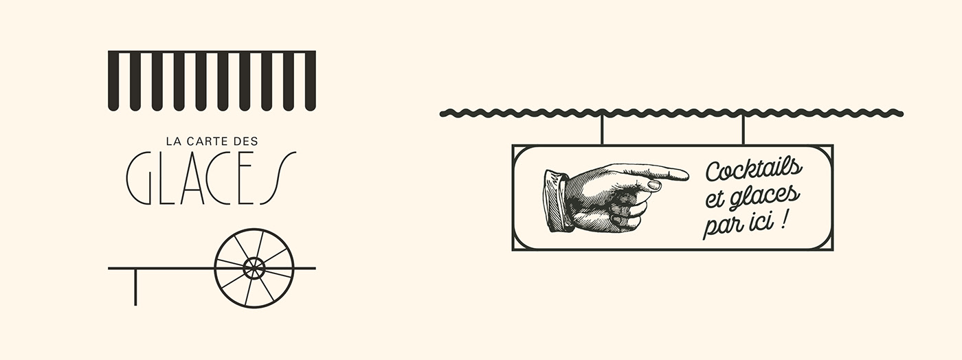
Our brand design also had to echoe the very strong link that exists between the city of Sète and its closest neighbor regarding gastronomy: Italy. Sète has a large Italian community well known for its colorful and generous gastronomy. This time of history, marked by the many cultural exchanges with Sète, and the friendliness of its inhabitants, is strongly linked with its artistic trend: Art Deco... and of course Art Deco was an inspiration for us. The visual identity is thus punctuated by ornamental and geometric patterns that provide the pub's stationery with an elegant touch. A result that is as simple as it is warm and that illustrates the values and history of this restaurant.
[FR] INSPIRÉ PAR L’ITALIE, ET PAR L’ART DÉCO
L’identité visuelle devait aussi refléter le lien très fort qui existe entre la ville de Sète et le pays méditerranéen le plus proche de part ses spécialités culinaires : l’Italie. La ville de Sète abrite une grande communauté italienne qui a su lui léguer sa gastronomie colorée et généreuse dans un esprit de partage. Cette époque de l’histoire, marquée par les importants échanges culturels avec Sète, et par la convivialité de ses habitants, est indissociable de son courant artistique : l’Art Déco. Une inspiration Art Déco clairement identifiable dans l'identité visuelle qui est ponctuée par des motifs ornementaux et géométriques qui habillent élégamment la papeterie du bistrot. Un résultat aussi simple que chaleureux qui illustre les valeurs et l'histoire de l’établissement.
—

—
[EN] A NAME THAT CARRIES MEANING
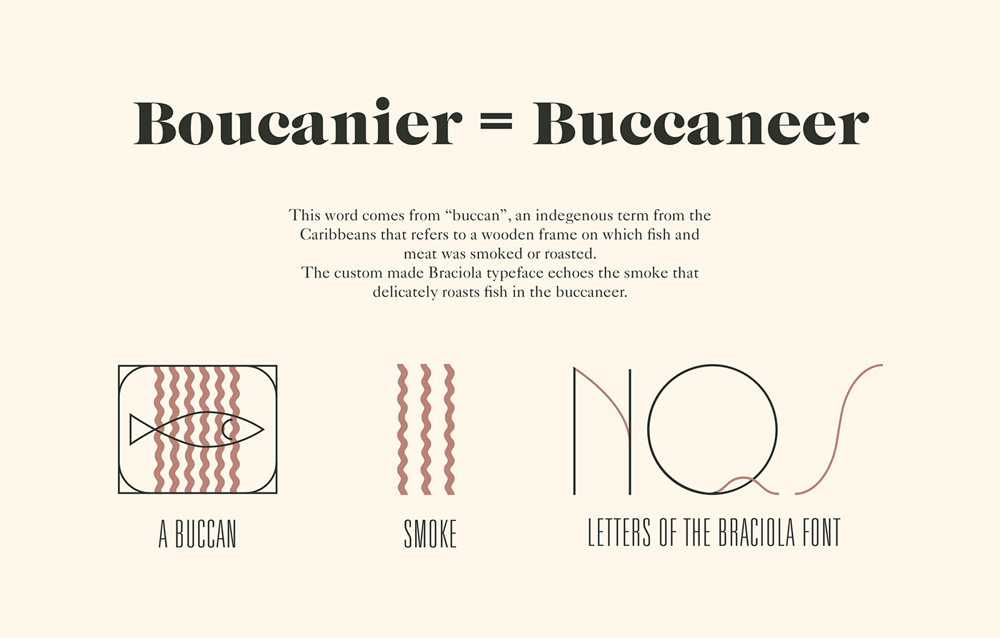
But what does Boucanier mean? Well, in English it could be translated buccaneer. This word comes from "buccan", an indegenous term from the Caribbeans that refers to a wooden frame on which fish and meat was smoked or roasted. And because this word really tells a story, we made it become the main theme of the branding and of the custom made Braciola typeface (click here to discover it). A typography that is marked by elegantly curved lines, which refer to the smoke that delicately roasts fish in the buccaneer.
[FR] UN NOM PORTEUR DE SENS
Mais qu'est-ce qu'un Boucanier? Le mot boucanier provient de "boucan", un terme indigène faisant référence à un grill ou claie de bois sur laquelle la viande ou le poisson était fumé et séché. Ce mot, riche en histoire, allait devenir le fil conducteur de l'identité visuelle, et de la typographie Braciola (cliquez ici pour la découvrir), réalisée spécialement pour l'occasion. Une typographie marquée par des lignes élégamment courbées, qui font référence à la fumée qui vient délicatement sécher le poisson disposé dans le boucanier.
—
—
Stationery
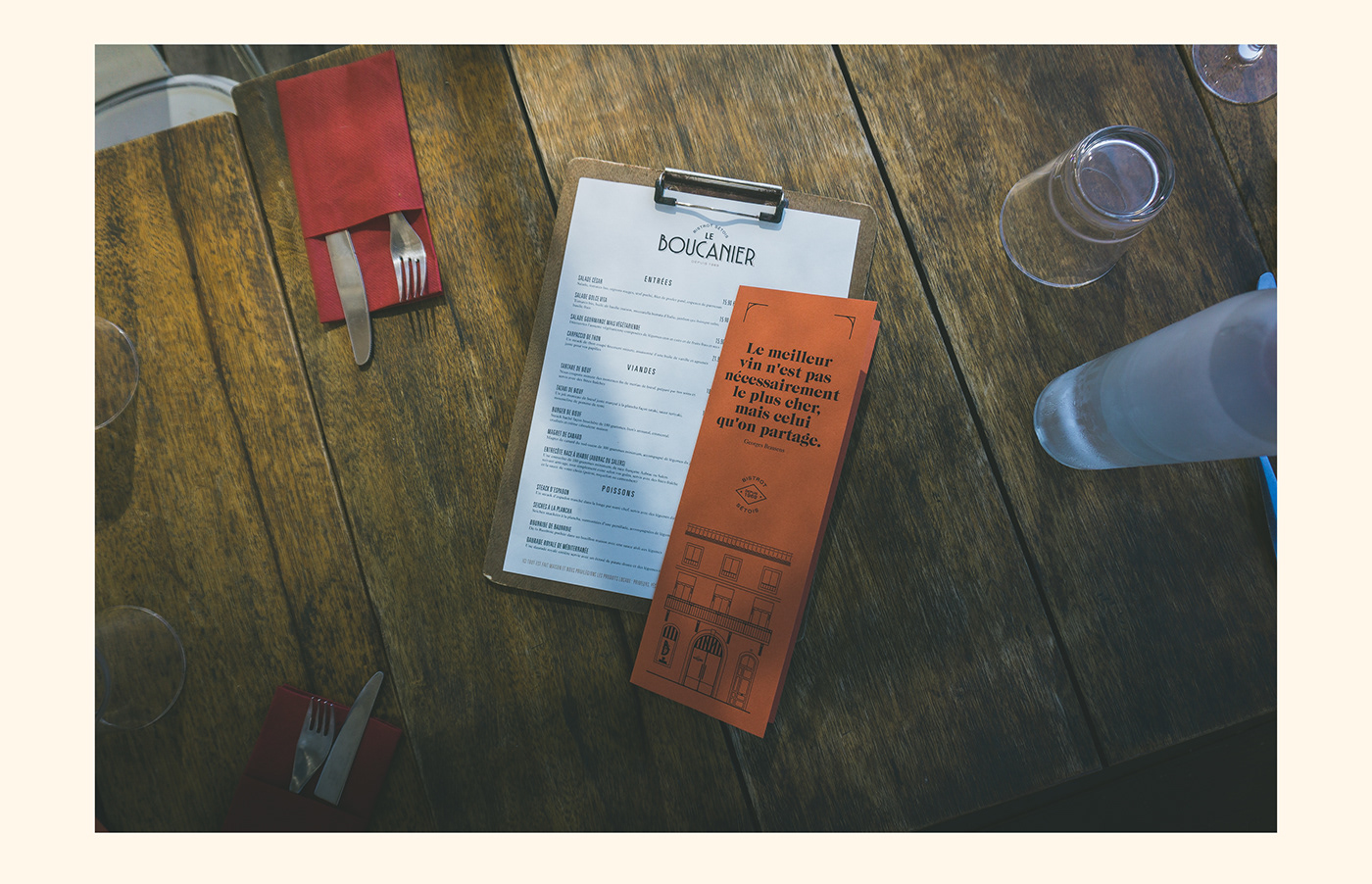
[EN] The Italian inspiration can also be found in our choices of paper. We opted for Fedrigoni papers, Fedrigoni being an Italian brand that creates high end papers since 1717. In line with the pub's philosophy that favors local products and a short supply chain, its stationery had to be simple, eco-friendly and tasteful. Following these principles, we chose the uncoated Materica paper, a recycled, biodegradable, pulp-coloured paper that gives exceptional sensations to the touch. The, all based on typography, visual identity was designed to carry those values. Therefore, it is simple and allows for an internal printing for a good looking and eco-friendly result.
Papeterie
[FR] L'inspiration italienne se retrouve aussi dans les choix de papier. Nous avons opté pour des papiers de la marque Fedrigoni, une marque italienne qui depuis 1717 est spécialisée dans la création de papier haut de gamme. Dans la droite lignée de la philosophie du restaurant, qui met en avant produits locaux et circuits courts, la communication se veut simple, éco-responsable et savoureuse. Suivant ces principes, nous avons choisi le papier non-couché Materica, un papier recyclé, teinté dans la masse, entièrement biodégradable, qui procure des sensations exceptionnelles au toucher. L'identité visuelle, purement typographique, a été pensée en amont pour porter ces valeurs. De ce fait, elle se veut simple et permet une impression en interne pour un résultat aussi savoureux qu'éco-responsable.
—


—
PROJECT DETAILS
ART DIRECTION, GRAPHIC DESIGN: ROMAIN DIANT
ART DIRECTION, GRAPHIC DESIGN: ROMAIN DIANT
TYPOGRAPHY (BRACIOLA): ROMAIN DIANT
PHOTOGRAPHY: SAMUEL ROGER
PAPER: FEDRIGONI MATERICA
MERCI DE VOTRE ATTENTION !
THANKS FOR WATCHING !
More on www.asenso.fr
THANKS FOR WATCHING !
More on www.asenso.fr
Follow us on Instagram


