LEÃO FOODS & BEVERAGES VISUAL IDENTITY Brazil, 2019
✦ PRESENTATION UPDATED IN 2024
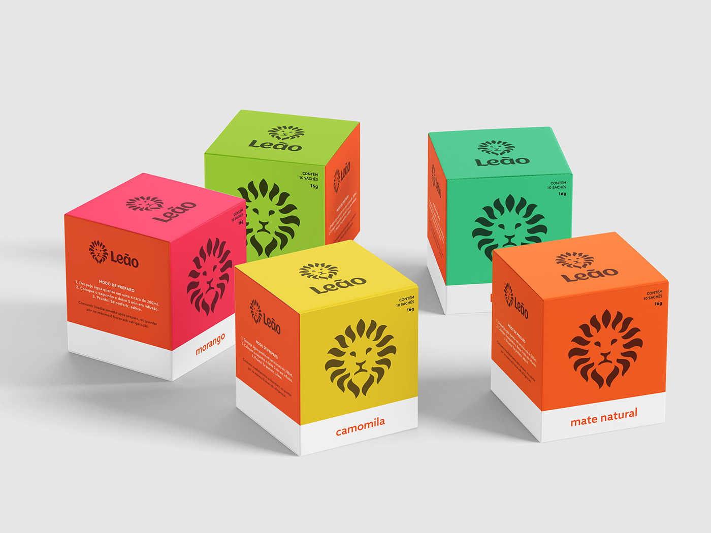
Exercise of redesign and strengthening for the symbol of a tea brand that has already been inside all the cups of Brazilians.
Leão, one of Brazil's most iconic food and beverage brands, was established in 1901 as Matte Leão, selling yerba mate tea. Over the years, the brand has expanded its product range and was acquired by the Coca Cola Company in 2007. However, the brand's visual identity encountered issues, particularly an inconsistency between the master brand and its sub-brands, causing a disconnect among its products. As a result, I decided to explore new possibilities for their visual identity through this creative exercise.

SCENARIO
The previous logo does not seem to follow a structure for the lettering size. It is not clear if there is a symbol that connects the sub-brands, as some use the lion as a graphic element and others do not. The symbol used in the mother brand is very generic and does not represent the brand. Despite the smooth endings on the letters, they do not seem to be really fluid. The lion has been losing presence in the brand over time.


GOALS & SOLUTIONS
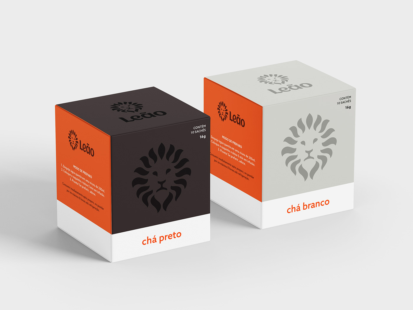
The suggested plan aims to streamline the main brand and sub-brands, making the visual style simpler for easier brand and packaging creation. An important step was merging the Matte Leão and Leão brands, making the lion image a strong symbol that connects all brands and packaging. The plan also suggests using flowing shapes and a range of colors to highlight the sensory experience of tea's taste and aroma.


