SENAC - VISUAL IDENTITY PROPOSAL - BRAZIL, 2023
✦ PRESENTATION UPDATED IN 2024
A minimalist approach for a consolidated Brazilian educational institution preserving the brand recognition and reinforcing its visual impact.
Senac is a professional education institution in Brazil. Since 1946, it has been training people for work in commerce, services and tourism. In 1989, it added university centers that offer higher education. These centers have laboratories, libraries, sports centers, a gastronomic center and other educational resources. This project is an exercise to suggest a basic redesign for the brand. I aimed to make the text simpler, the symbol more impactful and enduring, and keep the most notable parts of the old logo.

DISCOVERY
At the project's outset, I conducted research and collected testimonials to gain a better understanding of the brand. Through this information, I identified three primary concepts that make the brand unique:
TO BELONG: A Brazilian brand that unites different states and cities in a collaborative teaching project, where teachers and students are on the same team.
TO PURSUE: A company for individuals who think about the future, appreciating the path taken in the present through dreams, goals, and action.
TO EXPLORE: An educational institution that goes beyond the classroom, standing out through its laboratories, collaborations, event organization, exchange programs, and many more initiatives.
GOALS & SOLUTIONS
With the brand features and the project needs clarified, the following objectives were set.
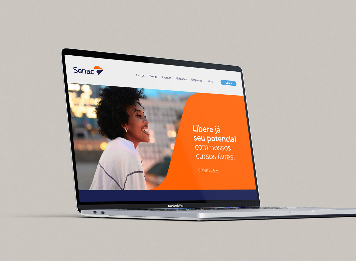
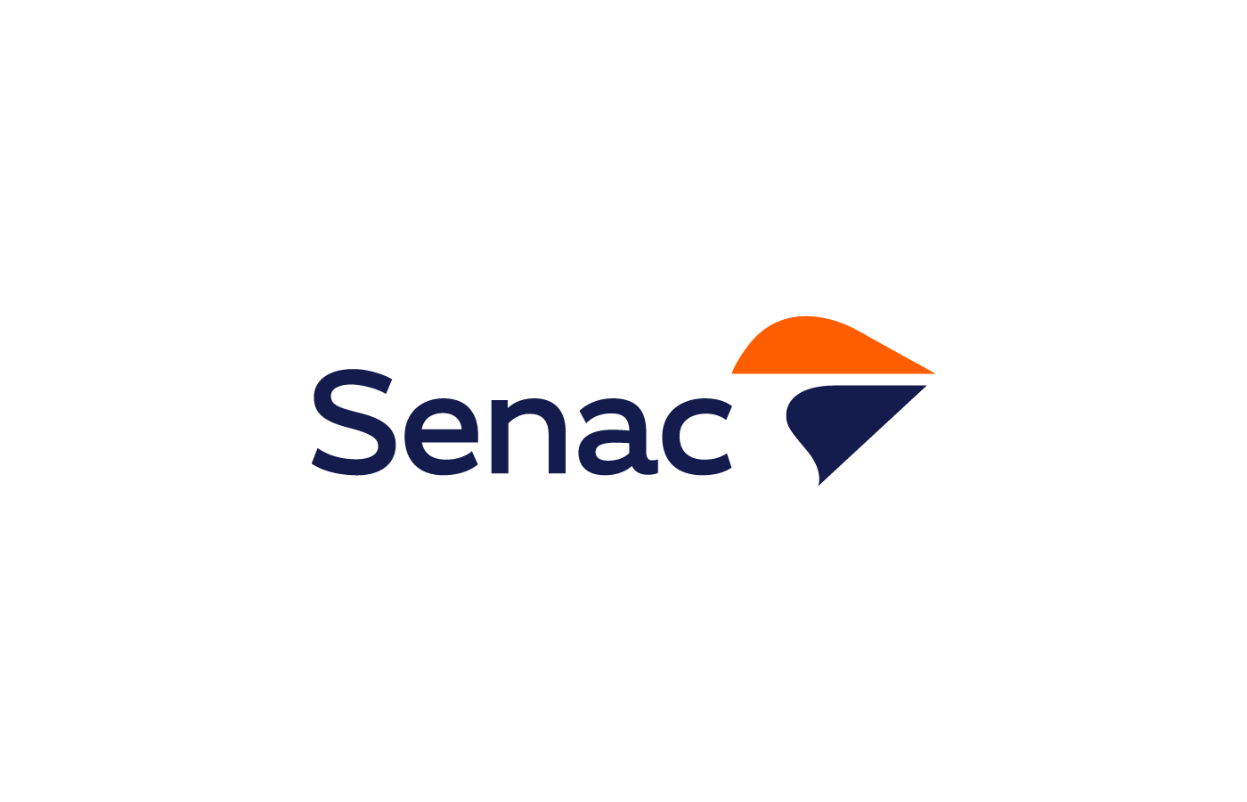
SIMPLIFY THE TYPOGRAPHY: The original logo used a font full of modifications that created a sense of disorder and inconsistency. I opted for a single modern sans-serif font to improve readability and visual coherence.
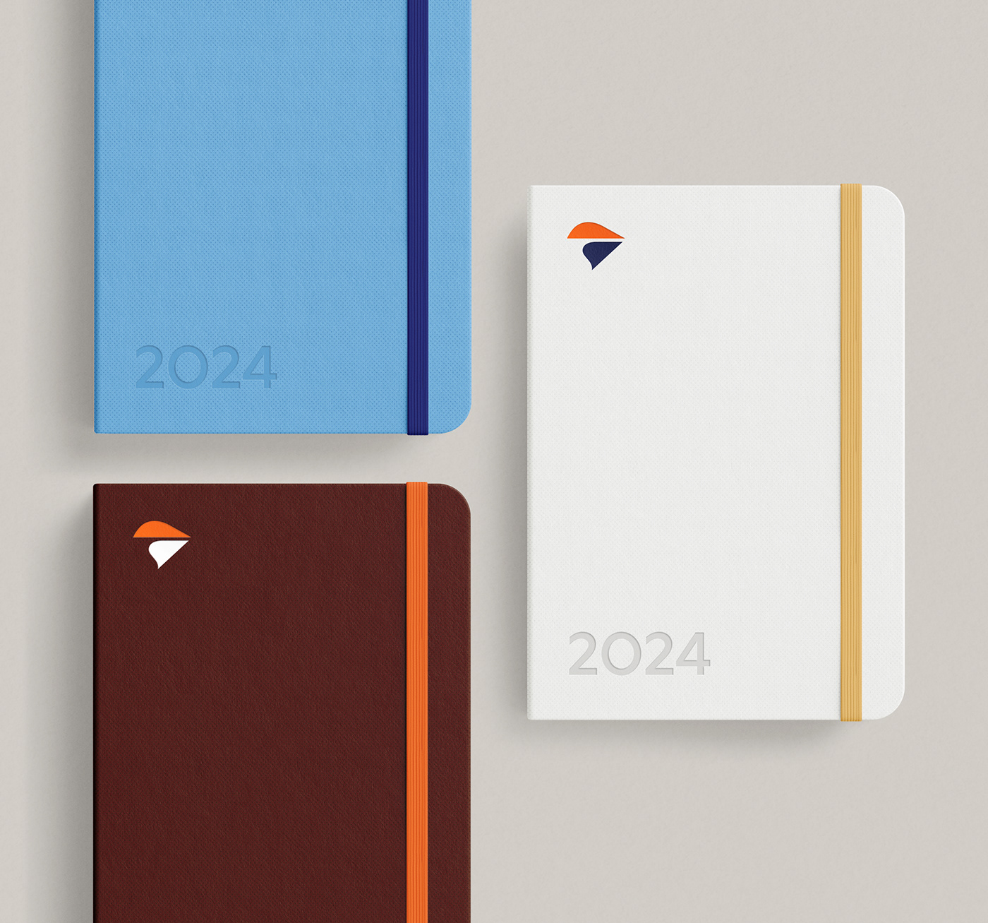
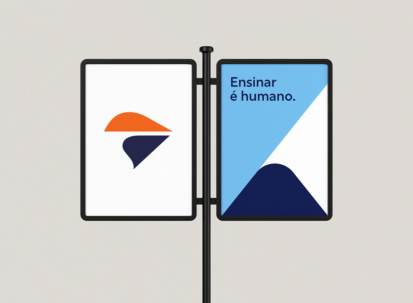
STRENGTHEN THE SYMBOL: The existing symbol, a stylized representation of a paper airplane, was hard to decipher at smaller sizes. I reimagined the symbol to be simpler and abstract, but still tied to the idea of moving forward into the future. I also added elements that refer to Brazil and the discovery of new paths.
PRESERVE THE MOST NOTABLE FEATURES: Even updating the brand, it was essential to honor its past. I retained the colors and basic shape of the original logo, ensuring a sense of continuity and familiarity for existing stakeholders.


— The result is a cleaner, timeless, and impactful new logo. It retains the essence of the Senac brand while making it more relevant and engaging for a new generation of students. By focusing on clarity and visual impact, I sought to develop a brand that seems new and familiar at the same time, and that conveys the values of Senac in a more mature and remarkable way.