KUBA ÁUDIO VISUAL IDENTITY & PACKAGING BRASIL 2022
✦ PRESENTATION UPDATED IN 2024
The Brazilian love for music meets sustainability, refined aesthetics, and impressive sound quality.
Kuba is a Brazilian headphone and audio accessories manufacturer, known for its high sound quality, durable products, and sustainable approach. The concept of this redesign, inspired by these values, aims to emphasize the quality and modularity of the products, and the brand's signature vintage handmade style. As this project is a creative exercise, I ventured into a more abstract and fluid visual territory.
DISCOVERY
While studying brand communication and customer perception, I was able to deepen my understanding. With this, I identified three characteristics to synthesize the brand personality and guide my decisions:
ARTISANAL - Through our hands and our aesthetic perception, we incorporate a little bit of ourselves into each headphone, transforming hearing devices into pieces of art.
TECHNICAL - Passion drives us, but it is our cutting-edge technology and our knowledge that materializes this feeling and takes our products to another level.
ENCHANTING - Each Kuba headphone is designed to reveal the hidden treasures in your favorite songs. We believe that music should be more than just heard - it should be felt and appreciated in all its richness and complexity.
GOALS & SOLUTION
With the brand's personality characteristics clarified, the next step was to think about strategies to effectively communicate them through visual identity.
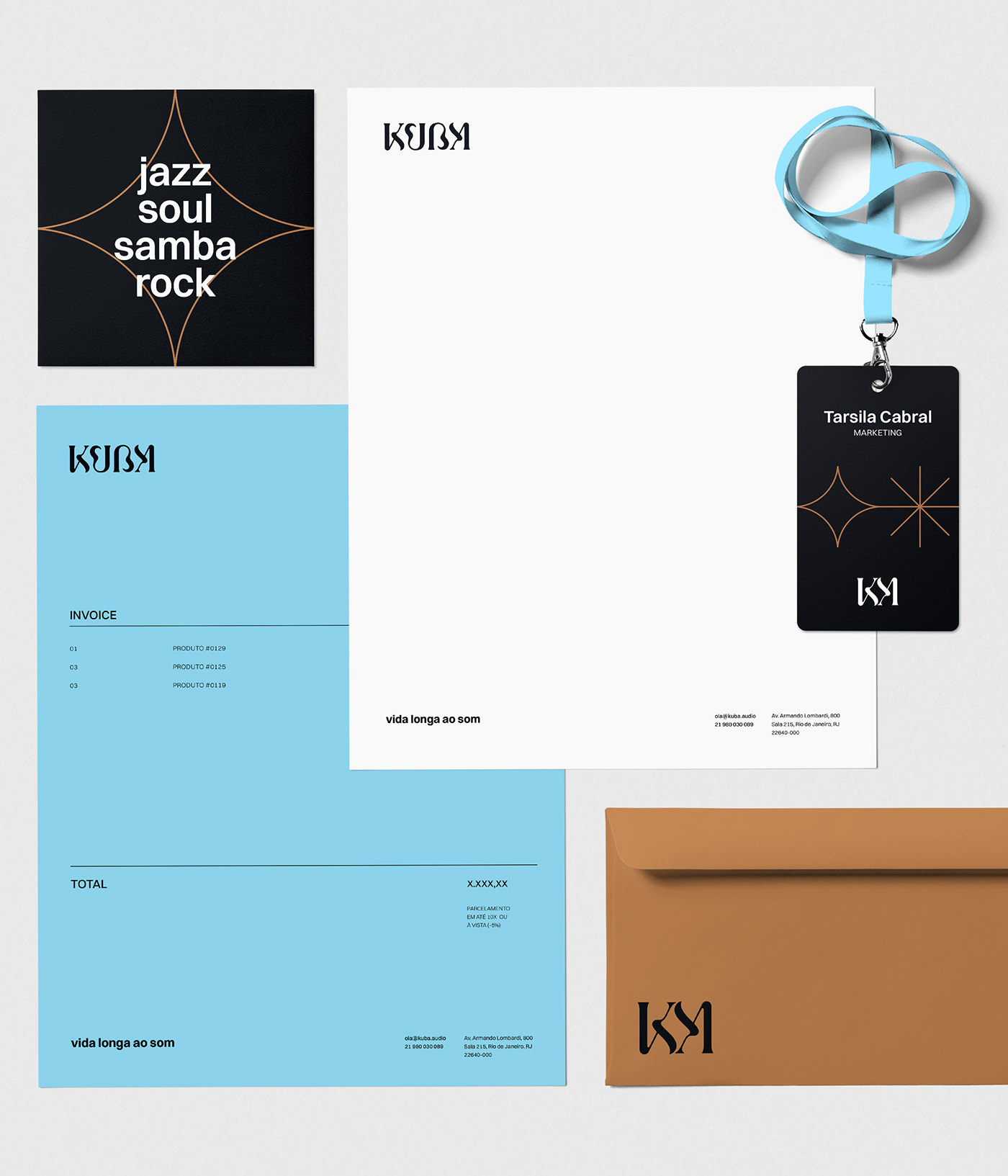
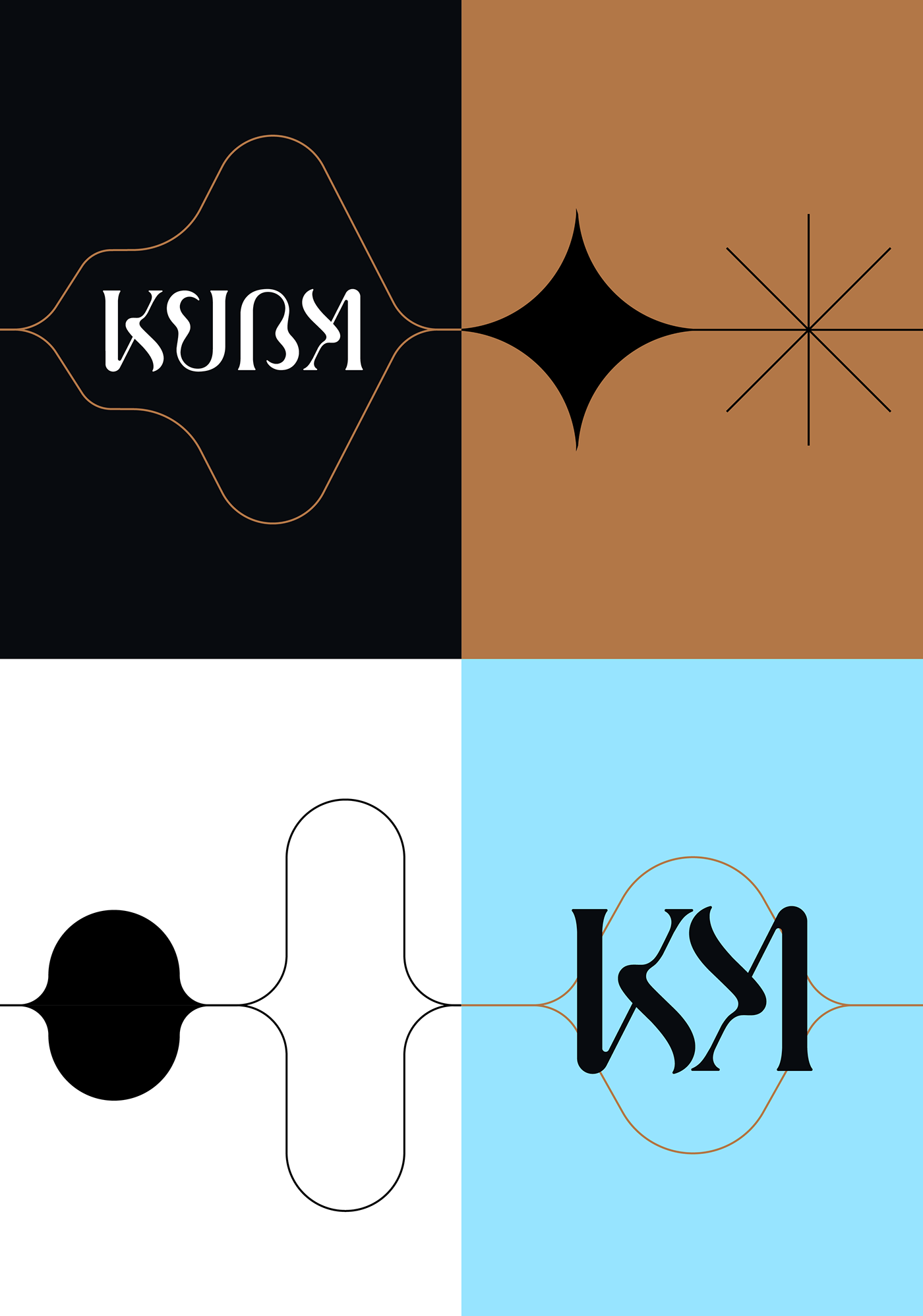
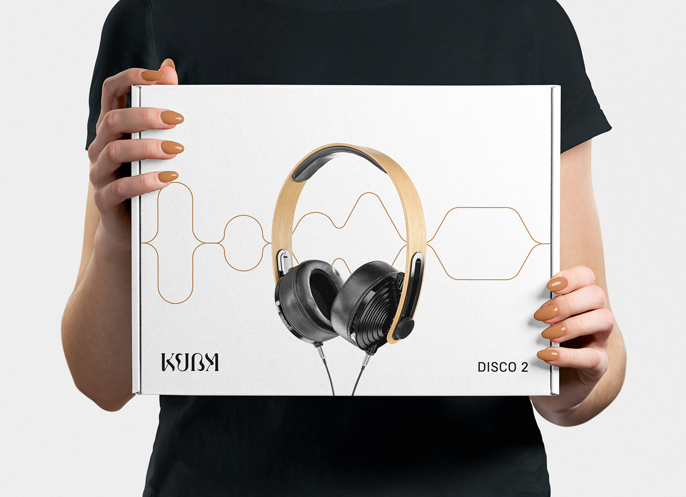
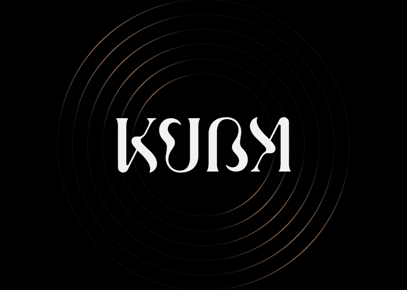
Modularity and Sustainability: An ambigram has been designed as a visual solution to be printed on parts that will be attached to both sides of the product, making easier the manufacture and replacement. The choice of the ambigram is also symbolic, suggesting the movement of rotation, similar to the playback of a disc, connecting to the brand's musical universe.
Handmade and Classic: The logo, designed to look hand-written with a brush, reflects the brand's artisanal nature, and evokes nostalgia from past-decades audio brands. The color palette incorporates vintage hues such as pale blue and caramel.
Elegance and Simplicity: The typography has been selected to convey a classic and timeless feel.
Sound Frequencies and Balance: The graphics draw inspiration from the oscillation of sound frequencies, visually embodying the audio quality delivered by Kuba products. The waves represent the lower and middle tones, while the star represents the brilliance of the highest frequencies, creating a dynamic and captivating visual experience.