SAL+DOCE VISUAL IDENTITY BRAZIL, 2013 (REFRESHED IN 2019)
✦ PRESENTATION UPDATED IN 2024
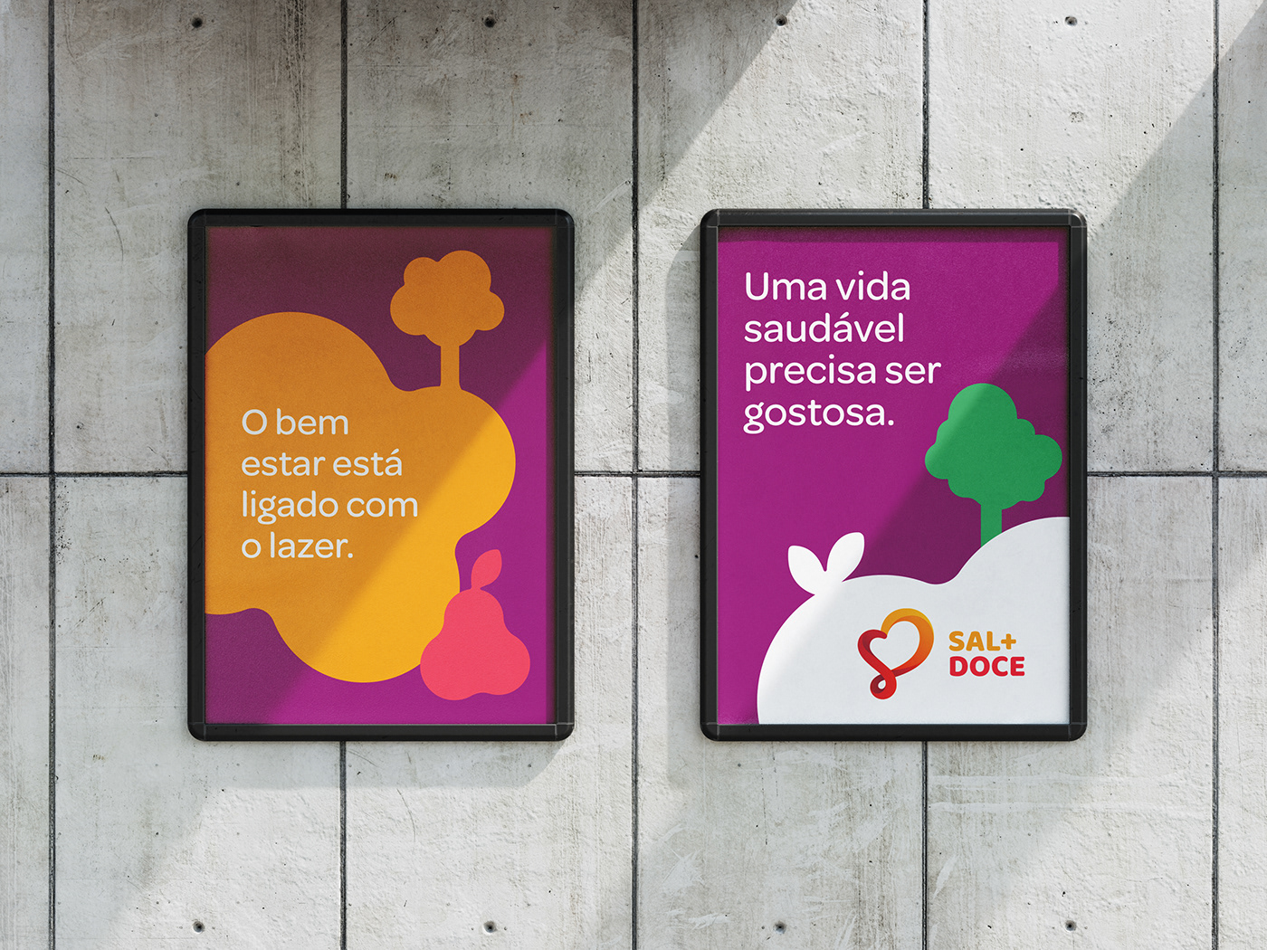
The most energetic and vibrant aspect of a healthy life.
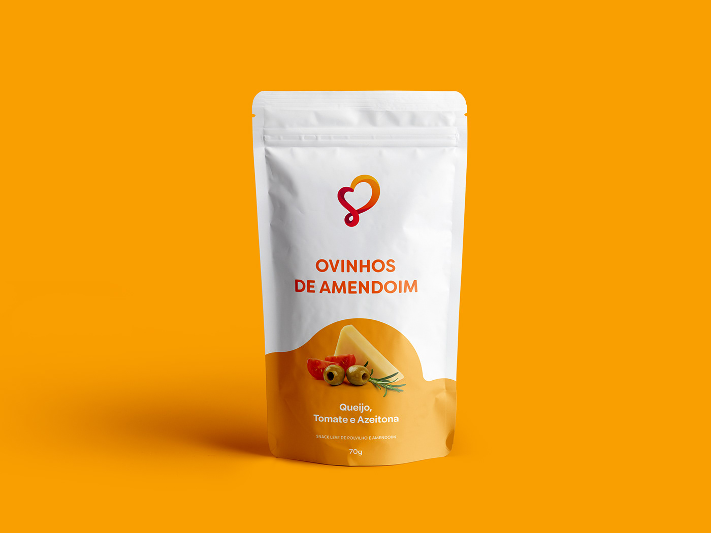
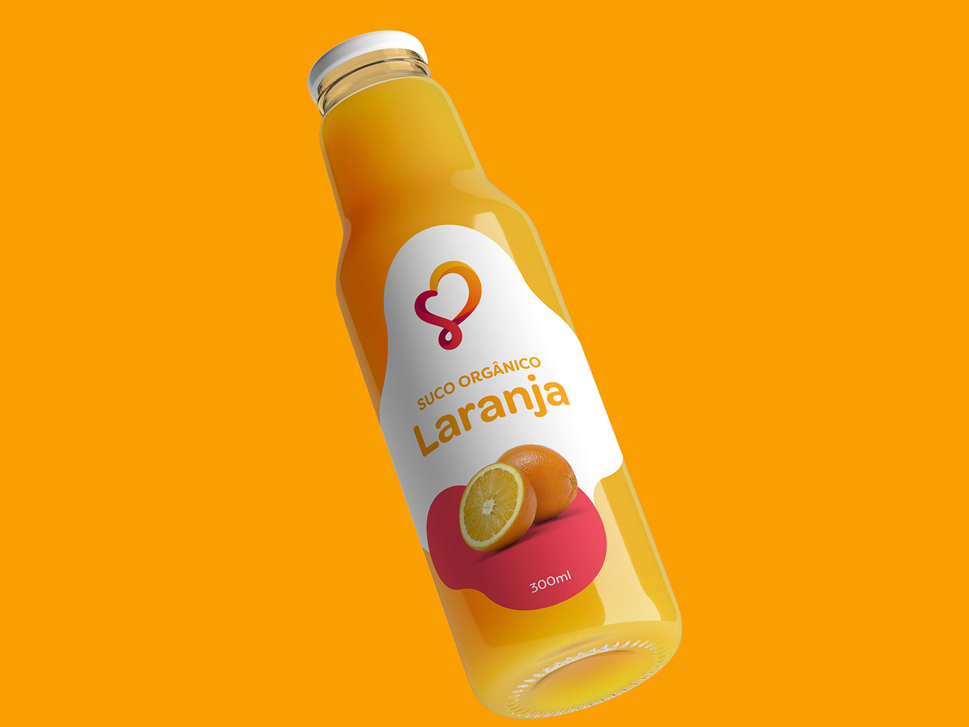
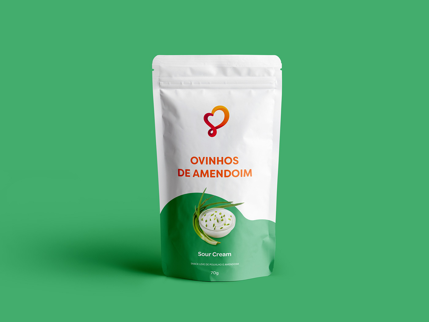
Sal+Doce is a store in São Paulo known for its natural food products — such as grains, seeds, cereals, spices and organic snacks and more. It promotes the concept that a healthy diet can be both delicious and a form of self-care. The challenge was to create a visual identity that encapsulates this idea and changes the perceptions of those who do not currently consume this kind of food.

VISUAL SOLUTIONS
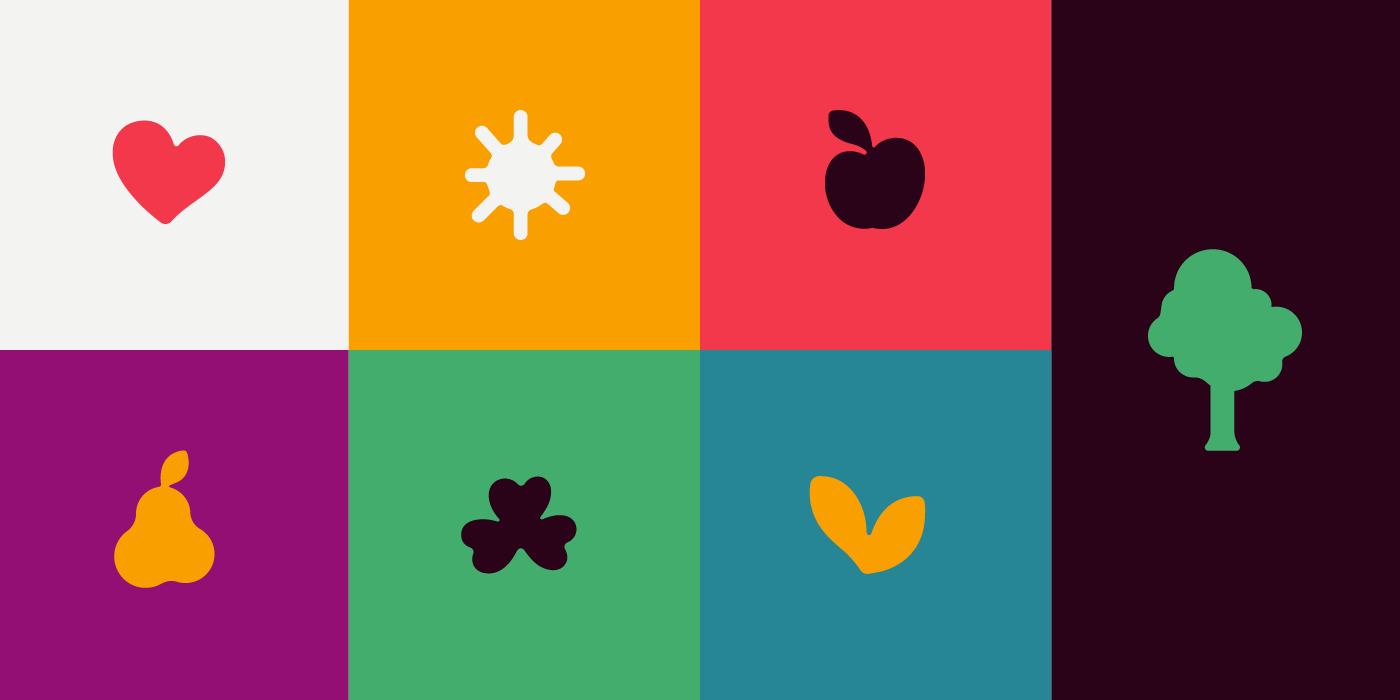
Back in 2013, the initial step was to create a logo that conveyed energy and movement, aspects that were underrepresented in the natural foods field at the time. The design aimed to evoke outdoor activities like cycling, running, and park walks, linking good nutrition to an active and healthy lifestyle. The logo's continuous motion symbolized the dynamism and vitality inherent in this approach. The vibrant palette brings to mind a sunny day outdoors. The stylized graphic elements, like hills, sun, and clouds, strengthen the connection to nature. The bold typography, softened by brush pen corners, communicates pleasure and well-being.
In 2019, the logo was refined for improvement, yet the key elements embodying the brand's essence were preserved. This polished version maintained visual integrity. The symbol, already prominent, received recognition in national and international design publications.