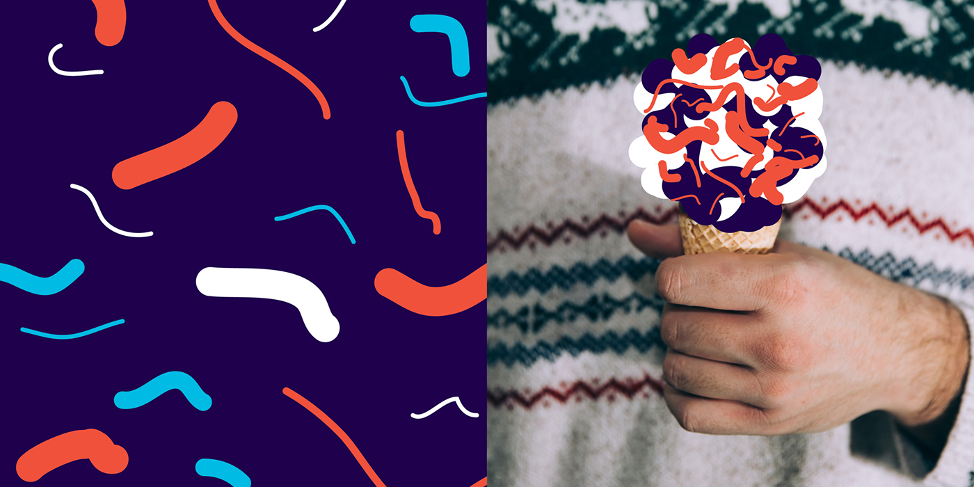
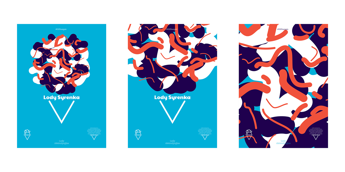
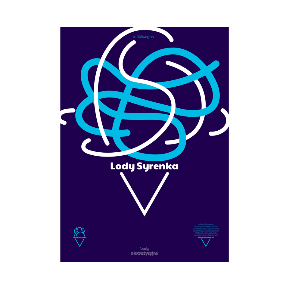
Visual identity for Lody Syrenka:
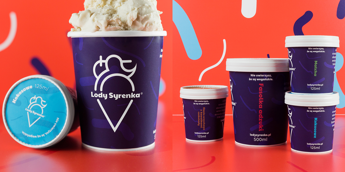
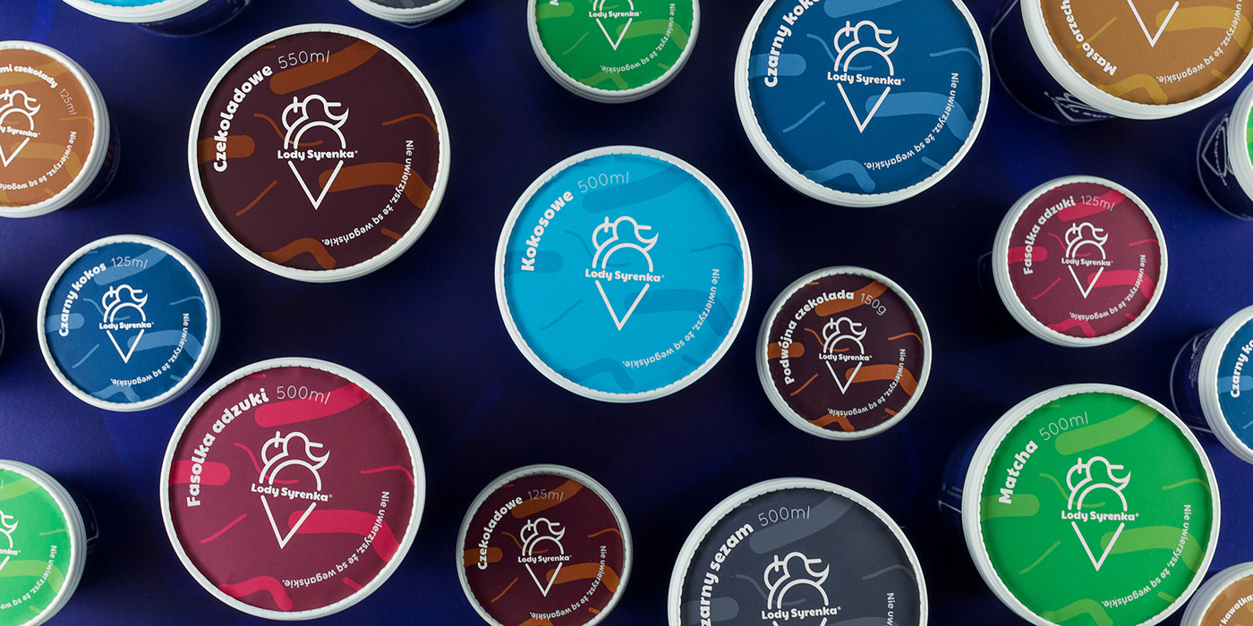
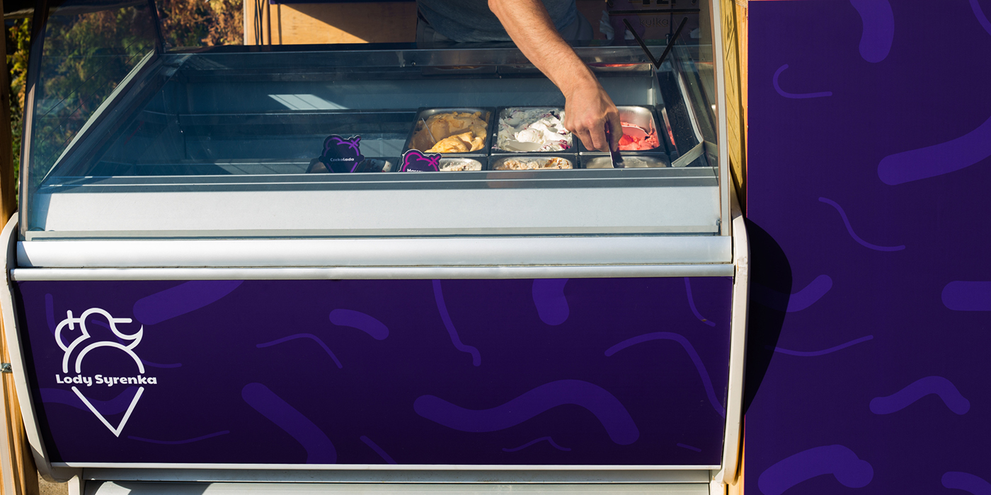
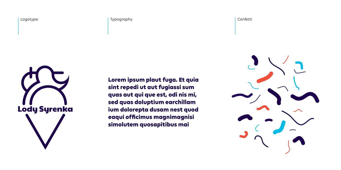
Lody Syrenka is a small ice cream manufacturer from Warsaw, Poland that makes ice cream from scratch, using only plant-based ingredients. Syrenka, or "Mermaid" is a cultural symbol from the city of Warsaw as well as a symbol of Warsaw's Vistula River. The brand embodies the soul of the city, its place of origin and unique character. The city is two-dimensional, juxtaposing work and leisure (yin & yang). Lody Syrenka want to be the city's expert in experiencing leisure. We wanted to show that simple pleasant activities can add another level to the urban experience. We fight the stereotype that living in the city is pure hurry and stress. Relaxation is also an element of a healthy lifestyle and is possible to achieve in an urban scenario. The logo of the brand is styled in the fashion of a neon sign, which is an invitation to celebrate the city lifestyle. The Lody Syrenka brand represents the energy of city enclosed in various flavors which inspired us to exchange the mermaid's tail for an ice cream cone.
The project encompasses the entire brand identity: the logotype, commercial and advertising materials as well as packaging design.


The second stage of the project was creating the graphic layout for the packaging.
-
(full case coming soon)