


Banking.com Branding & Web Design
Overview
Digital Insight (formerly Intuit Financial Services, now part of NCR) owned the premium domain banking.com but wasn't using it. The team convinced the client that the domain could become a financial industry portal while providing a platform for Intuit's thought leadership initiatives.
Branding & Logo Design
A neutral sophisticated color palette of blue and gray was chosen for the branding. A sans serif typeface was a natural pairing to enhance the modern sophisticated look the site required. As the site was slated to be an industry portal — with many different experts & authors — we chose to set the type in all lowercase to increase the familiar tone and set it apart from more corporate offerings. With such an iconic name, it was difficult to create an original mark while avoiding financial industry tropes. To that point, we chose to use the "dot" in Banking.com as a starting place. Focusing on the "b" and bringing both a square and rounded lettering, set at angle and bleeding outside of the circle, we designed a mark that held it's own without the accompanying full text. It also served as an excellent mark on social media.

Web Design & Development
Built on WordPress, the site was intentionally stripped down and basic to start. This allowed the team to generate a repository of content and attract industry experts to author posts for the site. The blue & gray color scheme was designed to present a modern yet conservative front for the brand & site.

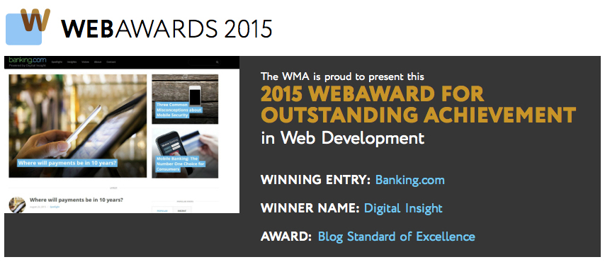
Results
The site won a 2015 Web Award.
Redesign
As Digital Insight separated from Intuit into it's own company, the brand and website required a redesign — while still maintaining the site's core financial audience.
Brand Update
The overall direction from the client was to brighten and freshen the branding to be livelier. The color palette was deemed to limited, so we updated the main blue color and added in a matching green tone. The "banking" text was now set in green to allude to the financial industry while the ".com" was set in blue to reference the digital web presence. In reviewing the brand, we also found users felt there was too much incongruity between the text and the mark. To remedy this, we simplified the mark to just the "b" and the "dot" set in white on green. This tracked well with feedback that users referred to the website as "BDC" as in "b dot".


Web Redesign
The main goals of the redesign were to improve typography and the reading experience and to design a platform for engaging photos. Typography was improved with a new serif font, larger point size and increased leading for the article body type. We also included a reading time progress bar so viewers could gauge how long it would take to read an article as well as where in the article they were. The new responsive design also allowed for a photo for every article along with larger hero images for recent and featured articles.


Results
After the redesign, the site saw an increase in both readers and in authors wanting to write for the platform.
Postscript
In 2016, Digital Insight was acquired by NCR. The site is still active and a variant of the logo and icon are still in use, but the website has been redesigned internally by NCR.


