


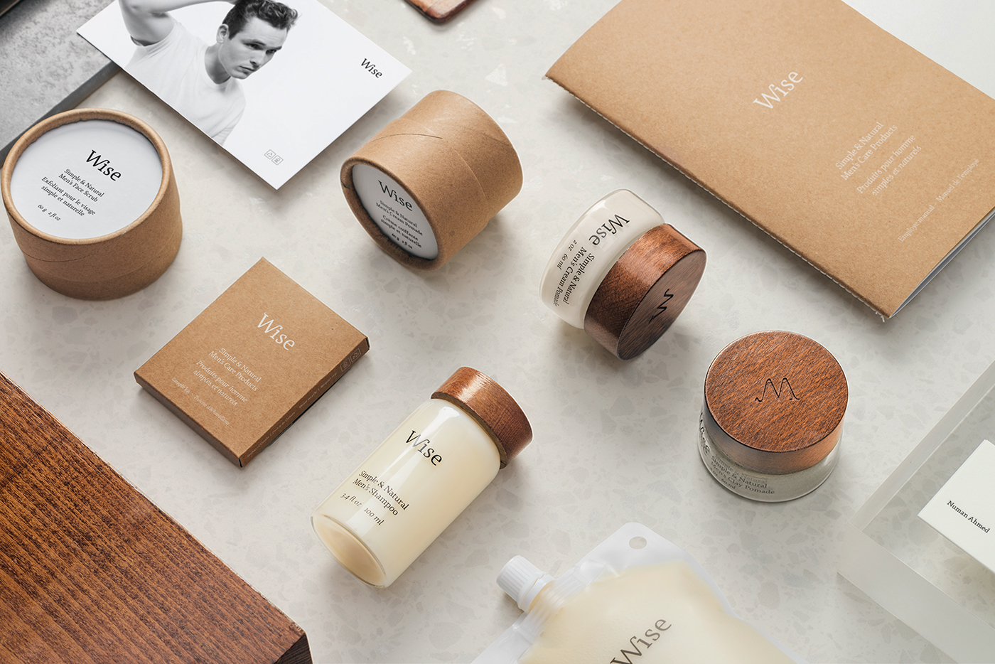
Design overview. Picture by LM Chabot.

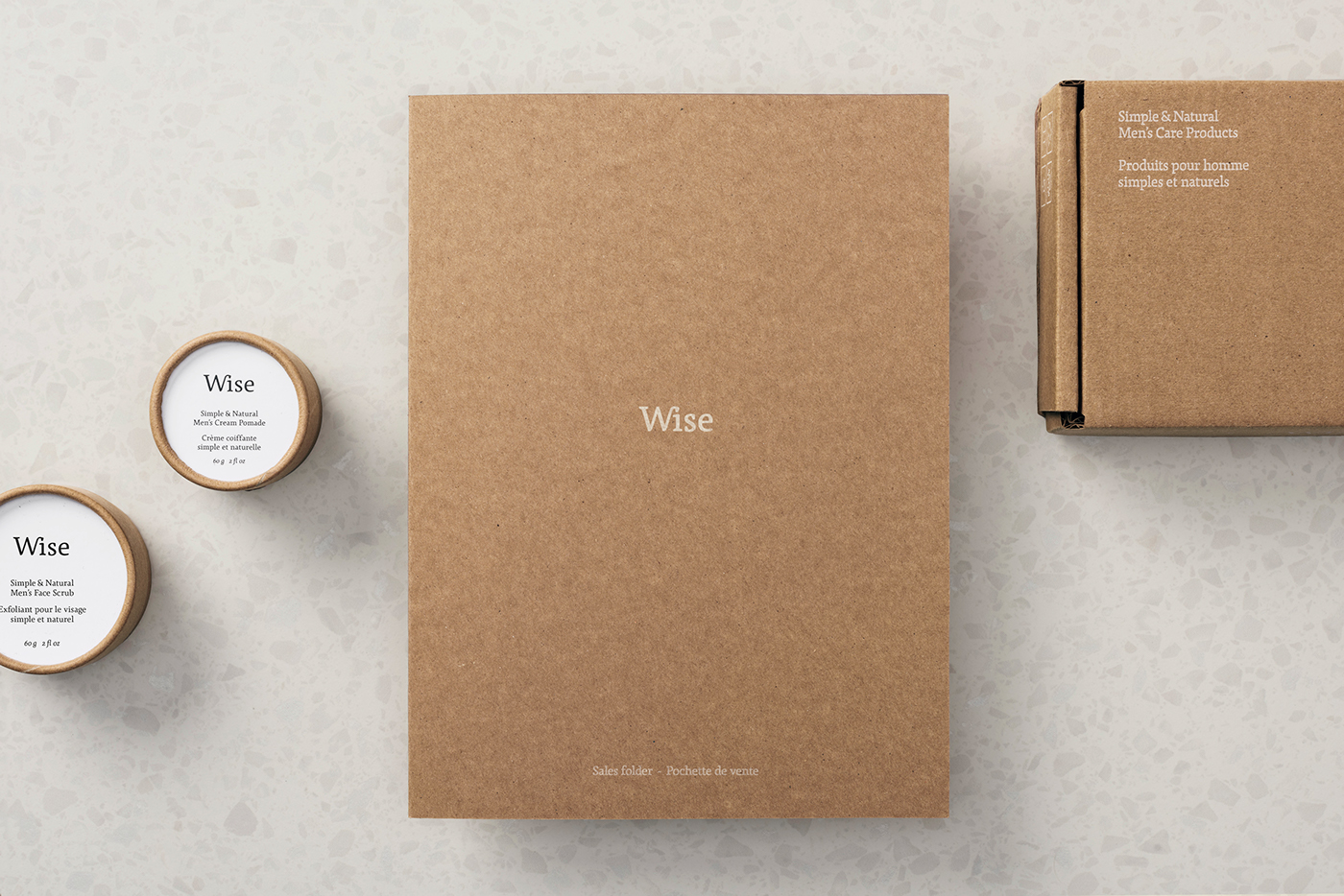
Wise is a line of high-quality, naturally sourced and eco-responsible personal care products for men that intends to revolutionize the personal care industry by proposing changes at several levels: improving product quality by making them more natural and healthy, reducing packaging pollution by limiting the amount of plastic used, and creating products that are more in line with men’s current lifestyles and convictions.
The branding is optimistic, intelligent and responsible, reflecting the new conscientious urban lifestyle.
We used a 360° approach to design the company’s offering, covering everything from vision, name, logo, colour palette, product ingredients, a dual packaging line, imaging/branding, copy tone, communications, online sales site, retail sales tools and delivery tools. The smallest details have been carefully planned to reflect the company’s healthy, eco-friendly philosophy to ensure that every point of contact with the brand evokes this new lifestyle ideal.
Our dual packaging line is a unique industry concept. Each product is offered in two different containers: an elegant, reusable glass bottle designed for the jet-setting consumer, and a minimalist, robust cardboard version aimed at the urban outdoorsman. These two options can also be combined, with the minimalist containers being used to refill the glass bottles. The result is an offer that multiplies the consumer’s possibilities, allowing him to personalize the way he uses each Wise product.
Below are our communications that tie in with the line launch. The product line is scheduled for expansion next spring.
Wise: a company with big ideas that is doing a lot with very little. Join the movement!

Brand promise & icon system.

Official packshots. Pictures by Samuel Pasquier.

Glacier clay pomade usage. Picture by Samuel Pasquier.
Packaging ideation process. Voice over by Sebastien Burns.

Responsive online store.

Blog post subjects and images.
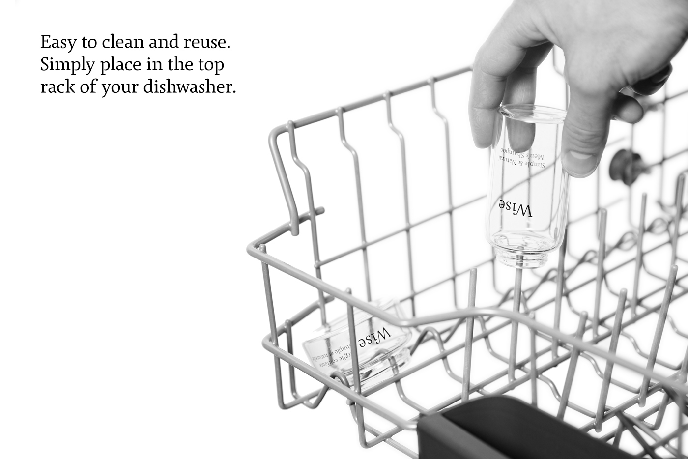
Dishwasher safe, easy to clean. Picture by Samuel Pasquier.
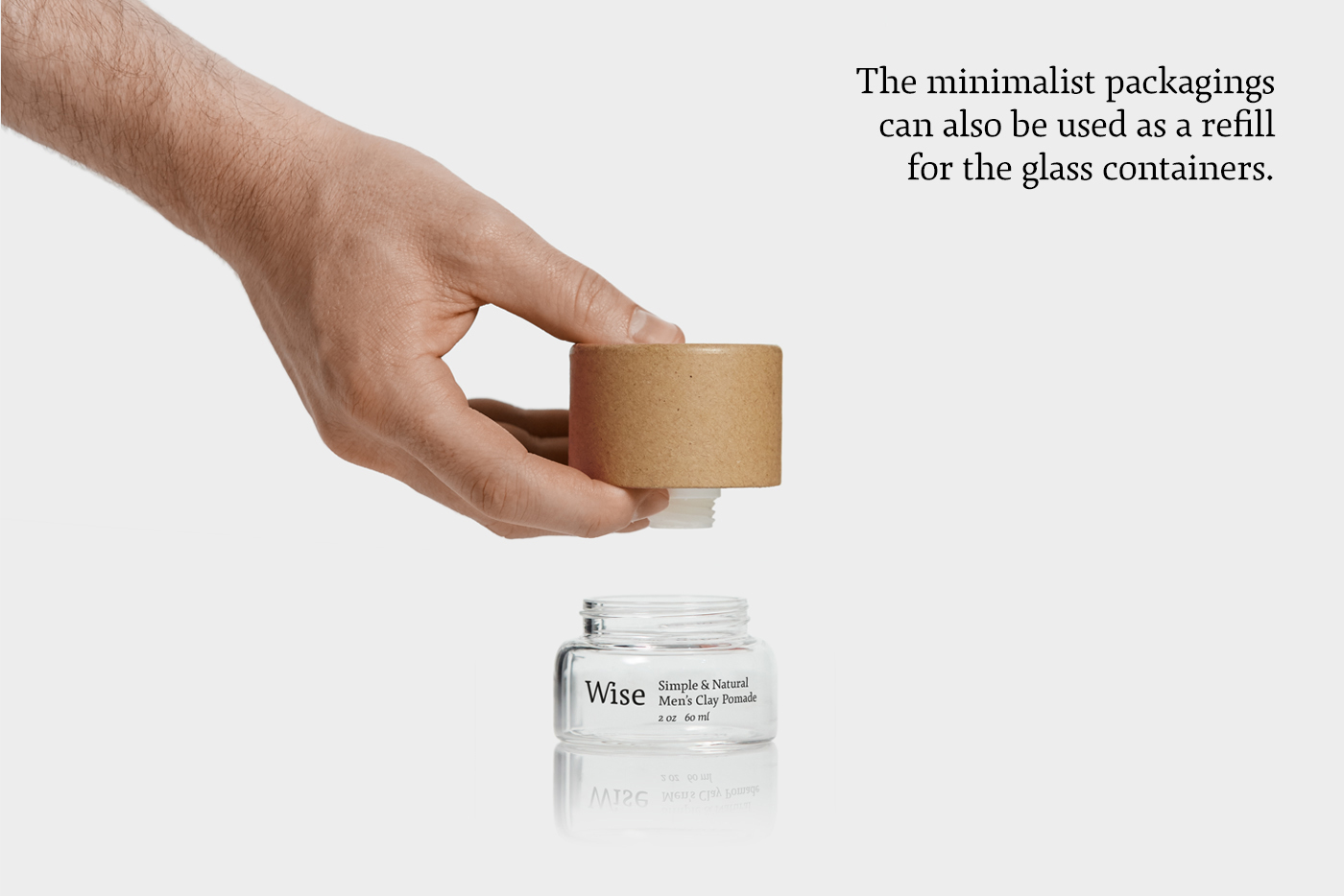
Easy product transfert from the refill to the glass containers. Picture by Samuel Pasquier.

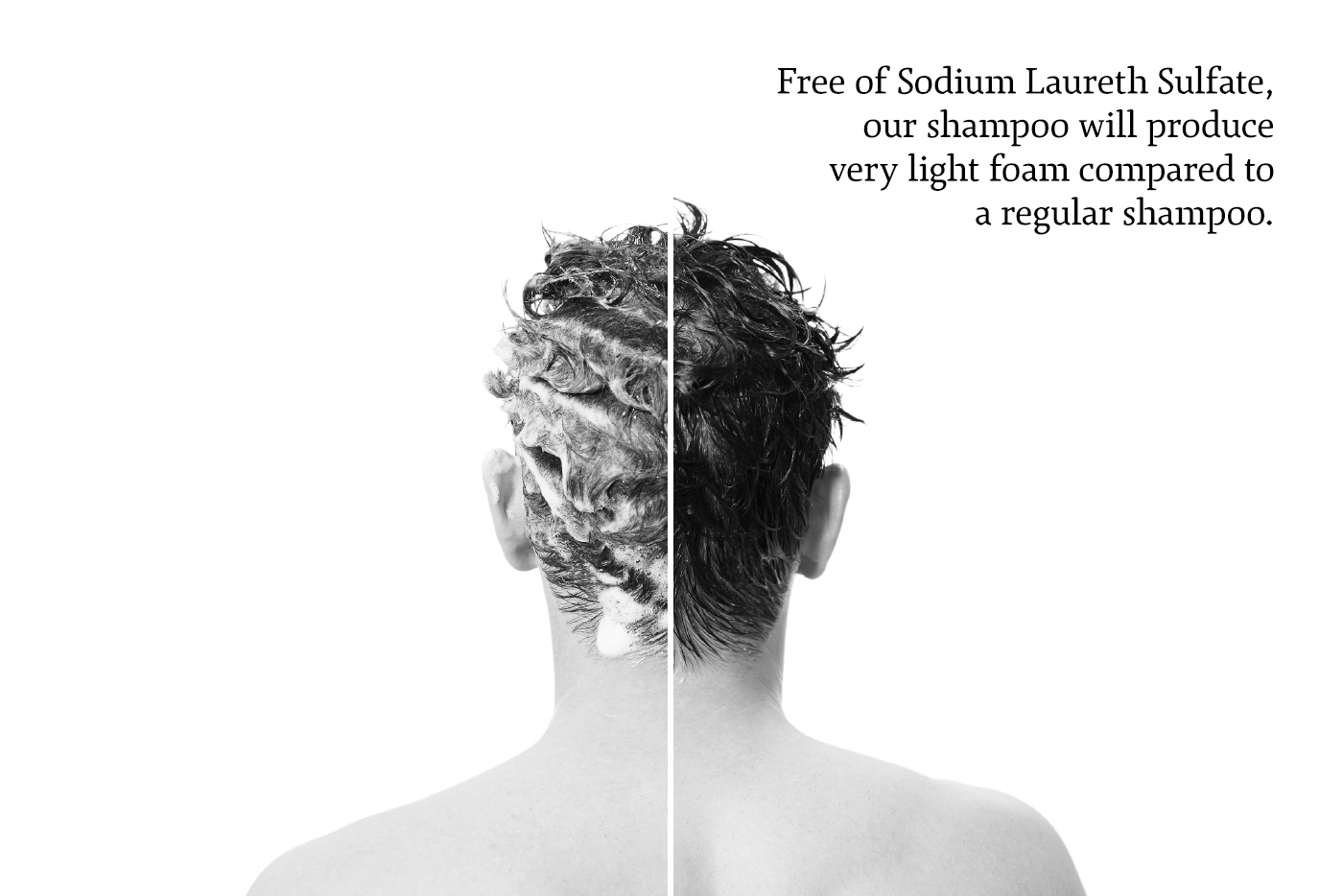
Using less plastic, usage comparison. Picture by Samuel Pasquier.
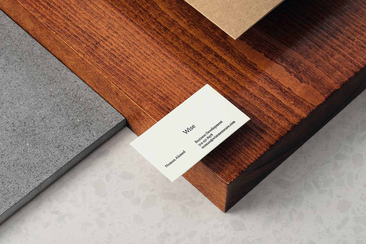
Letterpress business card. Picture by LM Chabot.
Sales representative pocket folder. Picture by LM Chabot.

Glue free pocket folder. Picture by LM Chabot.

Pocket opens-up when business card is removed. Picture by LM Chabot.
Birch bark daily shampoo usage. Picture by Samuel Pasquier.
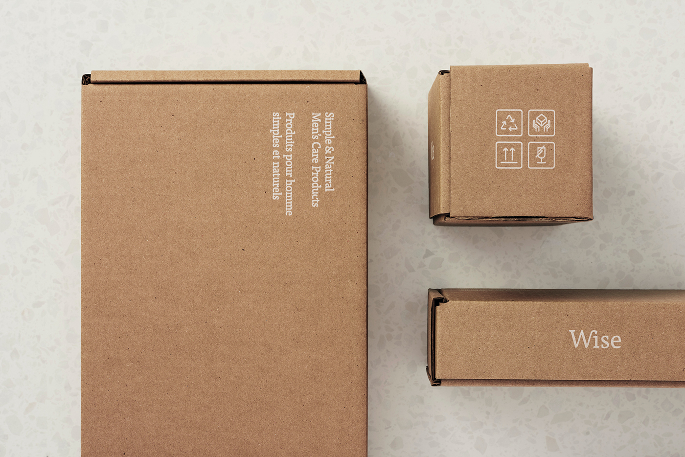
Glue free & multipurpose shipping boxes. Picture by LM Chabot.

Dividers integrated within the multipurpose shipping boxes. Picture by LM Chabot.

Glue free samples boxes. Picture by LM Chabot.

Point of sale folded brochure. Picture by LM Chabot.

Glacier clay pomade natural ingredient from northern BC. Picture by Samuel Pasquier.
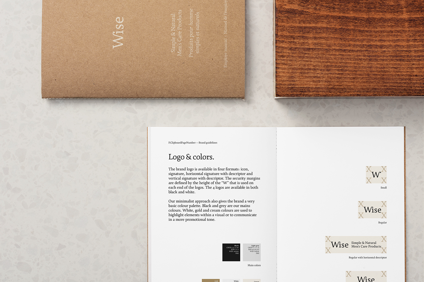
Glue free brand guide. Picture by LM Chabot.

Red Maple cream pomade usage. Picture by Samuel Pasquier.
Credits:
Brand strategy and positionning: Rachel Lecompte & Gabriel Lefebvre (Ethos)
Creative Direction: Gabriel Lefebvre (Ethos)
French Copywriting: Rachel Lecompte (Ethos)
English Copywriting: Ellen Teitelbaum
Packaging design: Gabriel Lefebvre (Ethos)
Photography: Samuel Pasquier & LM Chabot
Video Animation: Gabriel Lefebvre (Ethos)
Online Video: Maxime Lapointe
Hair Styling: Simon Chercuitte
Thank you.
@notre_ethos


