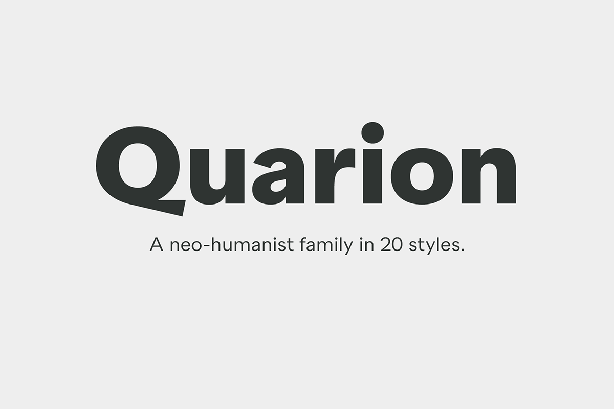
Quarion.
A humanist geometric.
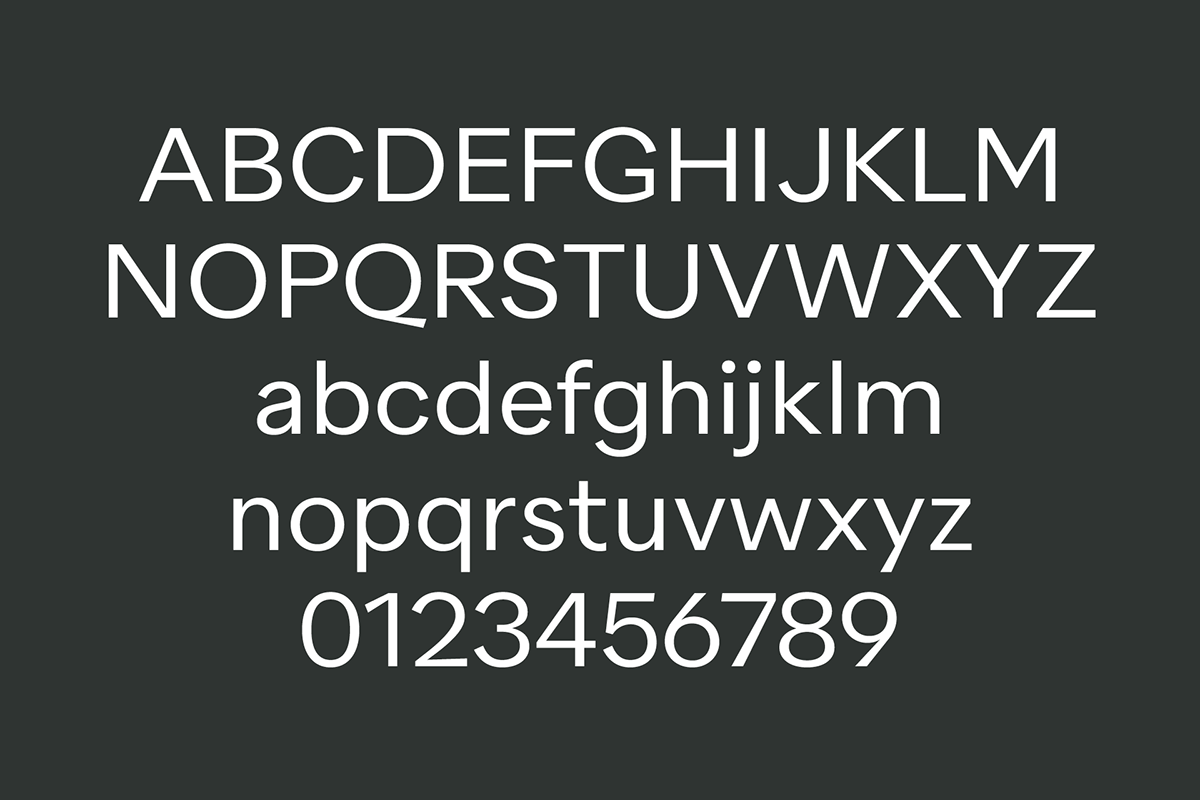
Quarion is a clean, neo-humanist sans with a contemporary geometric approach. Its design started as an exploration of geometric fonts from the early 20th century, like Futura, Neuzeit Grotesk or Recta which allows the typeface to generate an inviting but sophisticated feel on the page.
Characteristics
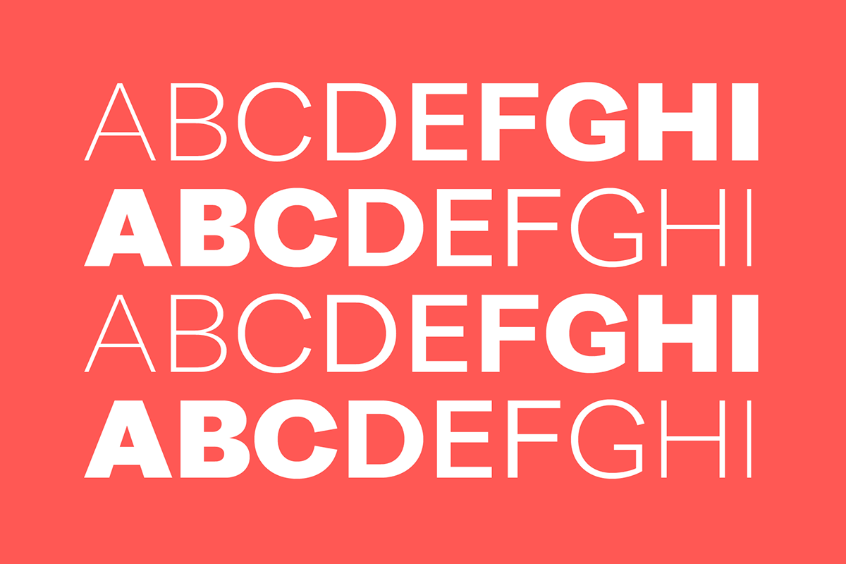
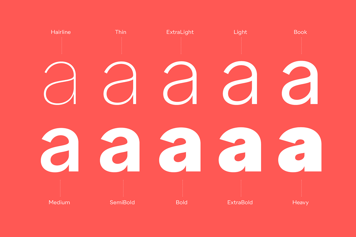
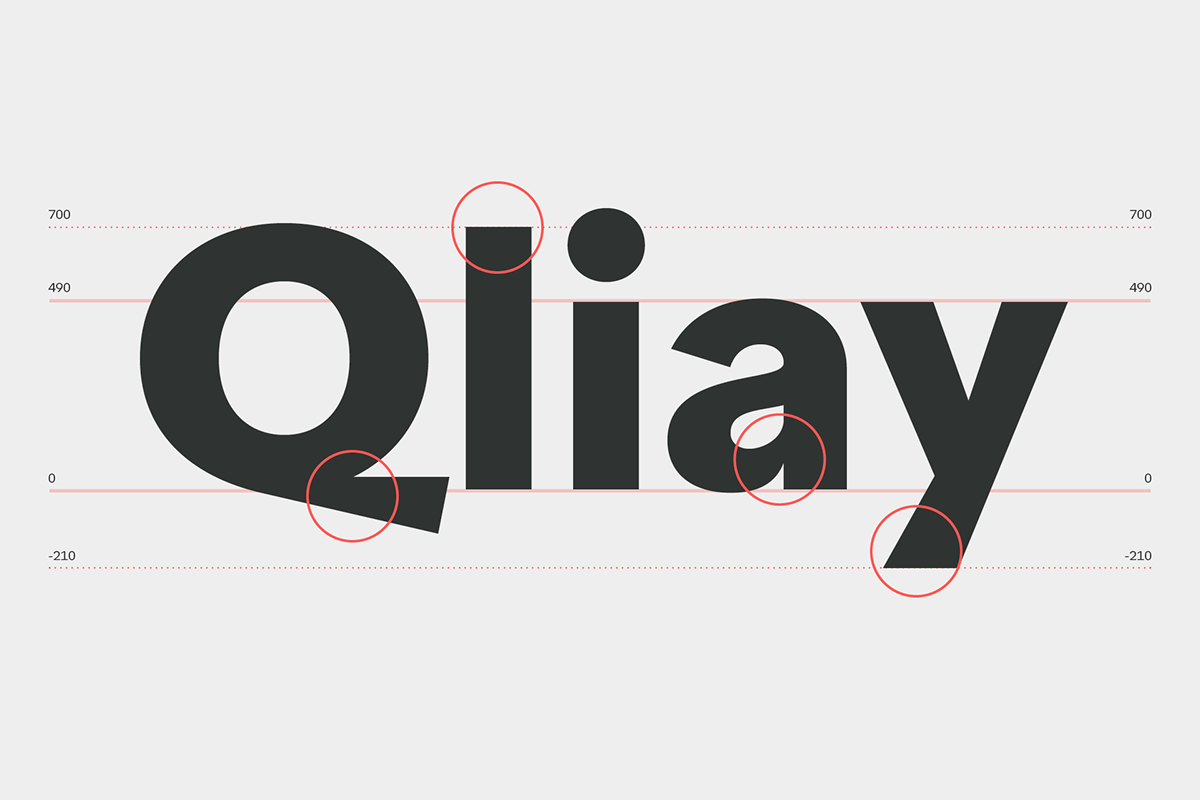
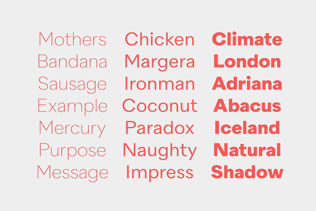
Quarion features contemporary humanistic proportions, nearly round shapes in uppercase O, C and G, and a medium stroke contrast. The conventional double-story a allows for great legibility in small sizes, while the eccentric uppercase Q provides a distinctive layer.
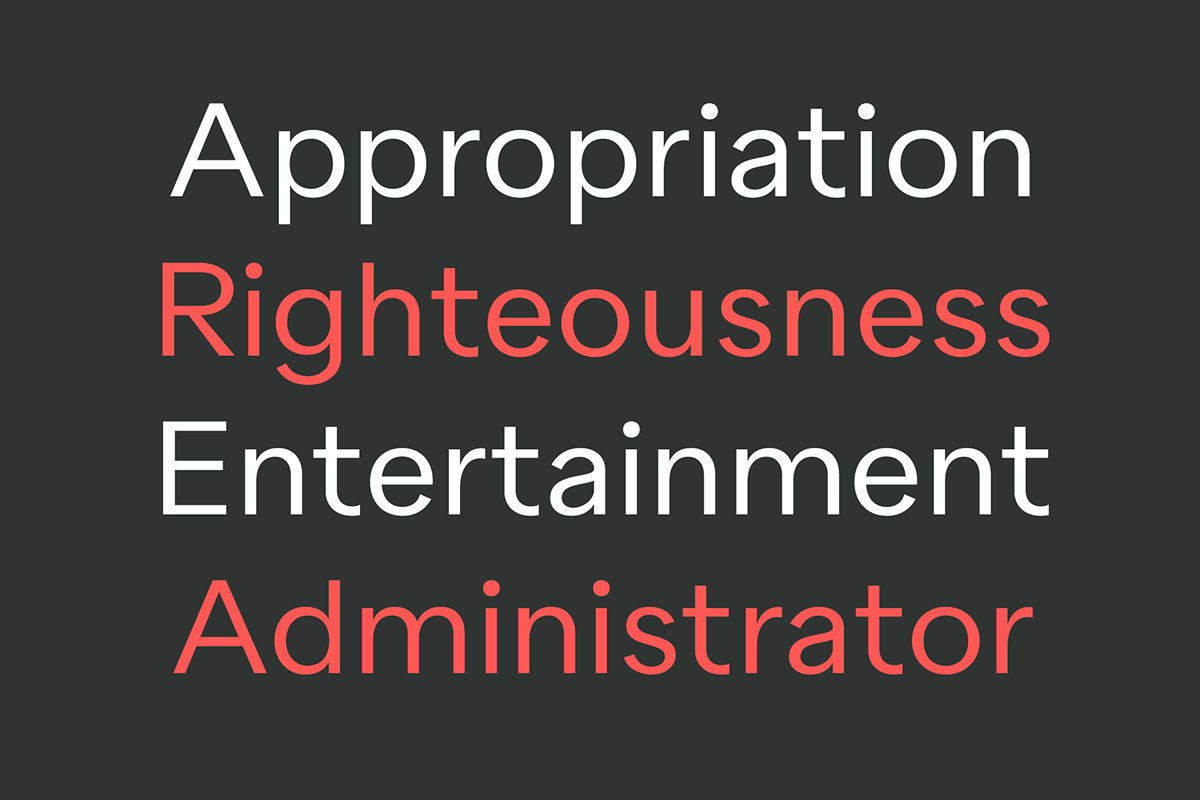
Alternatives
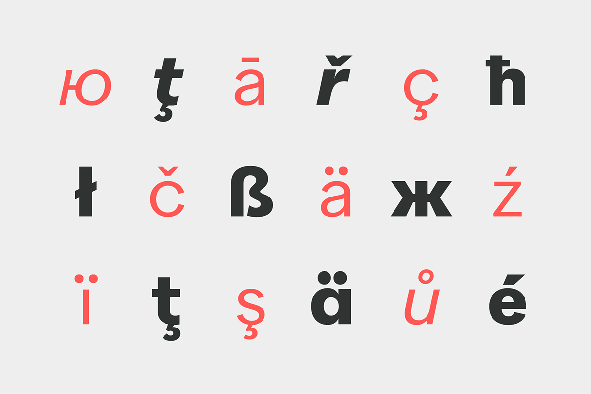
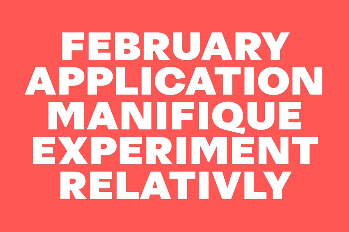
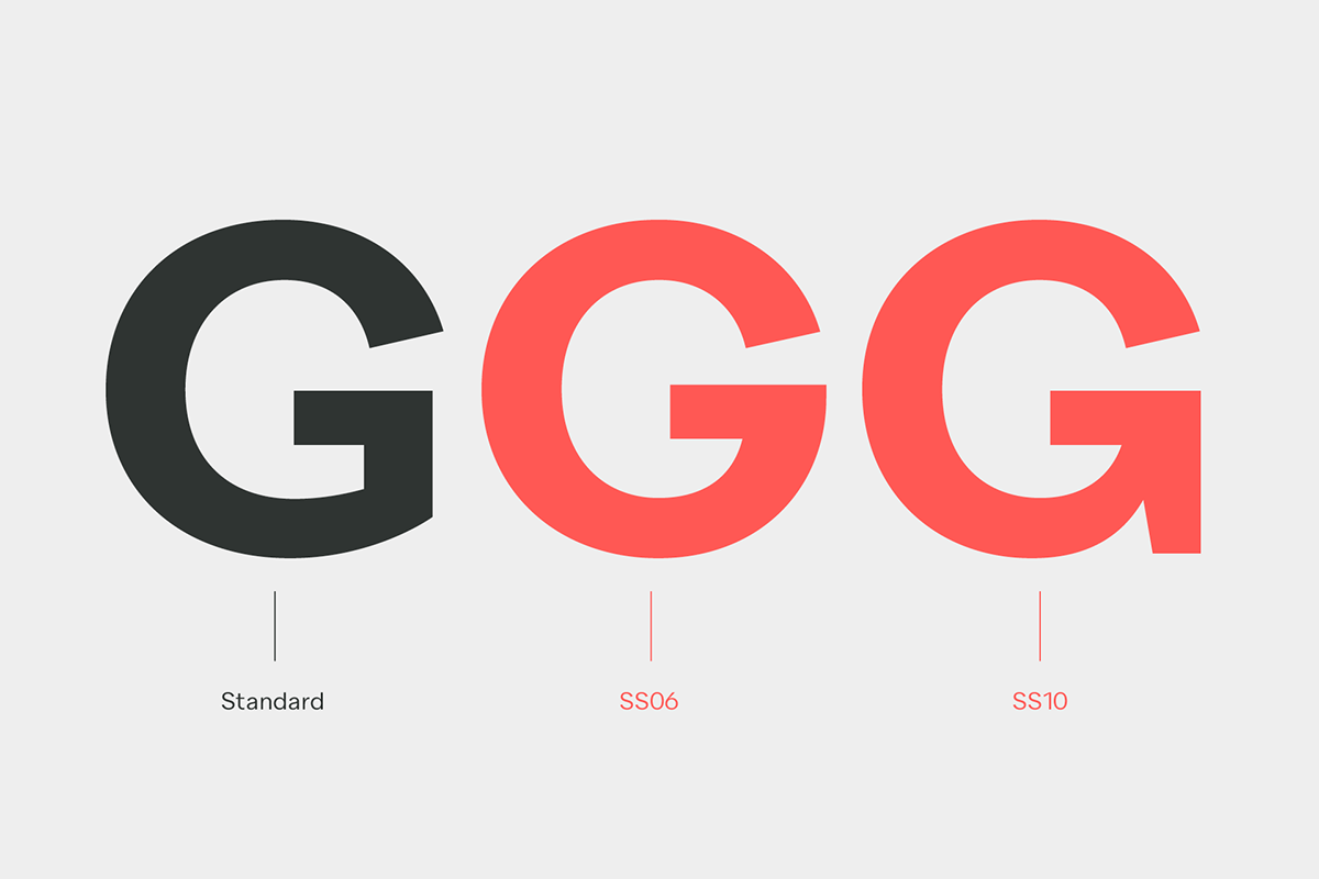
The family comes with many alternative glyphs, changing the appearance of single words or paragraphs dramatically. All alternative characters are available with their diacritic
counterparts.

Opentype Features
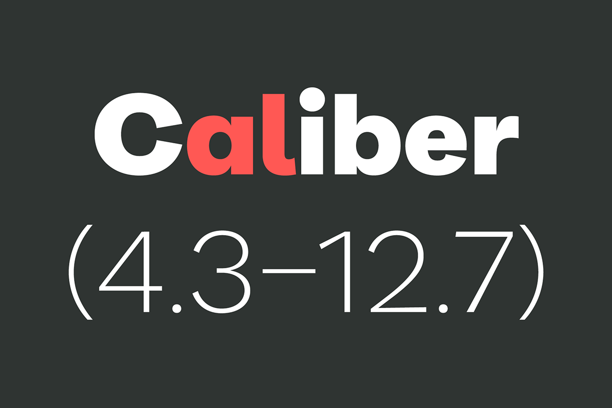
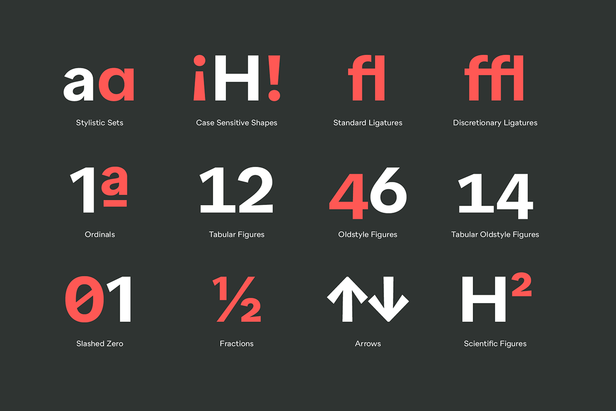
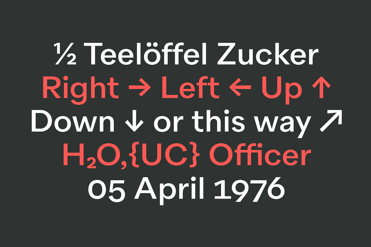
Completed with a wide range of opentype features like stylistics sets, case sensitive shapes, ligatures, various number sets, arrows and slashed zeros, Quarion is equipped for all requirements on modern typography.
Languages
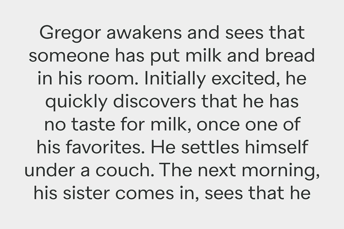
The family supports all european and western languages plus Cyrillic, and comes with 650+ glyphs per font.