DC Trails - Hop On Hop Off Tours

Issue
With over a million satisfied passengers and over 4.5 million safe miles annually, DC Trails is the premier tour bus company serving the Washington, DC, area. Their hop on, hop off city tours allow passengers to explore DC’s most popular tourist destinations at their own pace. They simply get on the bus at any of its stops, take it to the stop where they want to go, hop off to explore some destinations, and then hop back on when they are ready.
However, the passengers commonly encountered several key pain points. They didn’t know where to catch the next bus. Or they would go to a stop, not knowing when the bus would get there. They would have to call the dispatcher, in frustration, to find out. Then they would mention their frustrations in negative reviews on TripAdvisor and, especially, Yelp.
Solution
Working with the Sweetpea Mobile team, I conducted a survey to learn about existing and potential customers of DC Trails. I created personas using the survey data and used them to determine what features their mobile app should have in order to improve both the customer experience and the online reputation of DC Trails.
Results
This app launched to Apple’s App Store on April 3, 2017; results are still forthcoming.
Process
I began this project by reviewing the DC Trails website, watching videos of their tours, and reviewing what consumers had said about them. This gave me a sense of the business objectives that they needed to achieve with this project and the strong points and weak points of the services they offer. To understand their competitors better, I watched several of their competitors’ commercials.
Next, I drafted a list of survey questions. Our survey respondents came from three sources: recent customers of DC Trails, people who had liked the DC Trails Facebook page, and respondents from Amazon Mechanical Turk (MTurk).
For the MTurk respondents, I ran the survey in two rounds. The first round served as a qualifier for several hundred participants. I sent the main survey to only the most qualified respondents. I also created a list of qualifier rules for each respondent, but these are not public.

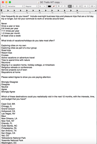
These questions went into our main survey.
Some of my initial assumptions were correct. I found that existing DC Trails customers were more likely than MTurk respondents to speak languages other than English, that a small percentage of hop on, hop off tour customers do these tours frequently, and that business travelers tend to be less price-conscious than personal travelers. Similarly, travelers who ran on a tight schedule tended more to travel with family and had a stronger interest in history. Lastly, people who would never take a hop on, hop off tour displayed a very distinct difference from everyone else.
Some of my other assumptions didn’t hold. For example, I found that people who visited DC spontaneously didn’t have a stronger tendency to tell friends about their trip on social media.
I also hypothesized that international travelers would have different needs from local and regional travelers, but this was inconclusive due to sample size.

A sample from our overall user survey findings.

I mapped all 85 survey respondents onto a list of the 20 most important behavioral variables from the survey.
Through 5 iterations of cluster analysis, I found that the users fit into 10 groupings. These became our personas. One was an outlier (a tour group leader) who was out of scope for this app. Two were clearly not part of our audience because they didn’t travel to major cities or they had no interest in a hop on, hop off tour. That left the other 7 groups.
The next several screenshots show how the personas evolved into their final version.
In the first iteration, I focused on demographic variables, main points, goals, and pain points. The negative personas, who were definitely not targets of our design, were already obvious. The group leader was still TBD.

The second iteration of persona creation involved comparing each of the non-negative personas to the others so that I could determine potential design targets for the app. Here, I ended up with several potential design targets for the app.

Using the factors outlined in Designing for the Digital Age by Kim Goodwin, I determined that one of our personas was the best primary for us because of her market share and the potential value that DC Trails could get from a design for her.

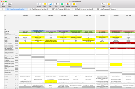
Final personas spreadsheet, showing our main design target, Sarah, in green.

Goals, pain points, and behavioral variables for all of our personas.

Empathy map for our app’s primary persona. Our secondary personas also had empathy maps.

I generated a list of design ideas, and our team worked to select ideas that were right for our users, good for DC Trails’ business, and technically feasible.

Next, I created user flows that contained the ideas we selected. These particular ones were part of the planning feature for Sarah, which we ultimately removed from our first release.

These design sketches include many of the ideas that we included in the live app’s Maps section.

This early design idea allowed users to find directions to their nearest bus stop based on nearby destinations if they had disabled location services on their phones. For version 1, we decided to require location services to be on in order to give directions.

Several of our user flows dealt with a touring mode, which would have provided special features to our users during their tour of DC. This flow shows how users in touring mode would finish their tour and invites them to review DC Trails on Yelp and TripAdvisor only after they have already completed a tour.

These wireframes show how the destinations list would have behaved with favorites and different types of sorting.

Our onboarding flow originally distinguished between DC Trails guests, people visiting DC but not touring with DC Trails, and people who were just checking out the app. These onboarding questions were intended to gear the app’s content toward users’ familiarity with the city and their interests.

At the end of onboarding, we would have invited users to download the maps and start planning their tour of DC.

I originally planned to allow users to opt into notifications right before and during their tour so that the app could help them find their bus and plan their trip.

This screen would have shown a user’s full touring plan when they started their tour.

This flow shows how users would connect to the bus’s WiFi during a tour. When the bus arrives at the stop where they need to get off, the app would provide some tips for visiting their next destination.

The planning feature would have let users keep track of where they had already been and add, reorder, or remove destinations from their tour.

These screens would have introduced a flow for users to find their nearest stop based on where they had been or where they had planned to go.

This flow would have provided some closure to people at the end of their tour day. It also would have presented an upsell to 24-hour tour customers to add the second day to their tour.

This flow would have helped people decide whether to see preset tour plans or make their own plan.

These are two examples of preset tour plans I was considering.

This shows how people would have been able to build their own plans to tour DC.

The “I’m in DC” button brings up a prompt for location services if they are not enabled. After enabling location services, people can see where they are on the route.

These are destination views on the map, scrolled to show cases like the last bus of the day and no more available buses. DC Trails’ route for this tour is such that there are several places where a departed bus could visit several other stops and then come back to another stop near the user’s current stop.

These views show similar cases for stops.

With GPS units on the buses, DC Trails can determine where their buses are at any time and relay that to the users.

TripAdvisor reviews of DC Trails frequently mention individual tour guides. Some passengers set out on their tour hoping to be on a specific guide’s bus, which is why we show that on the map views. This flow would have allowed users to rate tour guides (and have that display elsewhere in this app) and learn more about them.

I initially explored an accordion layout for destinations so that users could see more contextually relevant content more easily, but our team decided against it because iOS’s HIG lacks built-in accordions.

During development, I revised the wireframes to reduce scope and improve maintenance. This destinations list shows key changes to our sorting and the ways that we present attractions’ prices.
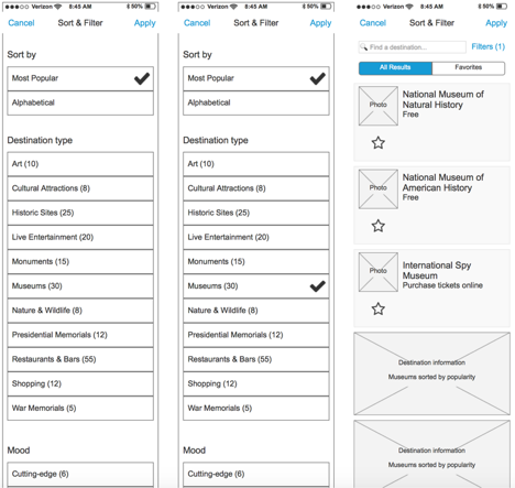
This introduced our new filtering flow, which explained how destination filtering would work when users apply multiple criteria.

We replaced our initial onboarding flow with a brief tour of key features, explained in terms of our personas’ goals.

Our annotations for stops, buses, and destinations became much simpler, and we added a button for re-centering the map on the user’s current location.

This change also simplified cycling through buses and stops, while also letting people see more of the rest of the map.

By anticipating other information that users would likely need, like bus stop information for a destination, I was able to use links to reduce trial and error in users’ navigation during their tour.

I also created a tab layout for the destination view, as an alternative to the accordion above. Further down the first tab, there is a Further Reading section with books and articles for those who want to learn more about a destination.

This is a Dribbble shot posted by Jamie Syke, the visual designer for this app. His great work on the visual design gave the released app its consistent, on-brand look and feel. I encourage you to read what he wrote about the project on Dribbble and give him likes and good comments!
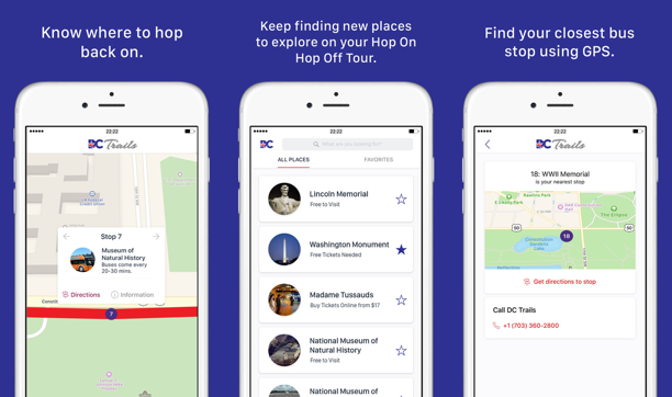
Lastly, here are screenshots of our live app in the App Store.
What was it like to work with me?
Sweetpea Mobile founder Pietro Rea, an iOS developer who formerly worked at Amazon, said this about my work:
"I worked with David on a mobile app project for about three months. He impressed me so much with his extensive knowledge of mobile UX, his strong work ethic and his professionalism that I decided to work with him exclusively on all UX-related projects going forward.
“I’ve worked with many UX professionals over the span of my career, but I've never worked with anyone as talented or reliable as David. One thing that sets David apart is the fact that he has a software development background. As a software developer myself, that meant that I didn't have to explain basic things like what a server is or what an API does and we could directly dive right into the product.
“David does a great job at balancing advocating for the user and keeping business goals front and center. If you're looking for someone who can come up with a great solution that will serve both business and user needs, David is your guy. Lastly, but perhaps most importantly, David is kind and patient and fun to work with. I consider myself lucky to be able to work with him on an ongoing basis."
View wireframes and documentation
The wireframes are available on Axure Share and password-protected. Please contact us if you would like access.
Download DC Trails - Hop On Hop Off Tours
Visit the iOS App Store to download this app.
Contact our team
I’d like to thank DC Trails and Pietro Rea from Sweetpea Mobile for the opportunity to work on this project.
We would love to know about any other mobile design and development projects that we can work on. Contact us from the Sweetpea Mobile website or the Thrill & Create website to get started.


