

BESTIVAL
IDENTITY DESIGN
Bestival is an annual music festival held on the Isle Of Wight. Bestival's Creative Director Josie Da Bank saw my cover for Stuff mag (here) and thought my style of work could suit their ideas for this year's festival.
SKETCH
The theme for Bestival 2016 was "The Future". I presented 3 approaches. They loved the idea of a floating metropolis, with the logomark formed from 3-dimensional structures.

I took this idea and fleshed it out on paper.

I developed the type into a lockup with the other elements - the theme, and festival info.

I also sketched out various illustrative elements that could accompany the type.


Once we were happy with the sketch I created the line work in Illustrator. Having the letterforms 'staggered' allowed for a reduced height, meaning the type could sit easier on the poster format, and on the website + mobile executions.

Playing with colour...

Vector illustrative elements. The peace sign and the heart are images Bestival asked me to include, having been used in previous years.

Next was the poster design. The client liked how built up and city-like it felt with lots of overlapping elements.


RETHINK
At this stage, it was decided that the logotype as it stood was a bit too far away from the existing flat Bestival logo. So I created a new logotype in a similar style but using the logo more closely, and with added legibility. Although I liked the previous version, this new approach felt more solid and impactful.


FONTS
We looked at various options for the accompanying typography, and settled on the idea of using a monospaced font - the computerised, 'techno' feel suited the rest of the design well. We chose OCR A Tribute, by Miriam Röttgers.

Colour exploration...

Poster art! This colourway was chosen for its neon, futuristic feel. The 2016 festival was to have a strong emphasis on electronic music, so this colourway felt appropriate.

PRE-LAUNCH BLUEPRINT DESIGN
Prior to launching the identity, Bestival wanted something to tease people with, a work-in-progress piece that could be used on social media etc. I created a blueprint-style design, with the type deconstructed.


Here's an ad for Bestival in the London Metro newspaper.

"My Bestival" app, created to allow festival goers to curate their own festival experience.

Site design. I worked with Bestival on all digital assets, adapting the artwork for each deliverable.

Social media banner art.

Animator Luke Barker created an awesome animated piece using the artwork (here).
SUMMER COLOUR
I created a new iteration of the design using a bright summery colour way. Here are some options we looked at.

Selected colour way. Kaleidoscopic!

Printed promotional posters

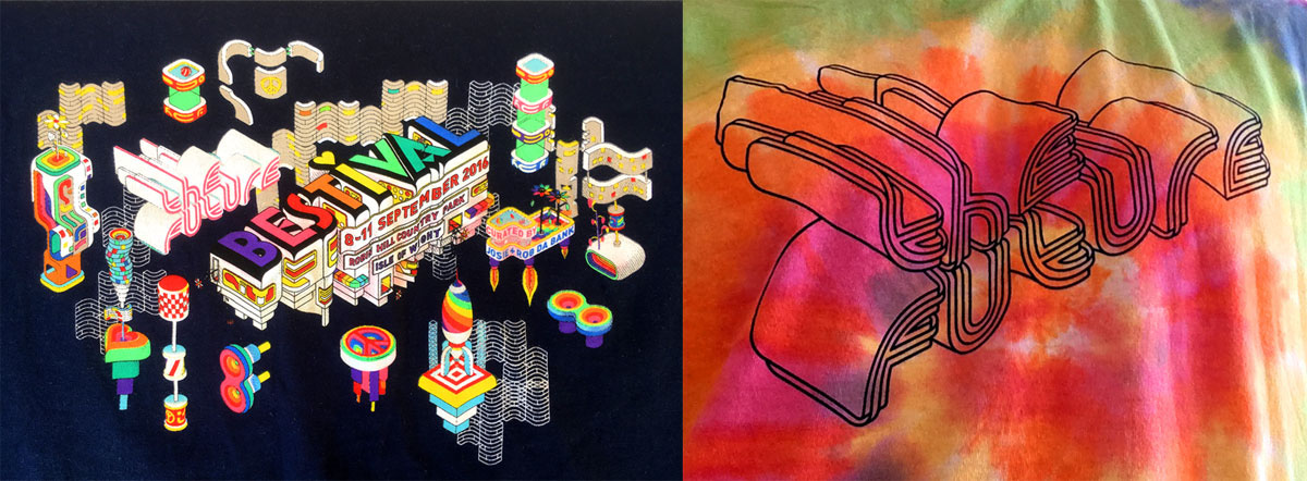
Merchandise clothing

BESTIVAL AT GOLDSMITHS UNIVERSITY
Bestival put on a one day festival event at Goldsmiths, and needed a standalone piece of design to promote the event. I was given an open brief - no guidelines needed to be adhered to.


Robert Smith, legendary frontman from headliners The Cure played a specially designed Made Up guitar at the festival, which was later auctioned for charity.

Some pictures from the event...

That's it! Thanks for looking through.
Big hearty thanks to my agent Kat at Snyder NY,
and Joe + Josie at Bestival.
Cheers
Charles
Made Up // Illustrative type studio


