I had the unadulterated joy + pleasure to be asked to pitch for the 2016 Bonnaroo festival identity. To those of you who don’t know, Bonnaroo is a massive festival in Manchester, Tennessee. Being from Manchester, England, I knew this would be a perfect project for me. Also, creatively, it seemed right up my alley.
I sent over some rough sketch ideas and they liked my thinking (+ my sketches) so decided to give me the - frankly epic - task of creating the entire aesthetic for the festival.
Here’s a selection of images from the project, annotated for your enjoyment and understanding.
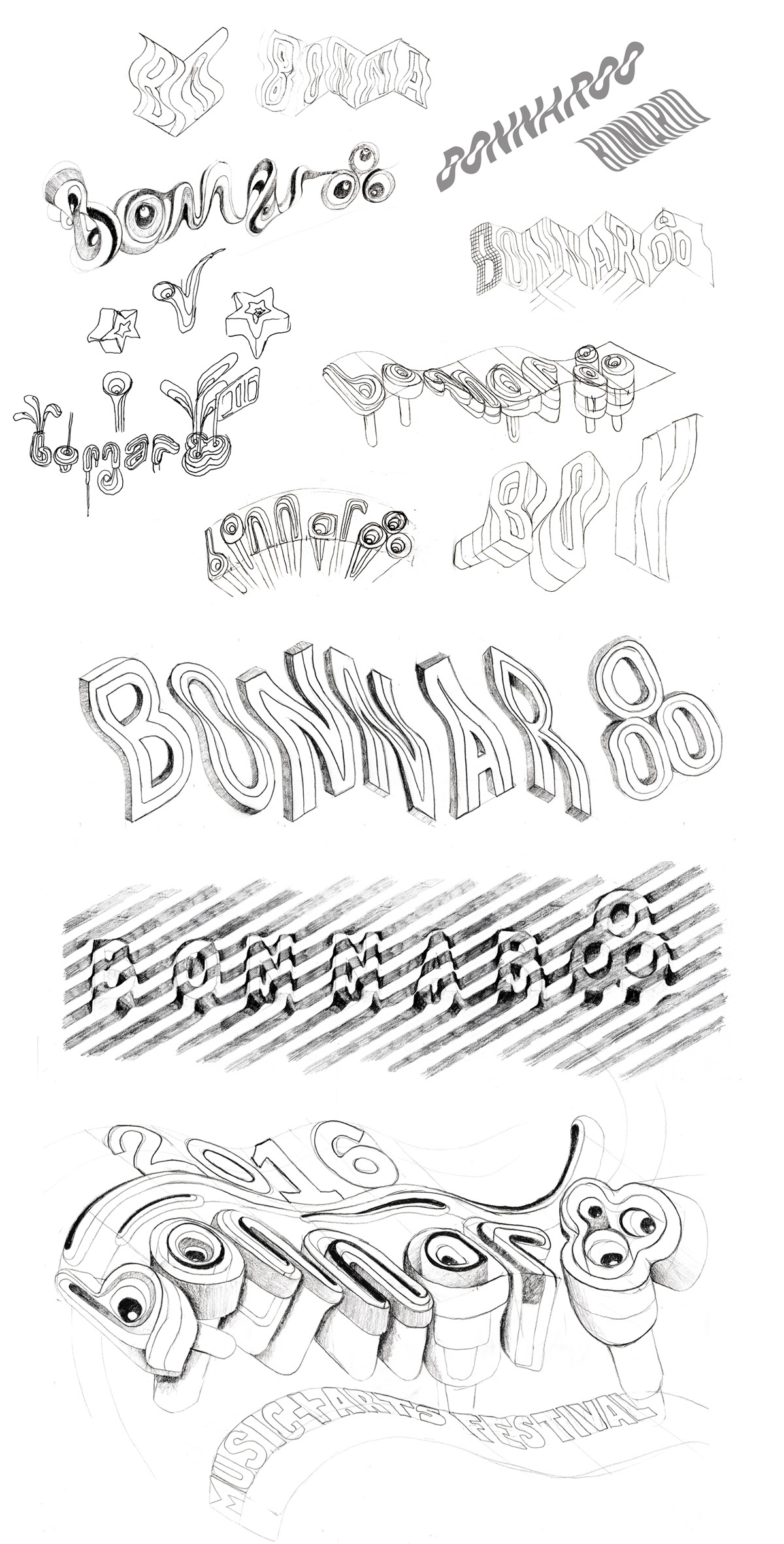
Initial ideas
I started with a variety of typographic/illustrative approaches. The brief was quite focused on the 'magic' of the festival, so I wanted to suggest this somehow.
Chosen idea
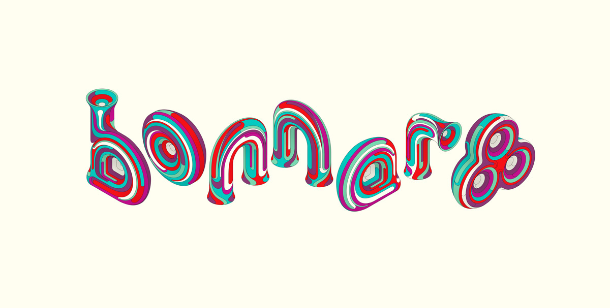
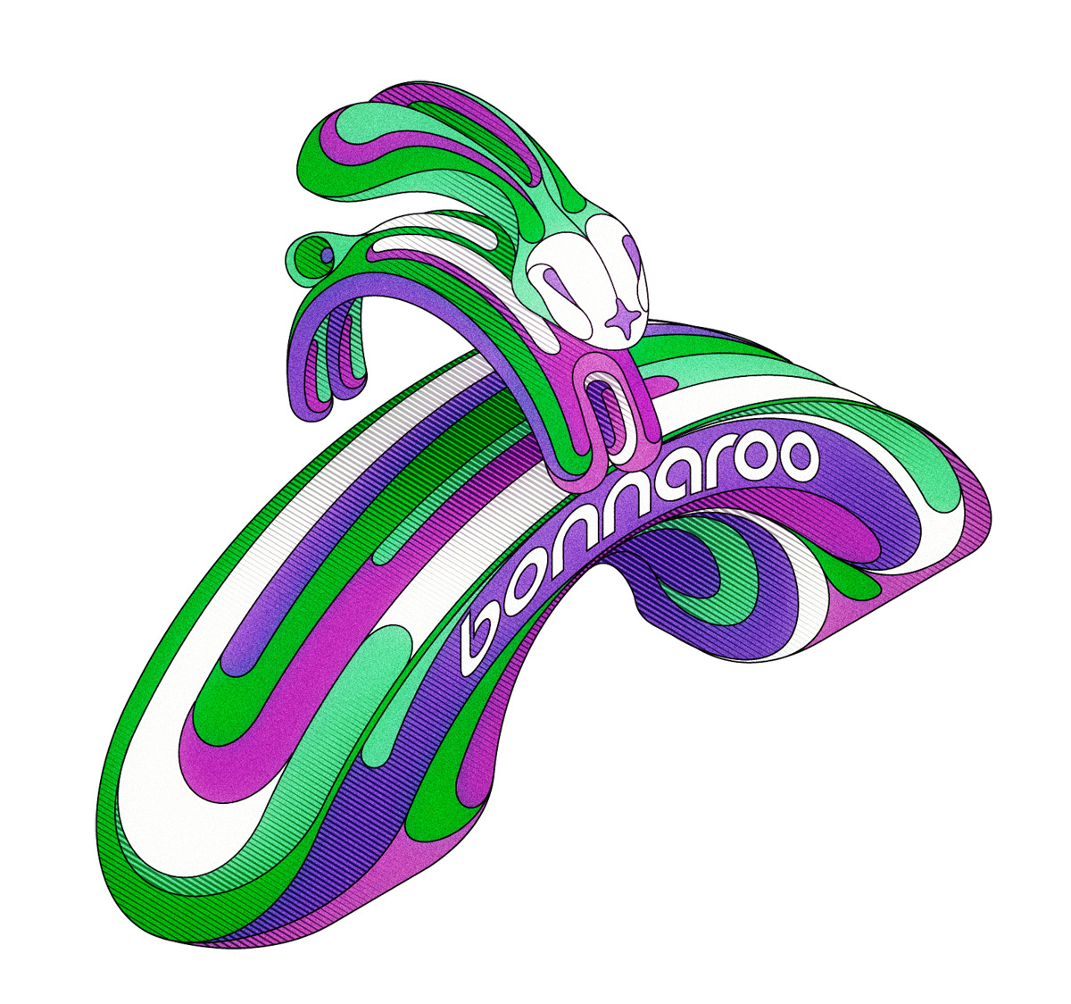
I did some research into the history of the festival. The name itself is a Cajun slang word meaning "a really good time." Bonnaroo "chose this name for its literal meaning, and also to honour the rich Louisiana music tradition that inspired our desire to provide many styles of quality live music for appreciative fans". With this in mind, plus Bonnaroo's preference for my 3 dimensional style, I looked at a design that felt highly musical, but with a sense of magic and impossibility. This went down really well.
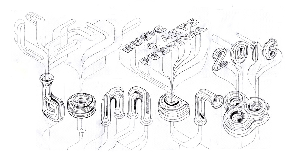

Sketch development
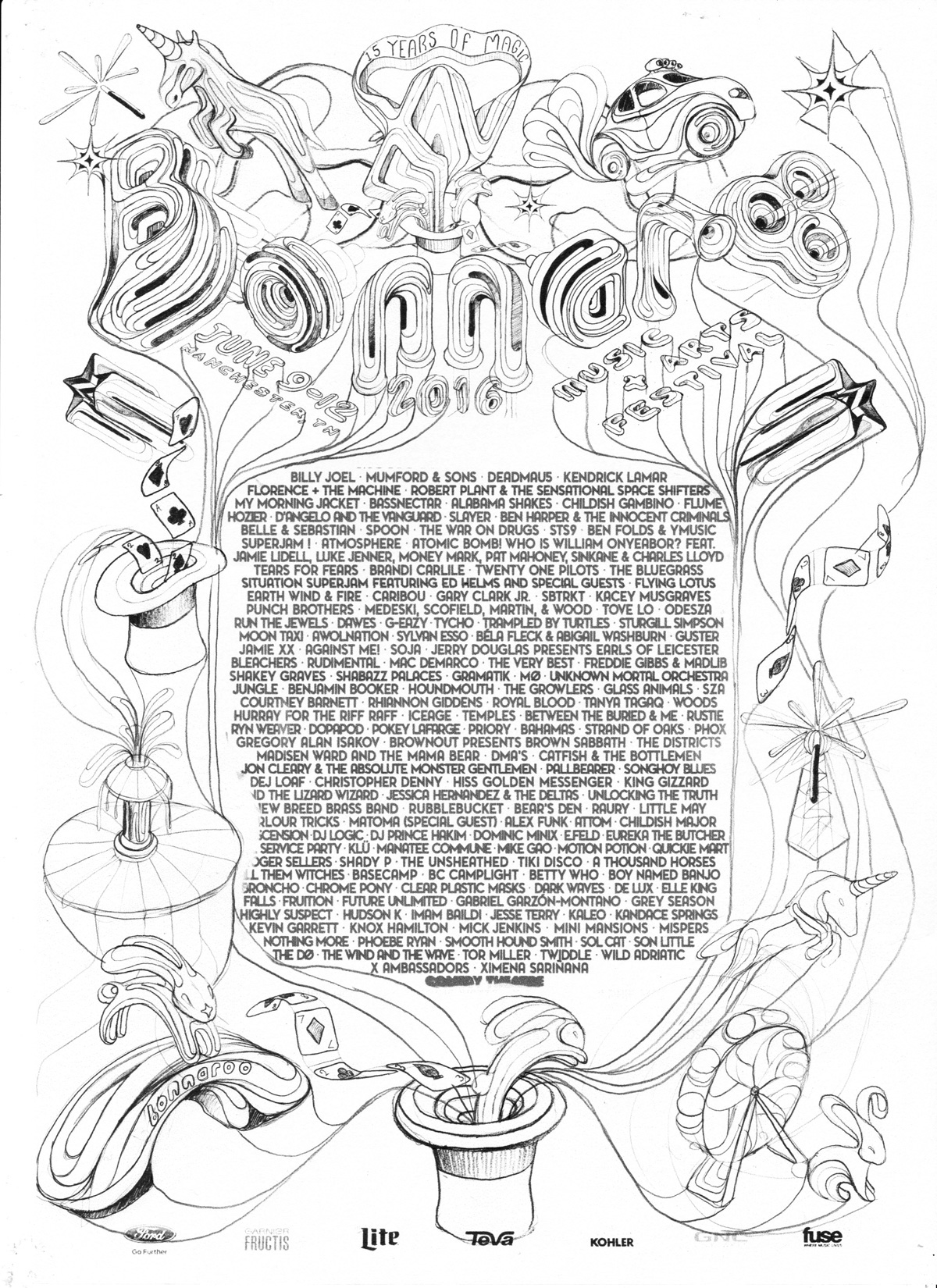
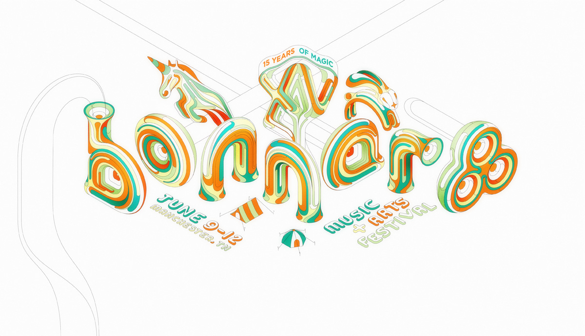
At this stage Bonnaroo wanted to see how the whole design would come together in poster format, which would be their main piece of marketing, so I created the various elements in this style, using an isometric grid, and the same magical/musical style.

I then looked at tightening up the type, bringing the identity closer to its eventual digital incarnation.


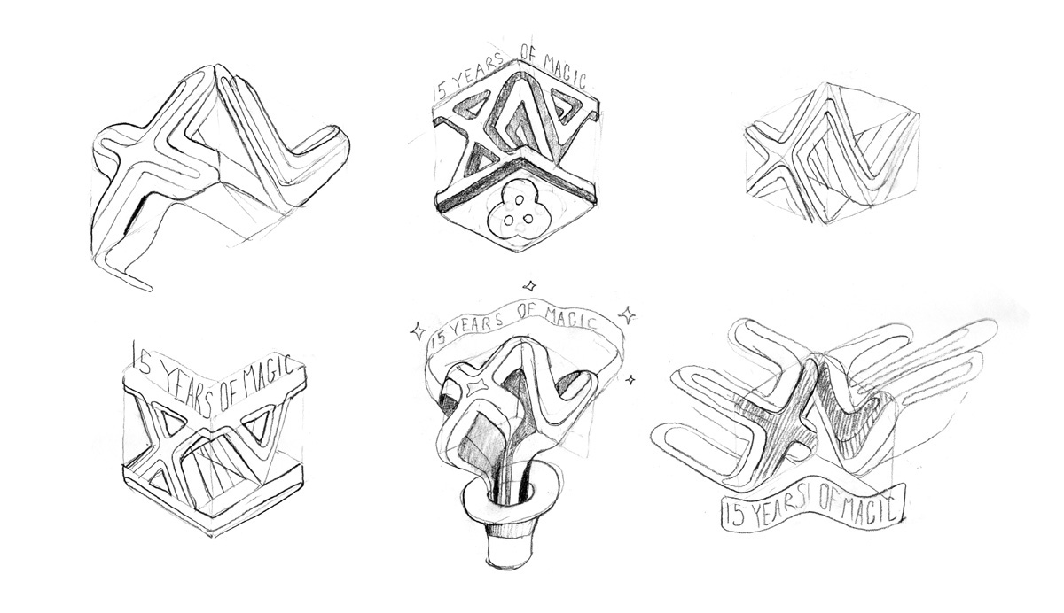
A key asset for the brand was the "15 years of magic" tagline, and how this functioned as a lock-up in conjunction with the main logotype, so I explored a variety of treatments.
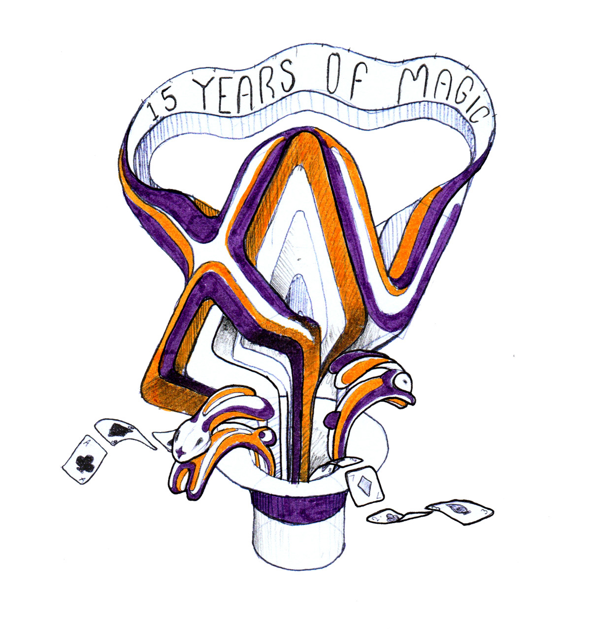
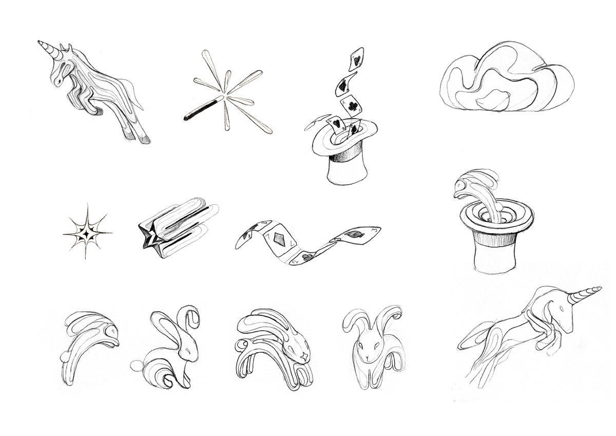
I created a series of magical elements to accompany the design. It was fun applying the style established by the type to various illustrative pieces. Especially these cute lil' bunnies, drawn using lots of circles.


By this point we were pretty much signed off with the sketch - probably the most extensive sketch I've ever worked on! It was great to flesh out ideas to such an advanced degree on paper, and made the digital transition smoother than a pack of melted brie.
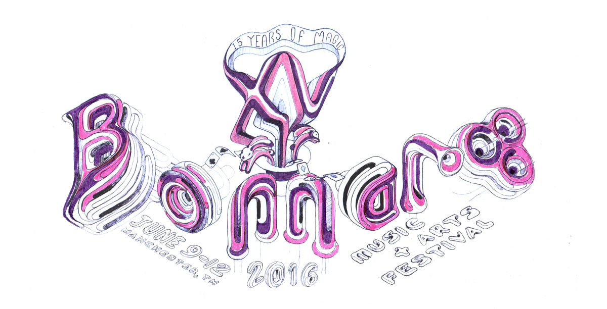
Colour sketch
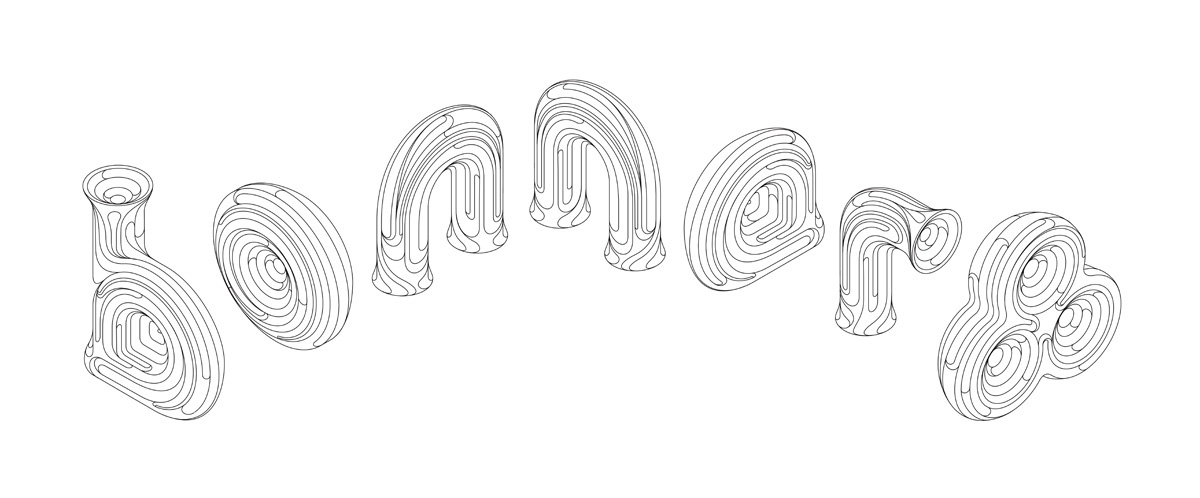
Logotype vector linework
Logotype vector, with sample colours added.
Initial Bonnaroo logo vector , created to illustrate how the sketch work would translate to digital.
Colour exploration
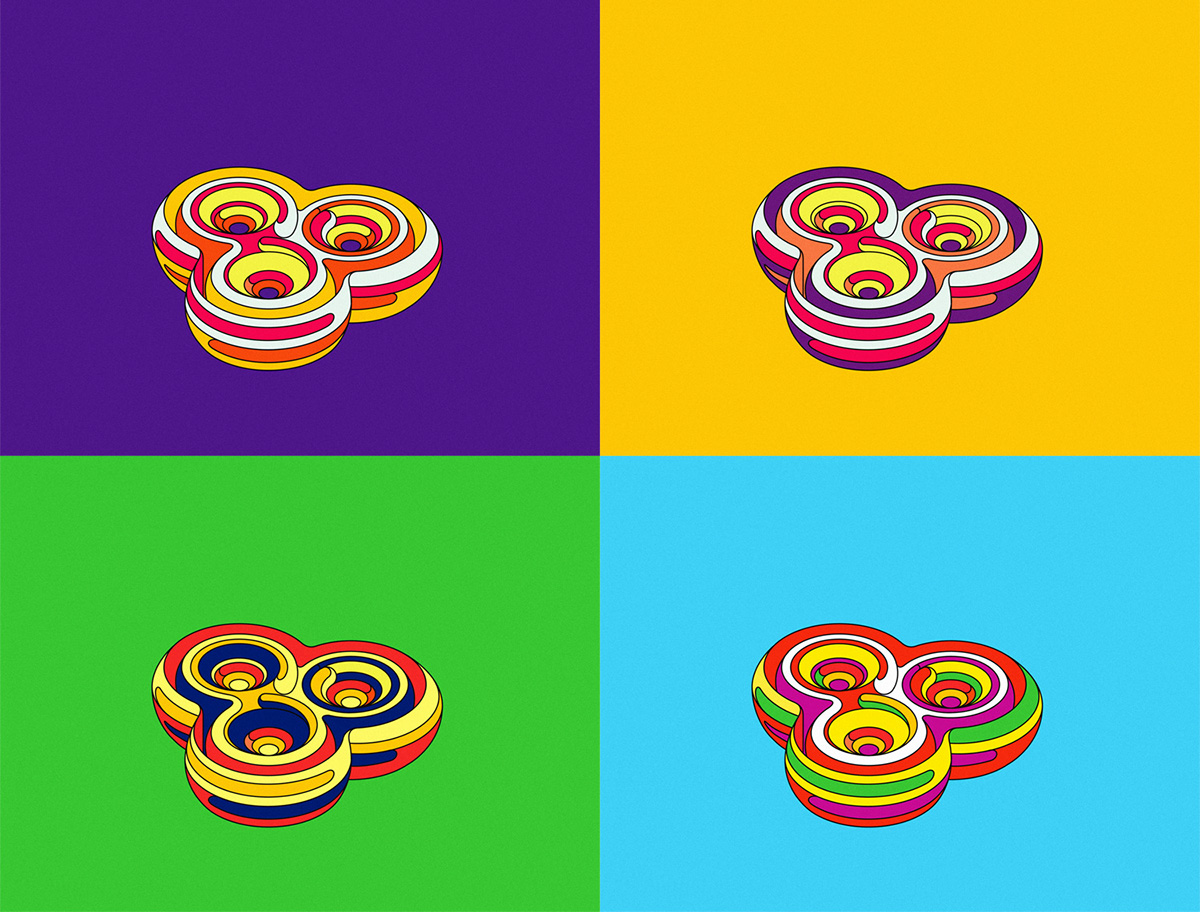
Extensive colour exploration using the logotype lockup


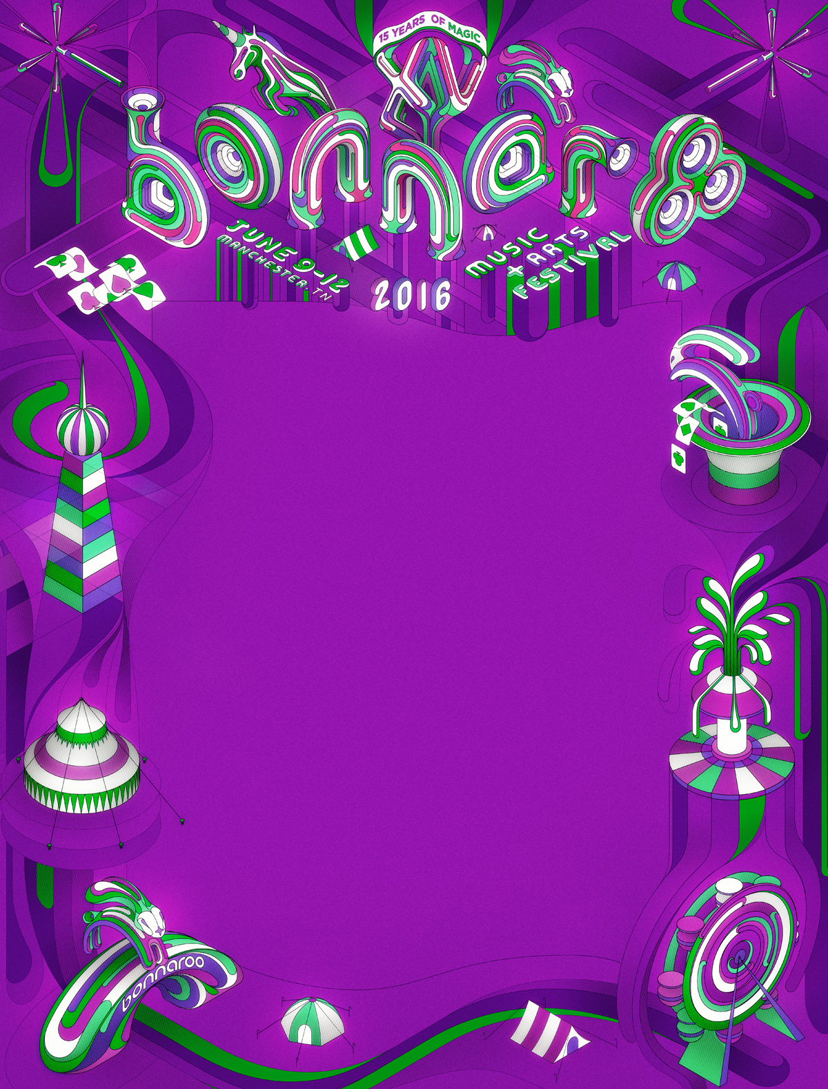
Chosen colourway

Poster layout
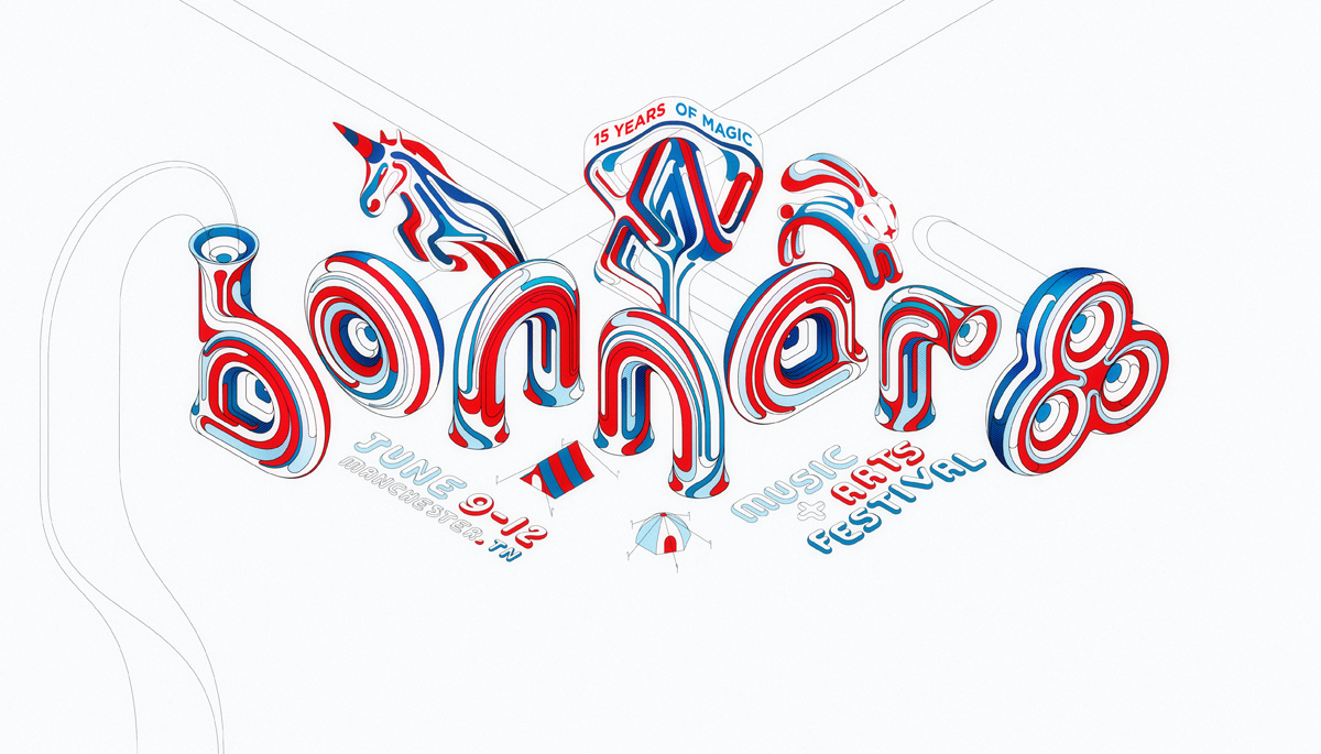
Logotype - full colour on white

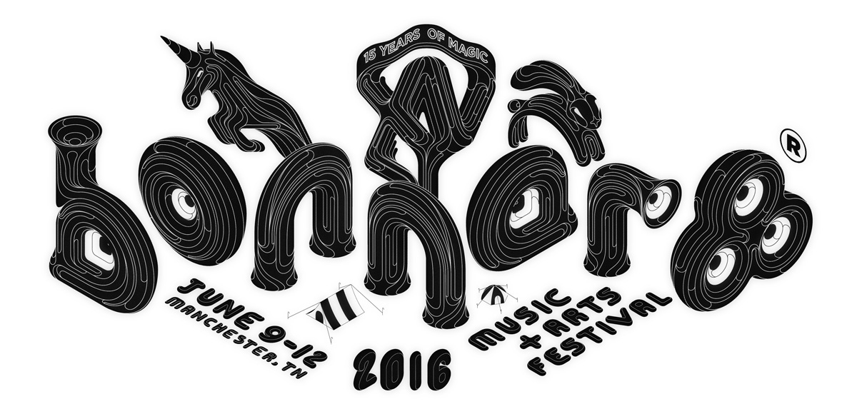
Logotype - black
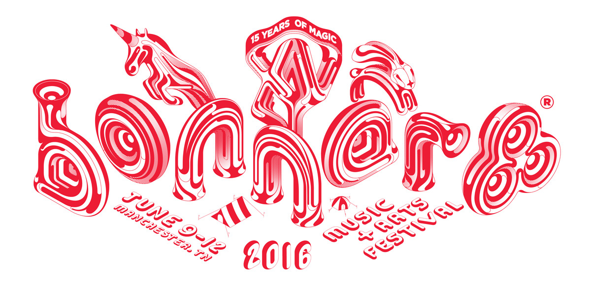
Logotype - red
Elements


Logotype detail

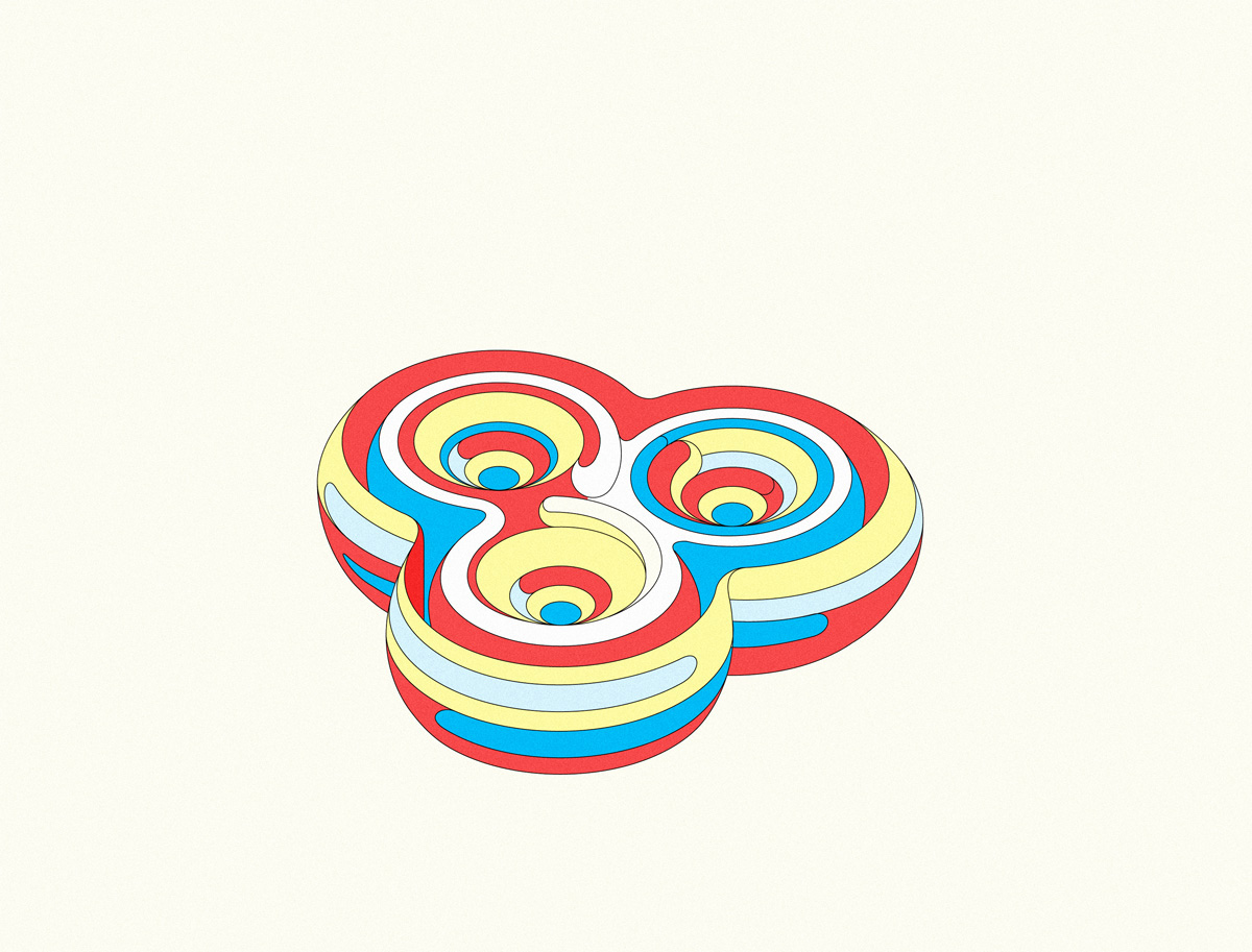
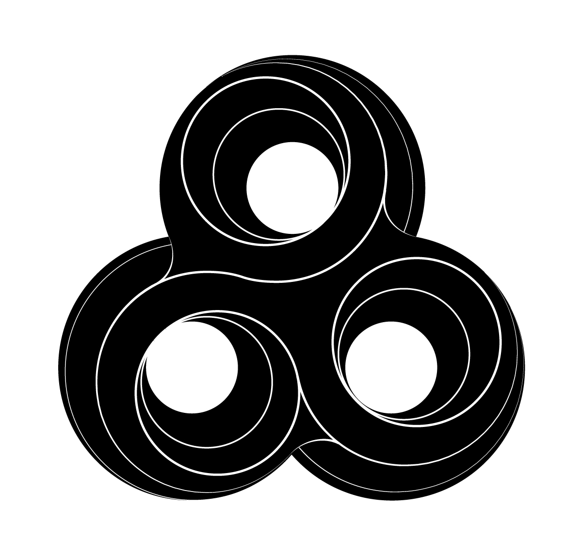
Bonnaroo "double O" logo

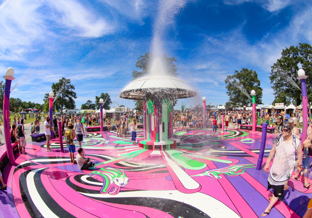
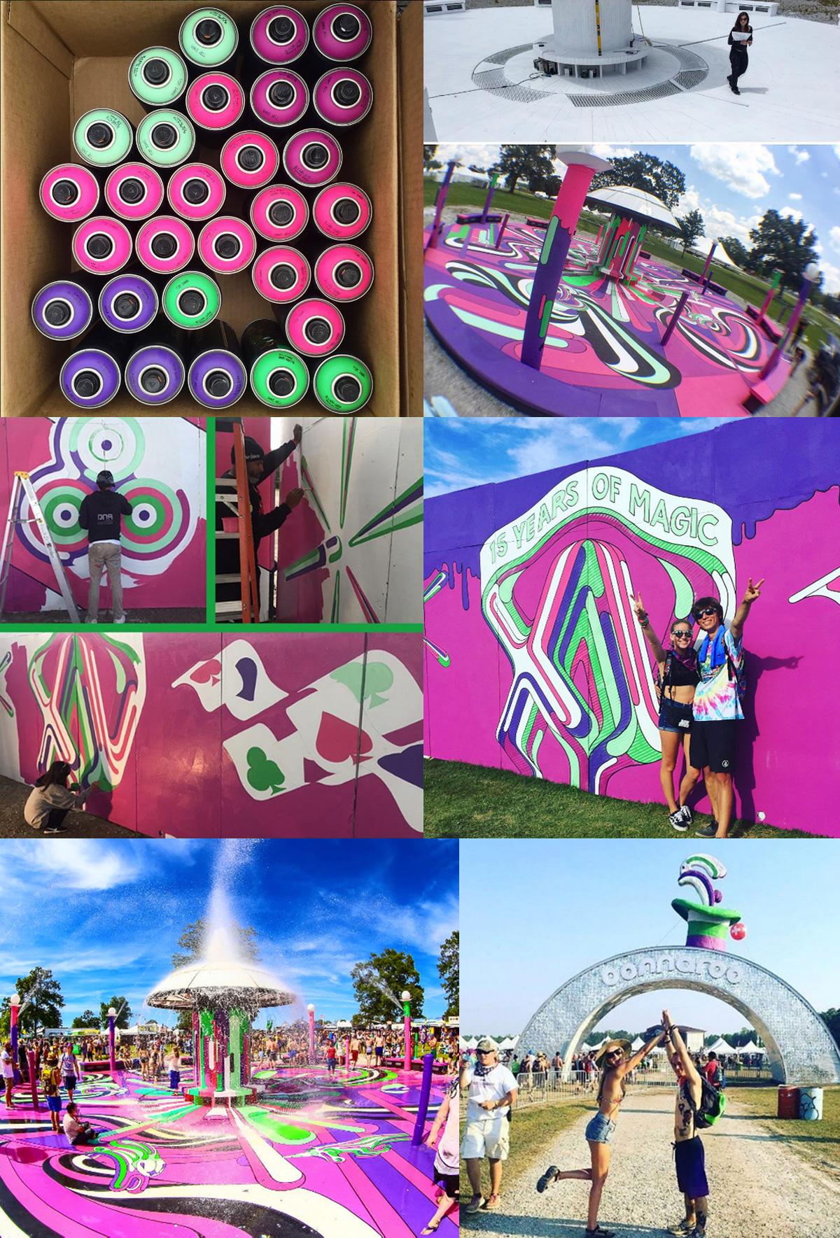
Bonnaroo next commissioned me to create a design for their fountain, an exciting feature of the festival. I used the word 'MAGIC' as the basis for the design, with various elements from the design featuring throughout. This was created in collaboration with Jill Folino, who did an amazing job bringing the flat digital design to life.

Flat logo design
I also created a simplified Bonnaroo logo to be used on various products at the festival, so it had to work well at small sizes.


Icon design
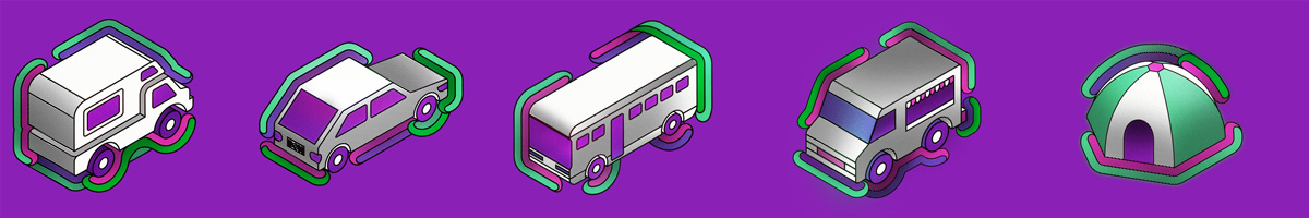
Various isometric icons created to be used on signage and online.


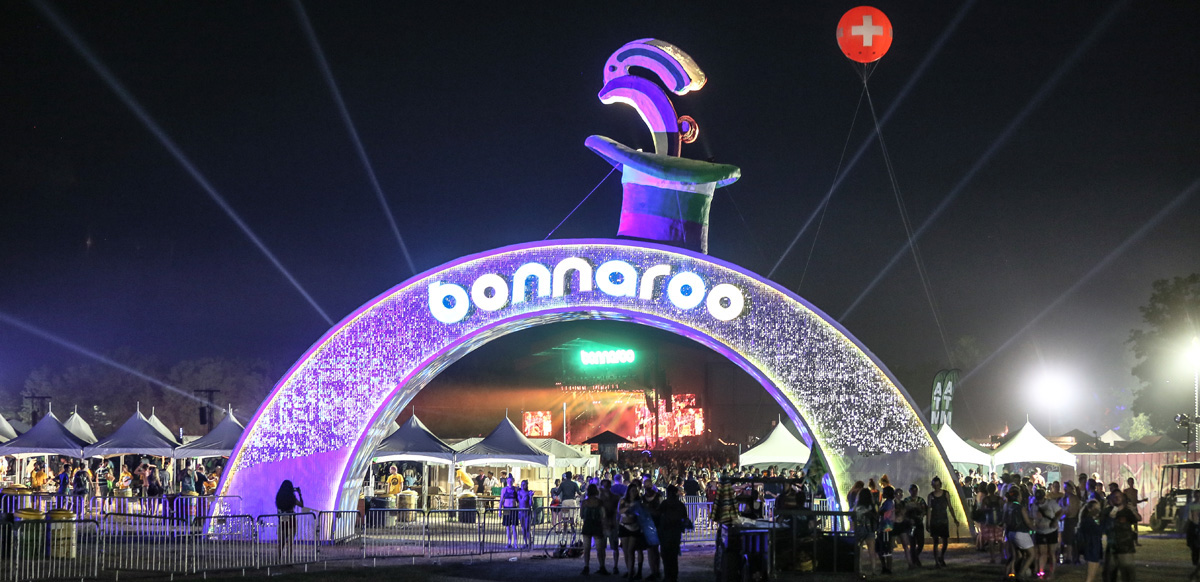
Bonnaroo created a massive bunny leaping out of a hat, based on my illustration.
This is probably the coolest thing that's ever happened to me.
Pictures from Instagram
Thanks so much for scrolling all the way down to this point!
And thanks to Bonnaroo for being utterly splendid to work with.
FIN.
Charles


