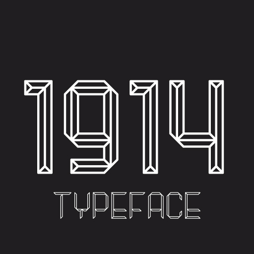
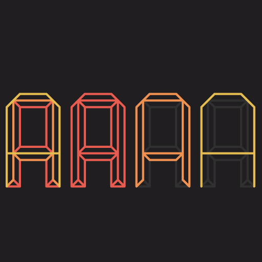

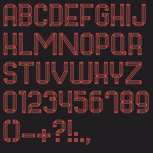

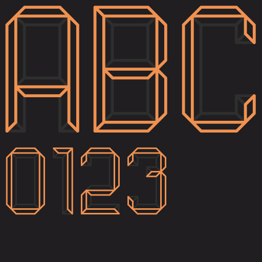

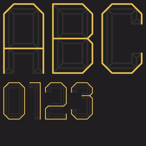
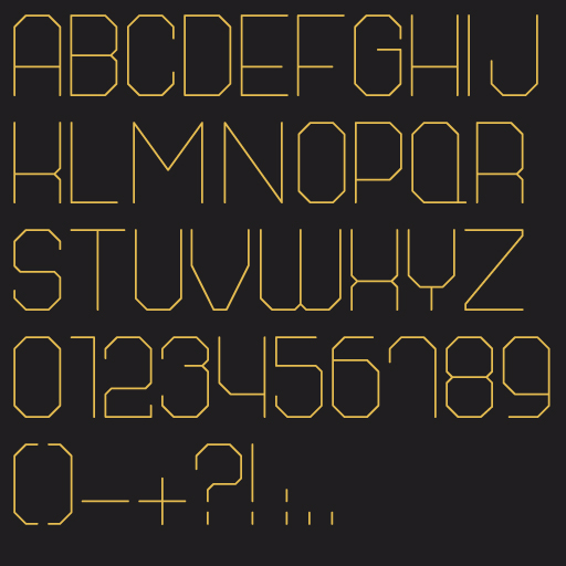

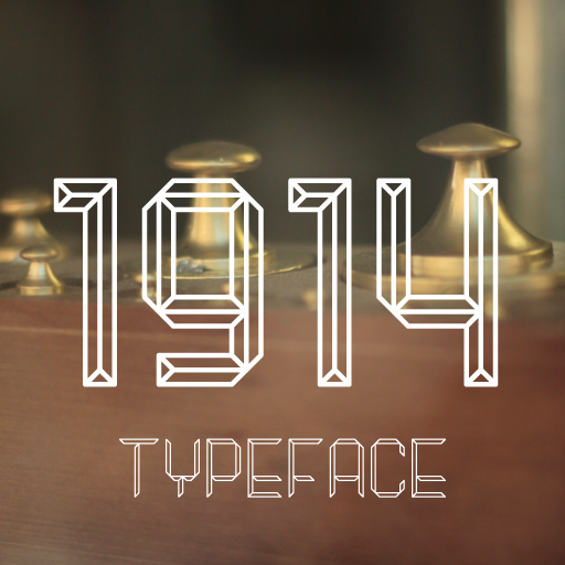


1914 Typeface
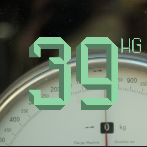
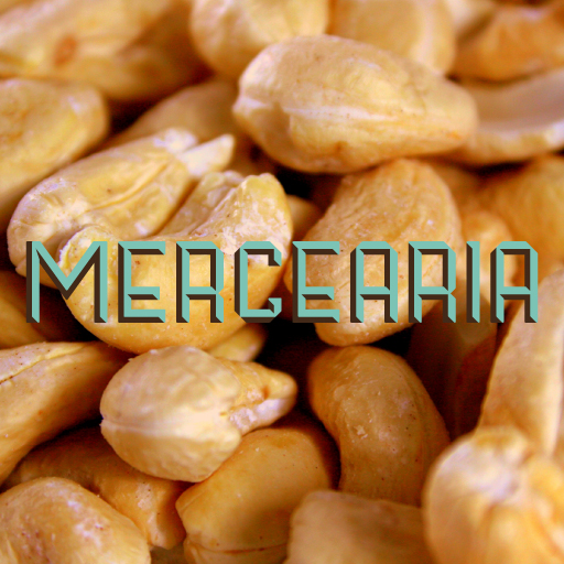
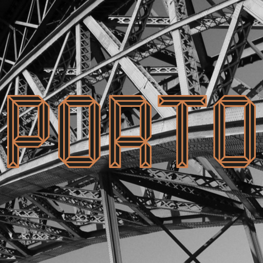
Seizing the unique opportunity to create the new visual identity for Mercado (Market)do Bolhão in Porto, we developed a new typeface designed to maintain its relation with the building's era trough contemporary principles.
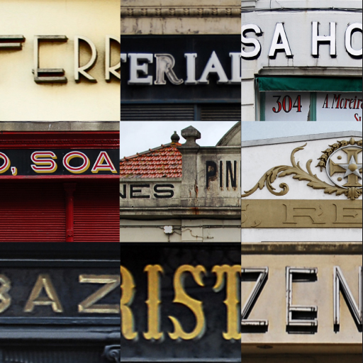
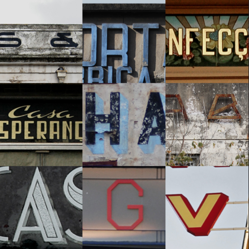
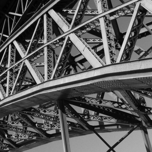
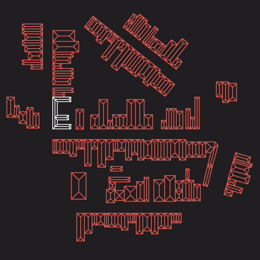
Based on Porto's architecture we used the distinctive roofs that inhabit the city of Porto, as a metaphor to create the 1914 typeface.
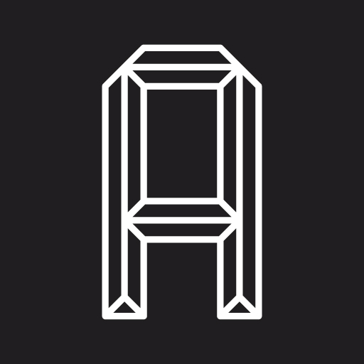
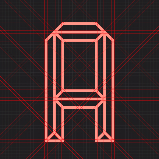
The typography result falls into the category of decorative or ornamental typefaces, quite common in the 19th and early 20th centuries, also associated to movements like Arts & Crafts, Art Noveau and the Mercado do Bolhão itself.
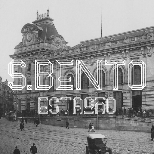
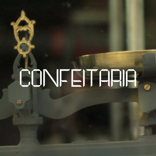
Today, clearly related with this historical period, these identities - despite their formal variety - contributed to the construction of a coherent and transversal identity of the city's downtown, part of a larger one - the city of Porto.
We've considered for 1914 typeface three distinct weights, allowing an efficient development of the entire graphic communication, as well as the construction of an unique family of funcional pictograms and iconography that will enhance the thematic coherence of Bolhão's new identity.
Seizing the unique opportunity to create the new visual identity for Mercado (Market)do Bolhão in Porto, we developed a new typeface designed to maintain its relation with the building's era trough contemporary principles.
Based on Porto's architecture we used the distinctive roofs that inhabit the city of Porto, as a metaphor to create the 1914 typeface.
The typography result falls into the category of decorative or ornamental typefaces, quite common in the 19th and early 20th centuries, also associated to movements like Arts & Crafts, Art Noveau and the Mercado do Bolhão itself.
Today, clearly related with this historical period, these identities - despite their formal variety - contributed to the construction of a coherent and transversal identity of the city's downtown, part of a larger one - the city of Porto.
We've considered for 1914 typeface three distinct weights, allowing an efficient development of the entire graphic communication, as well as the construction of an unique family of funcional pictograms and iconography that will enhance the thematic coherence of Bolhão's new identity.

