An investigation into semiotics
The task was to create 2 examples of each section of semiotics; iconic, indexical and symbolic. One set of examples had to link in some way and had to be set in an A3 format. The other 3 did not have to link and were to be designed for an iTouch, iPhone screen.
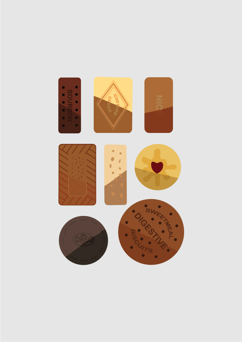
My first three images use very graphic shapes to portray my message. This use of graphic shapes runs through my three connecting designs. The first design looks at different strengths of tea that people drink. The second image is what biscuit people like to dunk in there tea and the third is the way in which people hold there tea cup/ mug. I experimented a lot with these outcomes and I feel that they answer the brief well.
This is a brief in which we learnt about graphic design skills. These three outcomes could be applied to a tea shop brand. Tea shops are becoming much more popular so using this a brand identity could be effective. Using each poster to potentially influence what they choose/ how they order. I started this project just creating the outcomes but it excites me to begin to apply it to brands and giving meaning to the posers.