

Re-branding
client. Pams Wheat Biskits
client. Pams Wheat Biskits
timeline. 2 weeks
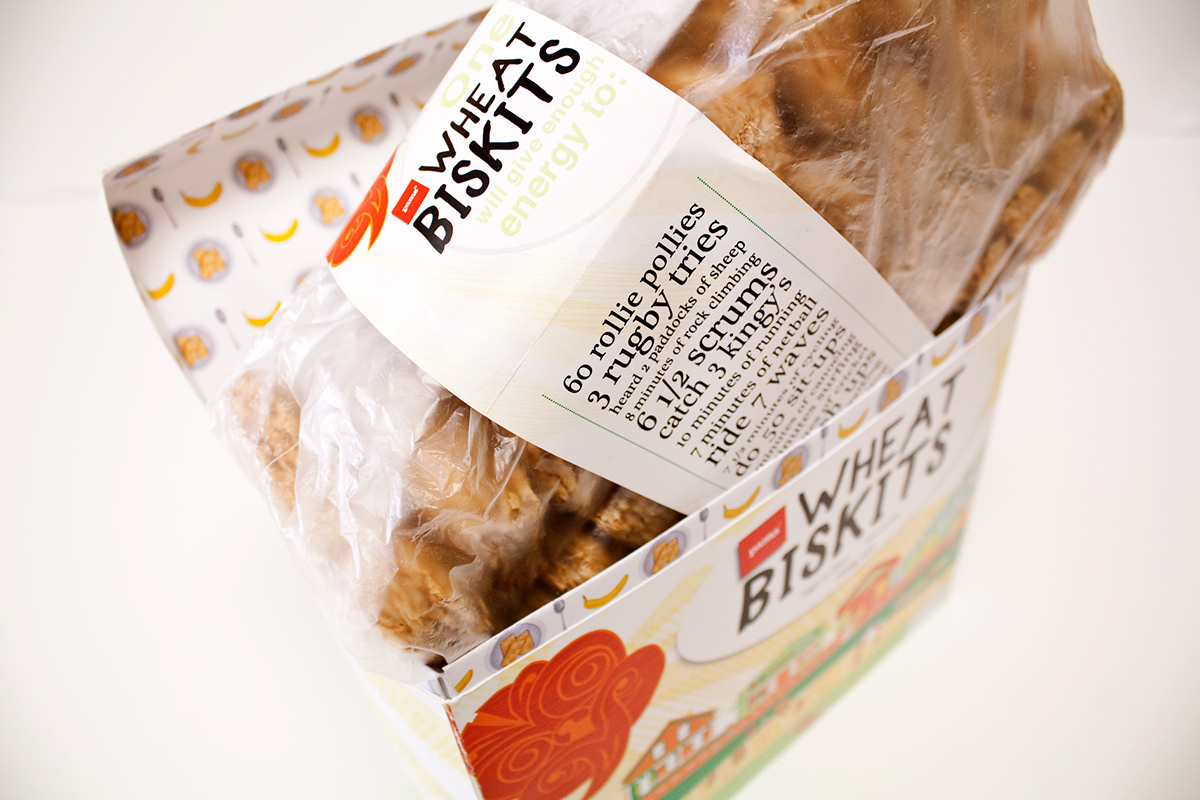
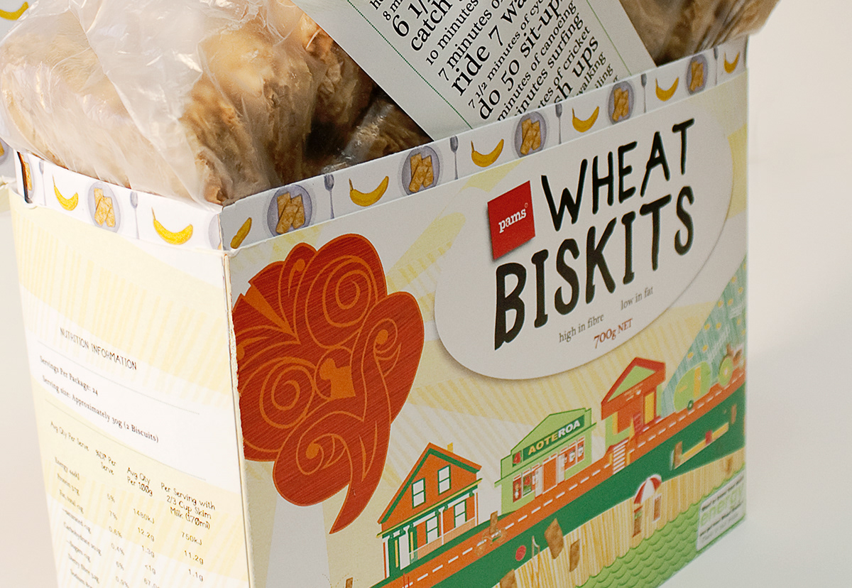
For this brief I was required to re-brand a generic product, which in this case was Pams Wheat Biskits, and make it appeal and attract a specific target audience. The target audience I chose out of the 2 choice, was the sporty, active, high-energy user type. After researching and analyzing my target audience, (looking at what previous products they would purchase, what they did for a hobby and for work, what they would look for in a product) I began idea generating. Once I came up with a solid idea, I further researched styles that would appeal to the target audience. Because the target audience was a New Zealander, I really wanted to emulate the classic, kitsch style of New Zealand in the 1940's, 1950's. I thought this would be appropriate because in these era's New Zealand sport was extremely popular. I also wanted to put imagery and words (the wrap around the Wheat Biskits) that epitomised a 'Kiwi kid', all in action. This would appeal to my target audience because she would relate to the illustrations of sporting activities, and the suggestions of energy use per Wheat Biskits.