


Zeronix collects and recycles waste into secondary raw materials, and also conducts scientific and technological research in order to maximize the number of fractions that can be recycled. The company promotes the relevant «zero waste» life concept, which is based on the idea of zero environmental impact when all waste is processed into new products or energy.
Tomatdesign was tasked with creating a name and visual identity that would reflect this global concept and resonate with the widest possible audience in various countries.
Simplicity, cleanliness, openness, minimalism, balance and ustainable consumption are not just trendy words but guiding principles of the company that formed the basis of the design strategy. The fundamental design concept of the Zeronix brand is separation. Separation as a semantics of balance. The balance reflected in splitting the elements of design into equal components can be seen in all basic brand identity elements.
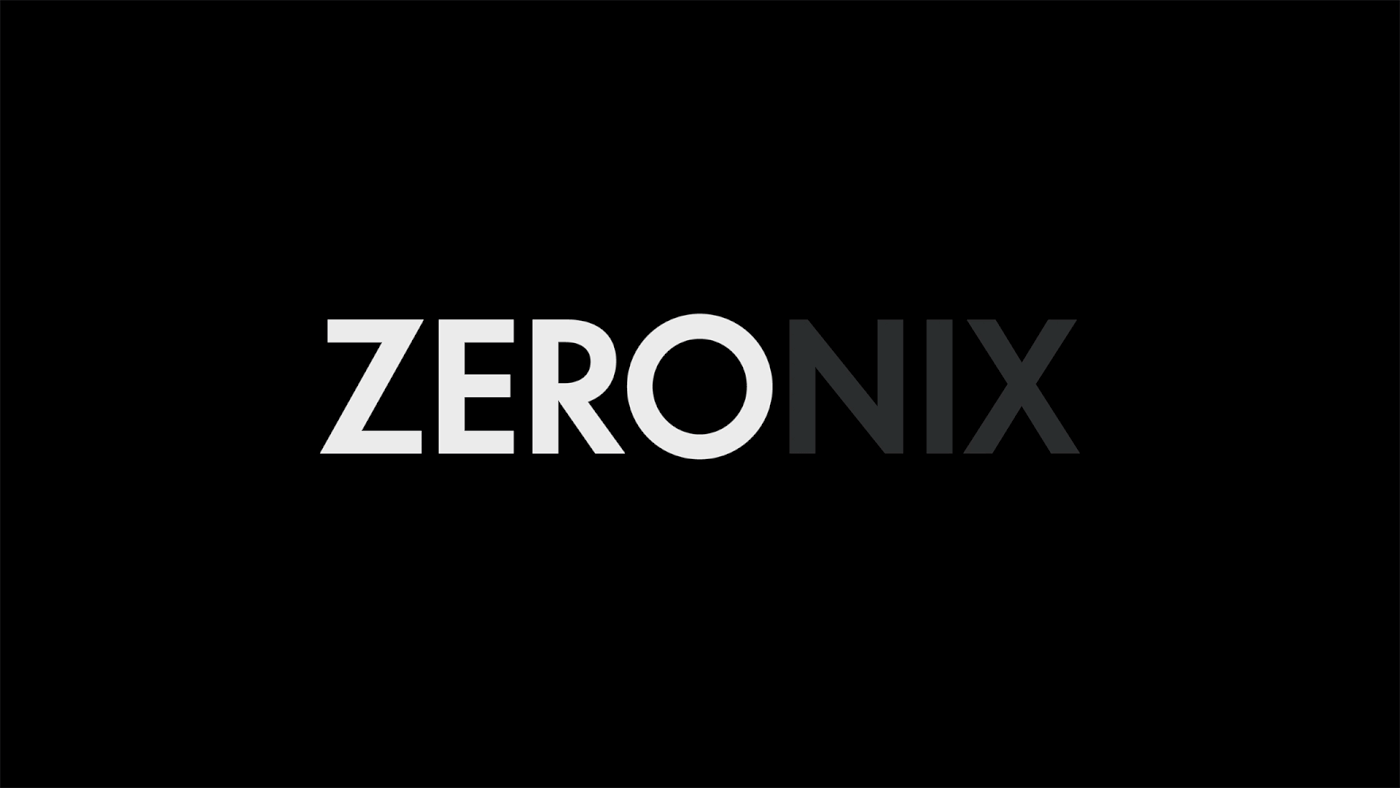
We came up with the word «Zeronix» for the brand's name as it reflects the company's mission and echoes the idea of balance. The words «zero» and «nix» mean «nothing». Zero as a graphic symbol is stable, symmetrical, and balanced. Zero as a ground zero for new thinking.
The spelling of ZERONIX is split by the symmetry of the letters, creating a balance in the logo: equally weighted parts ZER and NIX balance out the trademark «O» in the middle.
The structure of any layout is based on a grid formed by an infinite vertical and horizontal division of the format in half, continuing the principle of separation.

The combination of two fonts, the modernist and grotesque Futura and the academic Baskerville, creates a balance between the industrial and austere tone of messages and an educational, humanitarian voice on the emotional spectrum of communication.


There is no waste
The company believes that waste is not garbage, but a valuable resource. This resource can be extracted, used in production and become a source of profit. At some point, there will be eco-friendly ways to recycle everything. Therefore, we can say that there is no waste. Literally, it doesn't exist. Everything is a resource.


The color palette does not have a specific corporate color; all colors have equal importance and do not have a hierarchy. The principle of color formation by division is another reflection of the design concept, where each subsequent color forms a new pair of colors.

Creative Director: Andrey Tarakanov
Art Director: Anton Krivulya
Designers: Roman Gruzdkov, Anton Krivulya, Andrey Tarakanov
Copywriters: Maria Krasina, Anton Krivulya
Designers: Roman Gruzdkov, Anton Krivulya, Andrey Tarakanov
Copywriters: Maria Krasina, Anton Krivulya
Naming: Roman Urban
Producers: Varvara Pronkina, Anna Plyaskova
Producers: Varvara Pronkina, Anna Plyaskova


