You are here @ Your Local.
We were approached to create the brand identity of Your Local, a resto that serves Asian comfort food. We wanted the whole identity to be understated, witty and relevant to the what the company and its partners represent.
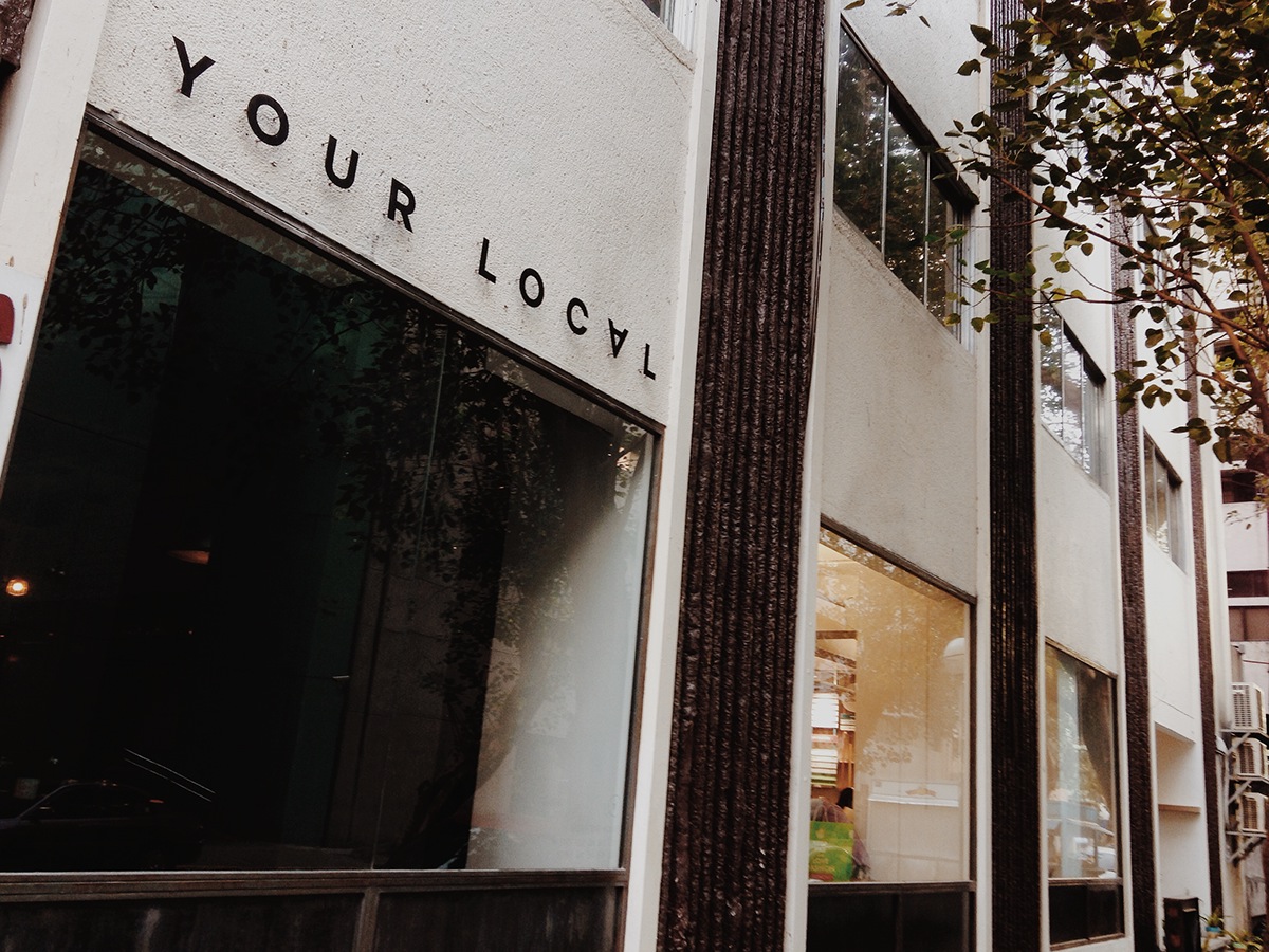
Welcome to Your Local.
Your Local is a place where you'll find a familiar face -- an acquaintance, neighbor, co-workers, or your friends already waiting for you with a table. Say hello to a stranger, you might just make a new friend. And relish the good vibes with a good meal.
At Your Local, spend the best parts of your day having conversations with friends, exchanging ideas with business and creative collaborators, or just giving that time to yourself immersed in a book or watching the day unfold from your window seat.
It's everything you'd love to find in a nice neighborhood spot. Enjoy newfound charms of the familiar.
You're always welcome at Your Local.
Copy by Dang Sering
You're Always Here. Your Local is your daily stop.

Some of the earlier design exploration.
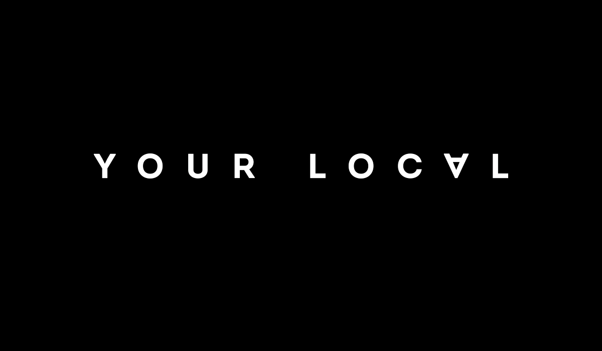

The logotype. The inverted "A" acts like a pin telling people that this is should be your daily stop.

The inverted A. It says "you are here" and @ (at) at the same time. :)

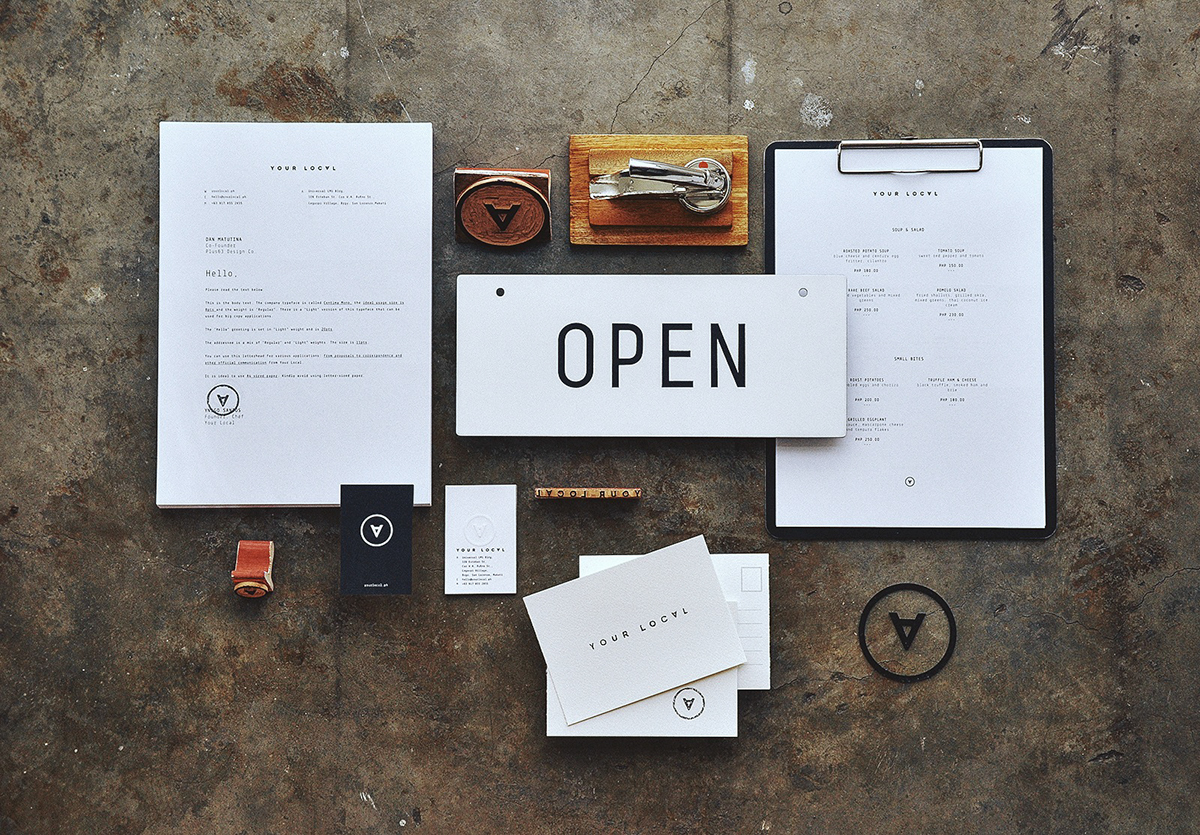
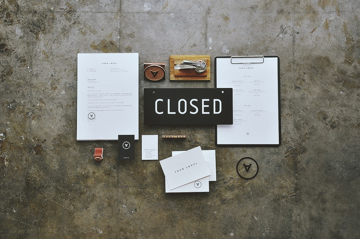
A closer look of the different identity materials.

The business cards are black & white. It's pressed on the backside.


Dry seal embosser used for various materials.
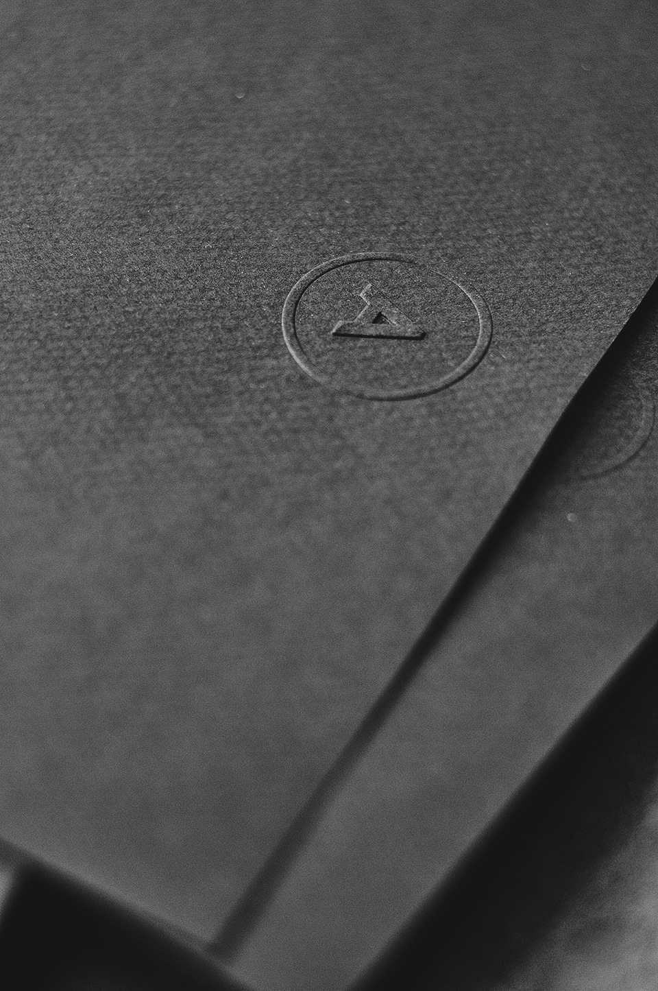
Dry seal detail.
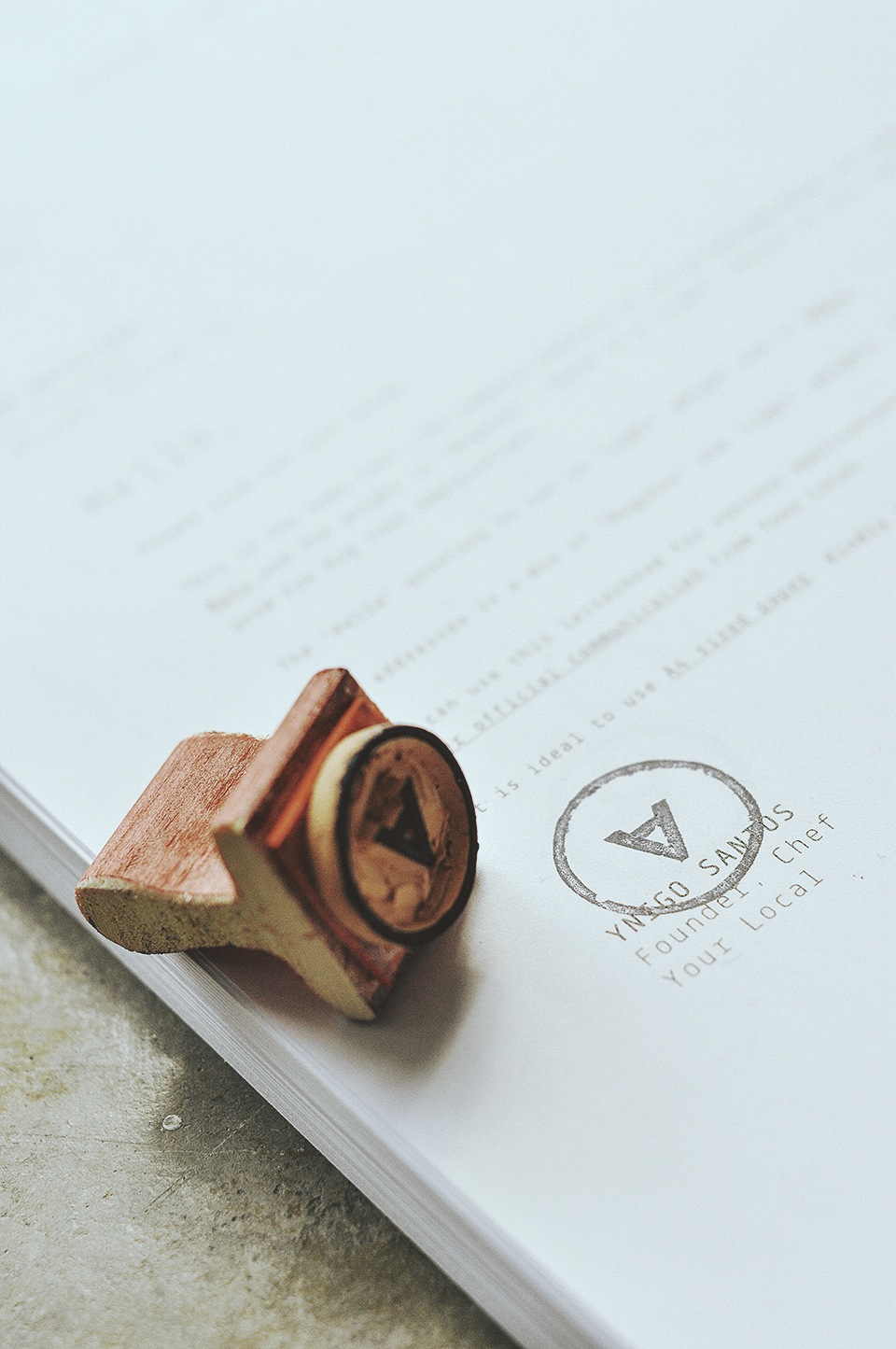
Rubbert Stamps used for correspondence.

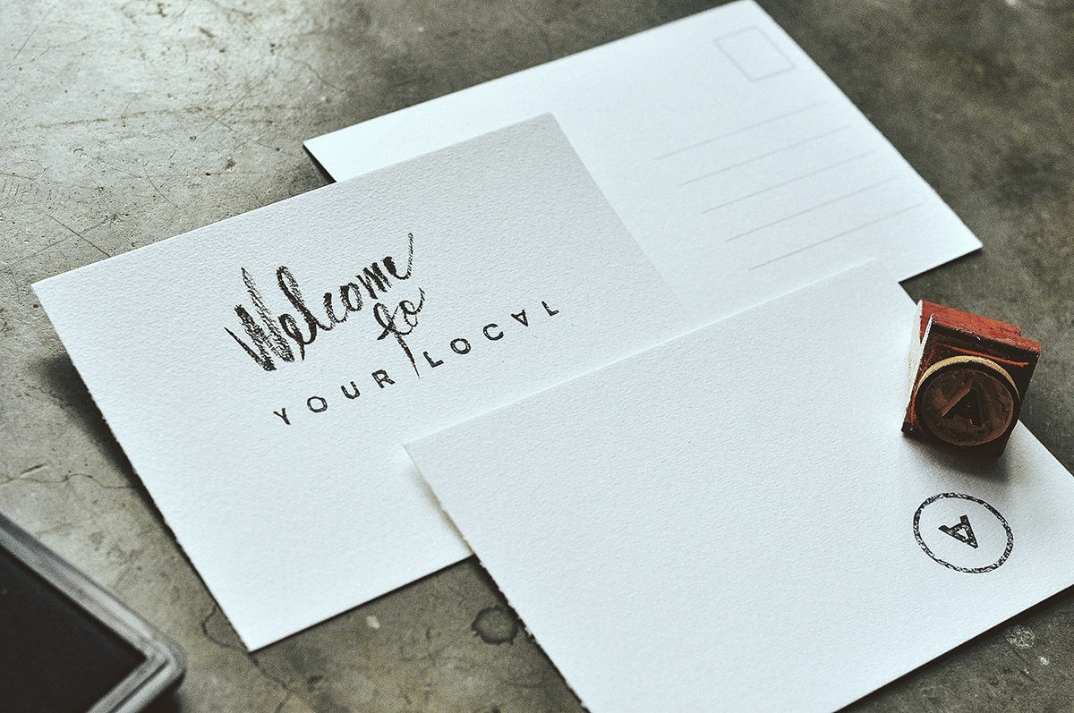
Blank Postcards and stamps.

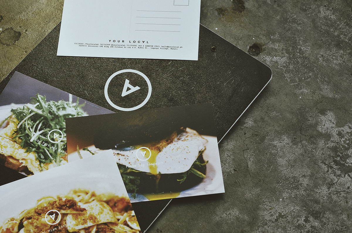
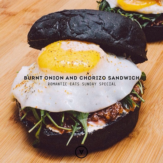
Printed postcards with food photographs.

The menu. It's understated and basic.

The menu clipboard was custom-painted. The menu is black, with white edges.
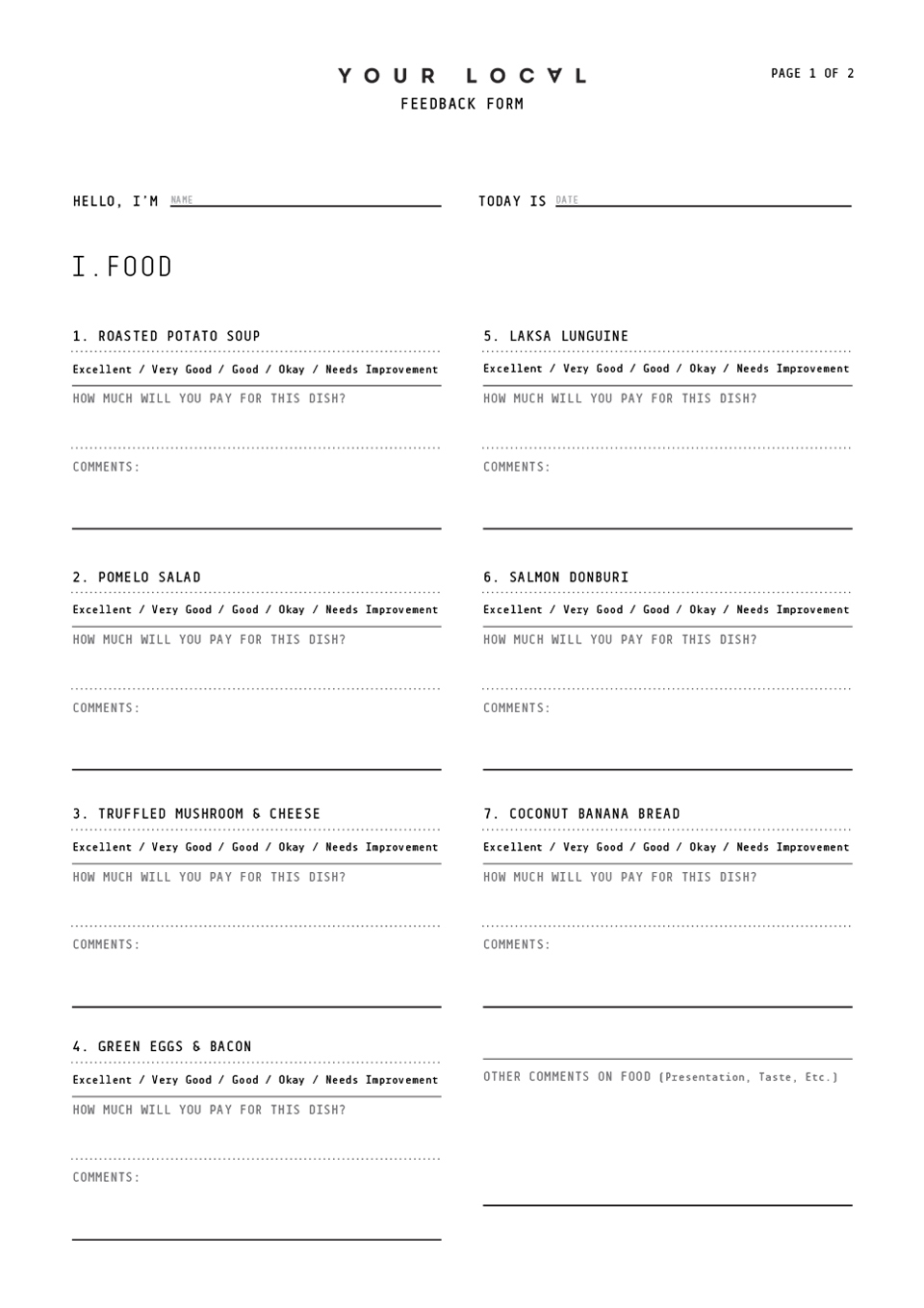
This was the design of the feedback form at the food tasting phase.
Graphic application for Social Media images.

We made a Custom Logo Wallclock. The apex of the "A" acts like the hourly arm. People can tell time by where the "A" points.
This is Your Local time.

Arm detail.

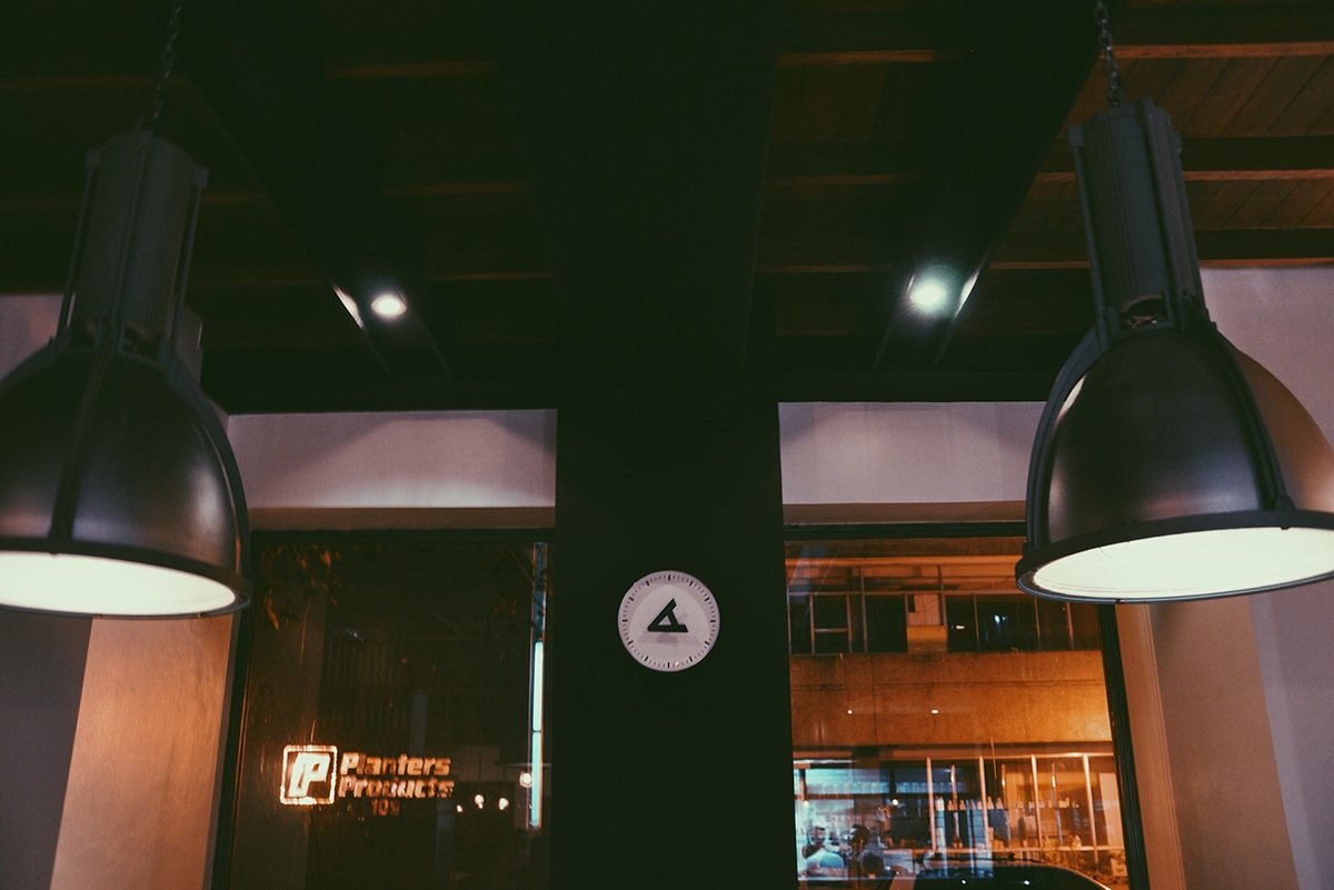
The Wallclock inside the shop. Your Local time is 8:15PM???

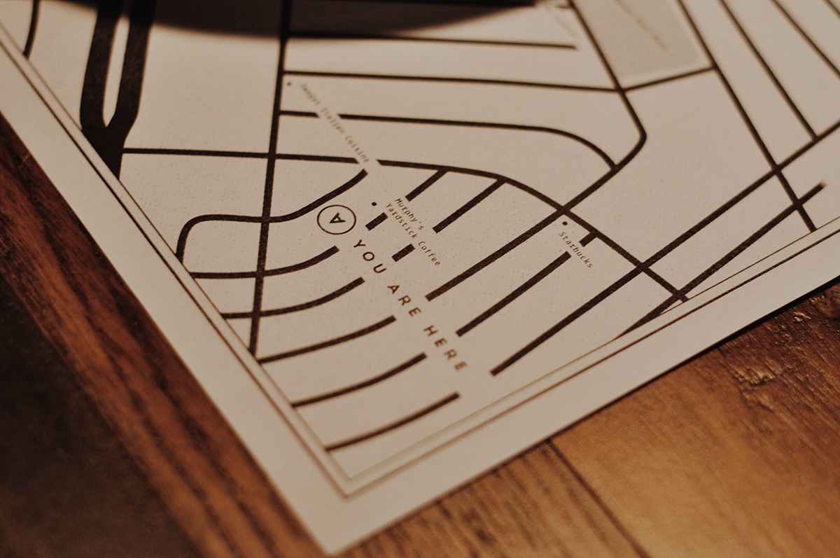
The "placemap" is a placemat with the map of the area. We placed the text "YOU ARE HERE" on the lower right corner instead of the logo. We even listed down the other restaurants, cafes and places of intertests in the area.
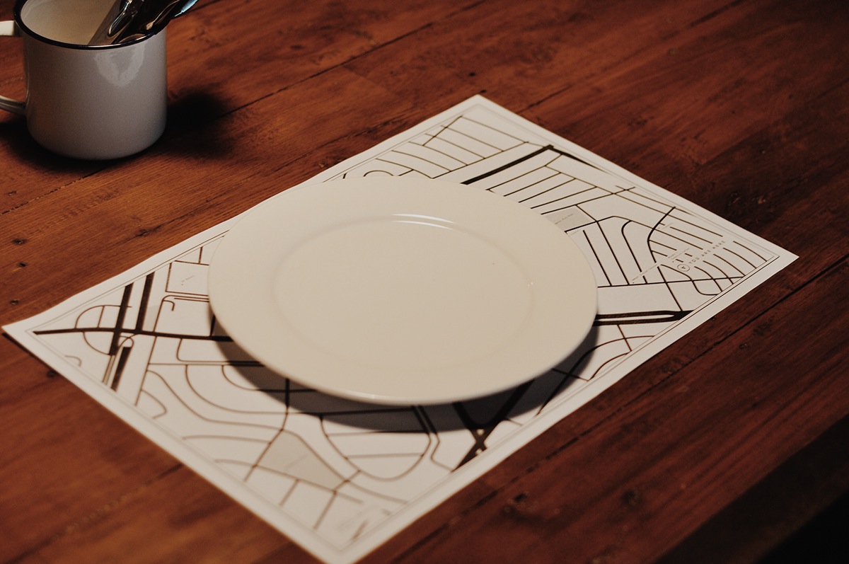
Table setting.
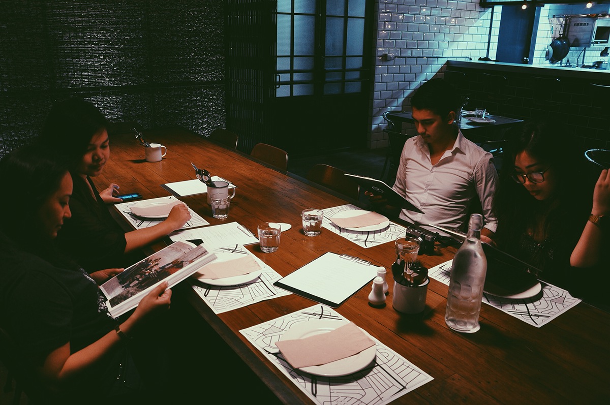
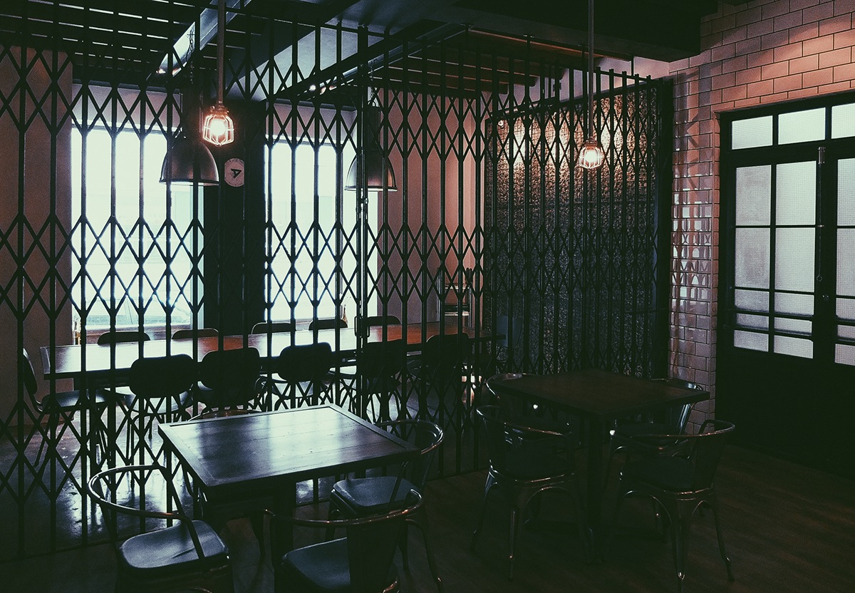
People dining inside.

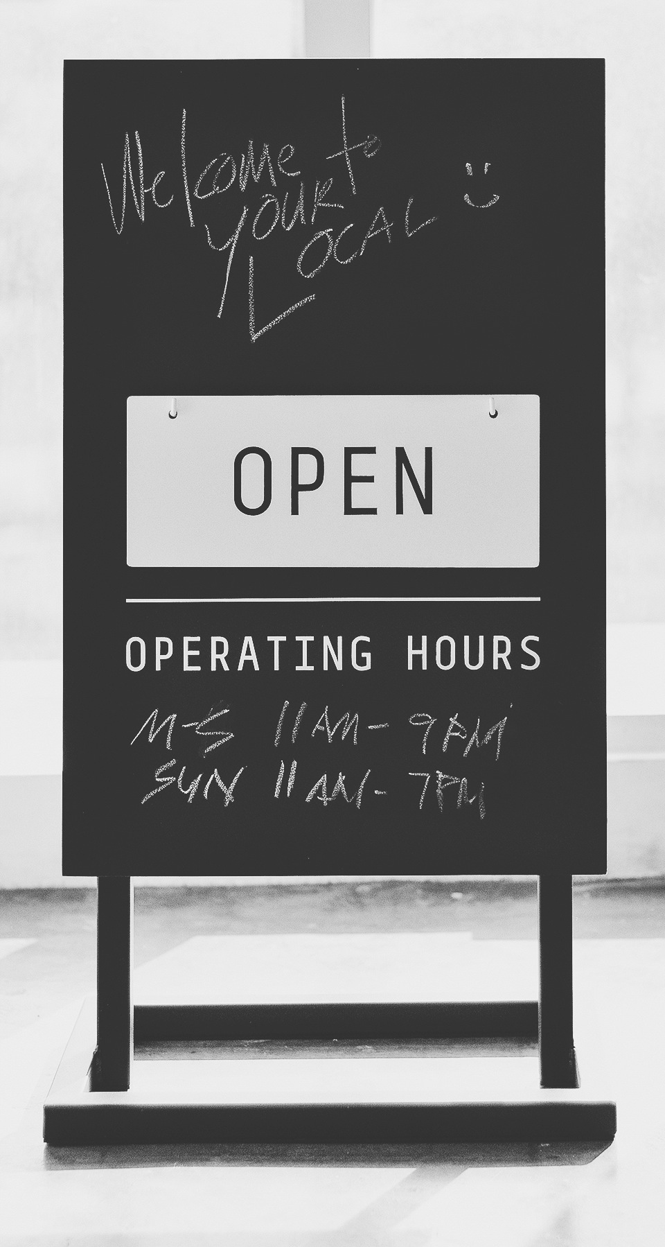
The standie signage. The purpose is to put announcements and specials by the restaurant door.

Authorized Personnel Only.

The understated window sticker. Notice the positions of AM & PM.

Proposed bathroom signages. The stickers are already available, but we're waiting approval from building admin.
The inverted "A' icon can be used as a graphic element for marketing materials.

The shop interiors.

Hanging magazine holders. We suggested using electrical wires instead of twine/rope.

The "sloppy" knot gives it a certain personality that matches well with the overall feel of the shop.

Your Local collaborated with Made by Fabrix in Singapore for their apron. They incorporated the Pinverted A on the tag.

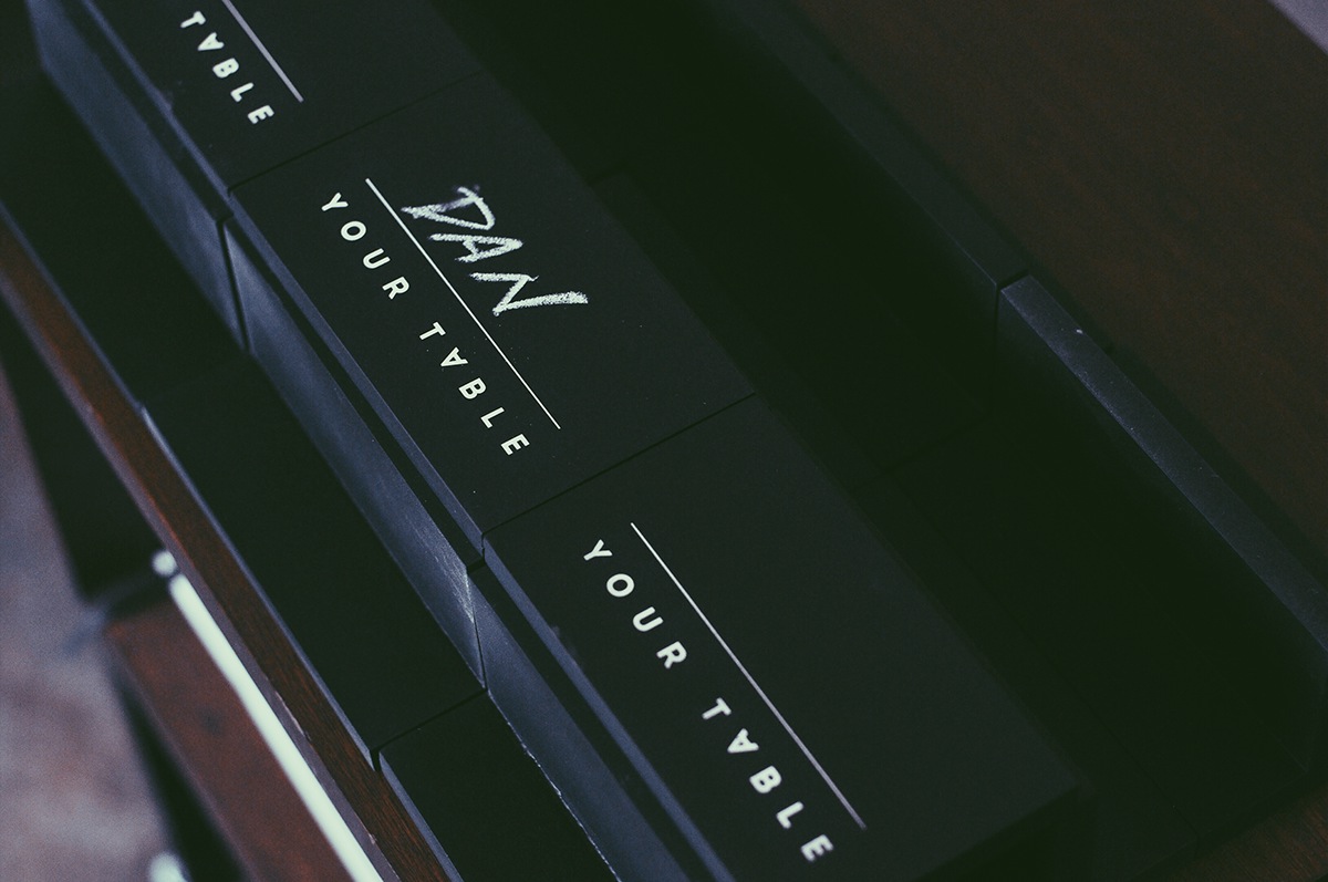
YOUR TABLE. Our own take on the table reservation sign. The name of the patrons can be written on it.
Thank you for coming. See you everyday.
YOUR LOCAL
Creative Team
Creative Team
Design: Joanna Malinis, Kitkat Pecson, Bernice De Leon & Dan Matutina
Copy: Dang Sering
Creative Direction: Dan Matutina
Production: Edward Quiambao, Gemsigns.
Copy: Dang Sering
Creative Direction: Dan Matutina
Production: Edward Quiambao, Gemsigns.