Logotype design and modular patterns for Beatgrid
A set of key brand characteristics were defined that would help set a focus on what the new logotype should communicate. It was crucial to capture how they absorb data, perform in-depth measurements, and provide clients with digestible and actionable reports.
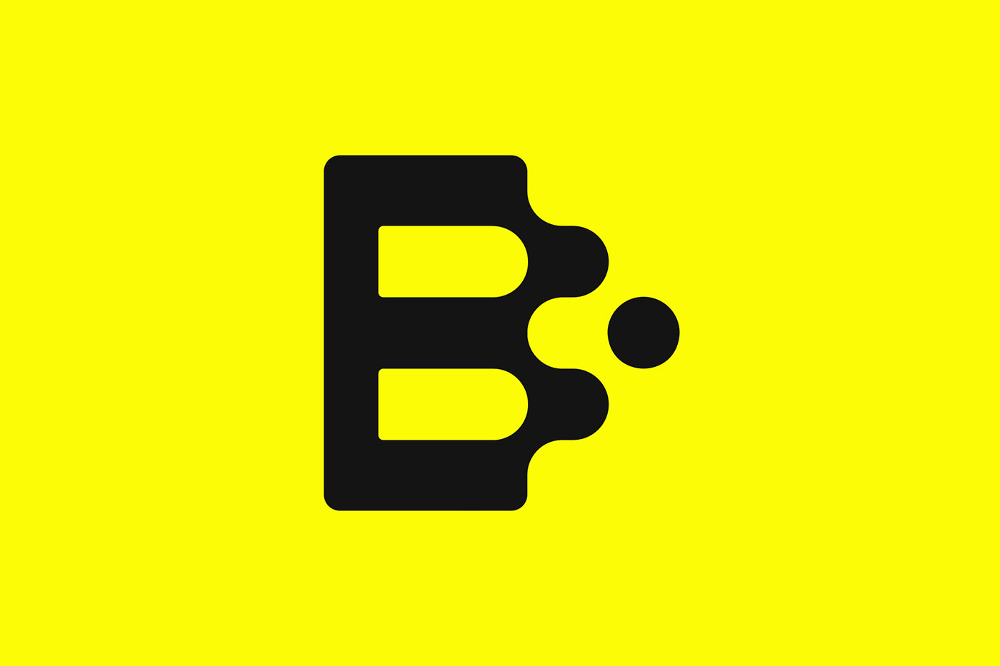
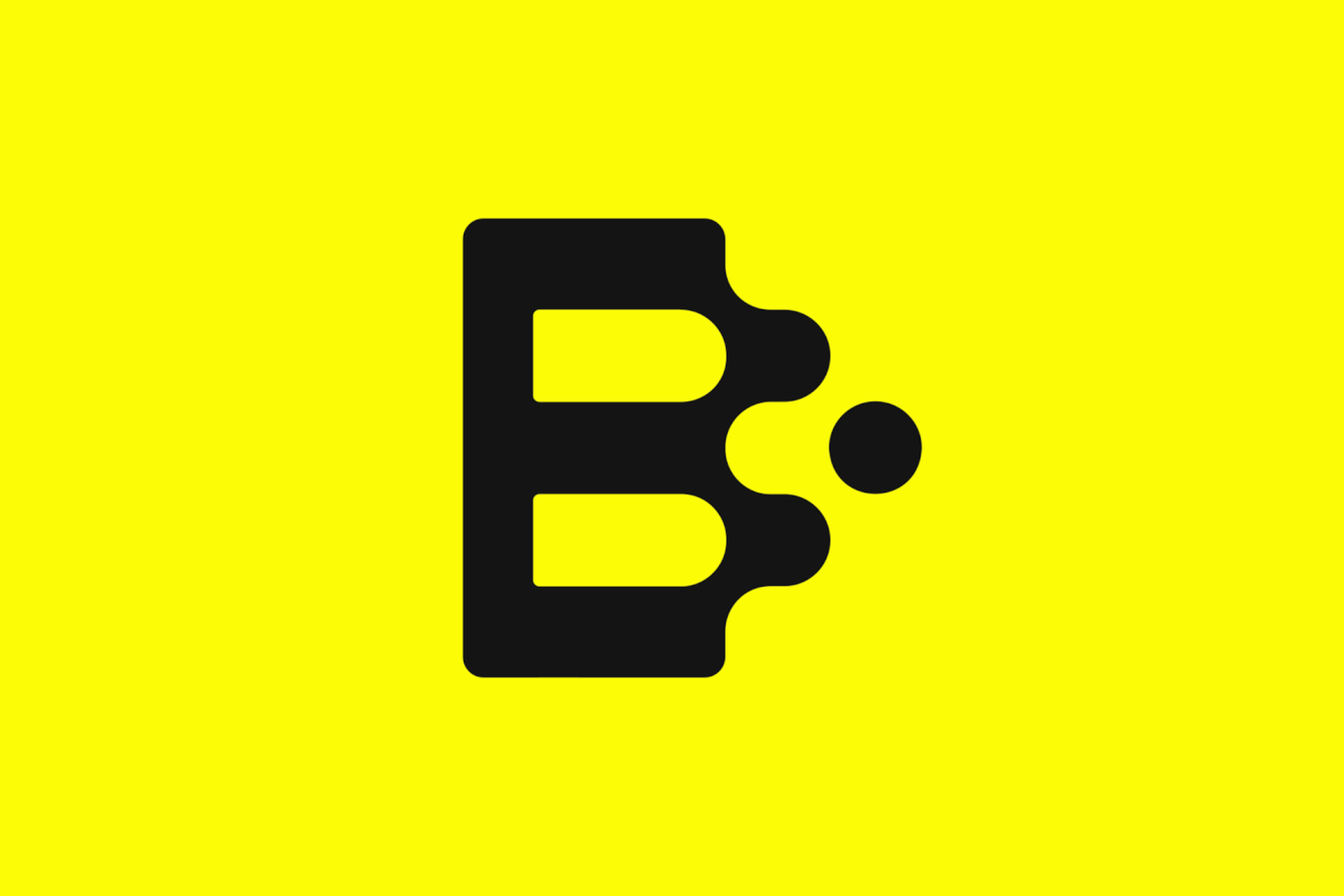
By taking Beatgrid’s process to heart, we could make sure that the rather complex measurement technology could be represented in a simple very simple visual language.
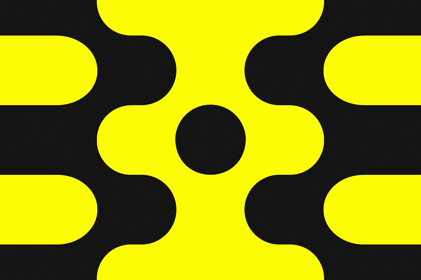
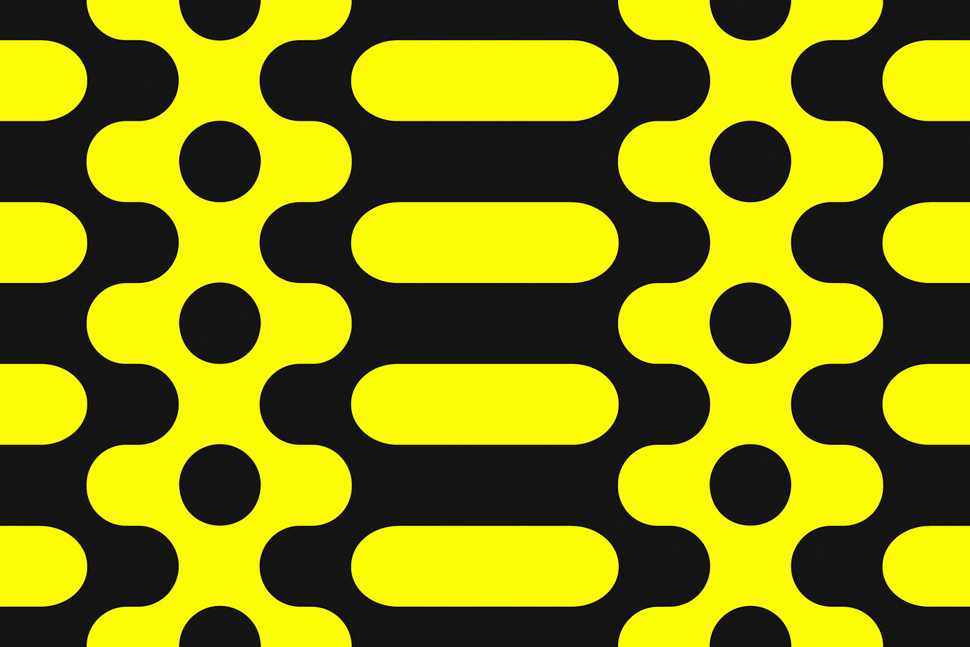
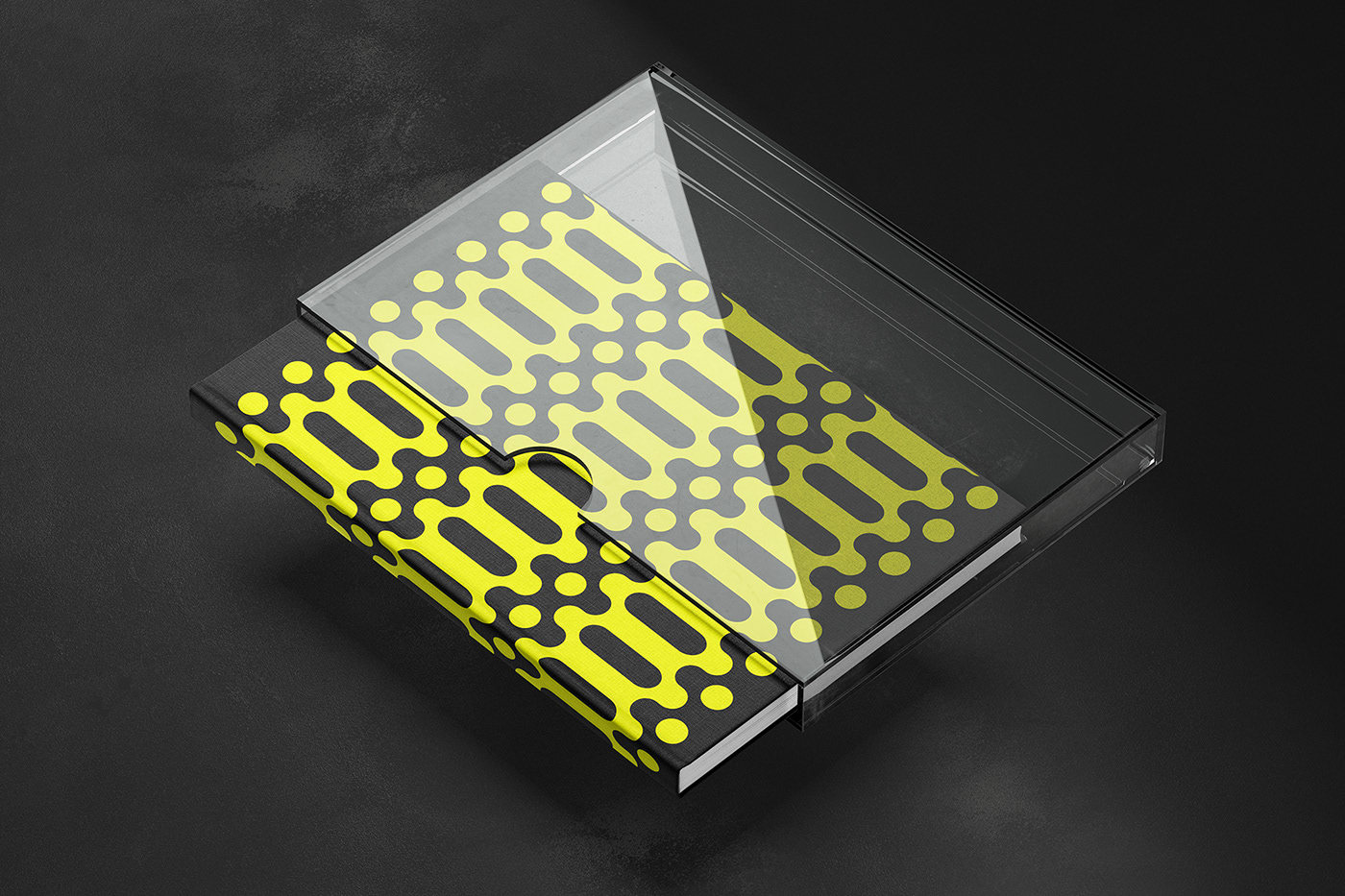
While the standalone icon itself is a play on connecting data, it can also play a part in never-ending modular patterns that can evolve into a larger brand identity language. These patterns are representing the nearly mechanical approach that Beatgrid has to their audience measurement studies. The distinct and unique shapes of the new Beatgrid logotype are emphasized through a stark yellow color that connects back to the contrast of what Beatgrid can provide in comparison to the competition.
Client: Beatgrid
Design and Art Direction: Erik Herrström
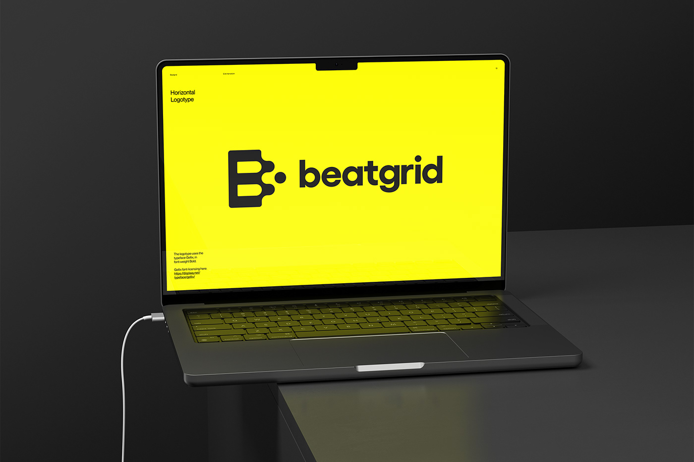
Typography: Gellix by Displaay