
Wink
-
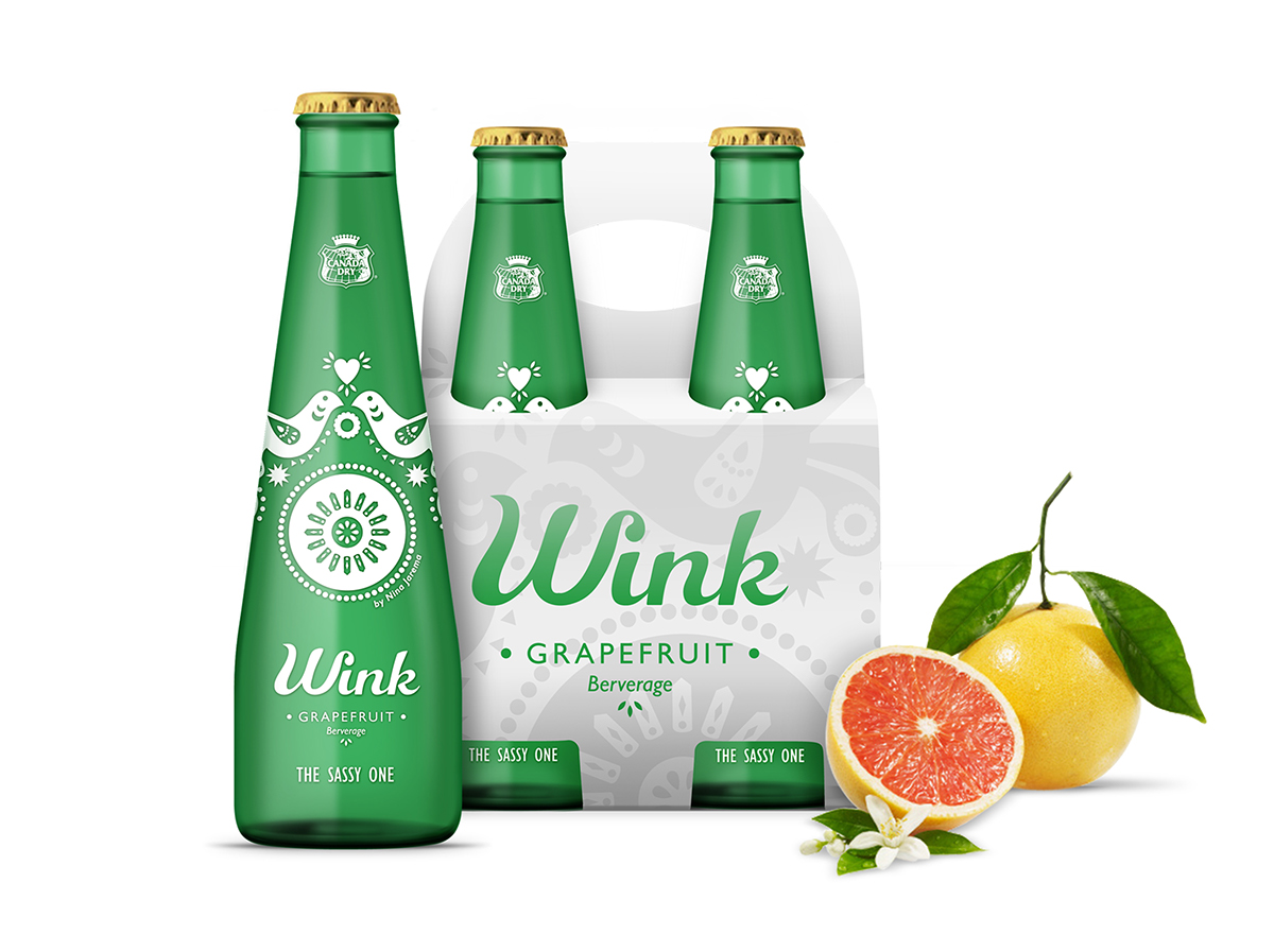
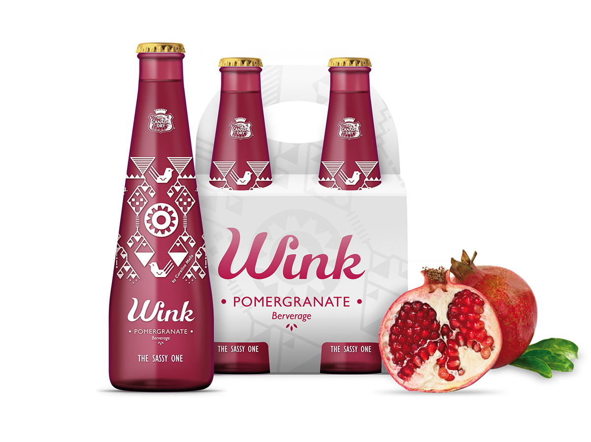
Wink was a grapefruit soft drink from the 60´s focused on feminine consumers, a brand of Canada Dry.
This project’s objective was to restyle the brand’s identity and the packaging design for a hypothetical reintroduction into the actual soft drink’s market. Furhermore, more flavors and formats would be included to make the range wider.
It was important to highlight the feminine and sophisticated character of the brand and also make its sassy personality stand out.
The process started with the structural design, the bottle must have a more stylized and feminine design, but maintaining the brand’s green color (only for the grapefruit flavor).
The logotype was redesigned using a playful and cheerful font as a base. A subtle “wink” was included between the logo W and i letters to empathize the brand name.
Illustrations were chosen as the best way to show the sophisticated and actual character of the drink. The range includes illustrations from three different artists.
In addition to the bottles, the project includes the design of the cans and the group packs.


Subject: Consumer Packaged Goods.
Workshop tutored by: Francesc Ribot.
Master of Packaging Design in Elisava School, Barcelona.
Master of Packaging Design in Elisava School, Barcelona.


