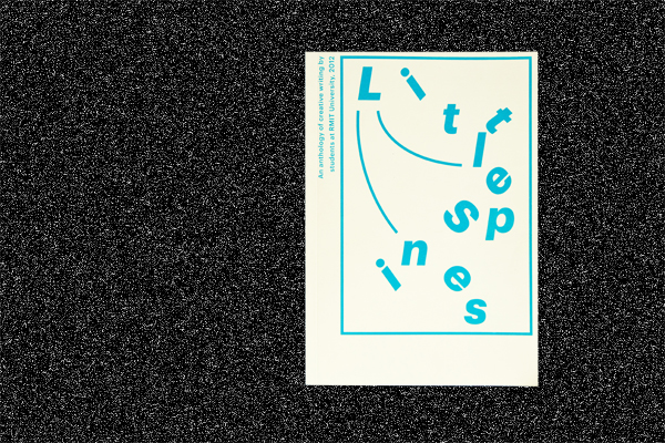
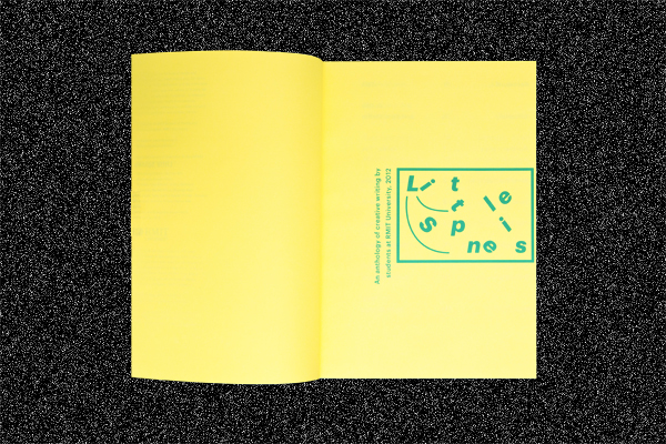
This is a design for a creative writing anthology. The most important part of this project was ensuring the focal point was the content. The type dominates the book.
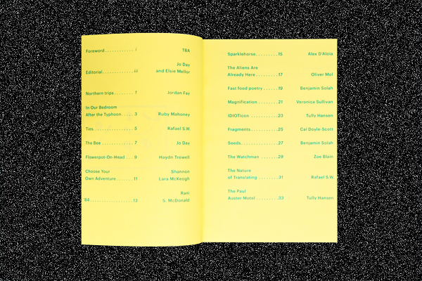
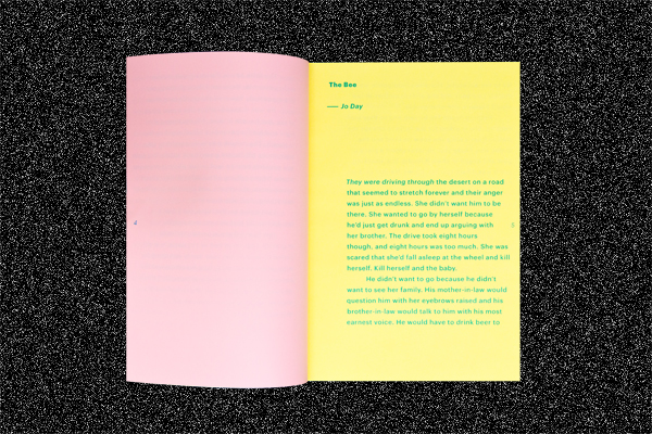
The large type makes the book easy to read and the tight margins reduce the page count, making it cheaper to produce. The page number is in the centre of the page in order to give your thumbs a place to rest while you read the book without obscuring the text.
Everything is printed in a single spot colour to reduce cost, but because it is a translucent colour, you get a different colour on each paper stock. The changing paper stock is also used to define when one story ends and another begins.