Not your average architecture studio
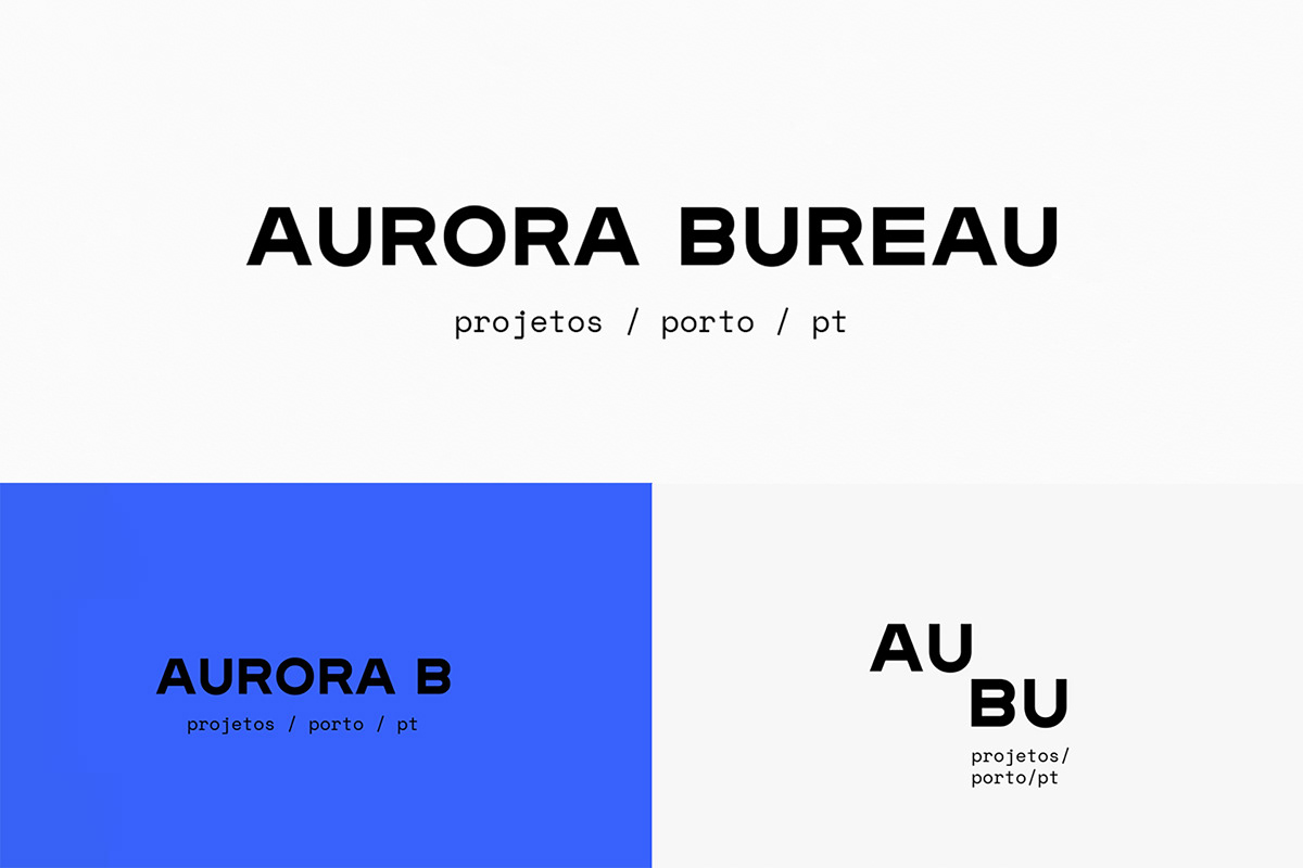
Aurora Bureau
Aurora Bureau is a porto based architecture practice, formed by Francisco Ascensão, José Luís Tavares and Patrícia Morais.
Unlike most practices, their work is full of colour, contrasting materials and unusual perspectives. On our first meetings it was clear each member had different perspectives on their own practice and work, but there was a common understanding — they did not identify with the traditional black & white modernist branding.
Based on this, a circle was defined as the main element of the branding, being that it symbolises an openness and collaborative approach. At the same time, and because there are three minds behind each project, the circle took three different approaches, one to be used by each architect. With this in mind, we created a flexible identity system that serves the primary objectives: flexibility, clarity and originality.
CLIENT
Aurora Bureau
AREA
Branding, Graphic Design
PROJECT'S PHOTOGRAPHY
Aurora Bureau