

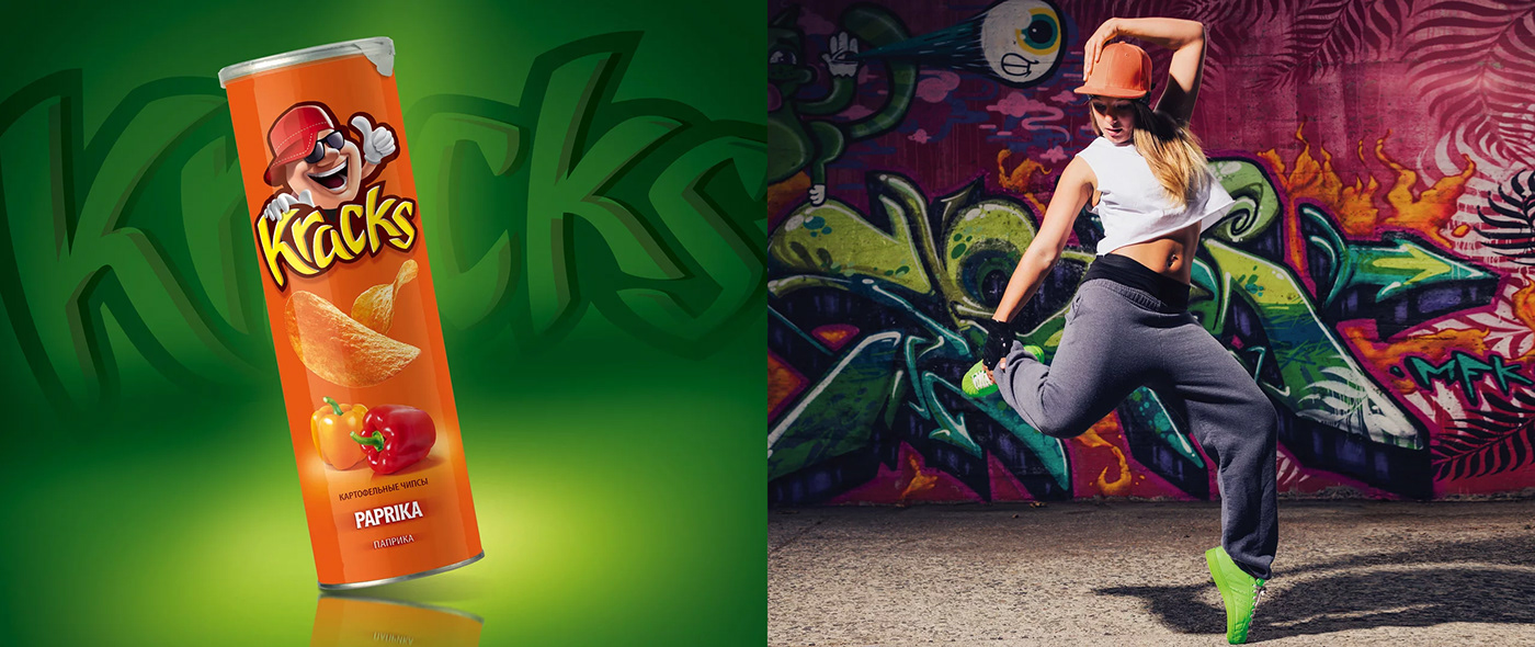
KRACKS
Brand: Kracks Client: Food Empire
Restyling of the logo, character, food style design and packaging of chips for the company-a world leader in the prodRestyling of the logo, character, food styling and packaging design of chips for the company - the world leader in the production and sale of instant drinks, frozen pre-packaged products, confectionery and snacks. The corporation's products are exported to more than 60 countries. Uction and sale of instant drinks, frozen semi-finished products, confectionery and snacks.

Task
The agency's task was to update the packaging in order to consolidate the brand's success on the market. The updated design had to meet the latest trends, look stylish and attractive for the brand's consumers, and easily fit into the lifestyle of the customers. It was also important to improve the differentiation of different products, stand-out from competitors and to raise the perceived brand value in the eyes of buyers.
Solution
To solve this problem, the agency carried out an evolutionary restyling of the packaging. The reworked logo, character and product are enhanced by a large mouth-watering and informative food style that makes you want to instantly taste the brand's products. Colour code of packaging, simplistic design and accented logo block attract attention and have a positive effect on the company's sales.

Photography
A professional advertising image is designed to aesthetically and functionally present the brand's products. In the photography, warm sunlight was used, appetizingly illuminating the edges of the product, making you want to buy and taste the chips directly at the outlet.

A clean background and bright colours of the brand charge the target audience with positive energy.
Product Line Differentiation
The packaging was divided into 3 parts: the brand area, the product area and the foodstyle. The product area and flavour text are perceived synergistically and help the consumer to more easily differentiate the taste and clearly identify the specific flavour of the product. This facilitates perception and affects both the conscious response and the subconscious reinforcement, positively affecting the speed of making a purchase decision.

Redesign Result
The combination of updated packaging elements and the addition of trendy style to the design increases the visual value of the brand in the eyes of the target audience and creates a sense of a bargain. The main attribute of the concept is taste. The simplistic design, the use of colour and an expressive product group reflect the lifestyle of the brand's audience.

Target Audience
The brand's buyers are young people under 30 who are easy-going, like to have fun with friends and lead an active life. They are always on the move and prefer a comfortable packaging format which it is pleasant to share with a group of friends.

"The main character of the concept, its art player is taste. The laconism of the design, the use of color bars and an expressive product group reflects the lifestyle of the brand's audience", - comments Arseniy Soldau


