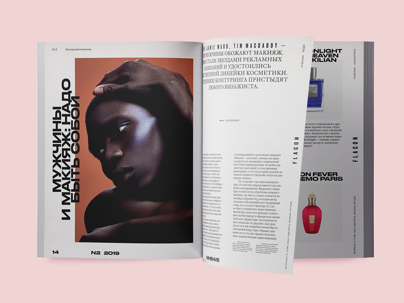
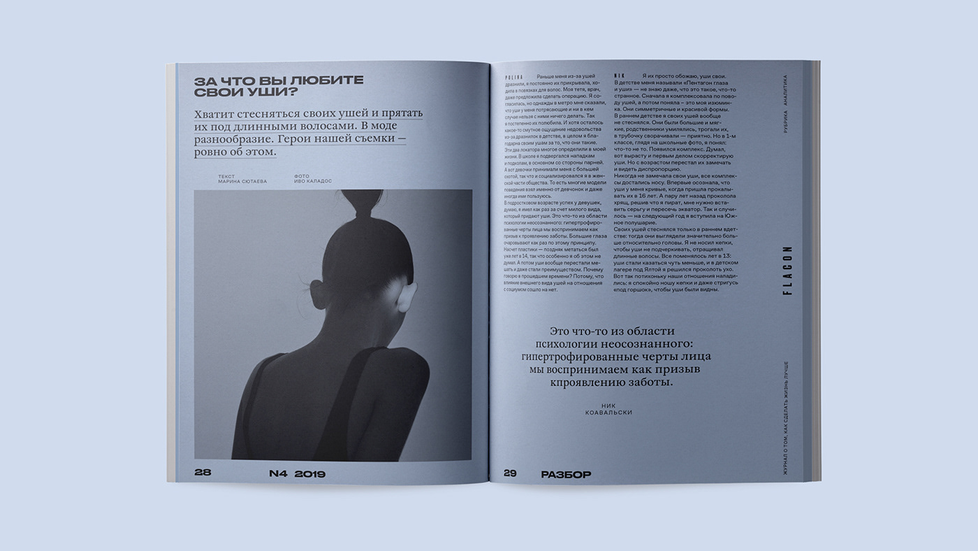
In the fall of 2018, the new Flacon magazine team, led by Alyona Doletskaya, decided on global changes in positioning and a partial transition to digital. Now Flacon is one of the true center of the Russian beauty industry, uniting bloggers, fashion gurus, content consumers and beauty brands to talk about beauty in all its manifestations. The changes concern the magazine’s visual content as well. The shoots are bold and unusual for our market, full of quirky concepts, rich colors, gender neutrality, interesting presentation and pictures with imperfections — and all of this can be found on the pages of today’s Flacon.

Our task was to develop a design concept for the magazine to complement and promote the new content. Testing cosmetics is an inspiring process itself. When a makeup artist experiments with textures or looks for that perfect color by waving a brush, you can find countless visual techniques that are perfect for styling a beauty magazine. Testing provides variability and the ability to mix colours and create new combinations. This concept can manifest itself in the form of unusual compositions and a mixture of typefaces.


In the world of beauty, one “judges a book by its cover”; therefore, the key touch point was the development of a compositional system for the magazine’s cover. The main attention was paid to the capital letter F, which could change texture: filled with varnish or velvet while printing, in either glossy or matte print. After all, quality, texture and tactile sensations are the first things you notice when testing cosmetics. Next to the letter we printed out the magazine’s full name, but we strive to ensure that the letter F would become an independently recognizable element of the logo.

Sometimes, you can just use patterns or one peculiar detail to make the cover brilliant. In digital we abandoned pure colors and used a smooth gradient as if it was a makeup line on a hand. In this way, we made the hovers on the site brighter and highlighted some text blocks in the printed version.


We offered a bold font solution: using Druk font in two weights (wide and super-narrow) for headings, and the transitional Antiqua William for text typing. The fonts give high flexibility to create interesting typographic compositions. Even at the level of typography, this contrasting combination has created a fresh and dynamic image.


As a result, the visual system of the magazine turned out daring but clean, balancing the bright glow of its endless stream of content. We developed the main style and all additional creative techniques in the magazine’s unique digital platform.


