

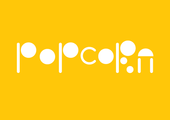
This is my first attempt at designing a modular alphabet. Named Popcorn, it is an abstract, display text inspired by the work of Philippe Apeloig. With its playful, bubbly personality, perhaps it could fit into a project for a younger audience.

This outlined version of the Popcorn typeface was in fact the final outcome for a long time, until I accidentally clicked the fill option on InDesign, which in the end I preferred.


Some examples of my development here, not including pencil work in the sketchbook.


When researching modular alphabets, I was particularly taken by the work of Philippe Apeloig. His Izocel and Abf Petit alphabets were particularly inspiring, taking note of the use of ascenders and descenders, and how he tackled the more problematic letters, such as S, R and Z, while still keeping to the modular rules.

