Ravi’s young, energetic, and has an up to date personality. It’s so charming that it could steal your attention on social media and causes crashes and death if used in outdoor advertising.
While designing the typeface, all I cared about was its legibility and readability, and I’m not exaggerating when I say I tested and edited it on print and web area in many different ways and scales for tens of times. Therefore, you can trust it to be used in long body texts, websites, catalogs, and magazines.
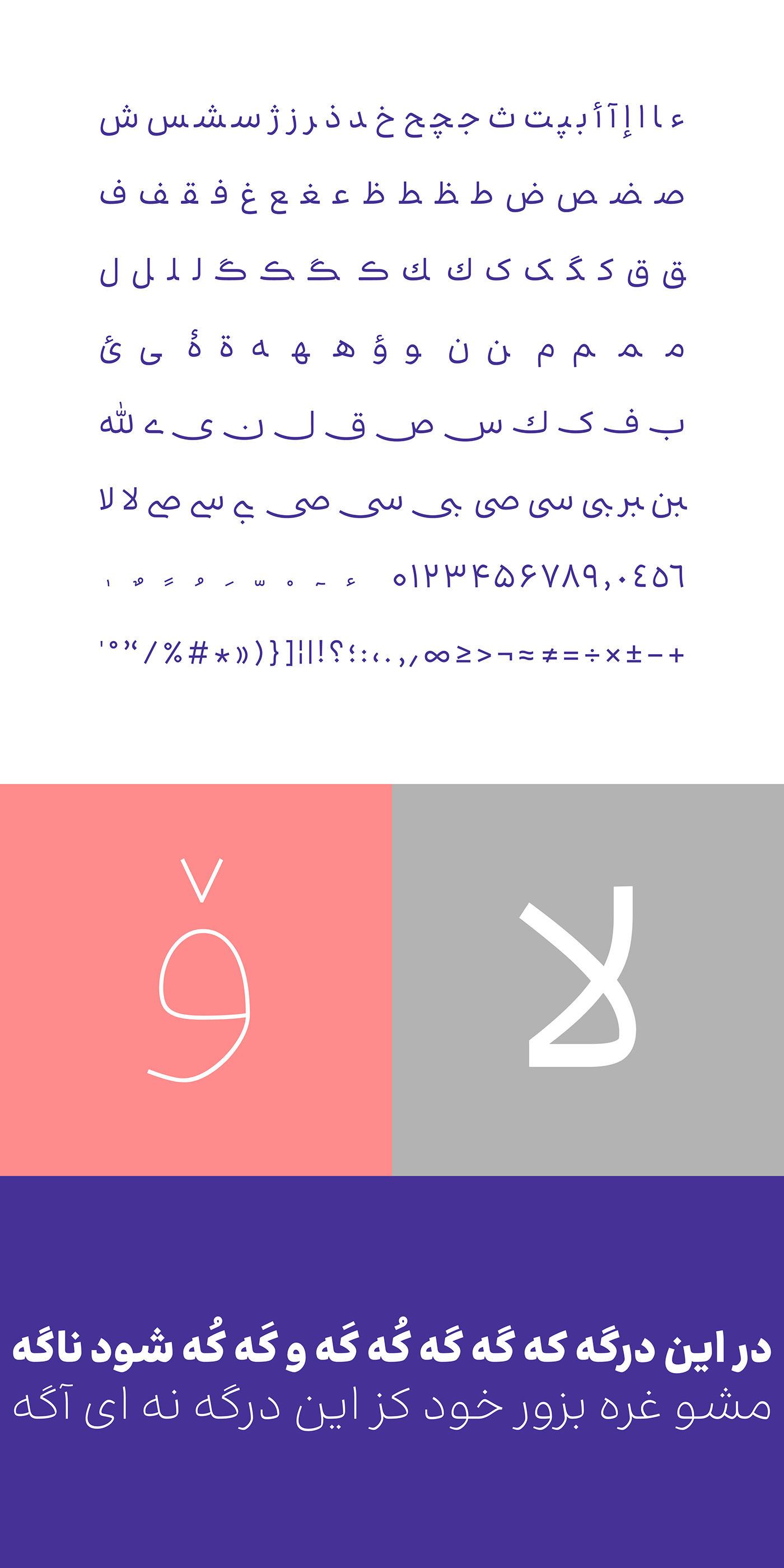
Ravi has short ascenders, small bowls, and a perfectly united structure, and is a good choice for UI designing. With tall teeth, big counters, and low contrast in thickness, it’s a good match for the Latin letters.
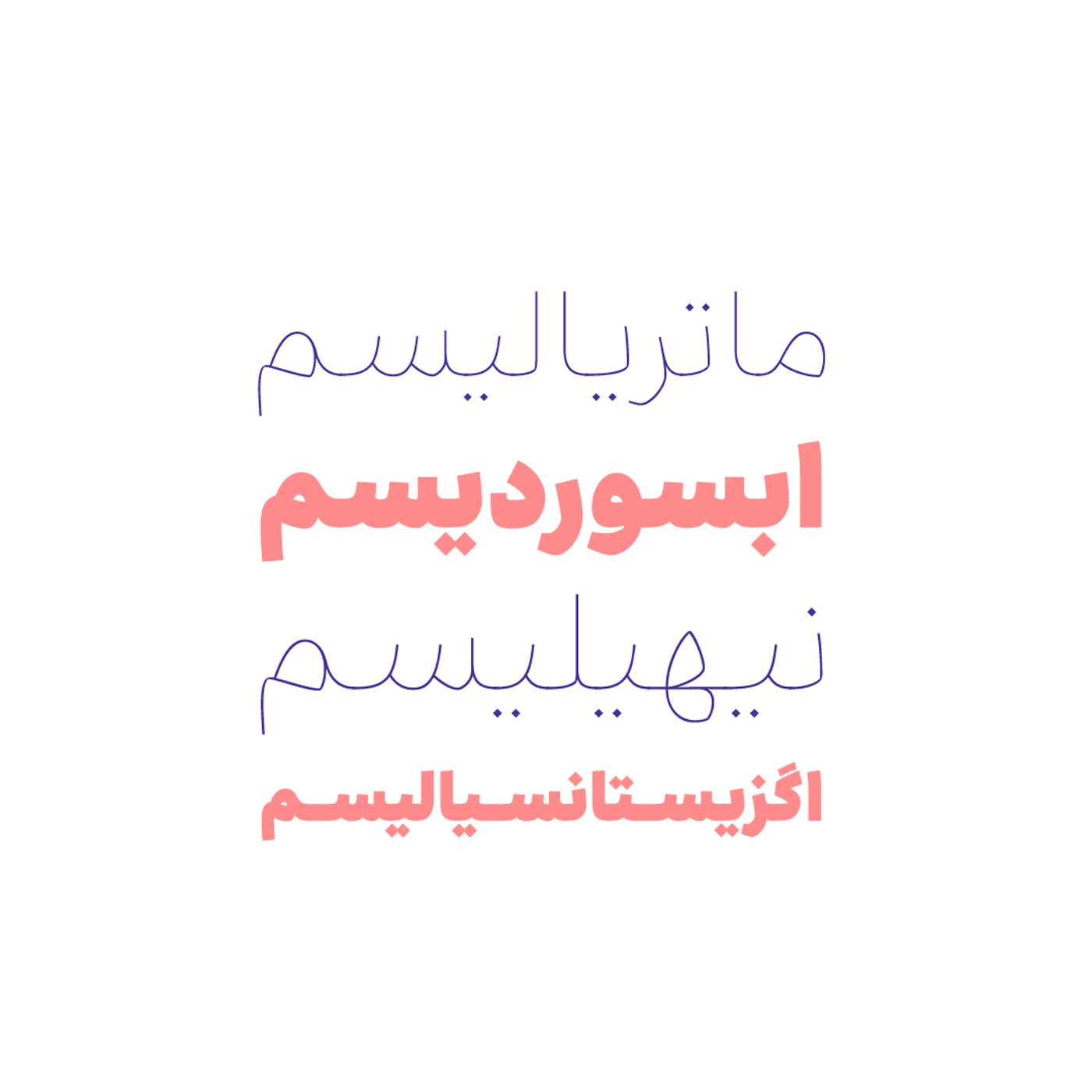
I started designing the typeface in 2010, on Designing Farsi Typeface course in Vije School, but edited and completed the characters and weights until 2013. In 2023, I completely updated the typeface. Ravi has eight weights and variable font.
*Ravi means teller
Ravi has achieved two honors:
• Second place in Eghtesad-e Novin Bank Typeface Design (Vije School 2012)
• First place in Silver Cypress (International Farsi Typeface Design Exhibition, text category) (Iranian Graphic Designers Society, 2013)
*any problem? contact Fontiran
راوی جوان و با انرژی است و شخصیتی بهروز دارد. با طنازیهای خاص خود میتواند در شبکههای اجتماعی نگاه شما را بدزدد و در تبلیغات محیطی باعث ایجاد تصادف و مرگومیر شود
هنگام دیزاین این تایپفیس دغدغهام خوانایی و روانخوانی بود و بدون اغراق دهها بار در فضای چاپی و وب به روشها و در اندازههای مختلف آن را آزمایش و اصلاح کردم. پس با خیال راحت میتوانید در متنهای طولانیِ وبسایت و کاتالوگ و مجله از آن استفاده کنید
راوی الفهای کوتاه، کاسههای کوچک و بدنهای منسجم دارد و برای طراحی UI انتخاب مناسبی است. با دندانههای بلند، چشمهای بزرگ و کنتراست ضخامت کم همنشین خوبی برای حروف لاتین است
طراحی این تایپفیس را در سال ۱۳۸۹ در دورهی «طراحی قلم فارسی» در مدرسهی ویژه آغاز کردم، اما اصلاح و تکمیل کاراکترها و وزنهای آن تا سال ۱۳۹۲ ادامه داشت. در سال ۱۴۰۲ نیز بهروزرسانی عمدهای روی فونت انجام دادم . راوی دارای ۸ وزن و نسخهی وریبل است
تا امروز، راوی ۲ افتخار کسب کرده است
جایگاه دوم مسابقهی طراحی فونت بانک اقتصاد نوین - مدرسهی ویژه - ۱۳۹۱
جایگاه اول سرو نقرهای (نمایشگاه بینالمللی طراحی حروف فارسی، بخش متن) - انجمن صنفی طراحان گرافیک - ۱۳۹۲