“Bonyade Koodak” is a friendly and simple font, it has a smile on its face and is hopeful. It is a cheerful and determined child who has big dreams in his head.
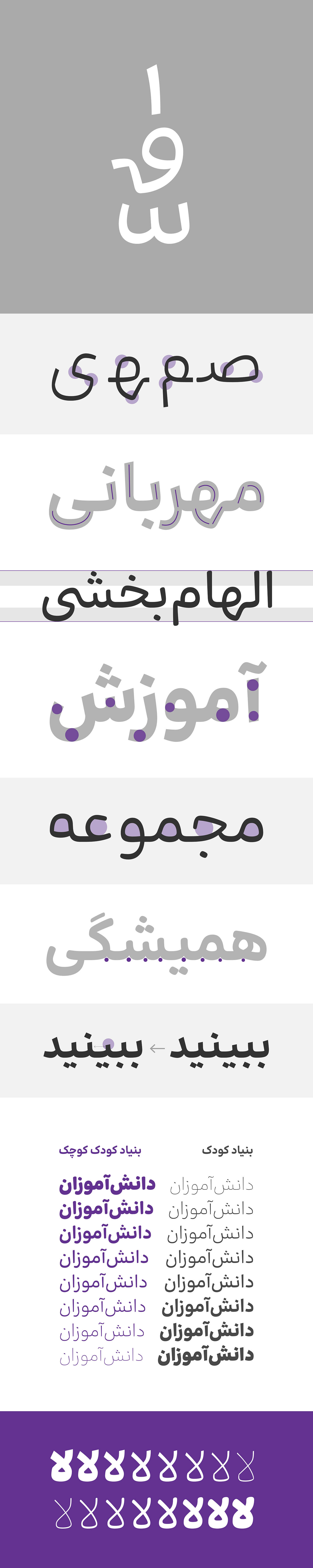
The forms of this font are simple and easy to read with relatively big eyes, clear teeth, and familiar proportions. In designing this font, a balance has been established between curved and flat forms; for this reason, it can cover a wide range, both in terms of subject and audience. The “Koochak” (means little) style of this font is more childish and sweeter. It is soft, delicious, and smiling. This font is usable and reliable in print, digital and environmental media. It does not lose its readability in long texts and it is charming in big headlines.
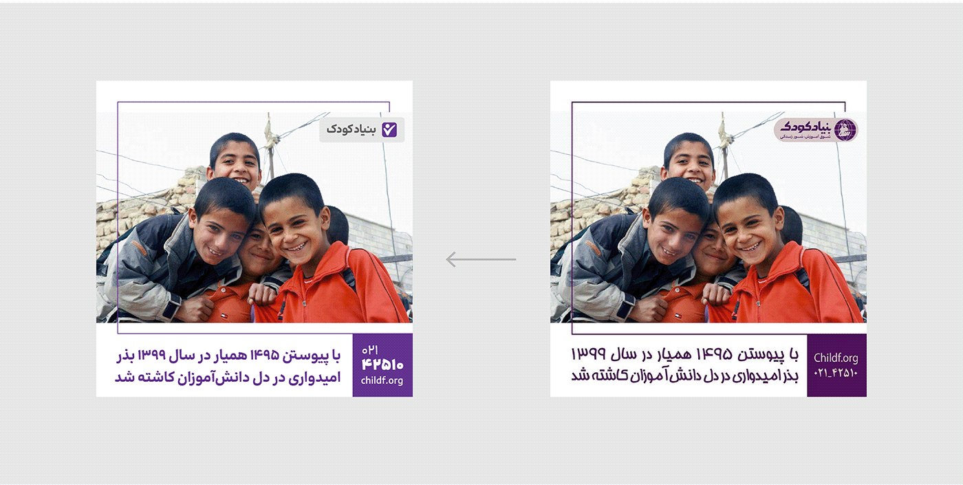
“Bonyade Koodak” (Child Foundation) is the name of an NGO that strives to meet the educational needs of underprivileged students with the help of donors and philanthropists. During the planning for rebranding, this institution needed a dedicated font to improve communication. the design team proudly went along with this movement In line with social responsibility and by taking advantage of their expertise.
By examining the data and information provided by the foundation, as well as developing ideas based on the main characteristics and distinctive features of the brand, we carried out the work of characterizing and designing font characters. While paying attention to “children” who are the reason for the existence of the foundation, “adults and philanthropists” as the main audience, and the “position and tone of the brand”, we came up with a suitable personality to meet the brand's needs. For example, we considered the degree of softness of the letters in such a way that it has a relationship with the name of the foundation, and at the same time it can be accepted by the audience. The design process was completed entirely in software.
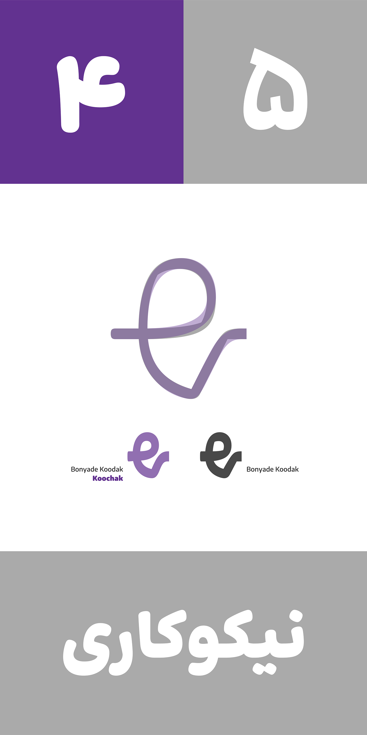
Now, in order to meet the needs of the students, the Bonyade Koodak has decided to publish its own font. The design team also went along with this decision and designed the “little” style and added it to the collection so that the font family is more comprehensive and practical for general supply and can cover more needs. With a softer body, fewer corners and rounded edges, Bonyade Koodak "Koochak" is the childish version of the font.
The Bonyade Koodak font was designed by Mahdi Ershadi and Reza Bakhtiarifard in 1401. This font has 8 weights, 2 styles, and a variable version. The income from the sale of the font belongs to the Foundation and the gifted students of this institution.
*if you haven't Iranian bank account, contact Fontiran
بنیادکودک فونتی خودمانی و بیآلایش است، لبخند بر لب دارد و امیدوار است. کودکی خوشدل و مصمم است که آرزوهای بزرگی در سر دارد
فرمهای این فونت ساده است و با داشتن چشمهای نسبتا بزرگ، دندانههای واضح و تناسبات آشنا، خواناست. در طراحی این فونت تعادلی بین فرمهای منحنی و صاف برقرار شده؛ به همین دلیل میتواند بازهی بزرگی را پوشش دهد، هم از نظر موضوع و هم از نظر گسترهی مخاطب. سبک «کوچک» این فونت کودکانهتر است و شیرینتر. نرم و خوشمزه و خندان است. این فونت در رسانههای چاپی، دیجیتال و محیطی قابل استفاده و قابل اعتماد است. در نوشتههای بلند خوانایی خود را از دست نمیدهد و در تیترهای بزرگ دلبری میکند
«بنیادکودک» نام مؤسسهای مردمنهاد است که با کمک نیکوکاران در تأمین نیازهای تحصیلی دانشآموزان کمبرخوردار تلاش میکند. این مؤسسه در خلال برنامهریزی برای ریبرندینگ، بهمنظور ارتباطات موثرتر، در اندیشه خلق فونت اختصاصی بود. به این ترتیب تیم طراحی در راستای مسئولیت اجتماعی و با تکیه بر تخصص خود با افتخار با این جریان همراه شد
با بررسی دادهها و اطلاعات ارائه شده از سوی بنیادکودک و ایدهپردازی بر اساس ویژگیهای اصلی و صفات بارز برند، کار شخصیتبخشی و طراحی کاراکترهای فونت را پیش بردیم. ضمن توجه به «کودکان» که دلیل وجود بنیادکودکاند، «بزرگسال و نیکوکاران» بهعنوان مخاطبان اصلی و «جایگاه و لحن برند» به تعریف شخصیت متناسبی رسیدیم تا جوابگوی نیاز برند باشد. بهطور مثال میزان نرمی حروف را بهگونهای در نظر گرفتیم تا نسبتی با نام بنیادکودک داشته باشد و در عین حال بتواند در نظر مخاطبان پذیرفته شود. فرآیند دیزاین تا اجرای این فونت بهطور کامل در نرمافزار انجام شد
اکنون بنیادکودک در راستای تأمین نیازهای دانشآموزان تصمیم گرفته فونت اختصاصی خود را به صورت عمومی منتشر کند. تیم طراحی نیز با این تصمیم همراه شد و سبک «کوچک» را طراحی کرد و به مجموعه افزود تا خانوادهی فونت برای عرضهی عمومی جامعتر و کاربردیتر باشد و بتواند نیازهای بیشتری را پوشش دهد. بنیادکودکِ «کوچک» با بدنهی نرمتر، شکستگیهای کمتر و لبههای گرد، نسخهی کودکانهی فونت است
فونت بنیادکودک توسط مهدی ارشادی و رضا بختیاریفرد در سال ۱۴۰۱ طراحی شده است. این فونت دارای ۸ وزن، ۲ سبک و نسخهی وریبل است
بنیاد کودک را میتوانید از فونتایران بخرید
کل درآمد حاصل از فروش فونت متعلق به بنیادکودک و دانشآموزان بااستعداد کمبرخوردار بورسیهی این موسسه است
کل درآمد حاصل از فروش فونت متعلق به بنیادکودک و دانشآموزان بااستعداد کمبرخوردار بورسیهی این موسسه است