Doran’s creation started with Freshte’s idea: designing a unique typeface for using in fashion industry.
We started the project with studying the scripts and we chose Thuluth to get inspired by. Thuluth is attractive and bold, like fashion. We started with designing the ExtraBold weight.
We started the project with studying the scripts and we chose Thuluth to get inspired by. Thuluth is attractive and bold, like fashion. We started with designing the ExtraBold weight.
A sense of Nastaligh and culture gradually appeared in the typeface, maybe unconsciously.
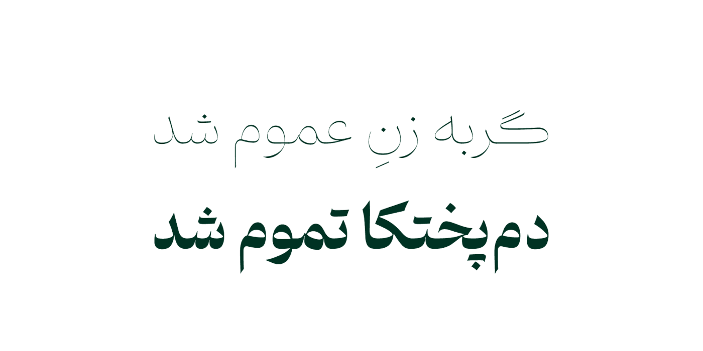
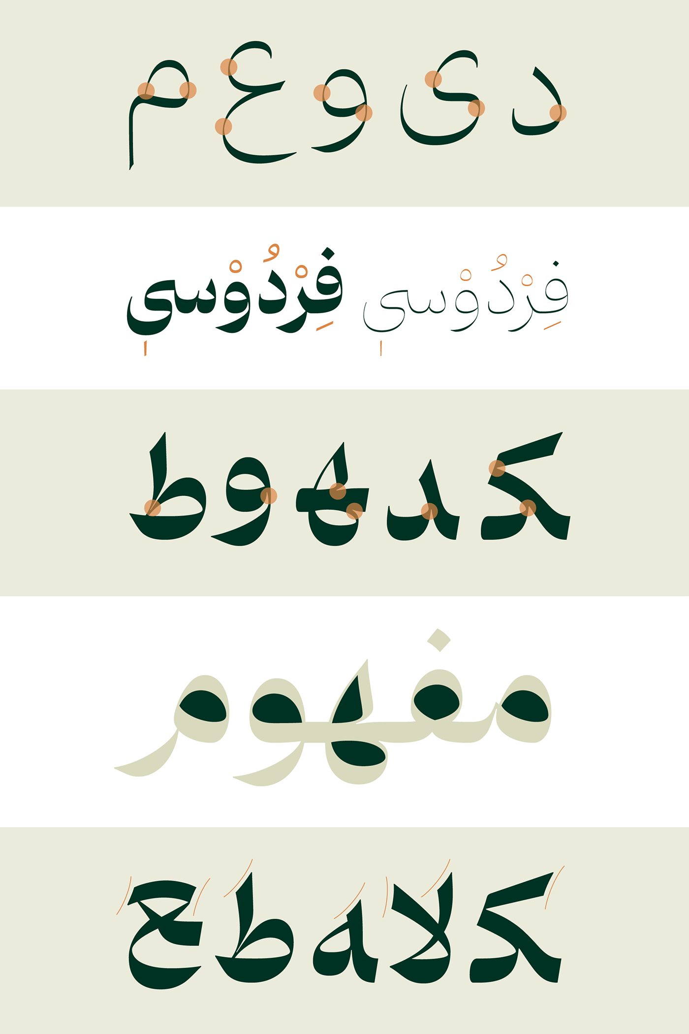
Doran is a kind, yet serious typeface. There are a lot of curves, and it takes time to find a single straight stroke. The joints are mostly smooth and without angles but they are designed with sharp edges. These features plus the high contrast in form’s thickness, made the typeface delicate and charming, and it shows of in the titles.
Doran has a classic taste and modern manner;
If it’s a person, it’s middle aged, it has passed the youth, maybe it’s fifty,
If it’s a car it’s a Mercedes,
If it’s music, Iranian instruments could be heard;
If it’s a person, it’s middle aged, it has passed the youth, maybe it’s fifty,
If it’s a car it’s a Mercedes,
If it’s music, Iranian instruments could be heard;
This typeface fits well next to classic and high contrast Latin typefaces, and can meet the designer’s need in this area.
Fereshte Iranshahi and Reza Bakhtiarifard designed Doran typeface in 6 weights in 2019-2021.
Fereshte Iranshahi and Reza Bakhtiarifard designed Doran typeface in 6 weights in 2019-2021.
*Doran means Era
*any problem? contact Fontiran
خلق «دوران» با ایدهی فرشته شروع شد: طراحی فونتی متفاوت برای استفاده در حوزهی فشن
کار را با بررسی خطها شروع کردیم و خط ثلث را انتخاب کردیم تا از آن کمک بگیریم؛ ثلث دلربا و جسور است، مثل فشن. با طراحی وزن اکسترابولد شروع کردیم
رفتهرفته و آرام چاشنی فرهنگ و اثر نستعلیق هم در فونت نمایان شد، شاید ناخودآگاه
کار را با بررسی خطها شروع کردیم و خط ثلث را انتخاب کردیم تا از آن کمک بگیریم؛ ثلث دلربا و جسور است، مثل فشن. با طراحی وزن اکسترابولد شروع کردیم
رفتهرفته و آرام چاشنی فرهنگ و اثر نستعلیق هم در فونت نمایان شد، شاید ناخودآگاه
دوران فونتی جدی اما مهربان است. پر از منحنی است و برای پیدا کردن یک خط مستقیم، باید وقت بگذارید. مفصلها اغلب نرم و بدون شکستگیاند اما از آن طرف لبهها تیز طراحی شدهاند. این ویژگیها در کنار کنتراست ضخامت زیادِ فرمها باعث شده تا این فونت ظریف و دلربا باشد و در تیترها خودنمایی کند
دوران سلیقهای کلاسیک و رفتاری بهروز دارد؛
اگر شخصیت باشد میان سال است و از خامی های جوانی گذر کرده، شاید پنجاه ساله باشد؛
اگر اتومبیل باشد مرسدس بنز است؛
اگر موسیقی باشد سازهای ایرانی در آن به گوش میرسد؛
اگر شخصیت باشد میان سال است و از خامی های جوانی گذر کرده، شاید پنجاه ساله باشد؛
اگر اتومبیل باشد مرسدس بنز است؛
اگر موسیقی باشد سازهای ایرانی در آن به گوش میرسد؛
این فونت گزینهی مناسبی برای همنشینی در کنار فونت های لاتین کلاسیک و پرکنتراست است و میتواند نیاز طراحان را در این حوزه برطرف کند. تایپفیس دوران را فرشته ایرانشاهی و رضا بختیاری فرد در ۶ وزن در سال۱۳۹۸ تا ۱۴۰۰ طراحی کردند
Music: Farshad Karimpour, Motion Designer: Mobin Taheri