
Belladonna
Hotel & Restaurant Brand Identity
Ita
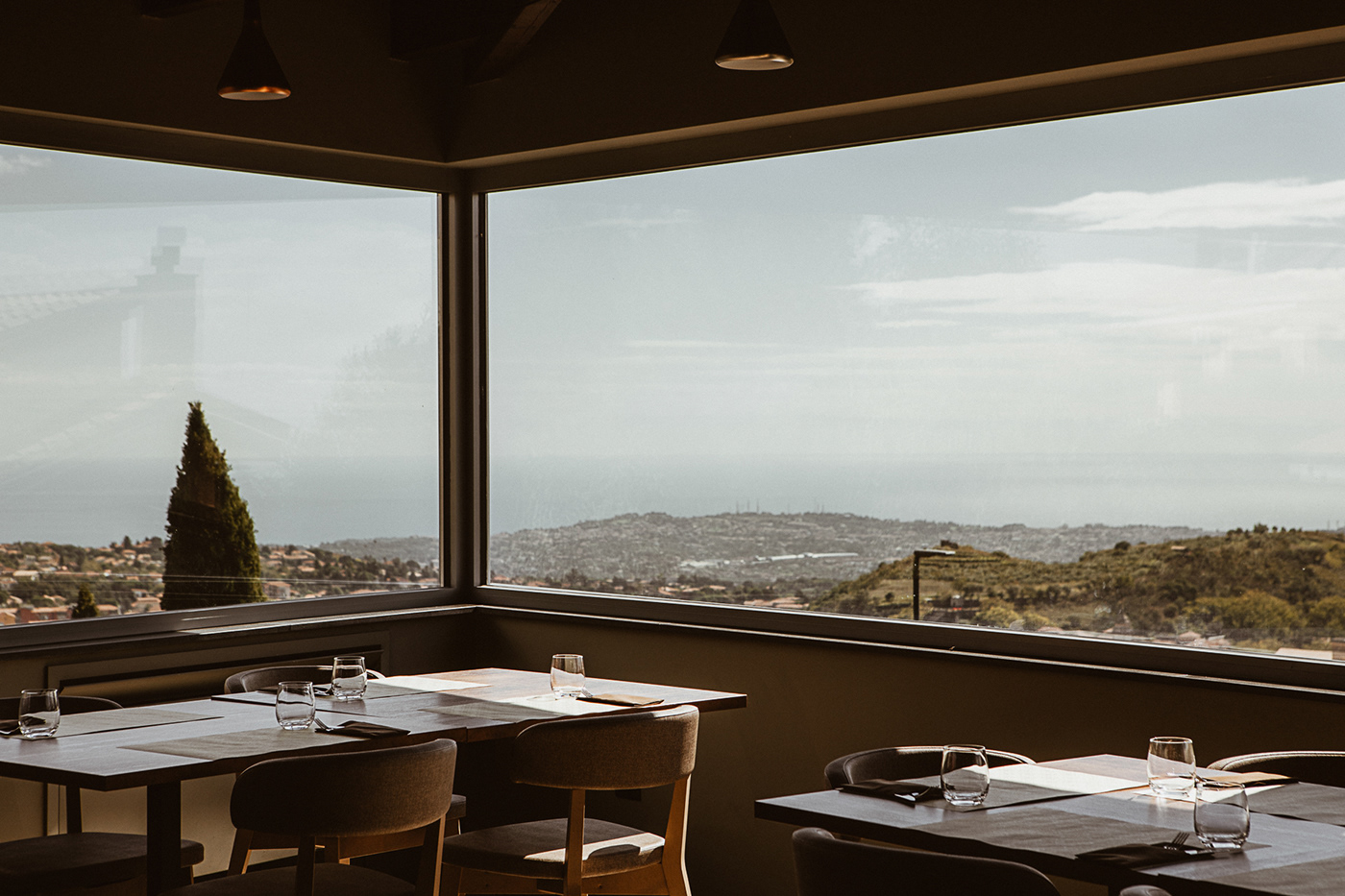
Il Belladonna è uno storico ristorante e hotel situato alle pendici dell’Etna. La famiglia gestisce l’azienda da oltre 40 anni, diventando nel tempo un’istituzione all’interno dell’hinterland. Ora la nuova generazione della famiglia è pronta a rinnovare la propria attività partendo da un marchio ed un’immagine aziendale totalmente aggiornata.
Eng
The Belladonna is a historic restaurant and hotel located on the slopes of Mount Etna. The family has been running the business for over 40 years, becoming over time an institution within the hinterland. Now the new generation of the family is ready to renew its activity starting from the brand identity.
What we do
The process
Ita
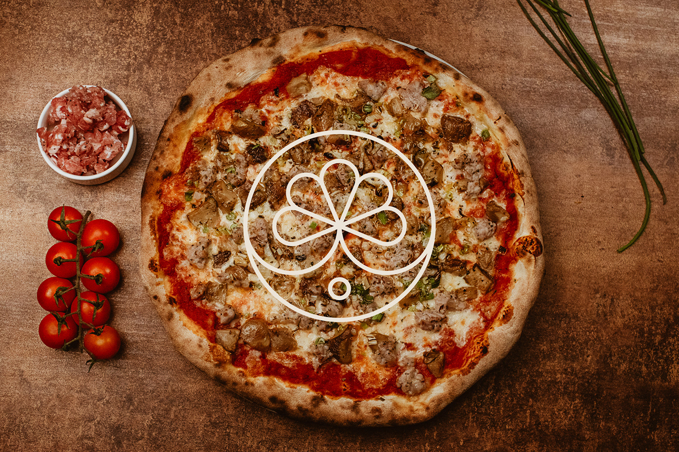
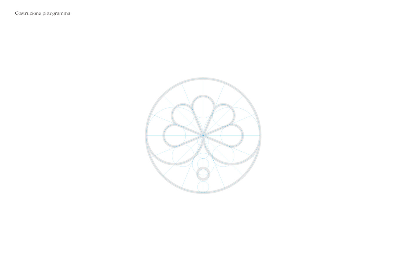
Abbiamo iniziato il processo di rebranding chiedendo alla famiglia e ad alcuni clienti di descrivere il Belladonna con parole chiave semplici che abbiamo poi analizzato e racchiuso in 5 diversi gruppi. Grazie a questa prima analisi siamo riusciti a capire meglio quali elementi ed emozioni dovevano essere trasmessi con la nuova identità. Il vecchio marchio rappresenta uno dei fiori tipici della zona e fu un dono di un artista locale. Il fiore del Belladonna è un simbolo ben riconosciuto dai clienti e non volevamo abbandonarlo. Abbiamo quindi progettato una nuova versione del fiore, più minimale ed elegante, adatta ai media digitali e facilmente riproducibile.
Eng
We started the rebranding process by asking the family and some customers to describe Belladonna with simple keywords that we then analyzed and enclosed in 5 different groups. Thanks to this first analysis we managed to better understand which elements and emotions we have to transmit with the new identity.
The old brand represents one of the typical flowers of the area and was a gift donated by a local artist. The Belladonna flower is a symbol well recognized by customers and we did not want to abandon it. We have designed a new version of the flower, more minimal and elegant, suitable for digital media and easily reproducible.


Color Palette
Colors from the territory
Ita
La palette di colori scelta esprime la nuova anima del Belladonna. Un’identità fresca, moderna e innovativa che rivolge lo sguardo alla tradizione e all’Etna. L'arancione e il verde rappresentano i due business dell’azienda. Il primo è un colore caldo ed energico proprio come la lava del vulcano, per tale motivo è stato scelto per la ristorazione. Per il business hospitality è stato scelto un colore più rilassante e naturale richiamante la flora dell’Etna. La scelta del nero continua il riferimento al territorio etneo ed in particolare alla pietra lavica, esprimendo luce e brillantezza. Infine, la scelta del tortora e del beige conferisce eleganza e prestigio all’identità.
Eng
The color palette chosen expresses the new soul of Belladonna. A fresh, modern and innovative identity based on tradition and the Etna territory. Orange and green represent the company's two businesses. The first is a warm and energetic color just like the lava of the volcano, for this reason it was chosen for the restaurant. A more relaxing and natural color has been chosen for the hospitality business, recalling the flora of Etna. The choice of black continues the reference to the Etna area and in particular to the lava stone, expressing light and brilliance. Finally, the choice of dove gray and ivory confers elegance and prestige to the identity.


Icon set
Developed for both restaurant and hotel


Menu
Restaurant printed menu


Digital content
Instagram feed


UX/UI and development
Restaurant website