


Fuller Brand Communication
Brand Identity, 2019
Brand Identity, 2019
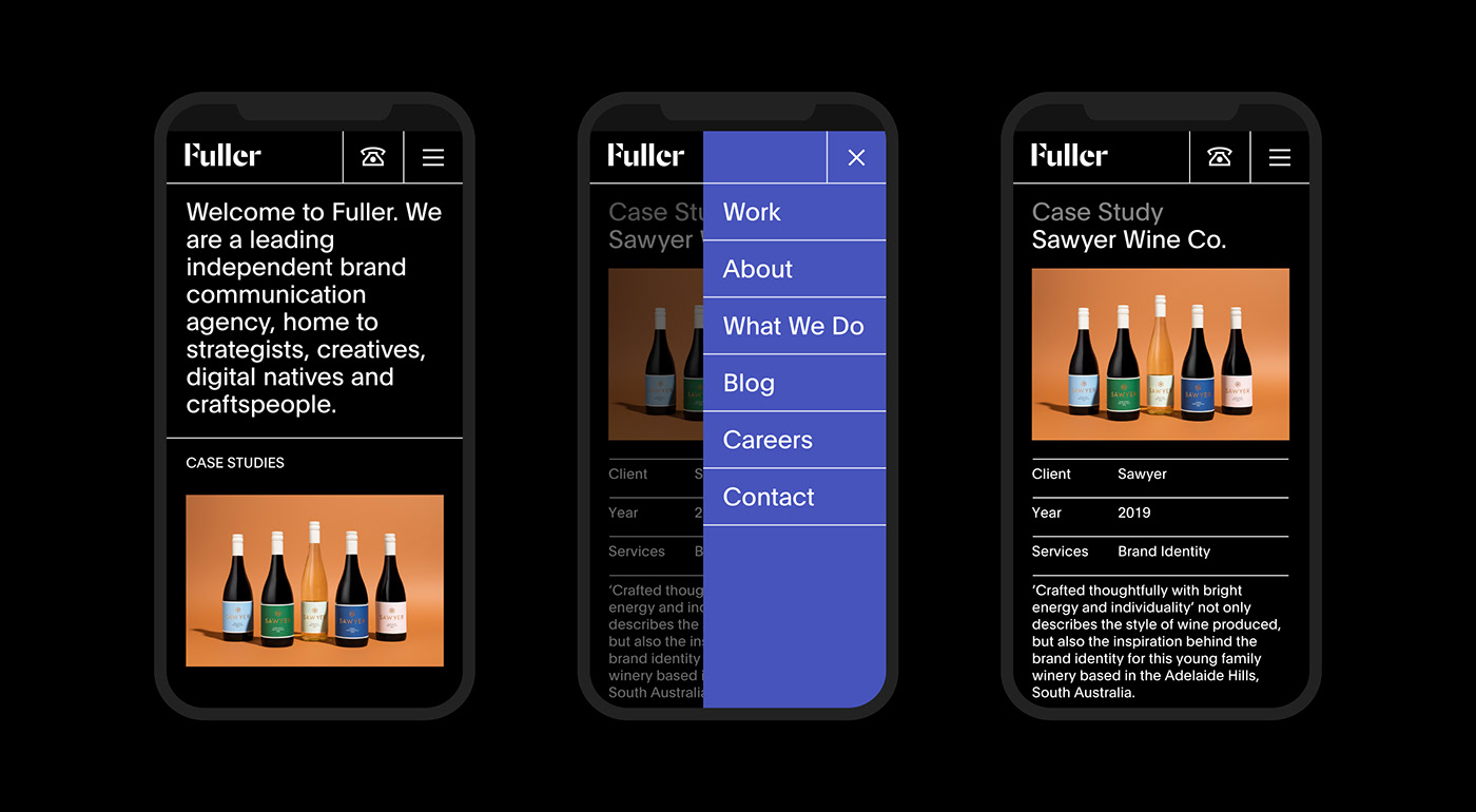
Fuller are a leading independent brand communication agency, home to strategists, creatives, digital natives and craftspeople. Eight years after their last rebrand, Fuller decided a fresh look with a restrained, timeless quality was needed.
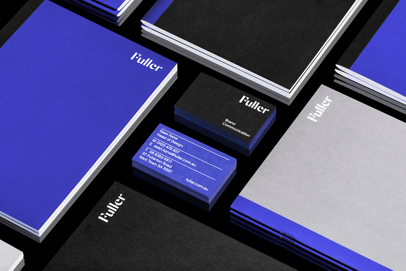
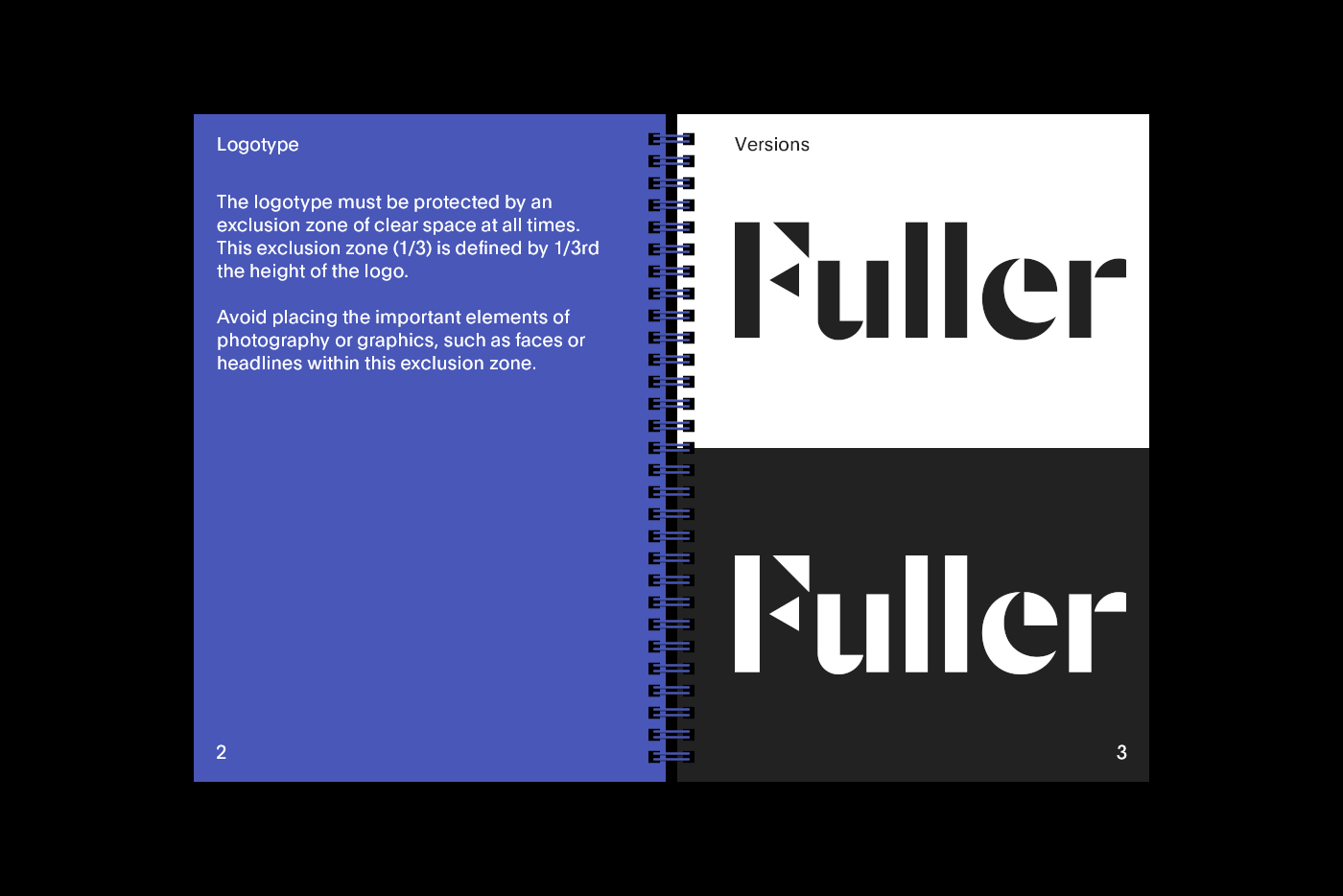
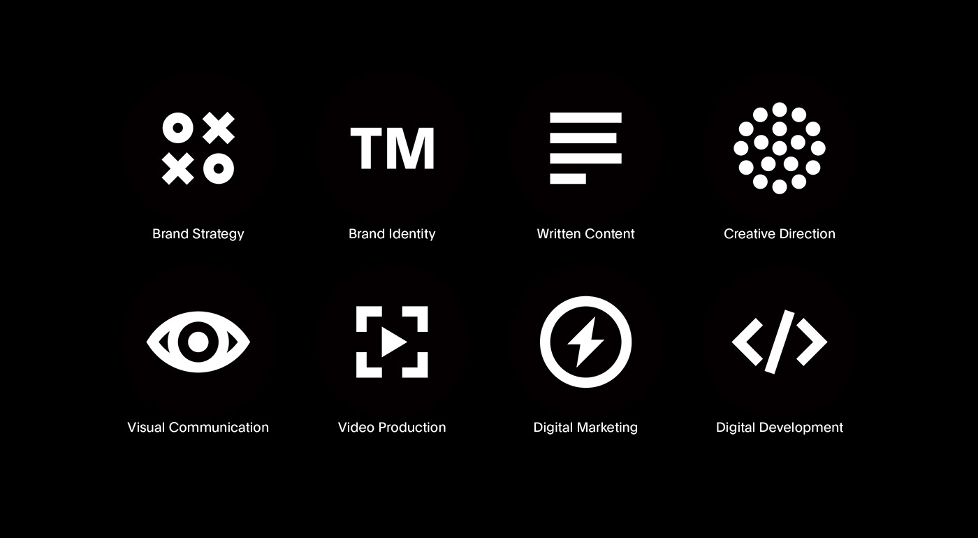
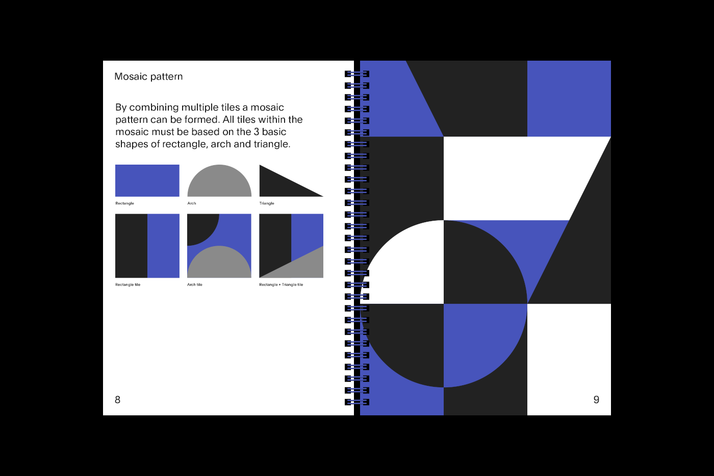
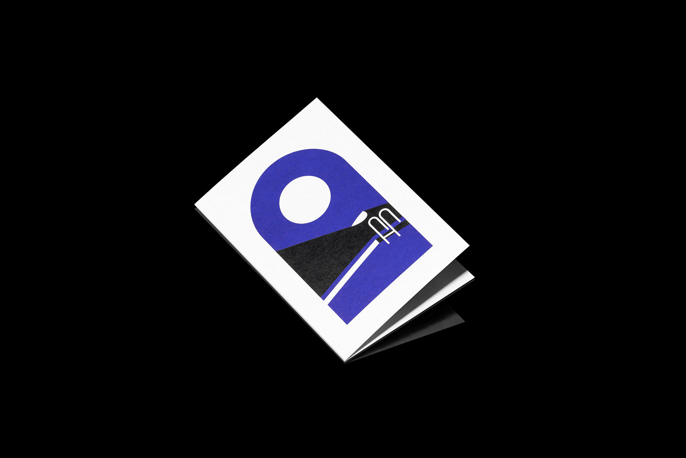
Through the confronting process of analysing their own brand, it was realised that the brand’s strength was in the parts that made Fuller whole — the history, family, staff and diverse range of clients. This concept is visually communicated in the arches, triangles and geometric shapes that combine to form the logotype.
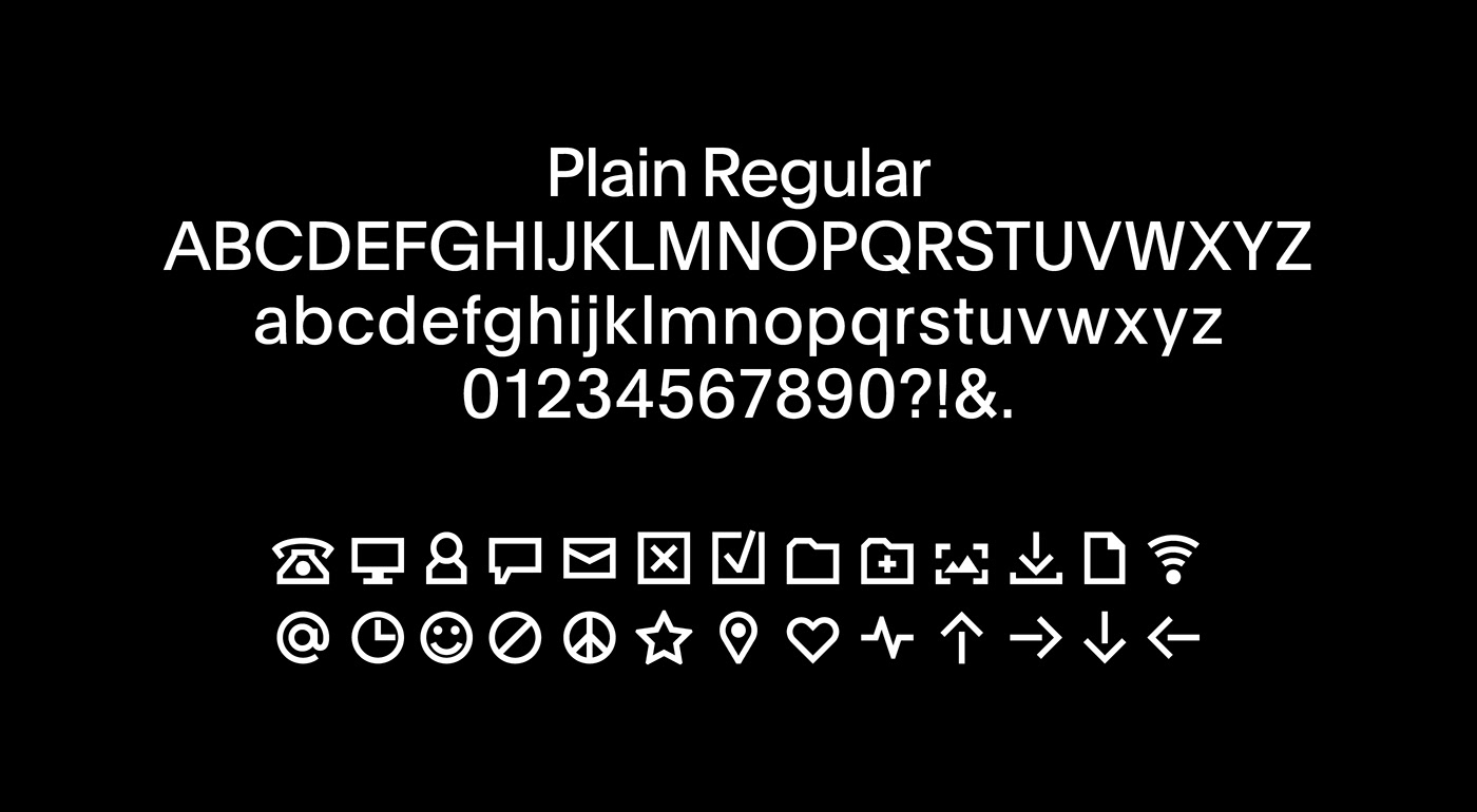
The colour palette reflects Fuller’s origins in writing and newsprint, with a bright indigo accent reminiscent of a blue biro breaking up the minimalistic black and white designs. To avoid flourish and transcend design trends ‘Plain’ by Optimo was selected as the primary typeface.
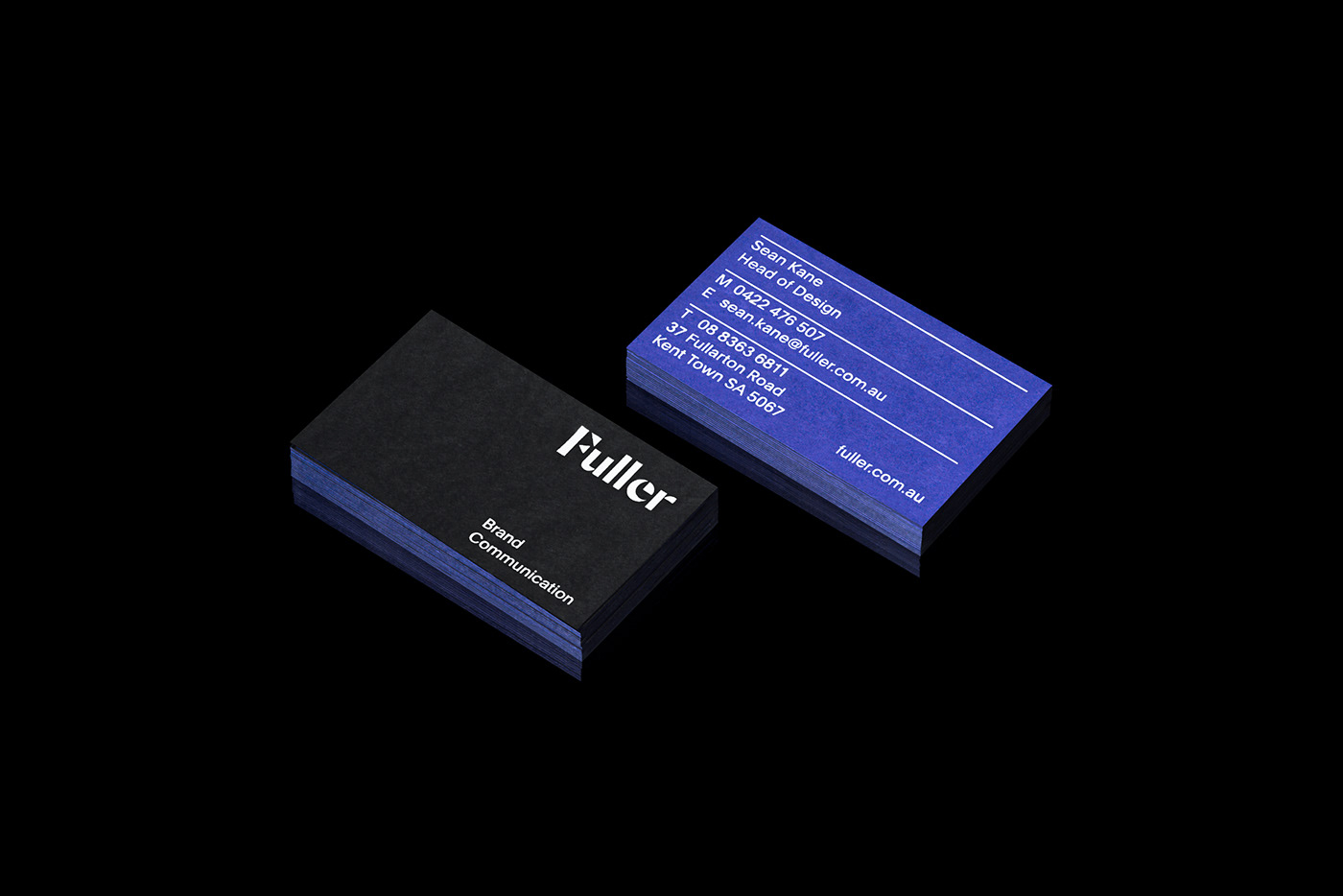


Business Cards
270gsm Colorplan Ebony
270gsm Colorplan Royal Blue
Duplexed
Notebooks
352gsm Neenah Solar White Stipple
Cards
350gsm Colorplan Pristine White
Graphic Design by Sean Kane
Card illustration by Millie Sander
Photography by Lightly Salted


