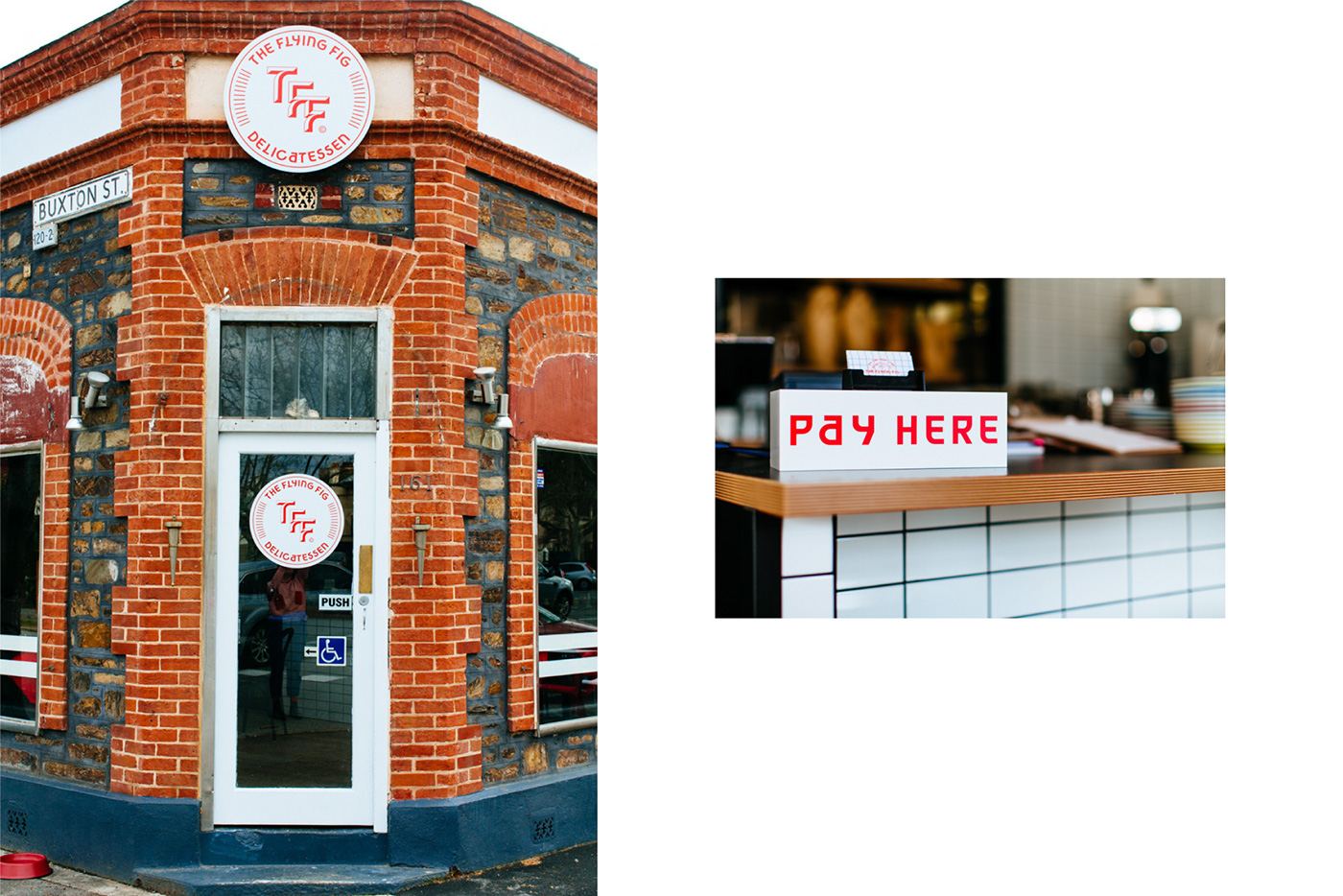
The Flying Fig Delicatessen
Identity, 2016
Identity, 2016
The Flying Fig is a New York Jewish style Delicatessen in North Adelaide. During 2016, I was asked to create the visual identity for the new venue.
The brief was to create a brand with a clean aesthetic that was mature and kept the Jewish, American and New York references to a minimum.
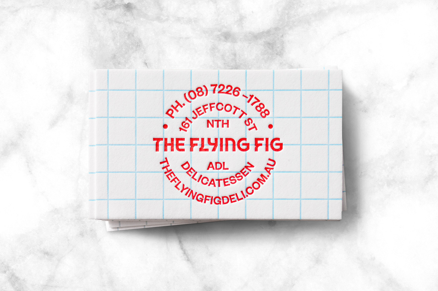
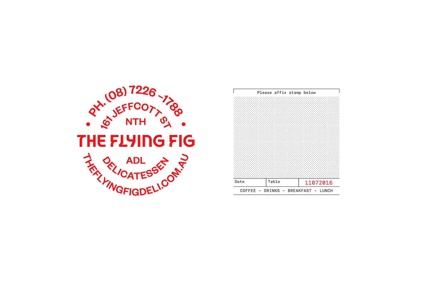
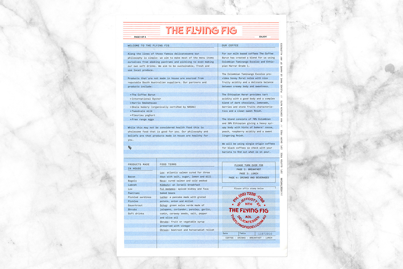
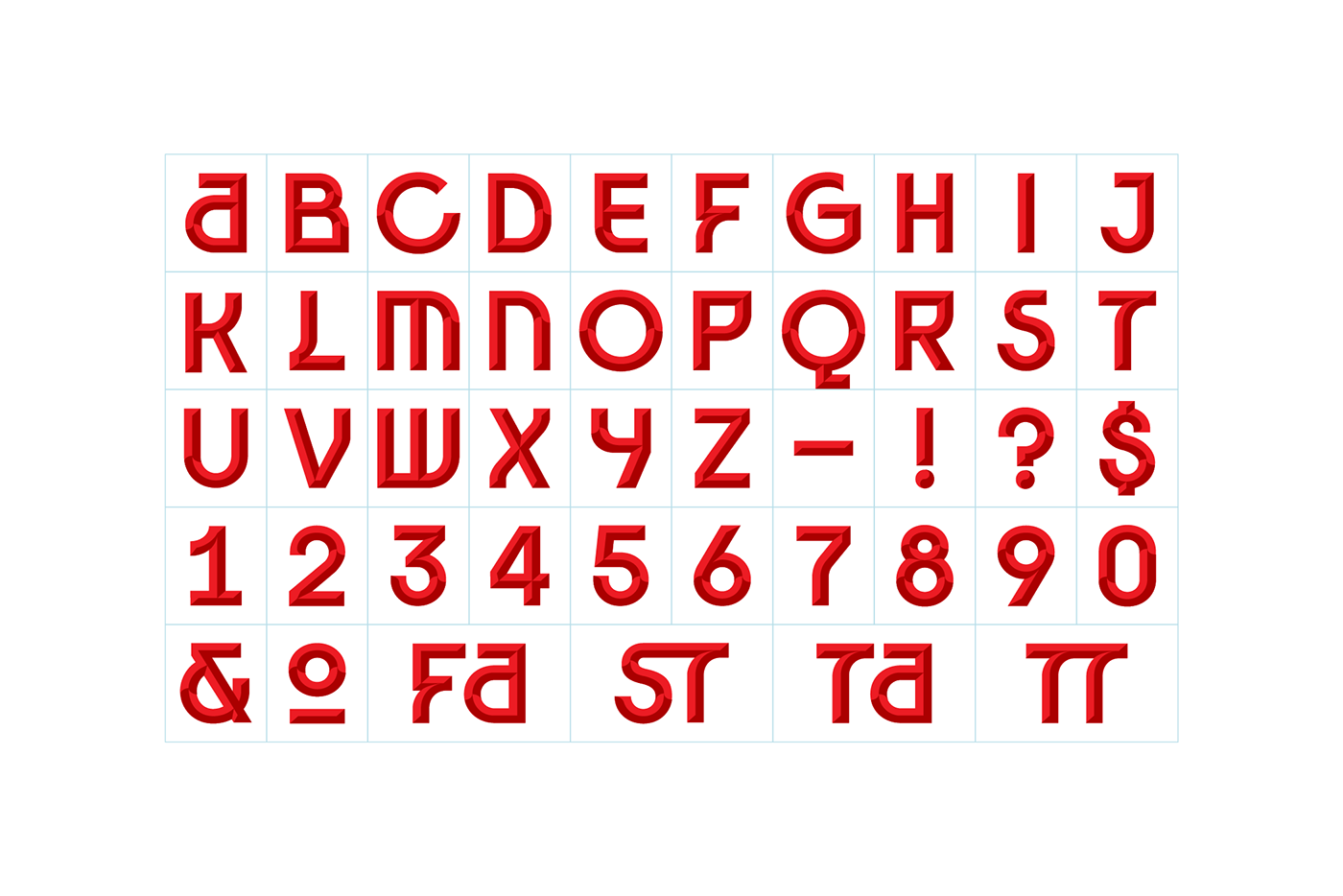
The solution involved creating a custom display typeface. The typeface ‘Pastrami’ took inspiration from the traditional Hebrew alphabet, resulting in a typeface which combines rounded curves with sharp corners.
The display typeface is juxtaposed by layouts that make generous use of white space and adhering to a strict grid system. Tactile print methods, such as Risograph, rubber stamps and letterpress were used to add warmth to the otherwise clean approach.
Business Cards: 450gsm Gmund Cotton
PMS Warm Red Letterpess, PMS 297 Letterpress
Menus: 100gsm Envirocare
Risograph Printed Base, Black toner overprint (with stamped address)
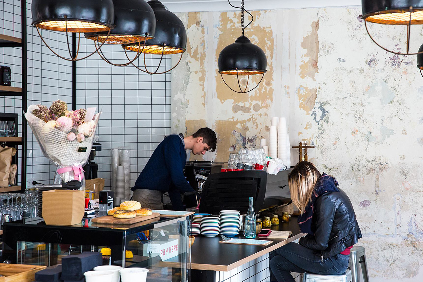
Interior Photograph: Josie Withers
Exterior Photograph: Jessica Clark