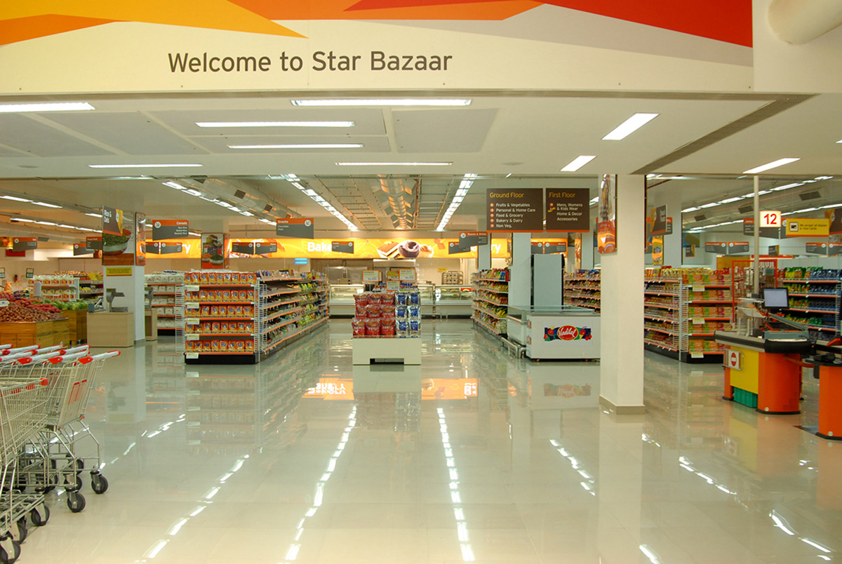
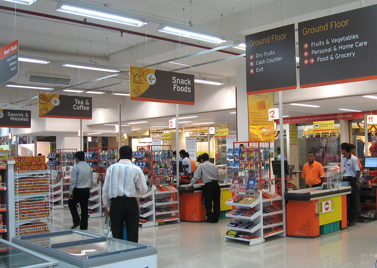
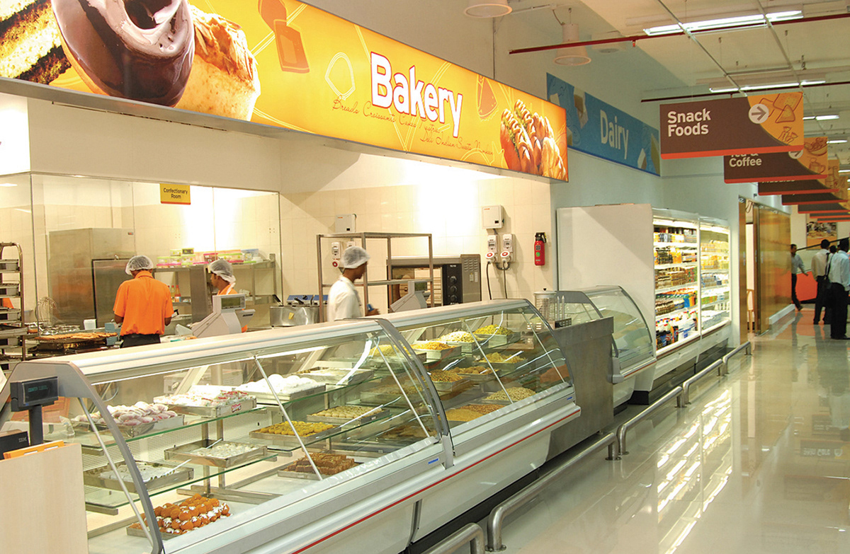
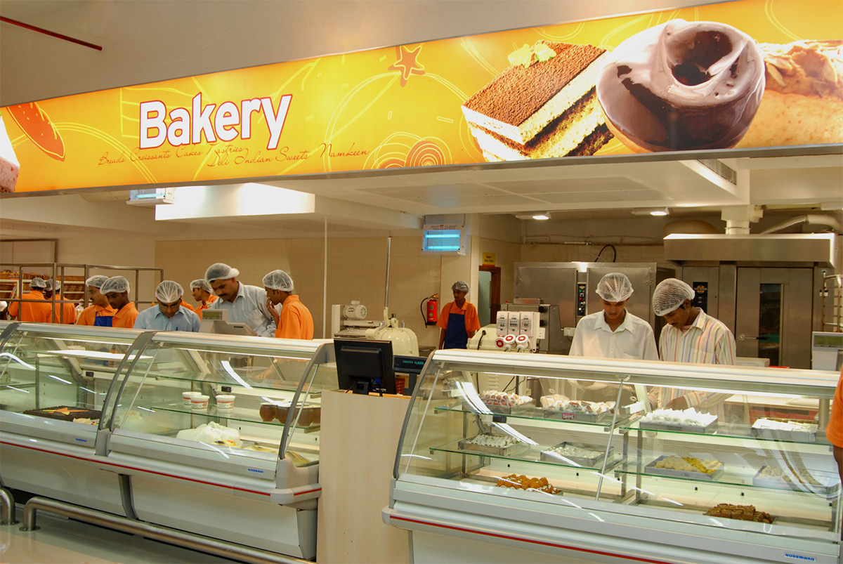
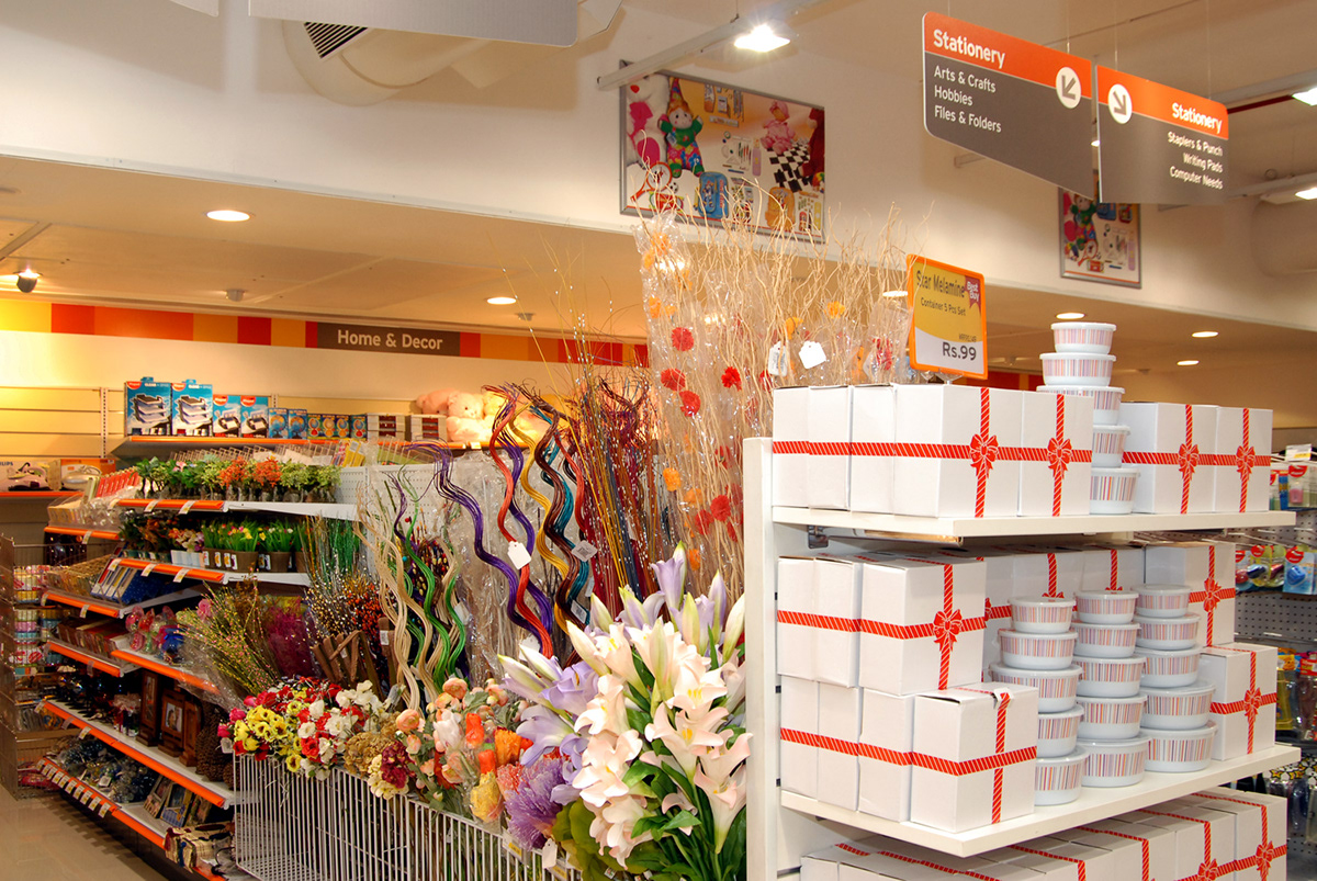
Tata Star Bazaar, Hypermarket
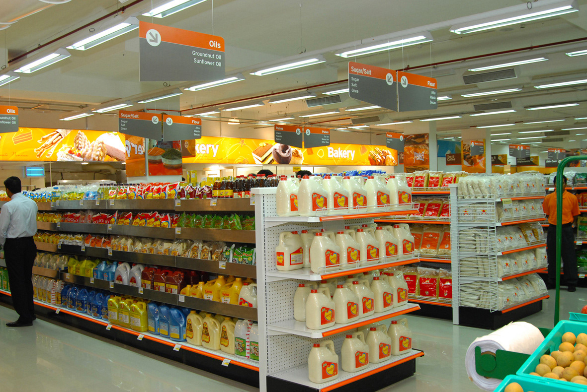
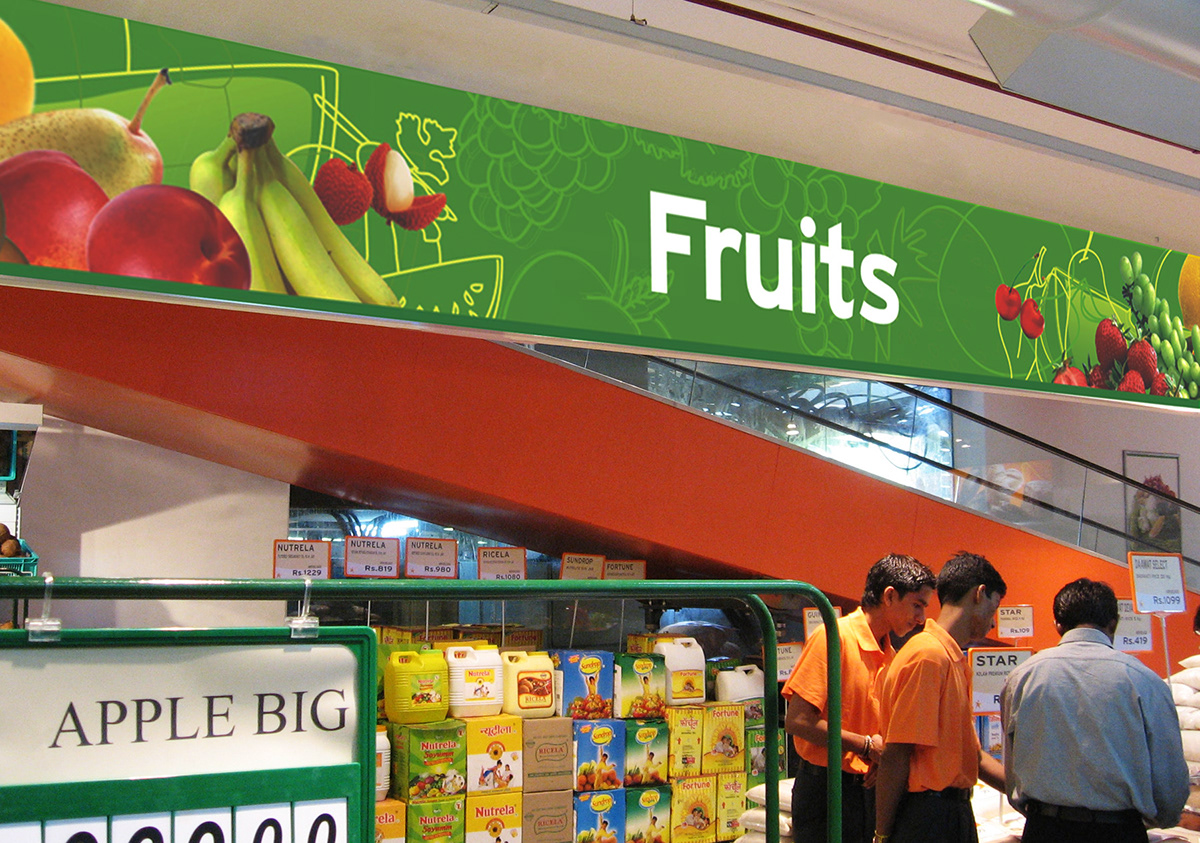
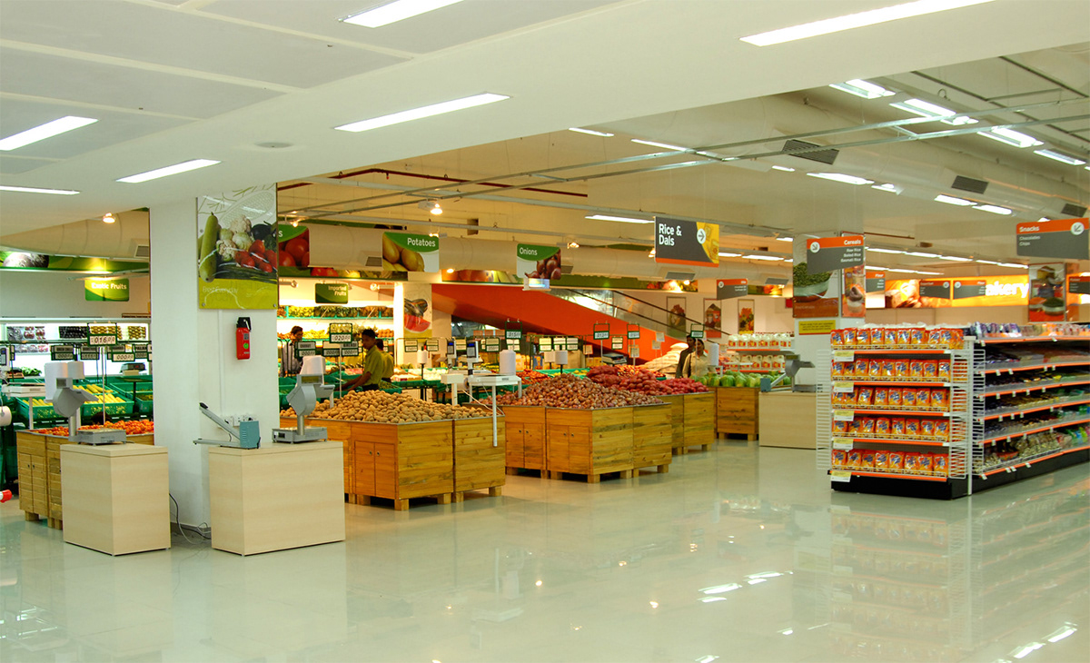
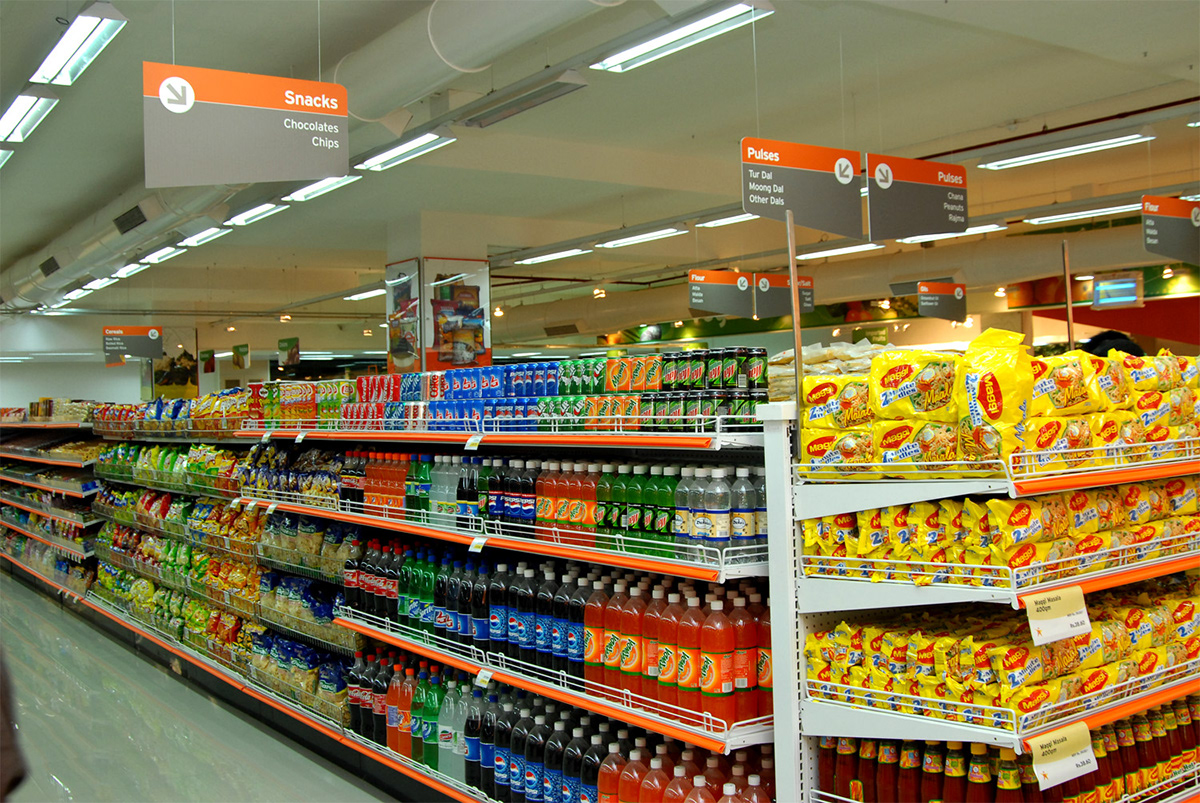
Transforming their identity, give them a moreorganized signage system and use their
spacious premises to the maximum. The environment waspredictably crowded and very
colourful with a display ofvarious brands. So, we picked a neutral colour i.e dark grey with
acombination of contrasting colours to go with eachcategory. A specific illustration style was developed for the branding ofcategories (vegetable, fruits, bakery, home & décor etc. as
photographswere common. Mapping and plotting of the entire store was done in order toplace
the signage as per the customer’s need, from the user point of view. Instore communication
and branding, relevant wall graphics and signagesystems were developed in the process.