Soaring to new heights with AirArabia
AirArabia, MENA’s largest low-cost carrier, was faced with a golden opportunity to leverage its position by demonstrating its leadership role in the aviation industry. Interbrand partnered with them in order to transform AirArabia into an iconic brand – one that could offer memorable journeys that could connect with all audiences.
In 2018, Emirati low-cost airline AirArabia was at a turning point in its history.
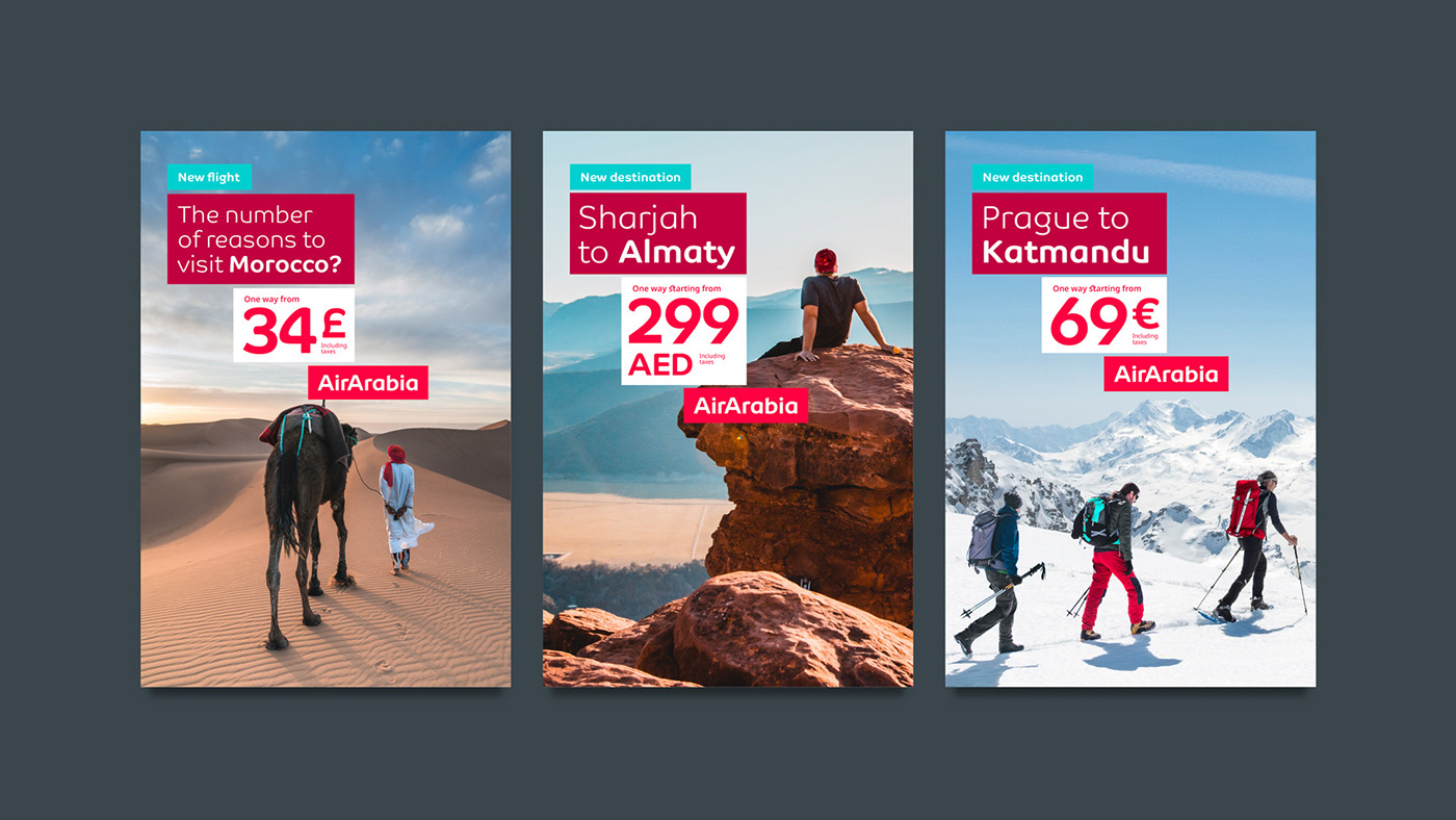
After rejuvenating their value proposition, this friendly, familiar and youthfully-spirited airline wanted to become a truly global player in the airline industry—driving growth from MENA to the world.
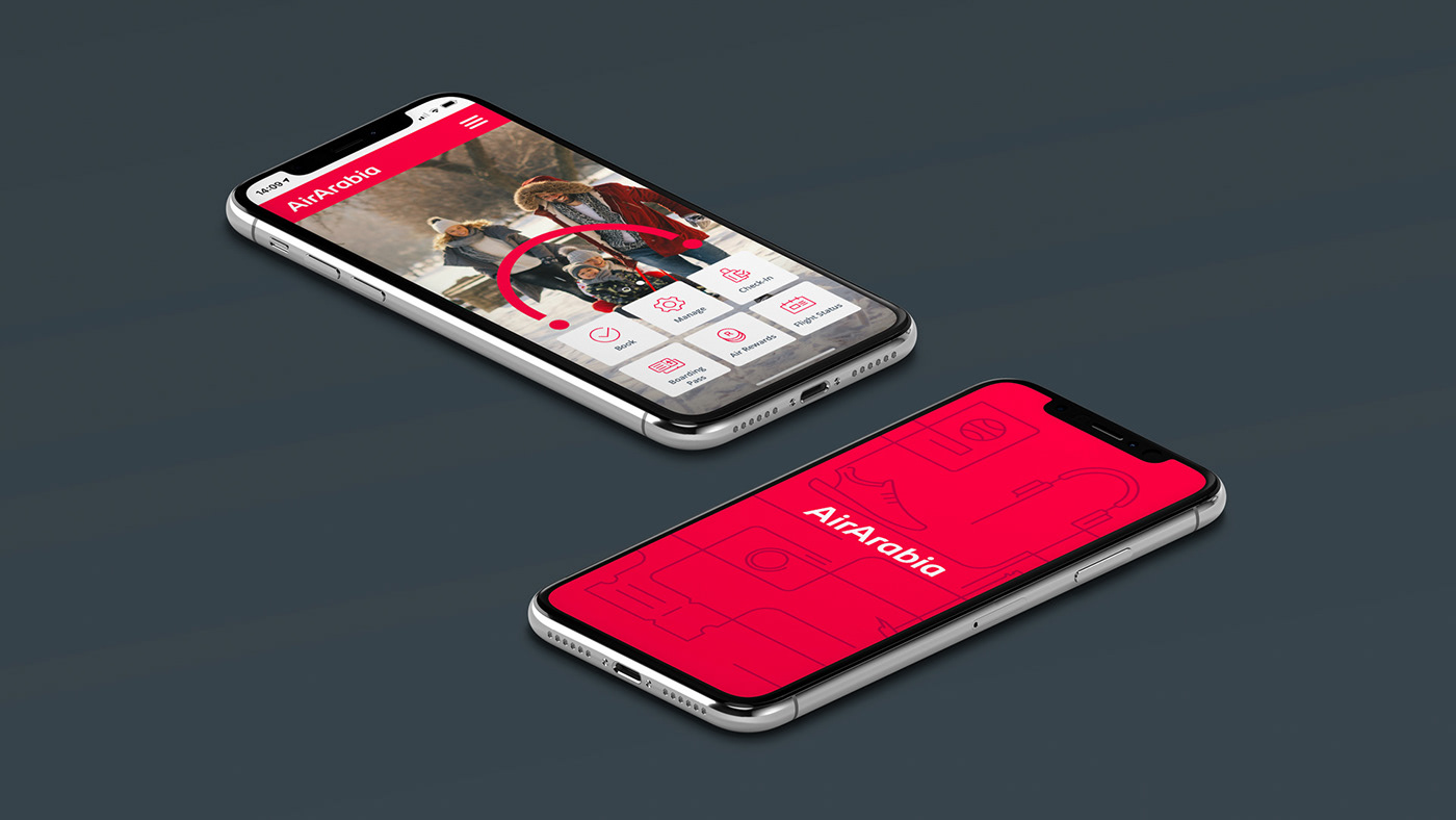
In preparation for presenting itself to the world and to properly target itself to new audiences, AirArabia created a visual universe perfectly aligned with its new brand strategy.
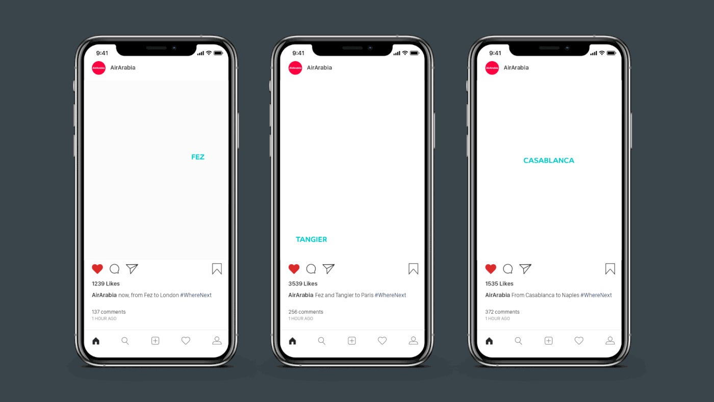
The concept of the “Modern Nomad” and their promise to make travel affordable was the foundation for the reimagined brand identity and the airline’s new positioning to align with a younger, international and more connected target group.
For their 15th anniversary, AirArabia’s refreshed brand identity was unveiled.
Logo evolution over the years.

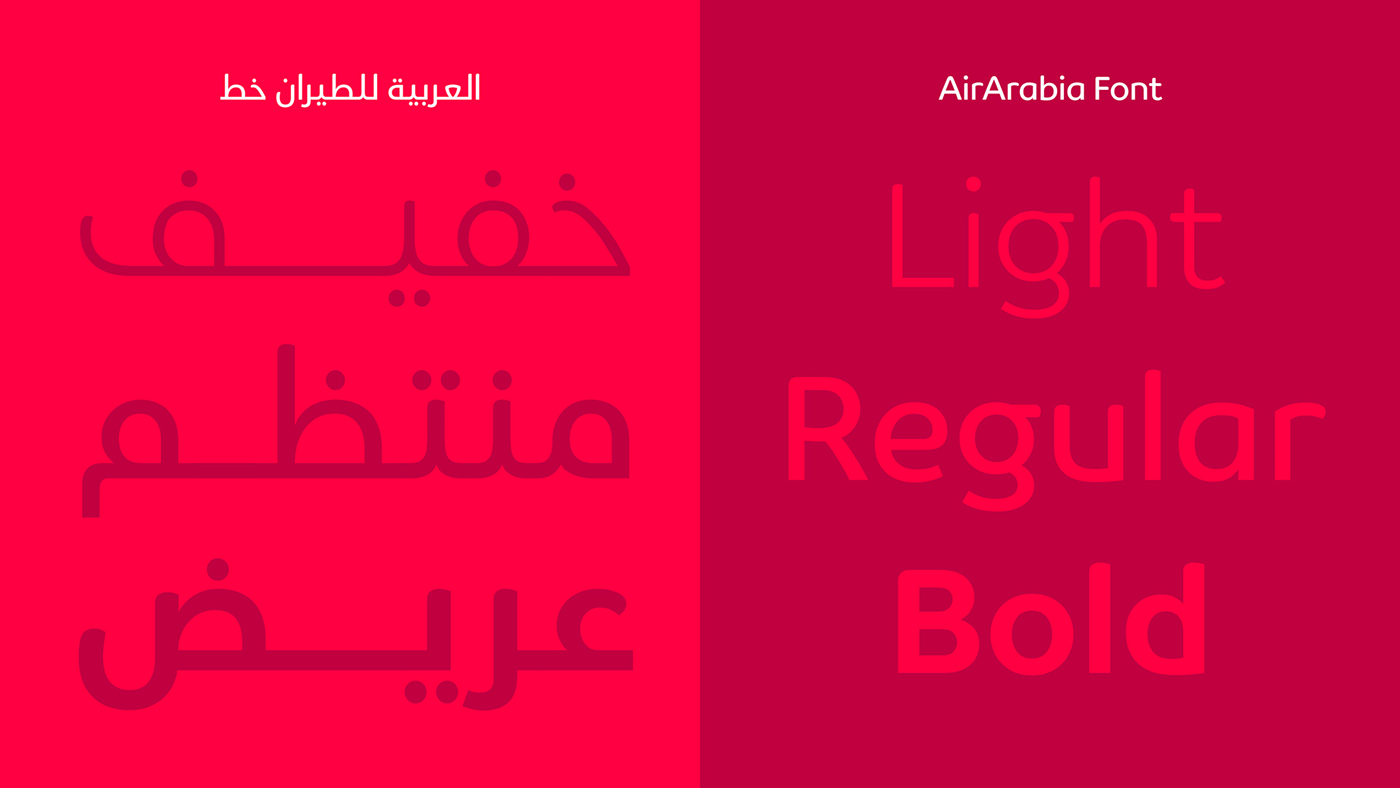
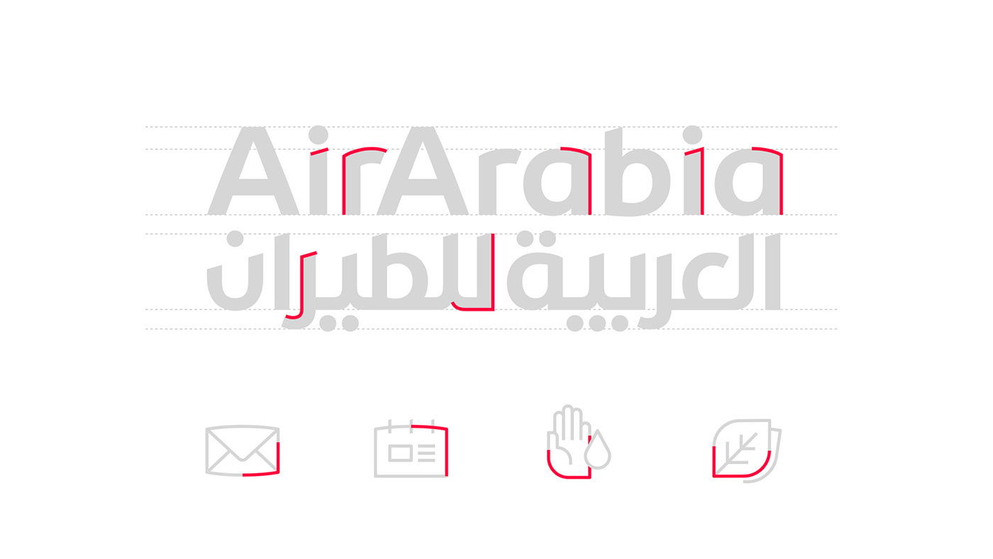
The logotype evolved to reflect a more modern, simple, versatile and global brand, with a morphology that provides a unique and ownable personality. A dual language logotype was developed, keeping the same aspects in booth versions.
Animation showing the same character in both versions.

A sub-brand system was developed to help the company organise the brand architecture.

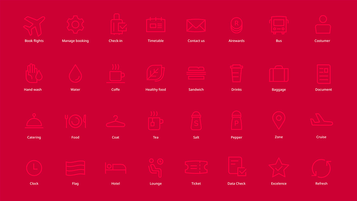
Details from the logotype inspired the pictograms system.
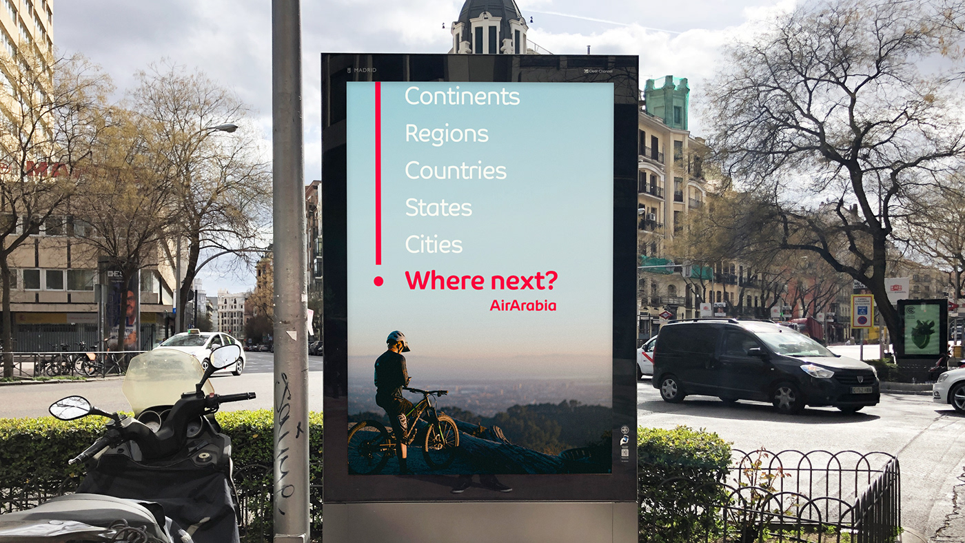
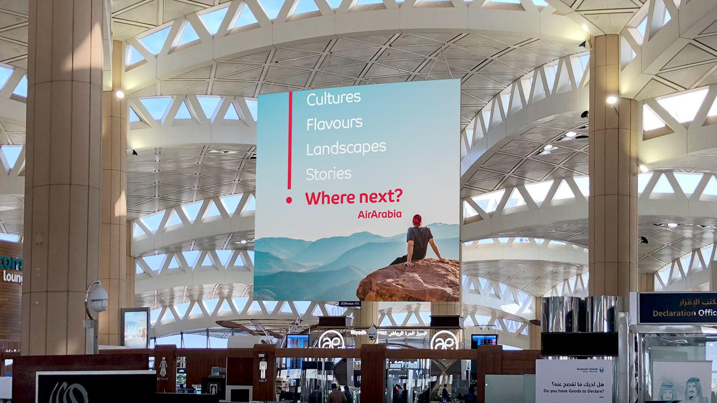
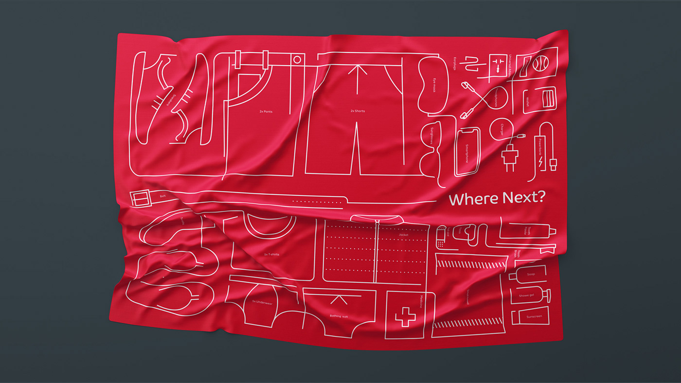
To represent the traveling experience and the connections made from one destination to the next, a graphic device was created based on old cartographic systems that visually communicates AirArabia’s new claim, “Where Next?” Providing a more differentiated identity for the airline across all touchpoints, this device is made of dotted and continuous lines to symbolize the “Modern Nomad” concept.

The on-going lines represent trips already taken and experiences already lived, and the dotted lines represent everything else yet to come.

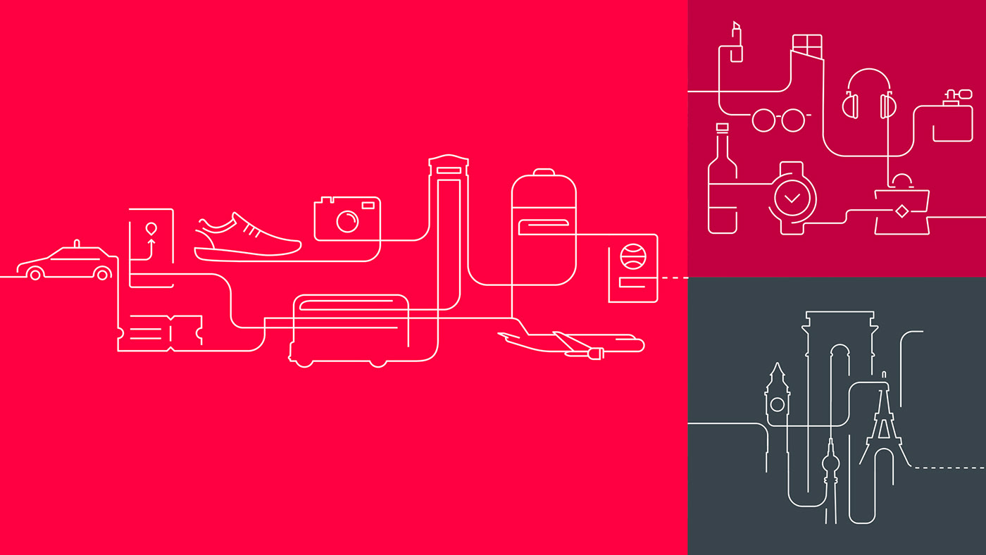
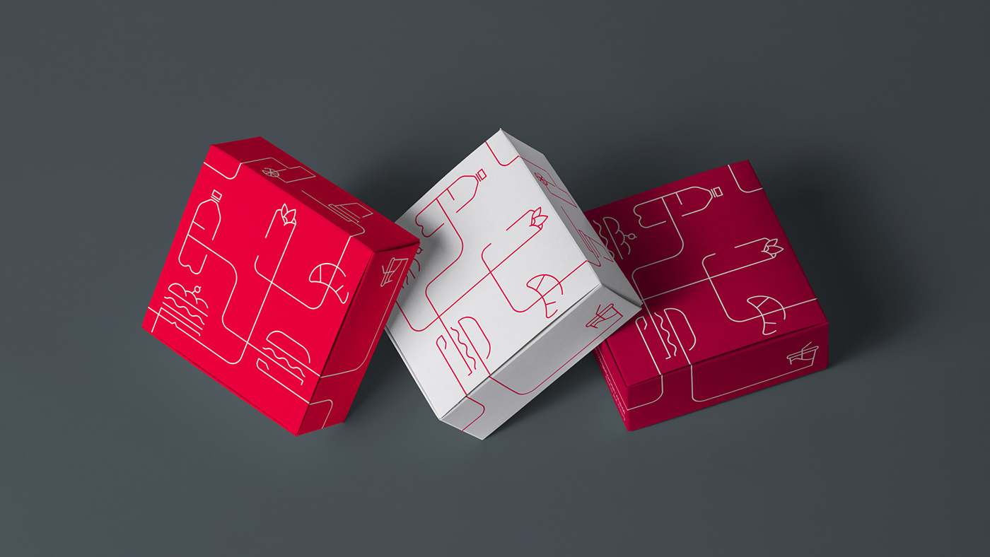
This graphic solution combined with the silhouettes of monuments and iconic destinations form the bases of the illustration style
The communication system now uses sequential boxes, making the information hierarchy easy to manage.

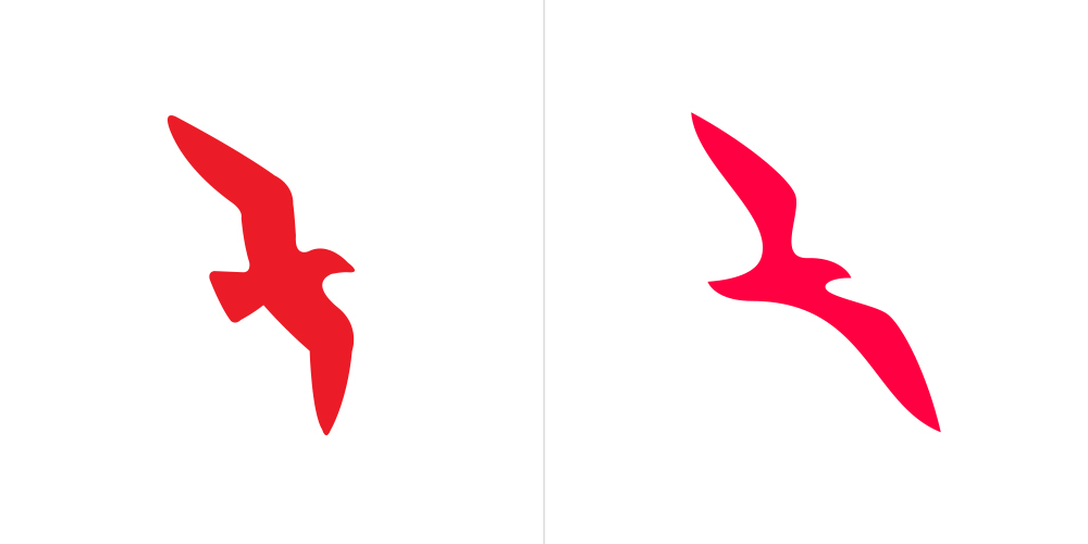
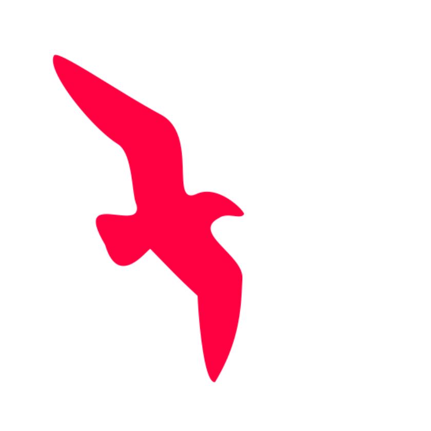
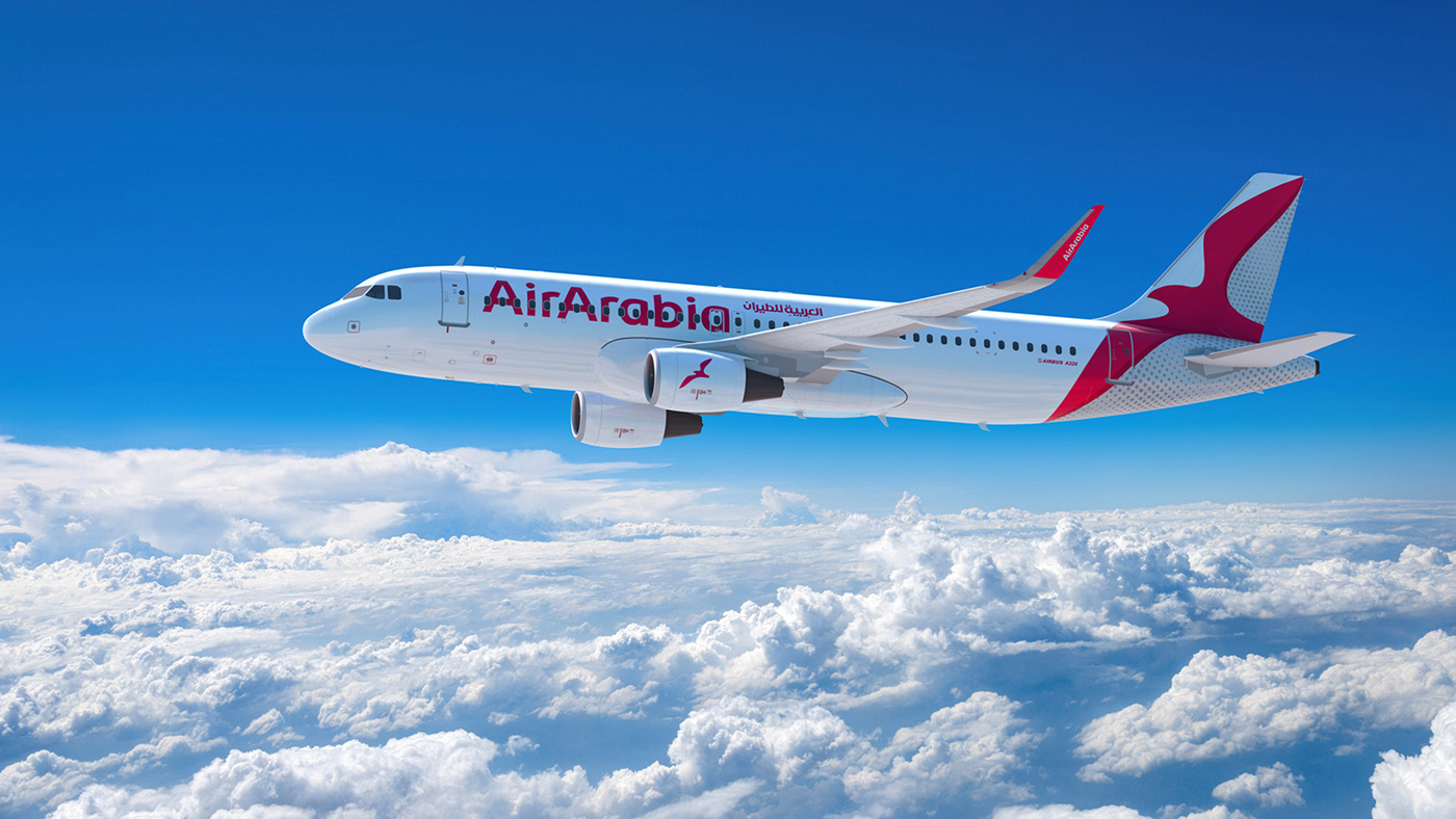
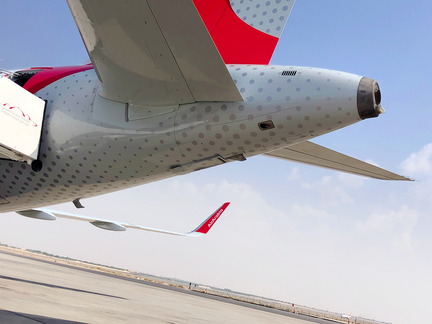
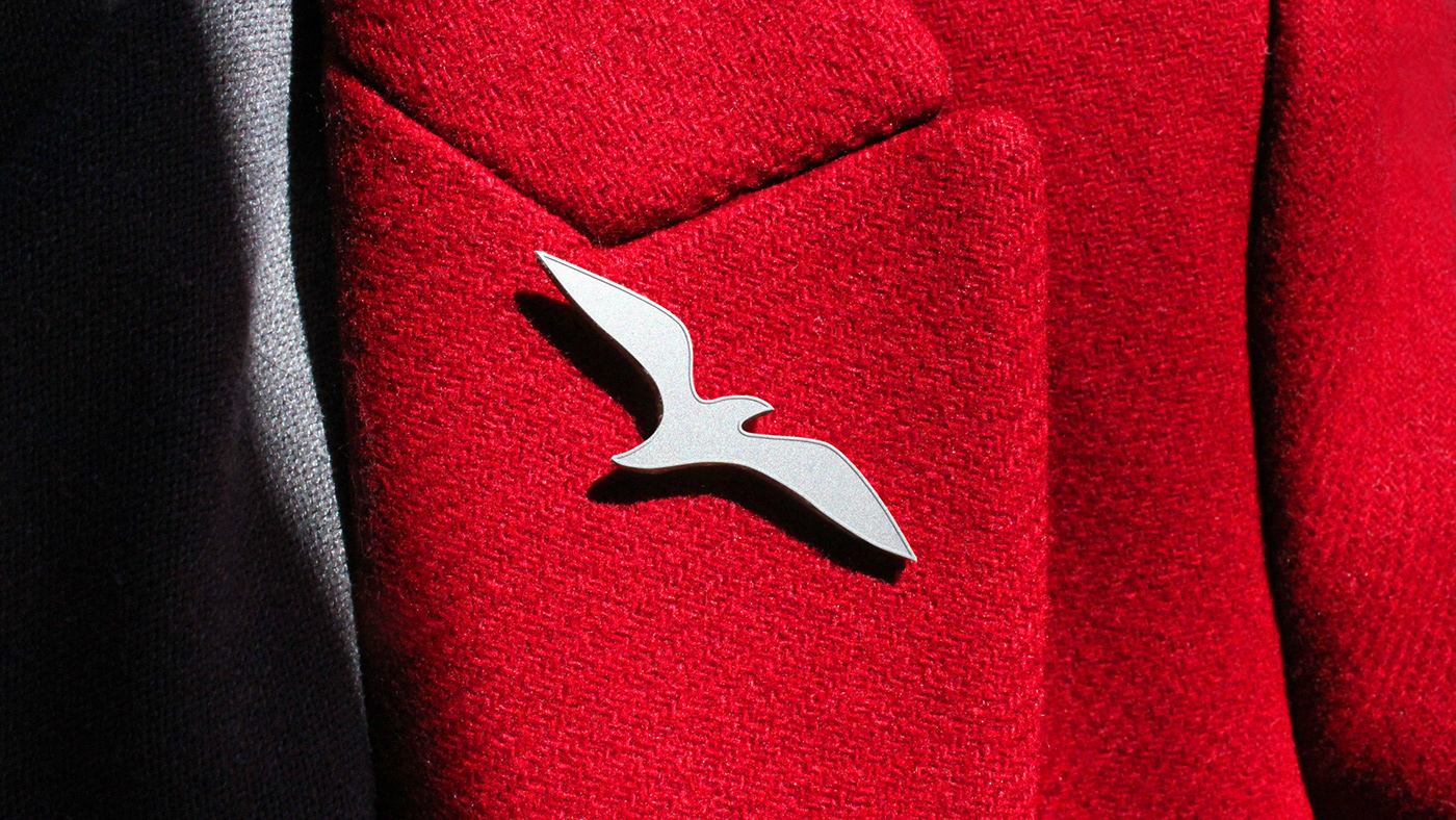
The airline maintains its recognizable symbol (the seagull) but with a modern twist, adding a fresh appeal while still staying true to its original image. The new design was inspired by the angles of an airplane’s tail so that it could naturally live within that space.
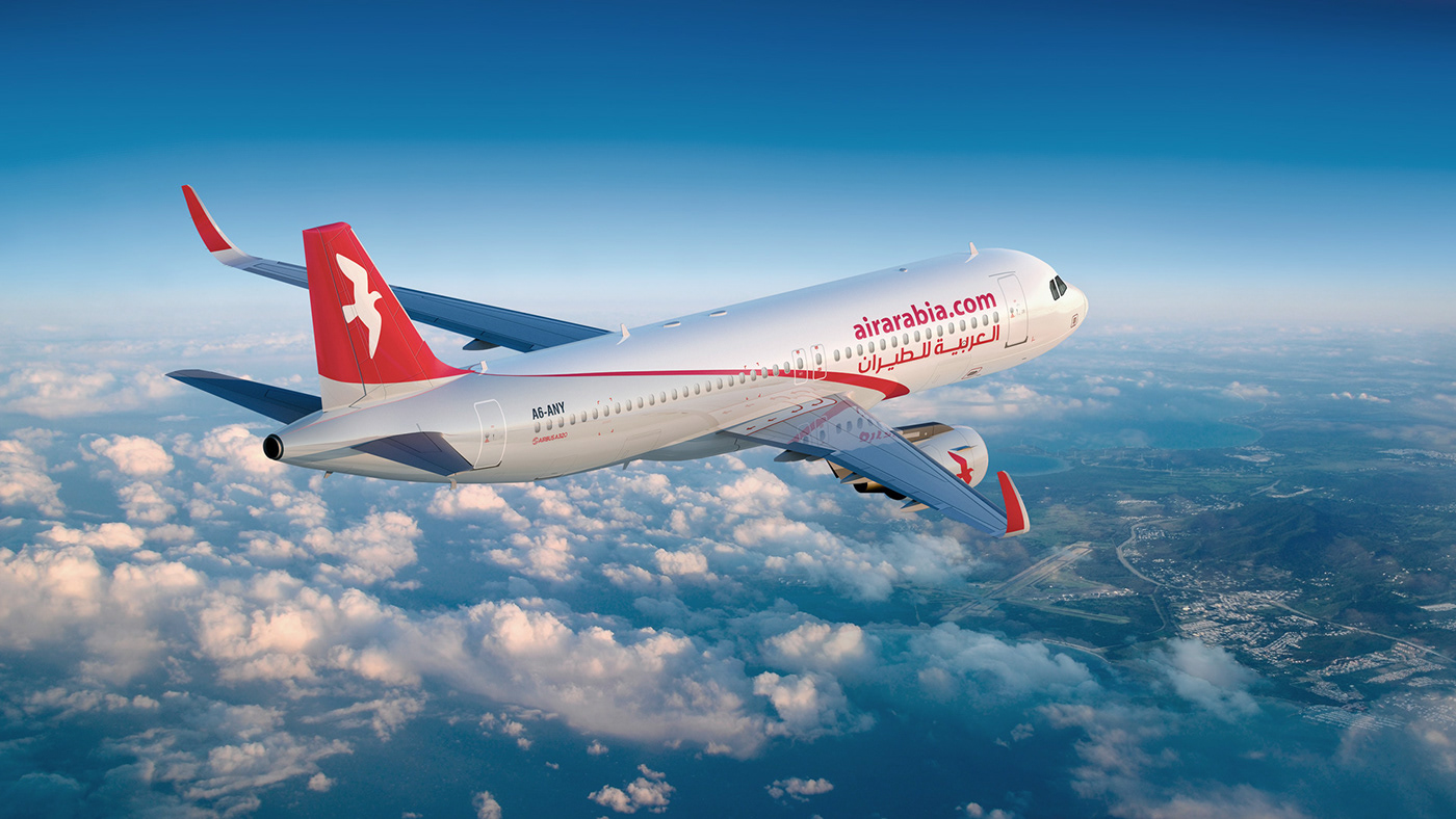
OLD livery
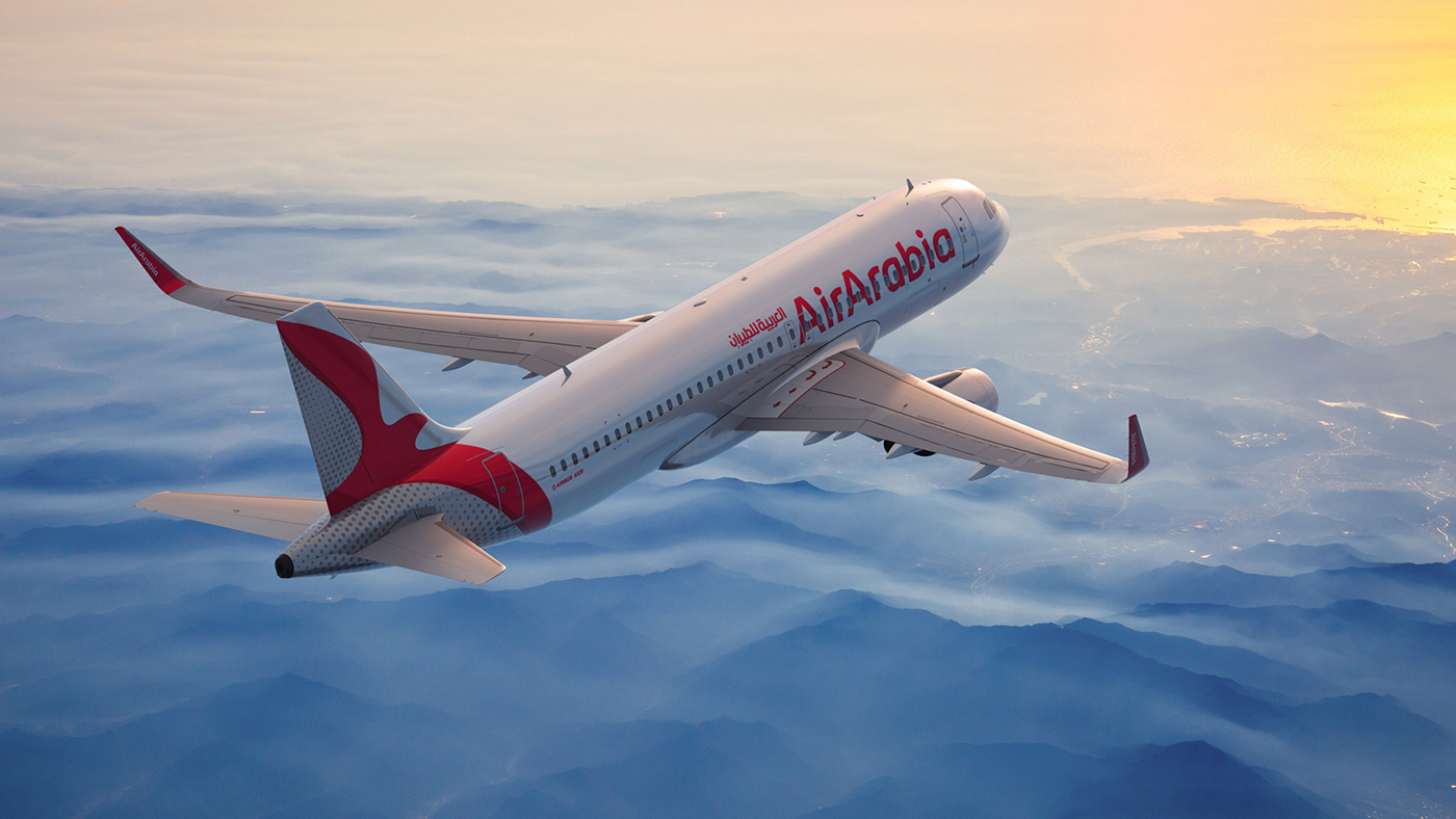
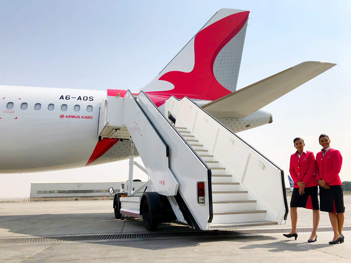
NEW livery
Comparison with the local market

Repaint time-lapse.
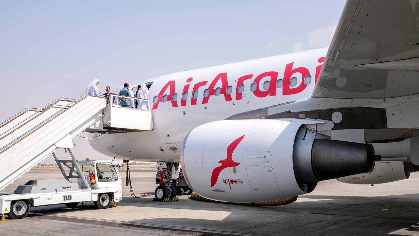
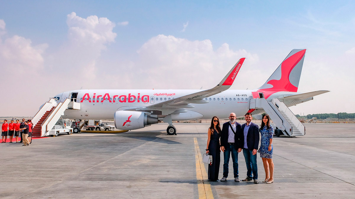
First delivered aircraft.
Tail detail. The dots create a sensation of dynamism from a far distance.
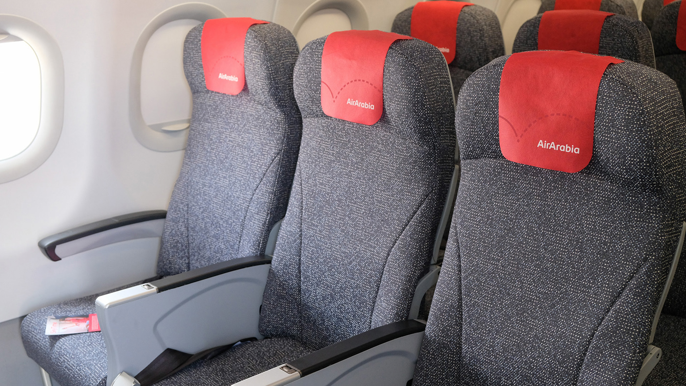
Cabin interior.
Crew pin
Team at the brand launch event.
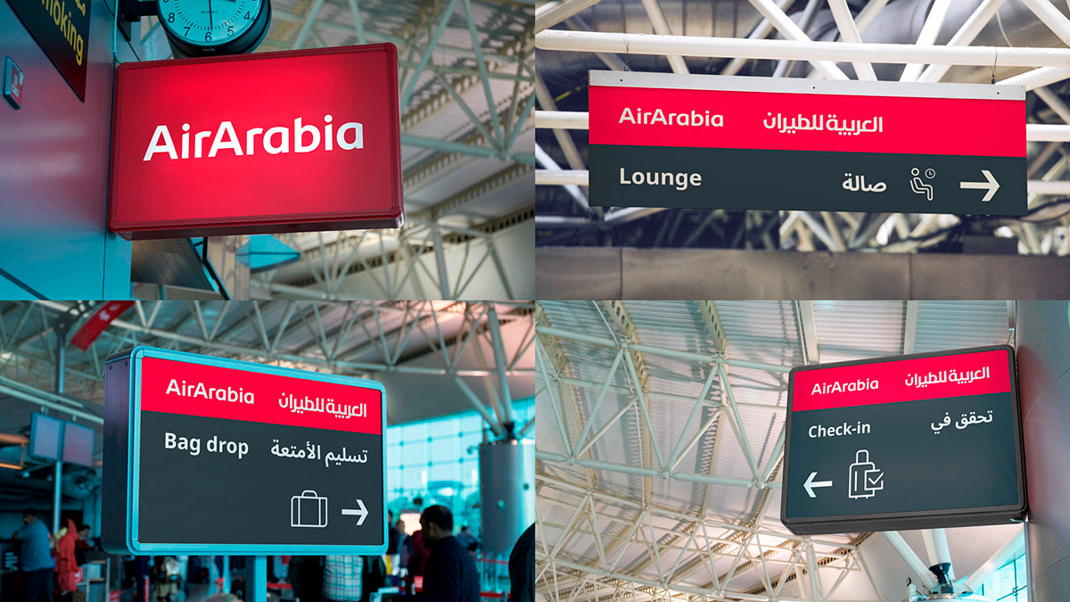
Airport signage implementation.