


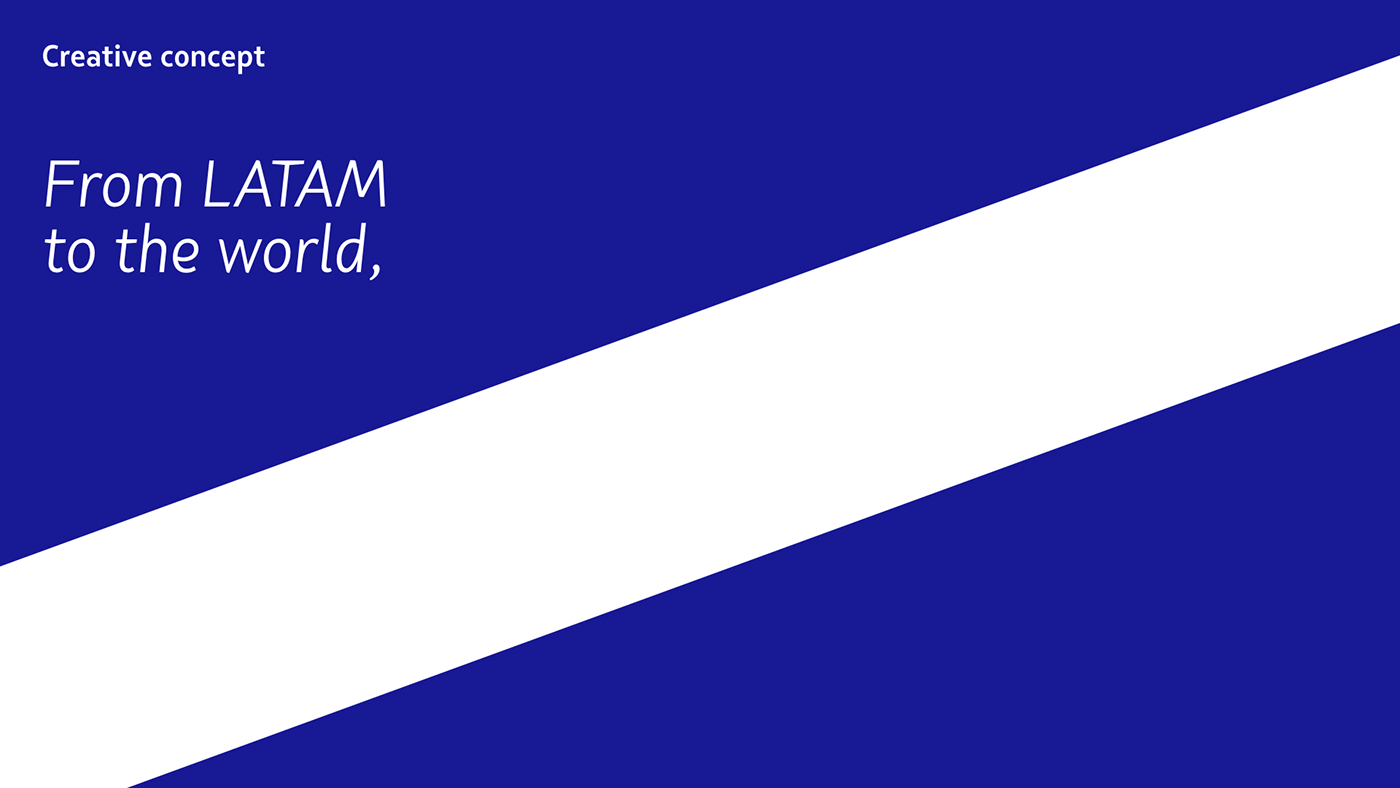
LATAM soars for global growth
The creation of the LATAM brand is a landmark in the history of aviation—it’s the first time that two great airlines fly together under an entirely new flag. When LAN and TAM merged, we uncovered an opportunity to grow the LATAM Group business by developing a strong, unified brand.
We talked people and customers on both sides of the new business to get at the heart of what they all had in common. What we discovered was a genuine commitment to taking dreams and people always further. Grounded in this core belief, we embarked on a two-year journey involving insights, strategy, implementation, and activation. Careful planning and intense work fueled the project, from idea to take-off.
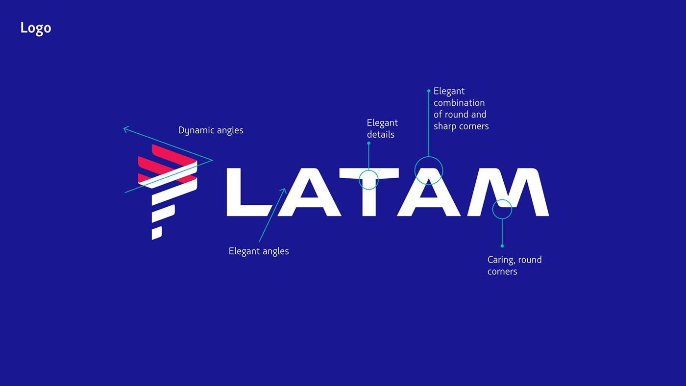
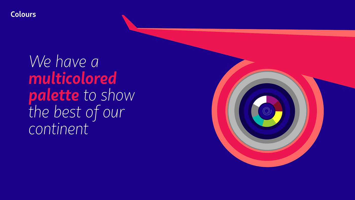
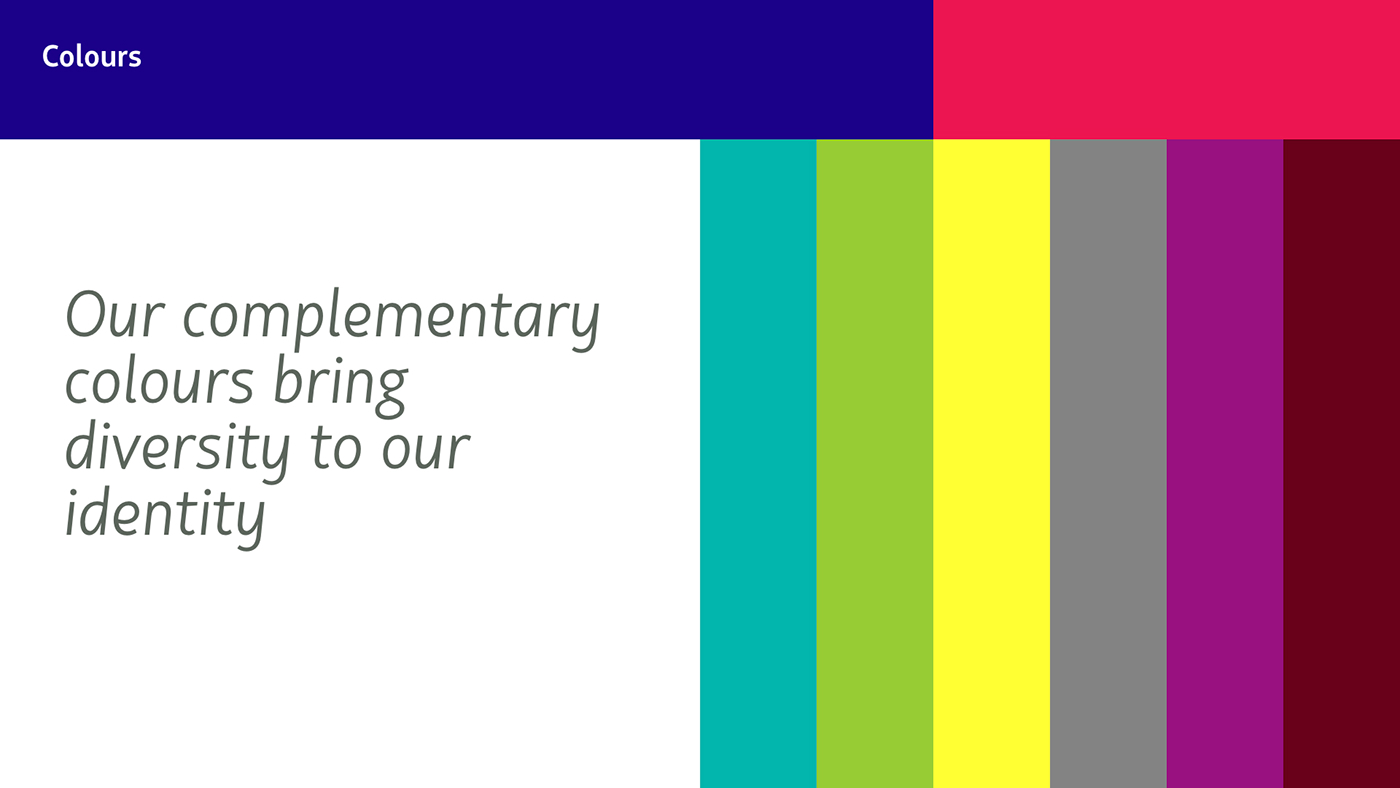
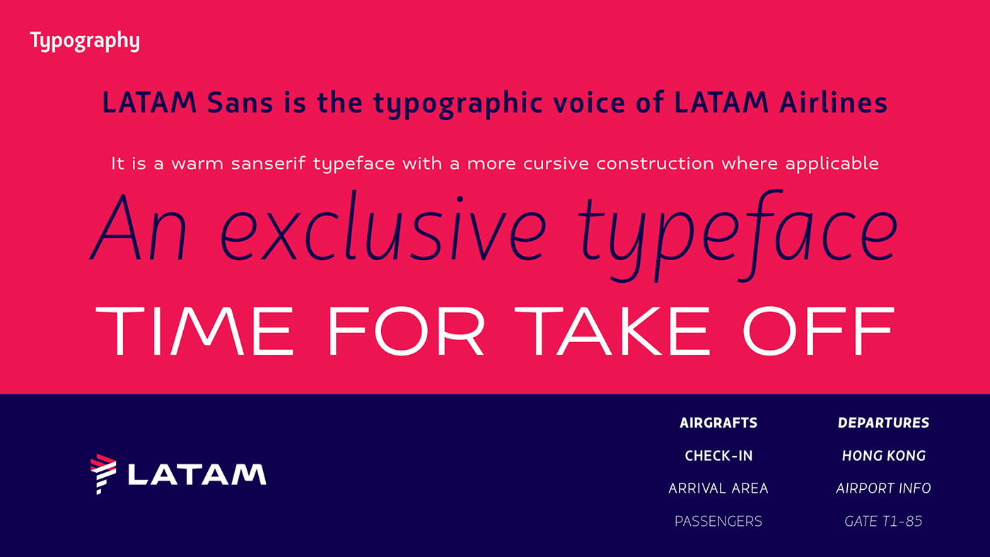
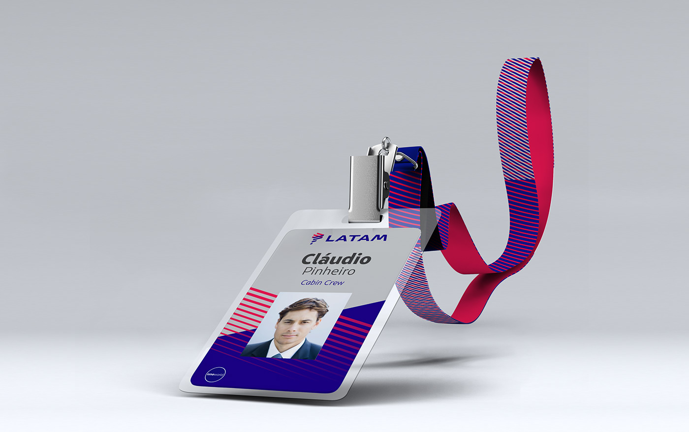
The building of LATAM gave birth to an original typography, a distinct sound-branding project, and an exclusive photographic identity. We also created a new logo inspired by the geography and dynamics of Latin America, blending sharp and rounded angles that connect the symbol and the logotype. The chosen colors, indigo and coral, bring together TAM’s red and LAN’s blue, while representing the harmonious combination of the brand’s efficiency and human passion.


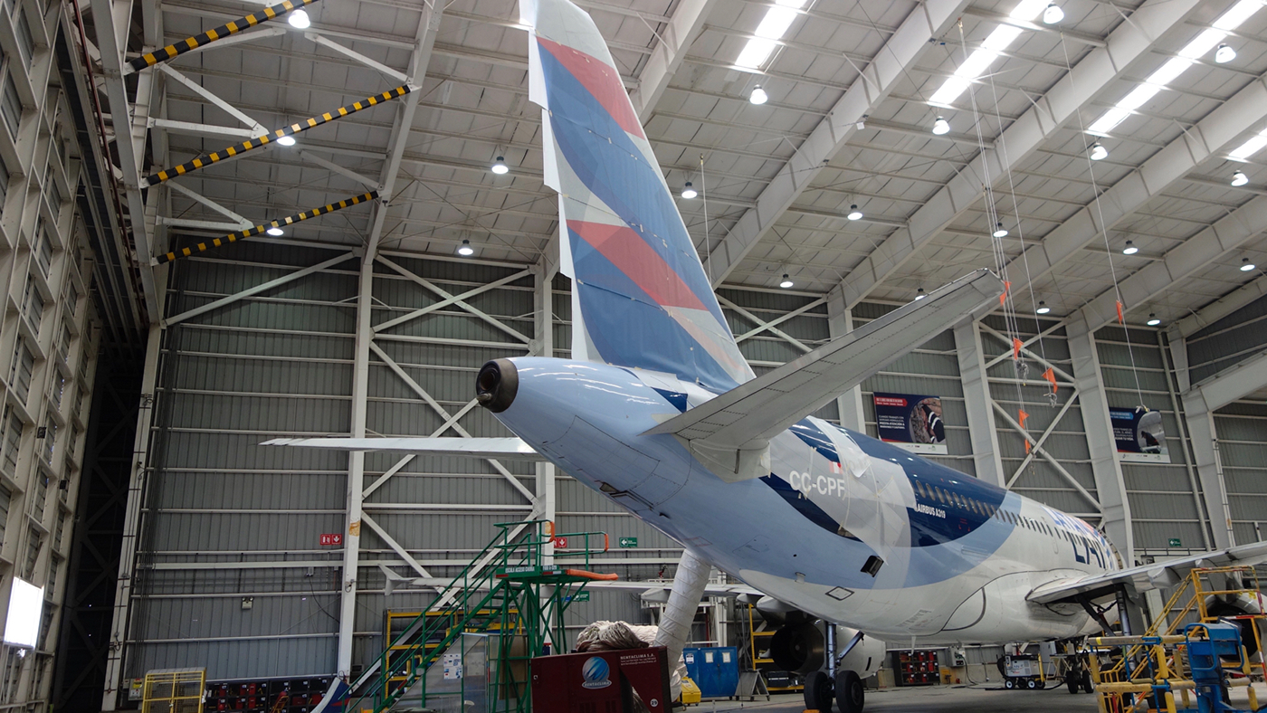
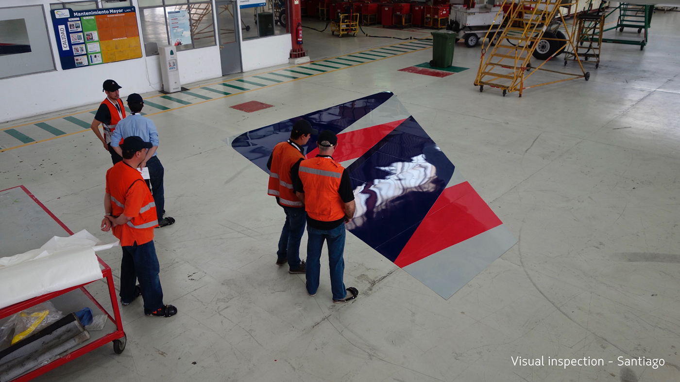
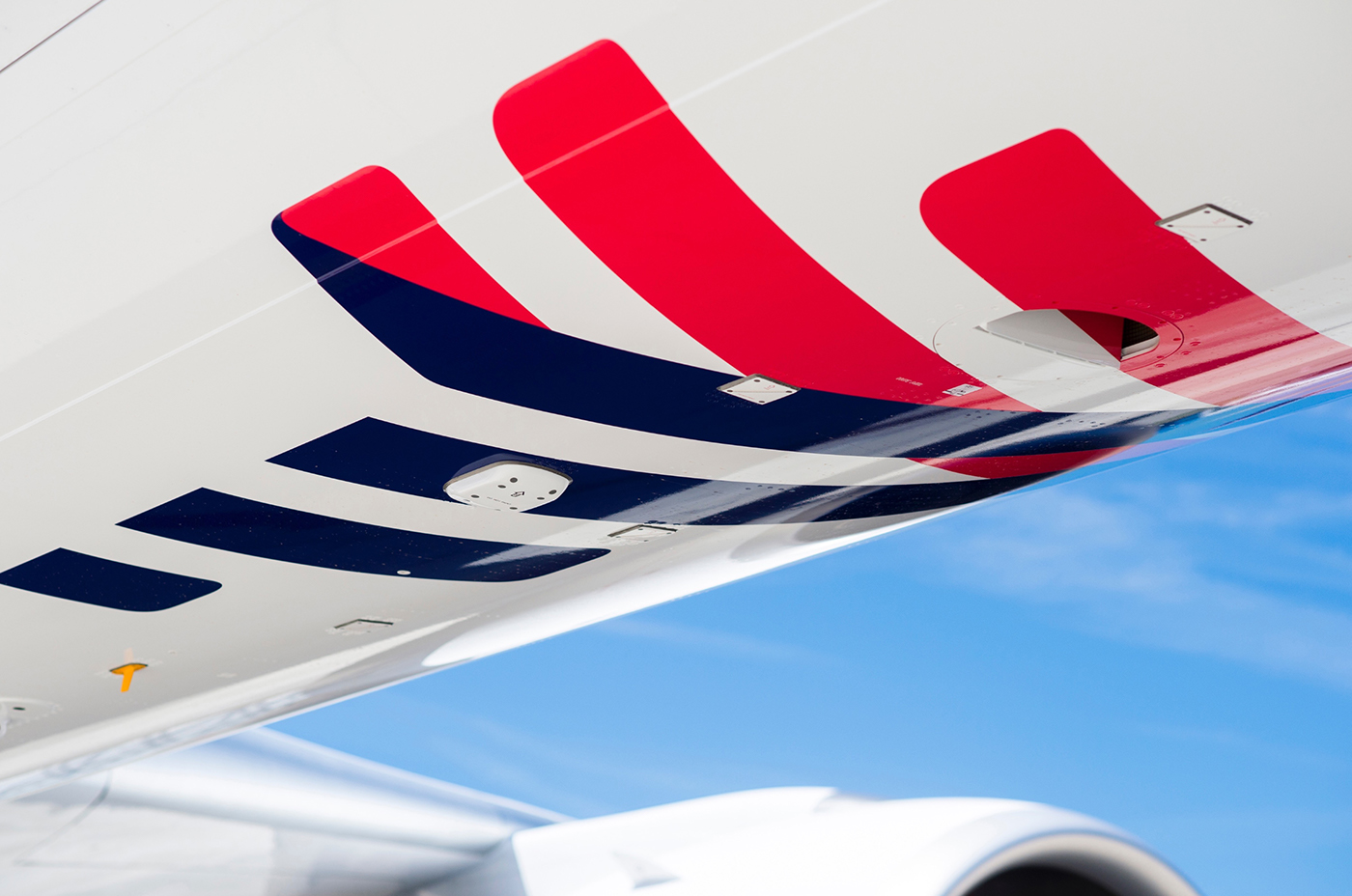
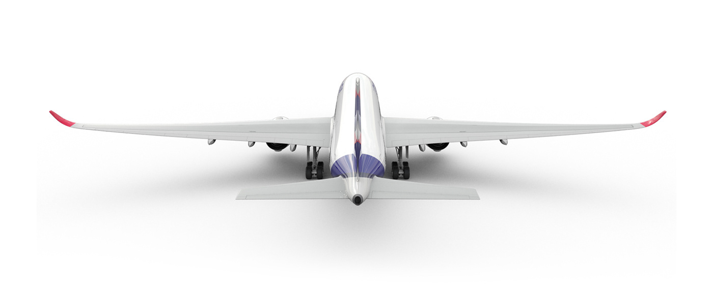
These elements are brought to life through the minimalist and elegant identity we created for LATAM’s most iconic touchpoint: its aircraft. From the rudder inspired by the logo’s lines, all the way down to details like the
two-colored winglets (indigo and coral) and the LATAM icon on the lower part (which can be seen during the flight), the plane is a powerful embodiment of the new brand.
two-colored winglets (indigo and coral) and the LATAM icon on the lower part (which can be seen during the flight), the plane is a powerful embodiment of the new brand.


Project by Interbrand São Paulo


