Strings of Autumn
2019
Client: Struny podzimu
Art director: Aleš Najbrt
Author: Jonatán Kuna
Font: Matter
Type: Application, Magazine, Brand, Web, Interior, Poster, Program
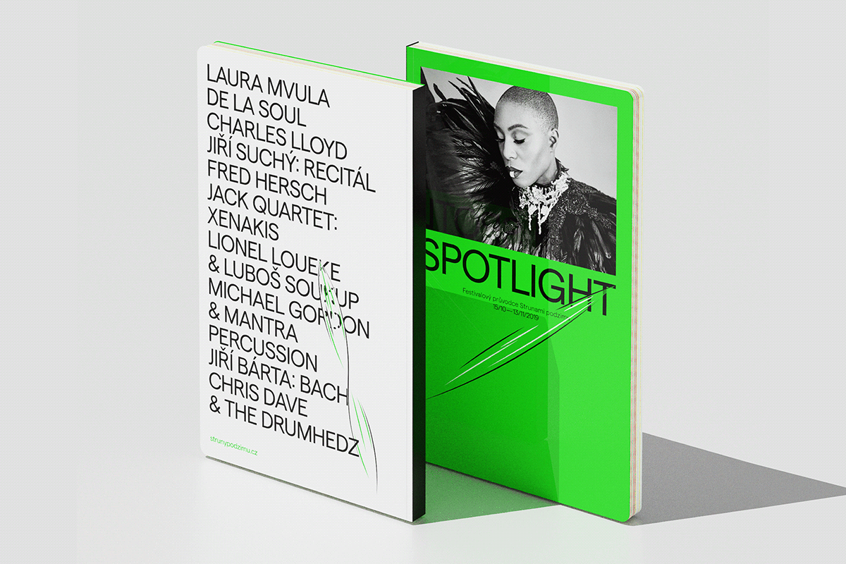
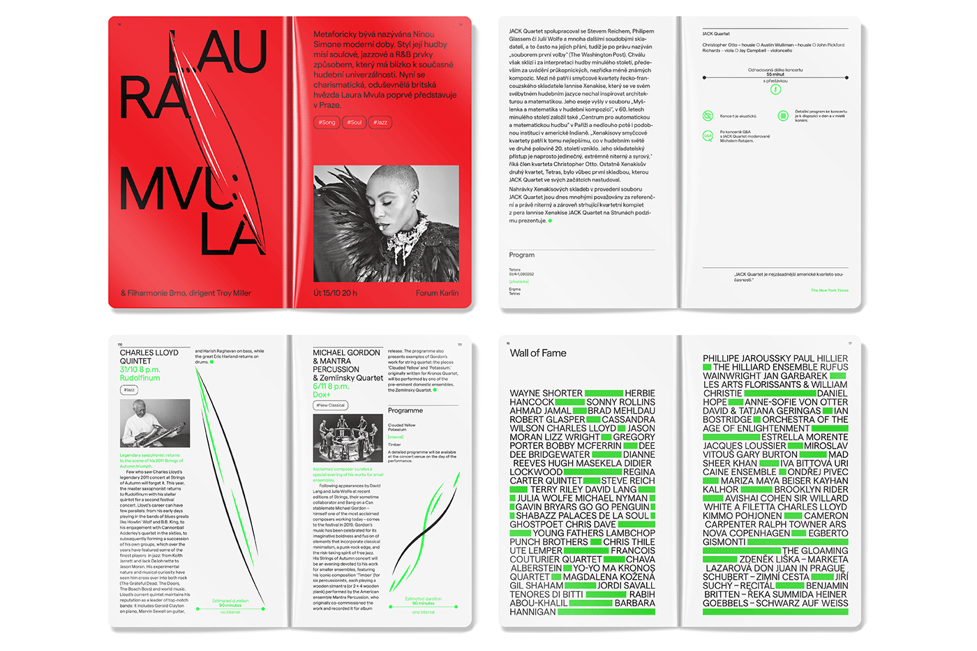
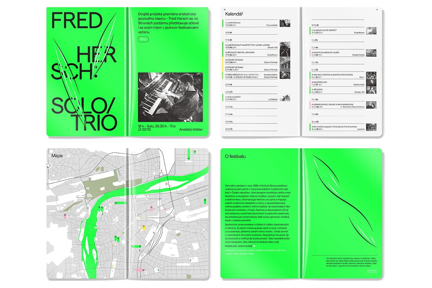
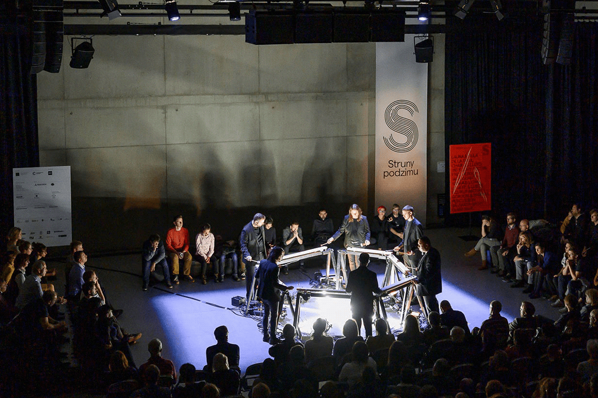
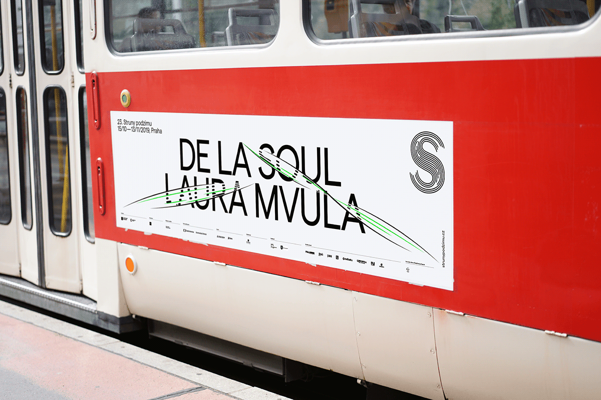
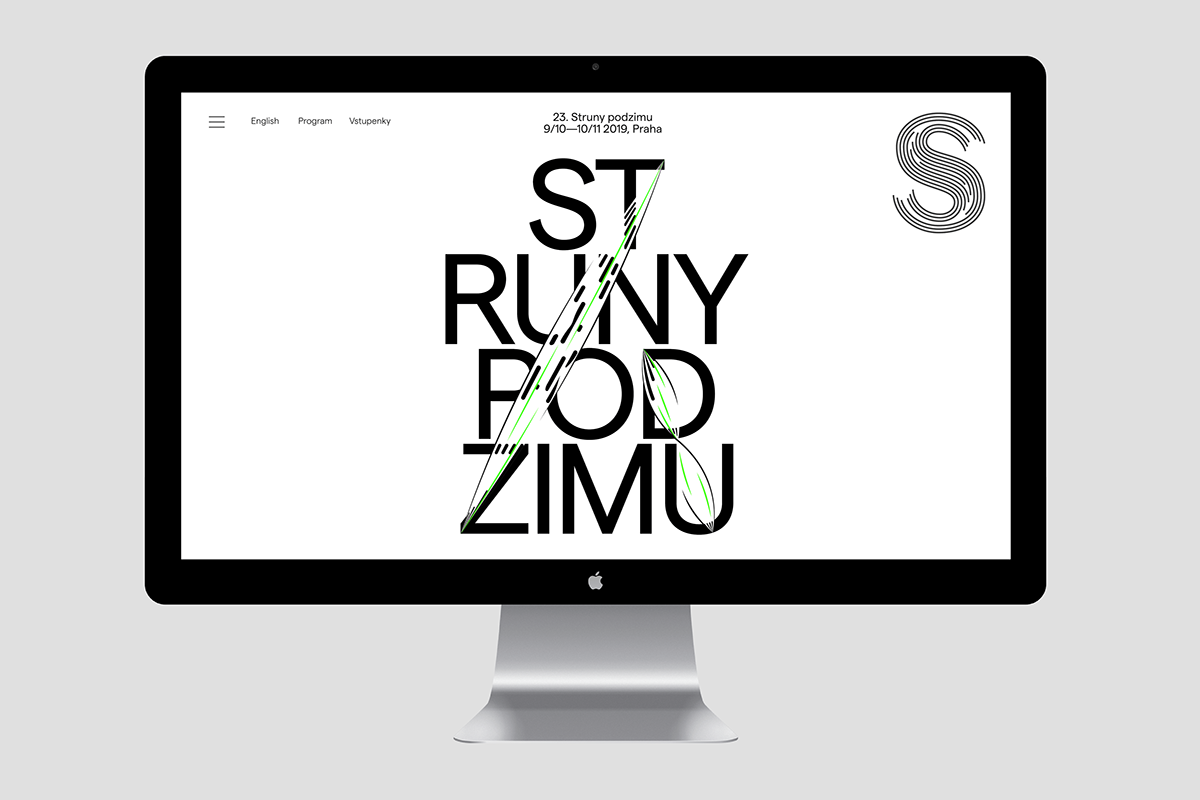
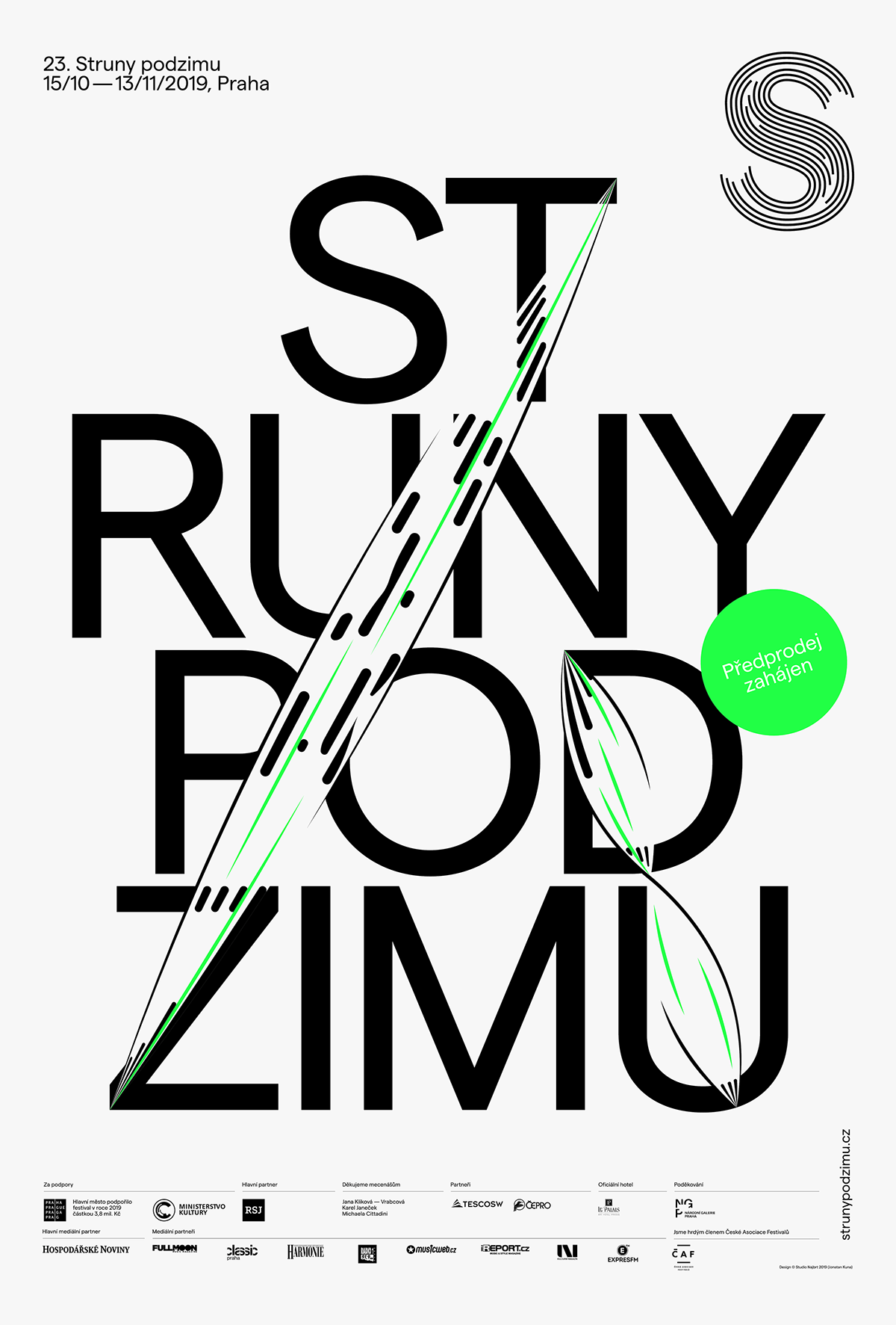
In 2017 we twisted and turned the strings of the Prague’s multi-genre festival into the S-shaped logo. Since then the idea of the strings vibrating with the letters of the enlightened line-up has sprung over different colors of every new year’s identity. This spring the campaign begun in fresh green, only to turn red in October.