


VISUAL IDENTITY FOR CO-CREATORS
School project, class by Jesper Olsen, 2019, deadline 6 days
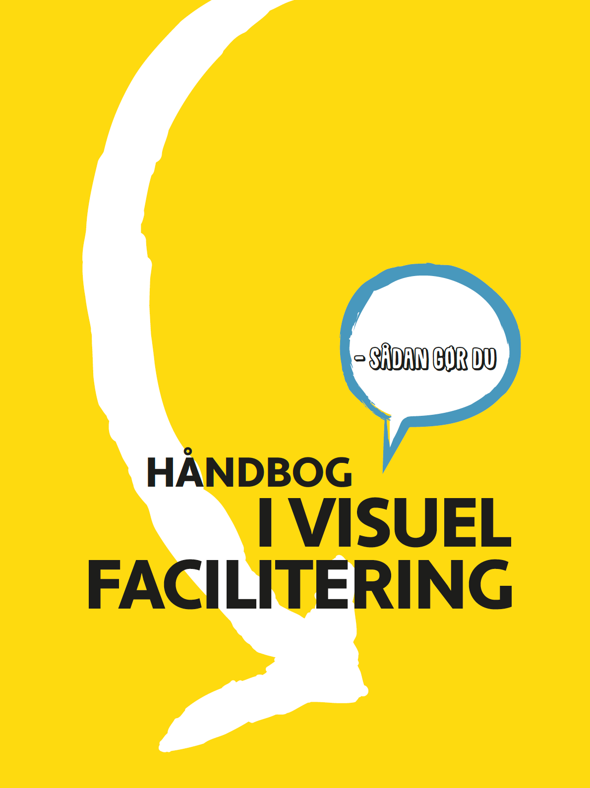
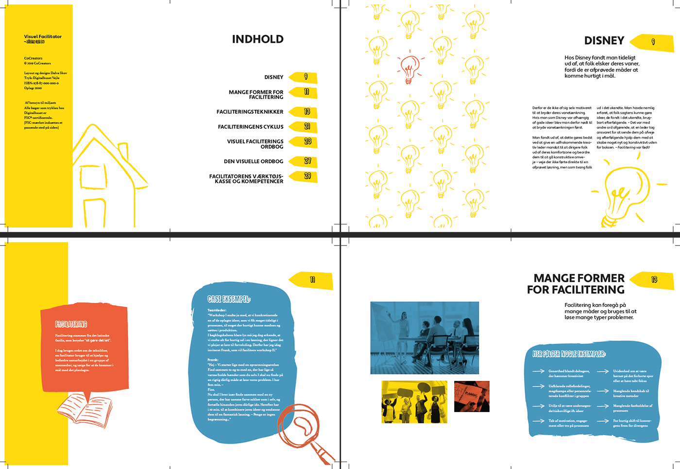
This was a project in two parts, based on a fictive company teaching visual facilitation. First we were asked to set up a manual on visual facilitation. We each had to make the layout and illustrations. The next part, was to make an identity based on the book.


I made all the illustrations in Illustrator. The duotone photos are free stock photos I edited in Photoshop. I used primary colours, because they are easy to differentiate. Each colour has its purpose: red is facts, blue is cases or examples and yellow is used to highlight. That way the reader can easily navigate in the informations.


Letter paper on the left. On the right, business cards with different covers.

Again yellow is used to highlight. Here is an envelope, easy to notice in a big pile of mail.
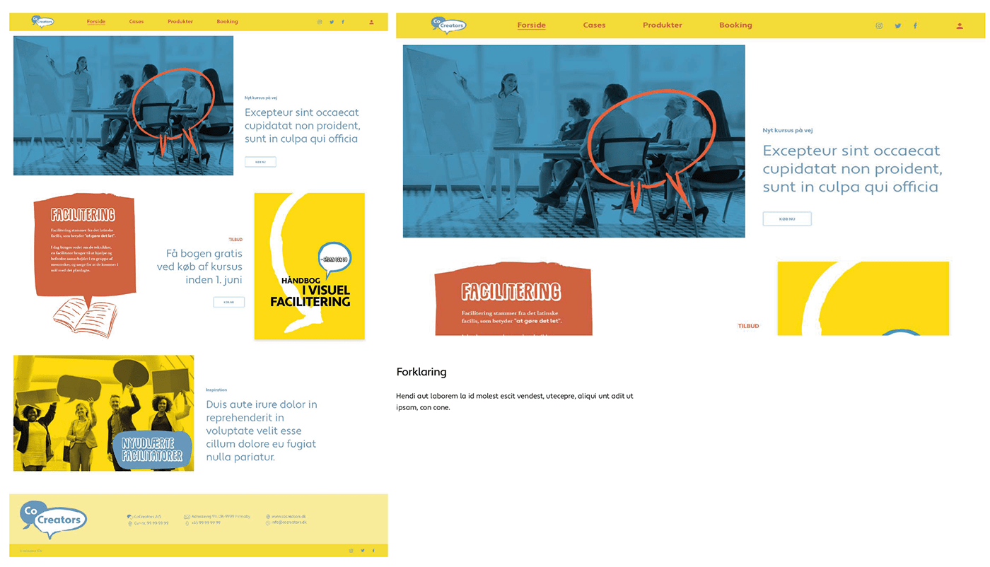
Landing page for Co-creator's website.


Two formats of printet ads.
Thank you for looking trough! If you want to know more please visit www.dalvaskov.com


