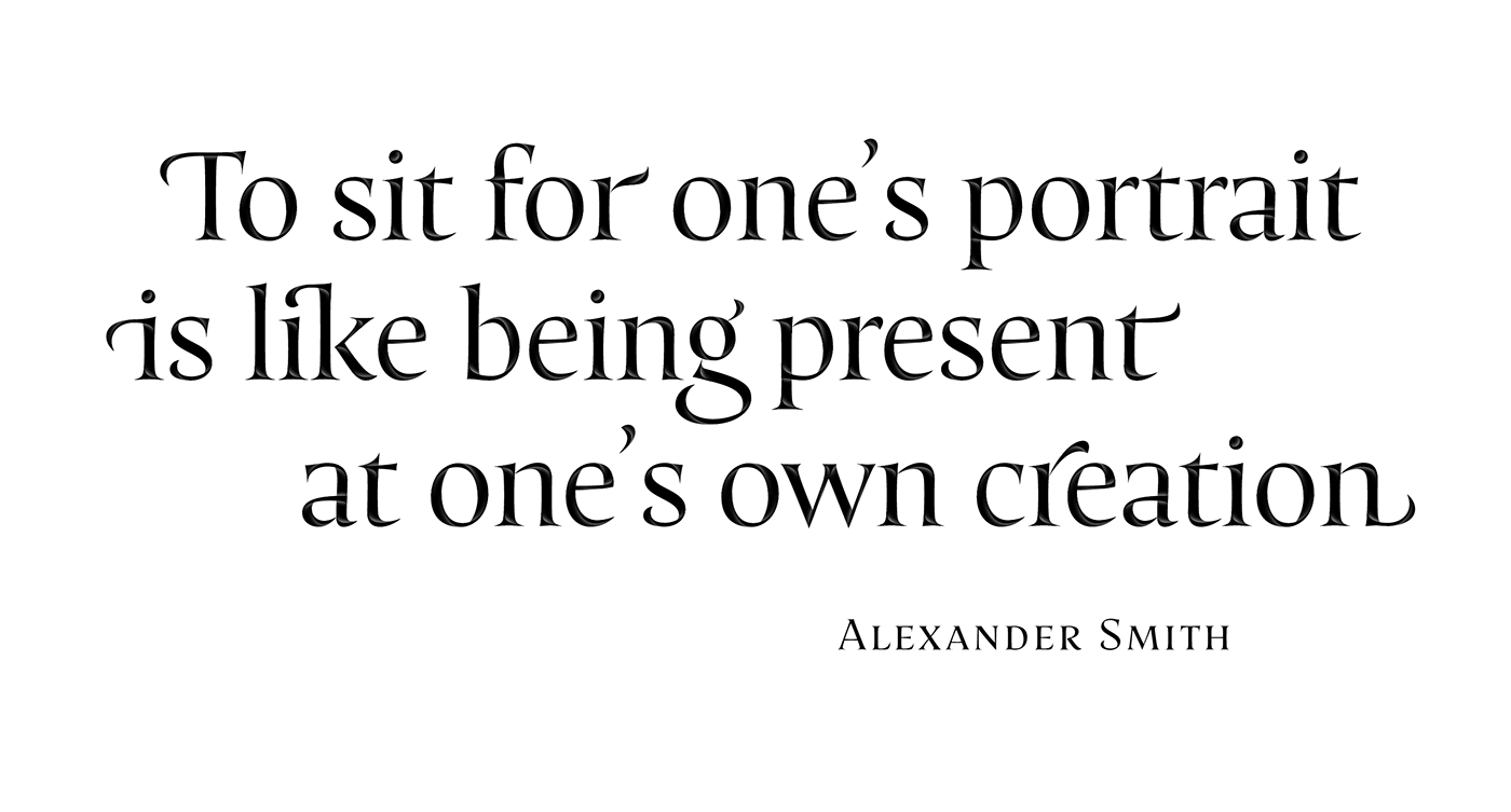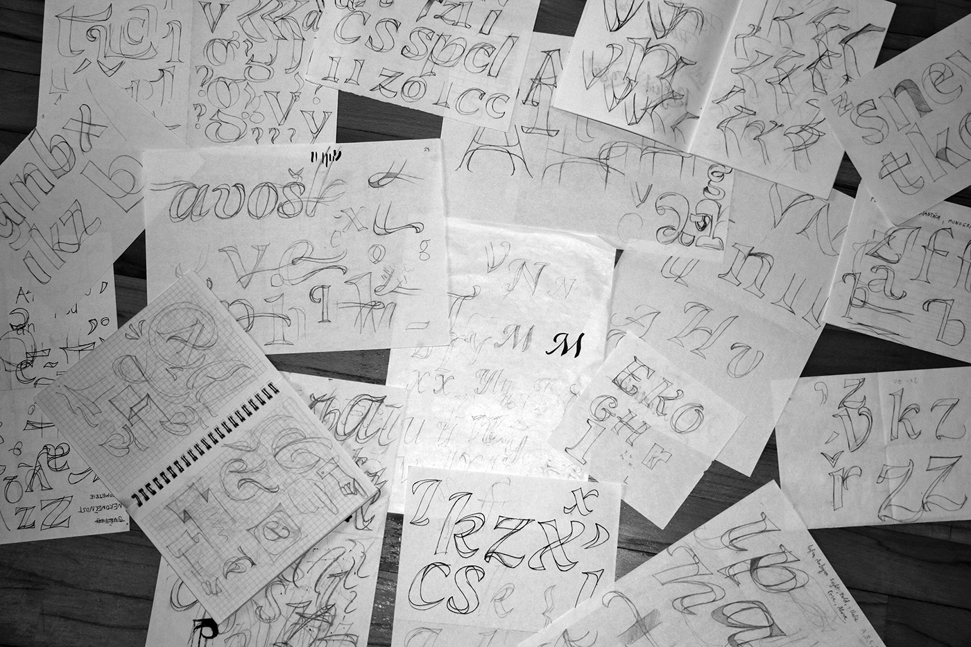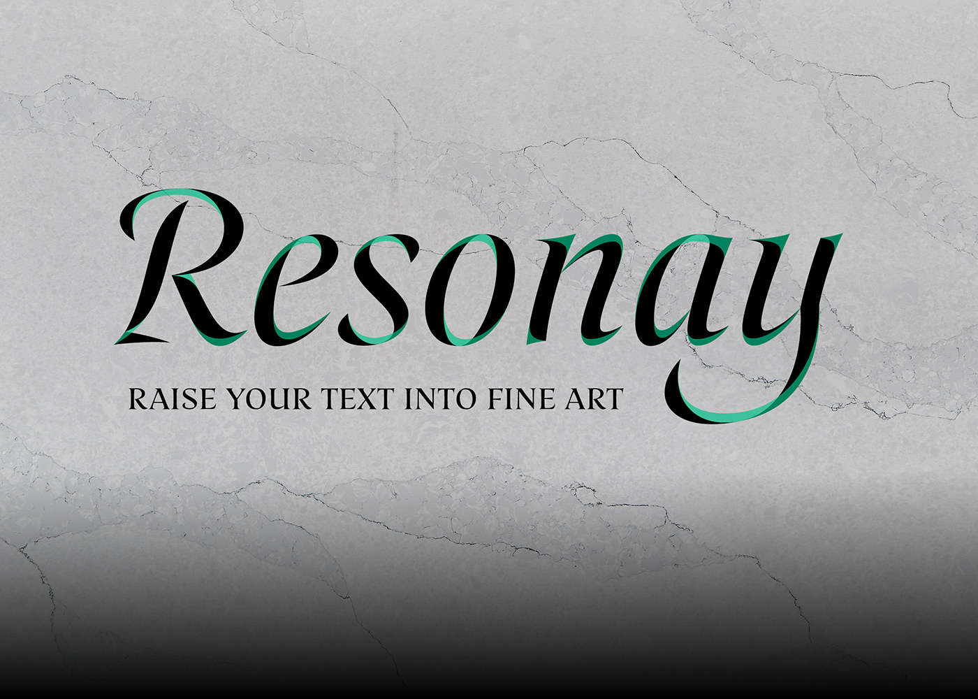
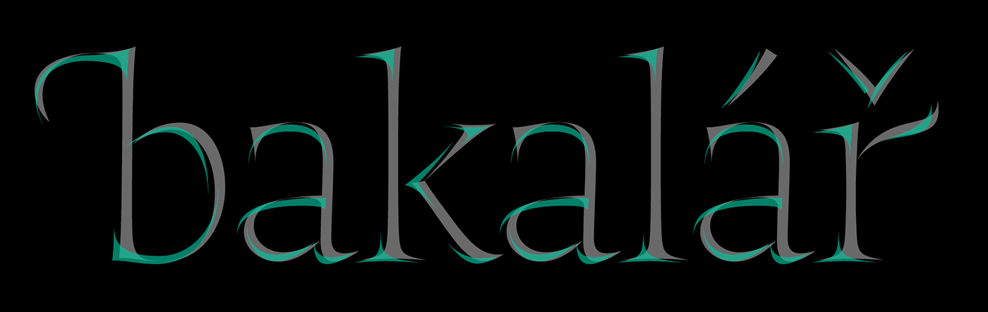
Resonay was created in an effort to touch the boundaries of beauty and harmony in type. Of course for such a magnificent goal it is necessary to go back to the past, when the printed type had a handwritten spirit. Typefaces from the early venetian renaissance therefore became a natural starting point. However, it was not just a tribute to the broad nib and the oblique axis. There is no point in making a new Centaur or Jenson. What makes such a typeface meaning is the connection to the current possibilities of graphic programs. That's why you can have a "renaissance craft" with "drop shadow" together. Features among which is 500 years can meet with big eye-catching effect today.

Resonay is best feels the huge sizes, where precise details stand out. The finesse of design goes to very edge – to the sharpest possible tip. Two layers are fitting to each other with 100% accuracy, no matter how close you look. Consistency of serifs or terminals is intentionally broken – concave and convex mixed together. Similarly, the very concept of layers is ambiguous – somewhere it behaves like a twisted sheet of paper, somewhere like shading, and somewhere only as a balance of matter. Everything plays on beauty that is also rationally inexplicable. The typeface thus changes the reader to an observer of beautiful shapes which themselves will replace the illustration. Many specialties as swashes, discretionary ligatures or initial/terminal forms supported this organic impression. With Resonay you can simply produce a stunning antique letterings with just a few clicks.
How it works:
1) type your text in Resonay Base
2) copy and paste into the same place
3) switch upper text to Resonay Cover
4) play with colors, shadows, opacity, gradients, motions…


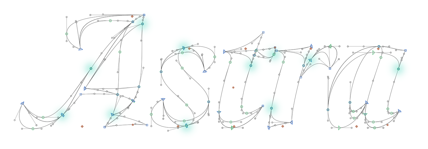
Unconventional ideas require unconventional technical solutions. Some anchor points that are common to both layers must lying at unusual places.


3 layout options – additional layer bottom, additional layer above and without additional layer.

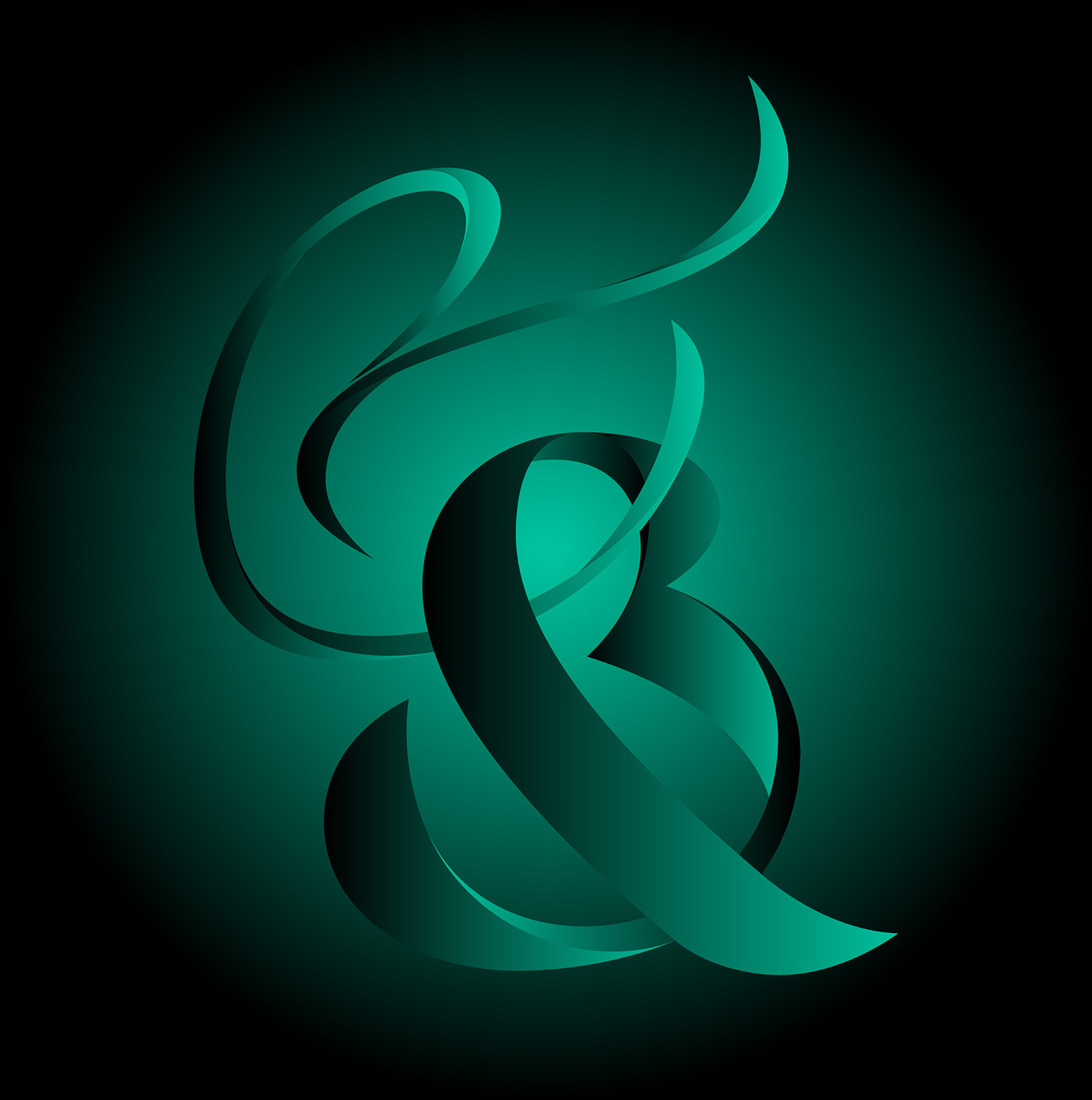
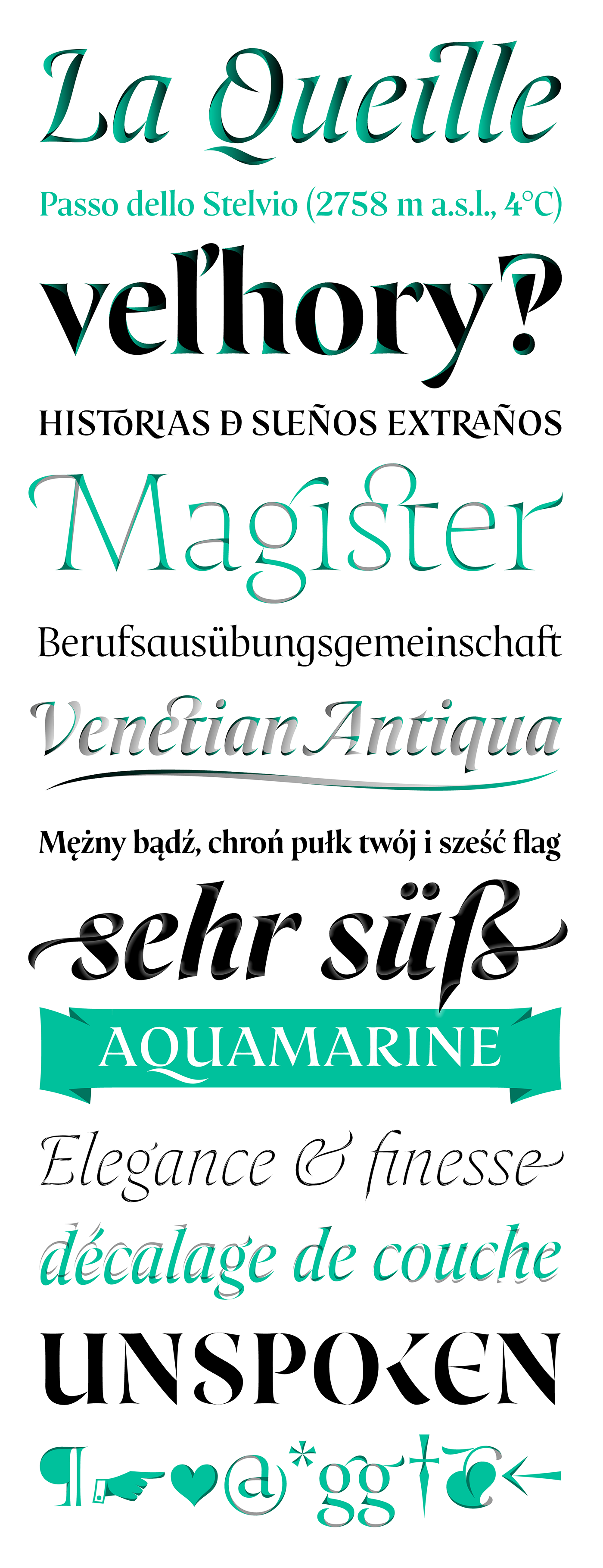
Would you like an really exotic ligature? With prepared shapes for tall letters can easily make your custom ligatures. You can also notice that there are no exactly straight lines in the font.
Similarly works uppercase ligatures with small caps, but some of them need to be manually lifted to the caps height.

An interesting feature of italics are the dynamically curved stems. Characters „f“ and „j“ have a tail inspired by blackletter typography to enhance this effect.
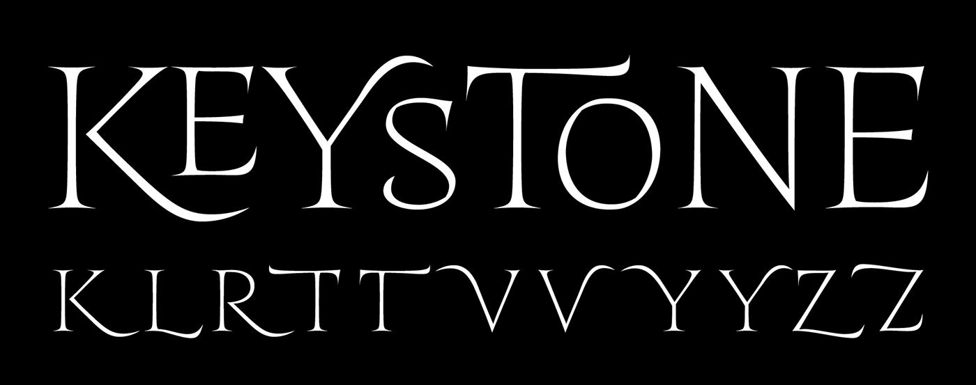
Initial and terminal forms will give your text a hand-crafted spirit.
Whole base layer can work independently as a totally contrasted font.