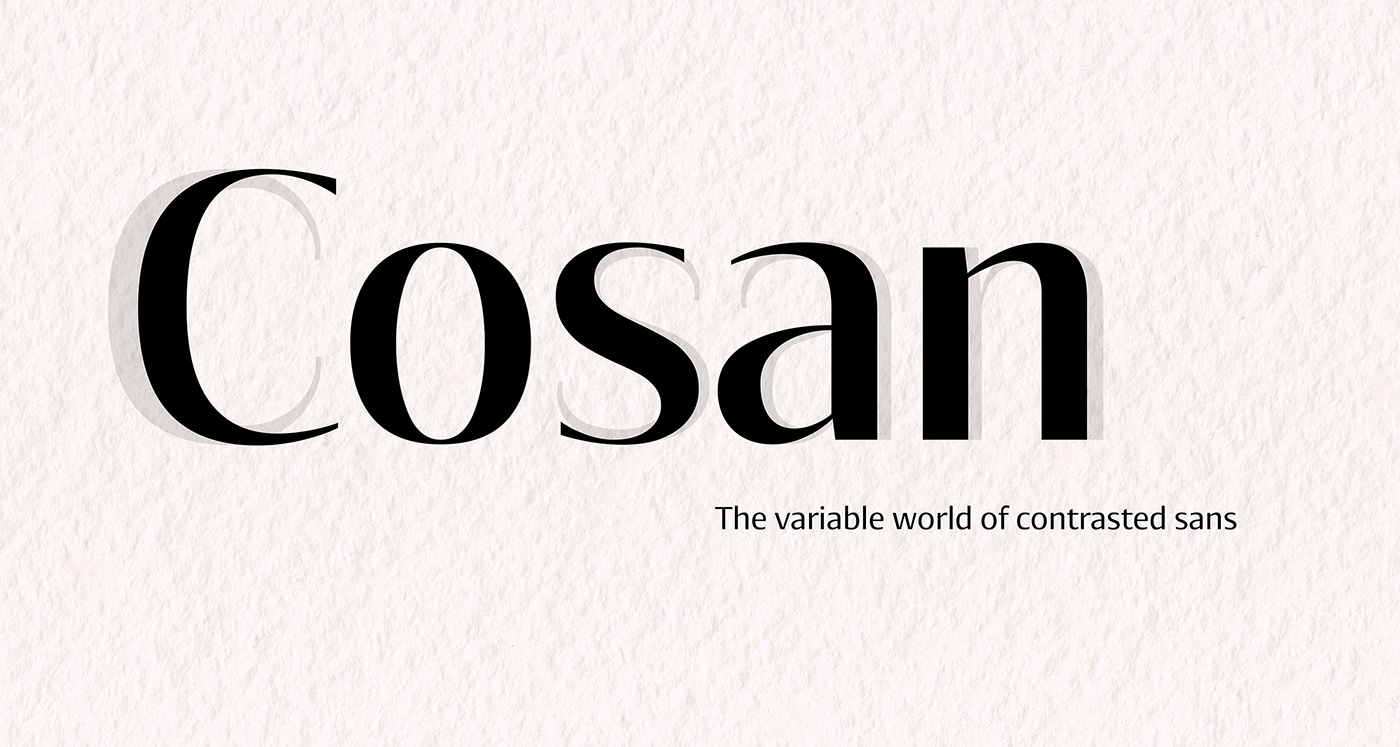
The idea was to find common intersections between the humanistic and the neo-grotesque model of sans. This variable font offers everything from the world of sans serif in one place – a broad range of weights, adjustable contrast, and a lot of alternative glyphs. As a bonus, you can choose the “cold” or “warm” impact of the text. The Cosan Cold variant has closed apertures and minimal tension in the manner of Helvetica, and the Cosan Warm is open, more dynamic, and airy. Cosan is very suitable for a parallel bilingual setting, as both types are equivalent in their proportions and text color. Like Yin and Yang, each has a piece of the other in him. The Warm version is not totally dynamic, nor is the Cold version totally rigid.
Cosan is available for purchase on Fontspring.


:) :P :D ;* :| :/ :(
:O :C :X :S ;) >( B)


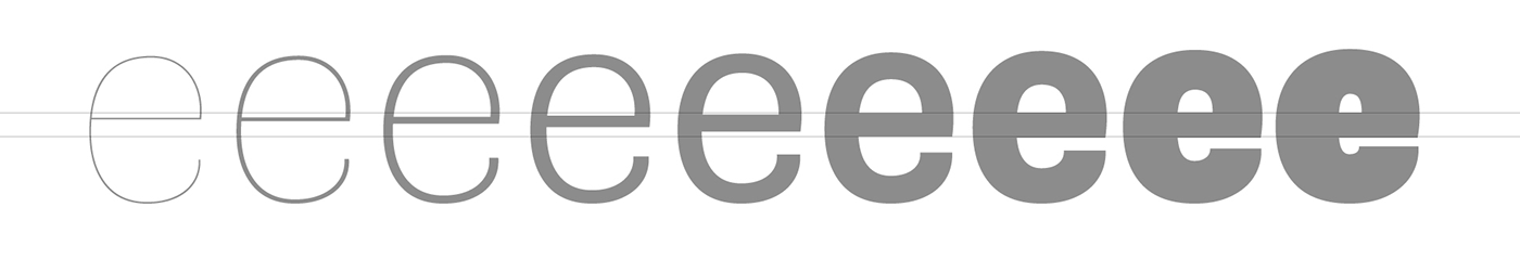
Optical correction – somewhere between Medium and Bold, the increase in bar thickness stops to make room for some light inside the Fat character.

The terminals are cut strictly horizontally or vertically, which supports a strong flat impression from the letters.

Instead of standard ink-traps, the converging strokes are shifted more apart.
Therefore, e.g. the base of the letter "V" wider than usual.

The slightly squarish character of the round letters helps to a certain softness and sophistication.
Applies to both variants – Warm and Cold.


