Many sport publications missed a typefaces designed especially for sport communication conditions. We usually see only mechanically slanted or other synthetically destroyed standard typefaces.
I want accordly fill this space and create system of fonts, that will be used primary in sport. It is usable for many prints - logotypes, magazines, catalogues, posters etc. Elasticity of glyphs reflected an adrenalinous shapes of latest bikeframes, skies or sportcars. Maximum open arches guaranteed good readability in very small sizes and prevented interchanges of glyphs "o, c, e" per poor reading conditions. Softness of lowercase is at uppercase balanced in bottom arches, that are subtly kicked-up.
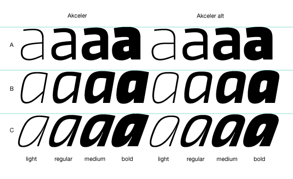
Numerals are an important component of sport communication, so here have they expressive design, different from numerals of book typefaces. Every font have 10 kinds of numerals. Character case contains between 1000 glyphs a sport icons and othes signs creating the sport feeling. Title "Akceler" represent acceleration, which is characteristic attribute of this typeface.
I want accordly fill this space and create system of fonts, that will be used primary in sport. It is usable for many prints - logotypes, magazines, catalogues, posters etc. Elasticity of glyphs reflected an adrenalinous shapes of latest bikeframes, skies or sportcars. Maximum open arches guaranteed good readability in very small sizes and prevented interchanges of glyphs "o, c, e" per poor reading conditions. Softness of lowercase is at uppercase balanced in bottom arches, that are subtly kicked-up.
Numerals are an important component of sport communication, so here have they expressive design, different from numerals of book typefaces. Every font have 10 kinds of numerals. Character case contains between 1000 glyphs a sport icons and othes signs creating the sport feeling. Title "Akceler" represent acceleration, which is characteristic attribute of this typeface.


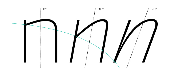
Join of arches falls by italics down for dynamical effect. Width of glyph become narrow too.

Diacritics at capitals is drawn different - more compressed and bigger. Strong distinction between height of capitals and height of top termination enabled in text with many private names good composition of type setting.
X-height slightly increases with weight, because of optical align.

OpenType features.

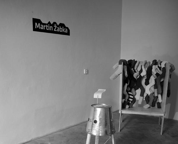
Akceler A used by Martina Rozinajová at Dizajnvíkend.
http://www.behance.net/gallery/Design-week-Br atislava-2011/2986107
http://www.behance.net/gallery/Design-week-Br atislava-2011/2986107


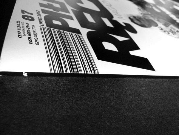


Akceler A, B, C used in sport magazine by Marcin Górski.
http://www.behance.net/gallery/Pilka-reczna-redesign/5564513
http://www.behance.net/gallery/Pilka-reczna-redesign/5564513


Akceler A alt used in swimming instrument by Peter Gála.


