1.0. Task
The task set was to design a logo along with other brand identity materials that would represent the core values and services offered by the start-up, farmcentric. The client specifically requested that the logo contained 'a tree' as a symbol. Also, the branding needed to be new, fresh, as well as, stylish, while communicating the major brand value which is, an all-round agricultural service-based business providing fresh and organic farm products to its customers.
2.0. Process
The logo development had in focus the core requirement of the client i.e. A tree. However, I had freedom to play around with ideas surrounding this. A quick observation of similar brands showed the idea of a tree to represent an agricultural based brand was over-used. However, it was needful to follow client requirements.
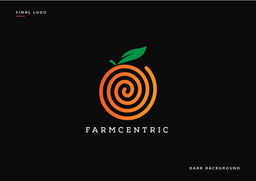
Using Word mapping approach, I broke the word farmcentic into: FARM + CENTRIC = TREE elements + all-round/circle/concentric. After several iterations, I came up with the idea of a Spiral with a leaf-stalk.
Hence, the Orange Spiral denotes a brand starting out small, yet, having a global focus to be the number 1 fresh organic food suppliers to its customers.
The Leaf stalk symbolizes fresh and vitality (still keeping in focus the tree symbol requirement of the client).
3.0. Typography

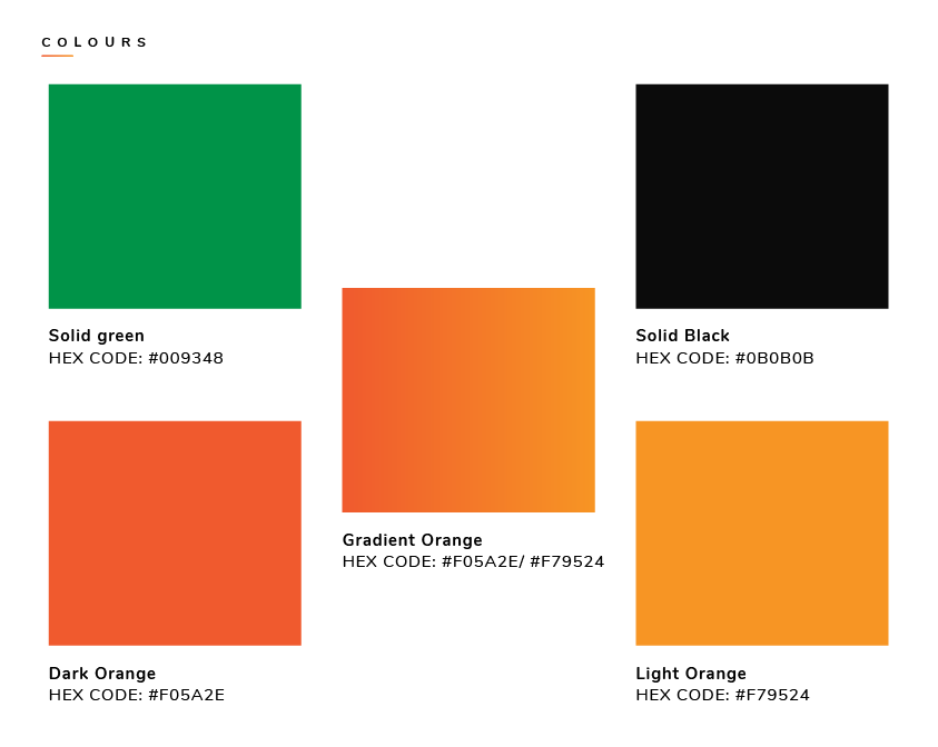
4.0. Colours
5.0. Logos

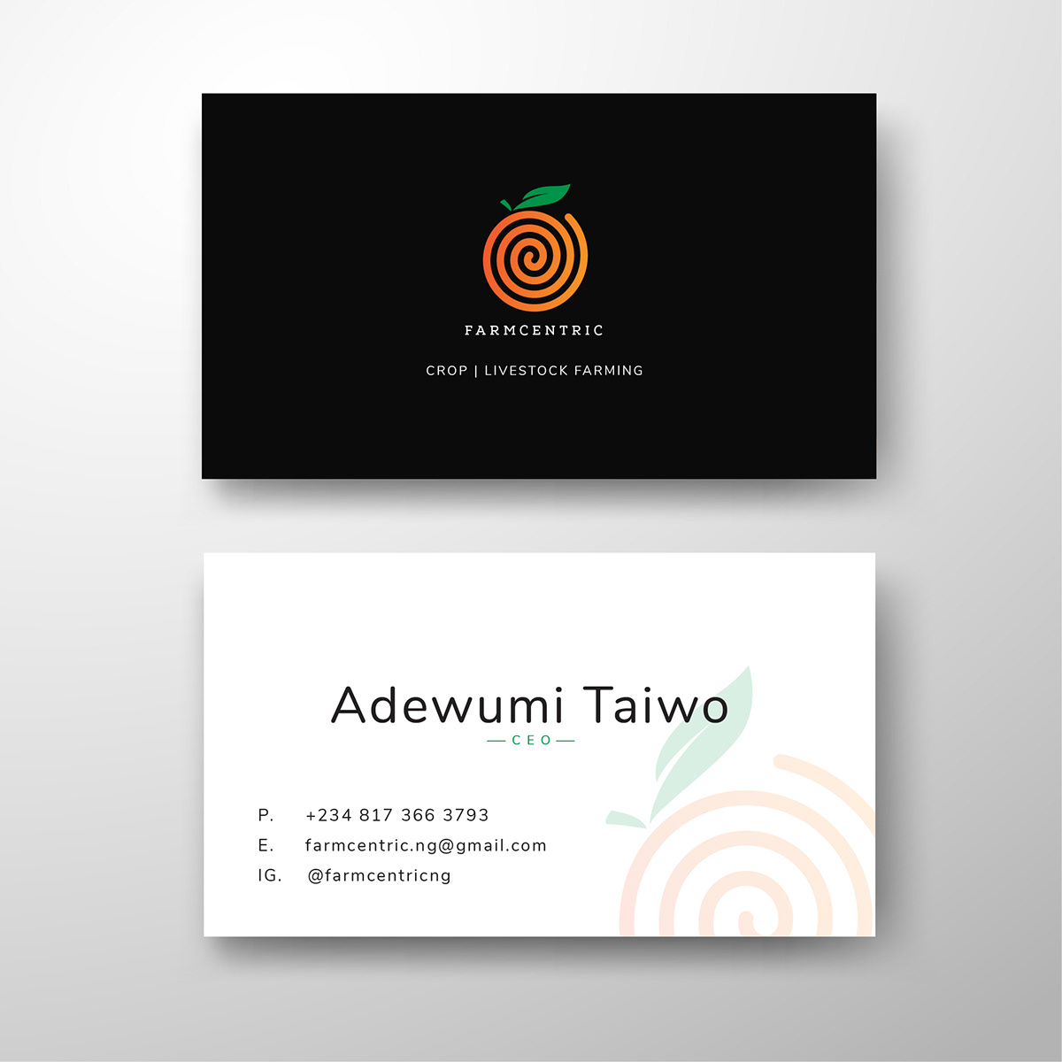
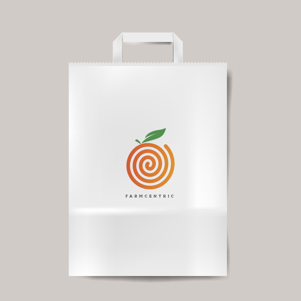
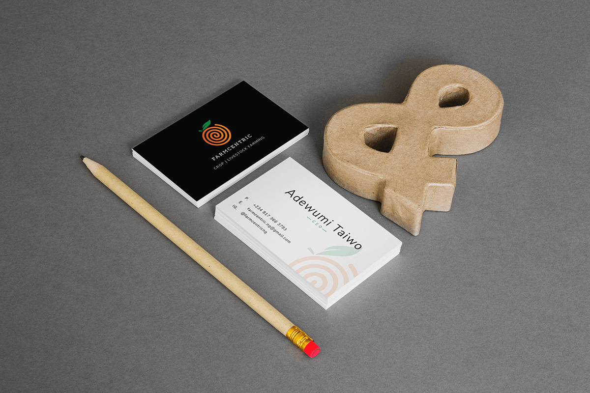
6.0. Branding materials