POSTUP
This app helps freelancers and other remote workers find places to concentrate.
This app helps freelancers and other remote workers find places to concentrate.
Research: user test and persona
J. provided a video of a user test, a PDF with quotes from multiple users, and a persona. Users were asked to imagine the process of looking for a good place to work from, and the video showed a user searching for one online. I analyzed these, noting key points:
1. Users want to know about a place's "amenities" like wi-fi as well as bathrooms and outlets.
2. Users want to know in a glance how a place looks (to figure out if it's busy, crowded, or noisy).
3. Users want to know where a place is relative to where they are and how to get there.
2. Users want to know in a glance how a place looks (to figure out if it's busy, crowded, or noisy).
3. Users want to know where a place is relative to where they are and how to get there.
Napkin sketches
To generate ideas for the features and visual design of three key screens, I did nine sketches in nine minutes. These show the experience of a user searching for places, sorting through a list, and landing on a detail page. I added annotations as well as separately noting bonus things she thought might be fun to add in the future, once the user's needs are addressed. (I made these in Procreate.)
To generate ideas for the features and visual design of three key screens, I did nine sketches in nine minutes. These show the experience of a user searching for places, sorting through a list, and landing on a detail page. I added annotations as well as separately noting bonus things she thought might be fun to add in the future, once the user's needs are addressed. (I made these in Procreate.)

Refined sketches and paper prototype
I then drew three screens and wrote notes describing how the entire app could work. (I also made a paper prototype with Marvel.)
I then drew three screens and wrote notes describing how the entire app could work. (I also made a paper prototype with Marvel.)

Sketch prototype
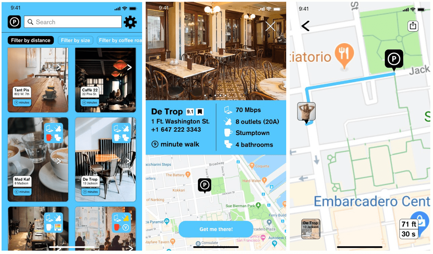
I designed those three screens in Sketch and made this basic prototype, drawing all the icons in Sketch too instead of using a kit. Some details:
I designed those three screens in Sketch and made this basic prototype, drawing all the icons in Sketch too instead of using a kit. Some details:
+ The user will have specified choices during onboarding, but filters allow him to express additional preferences. (See also my notes above.)
+ Icons let users see in a glance what they said they most care about: wi-fi quality, bathrooms, and the number of outlets. I threw in a few icons from my own ideas, like one indicating an LGBTQ-owned establishment.
+ On screen 2, these important icons are precisely qualified and quantified while their meanings are reinforced for future engagements.


BONUS: THE TALKING MACHINE
As a fan of type design and Ricky Jay's collection of 19th-century hand bills, I leapt at this challenge from Cooper ... and made it to the contest's second round. I was the only non-designer to get that far. Years later, the Cooper design lead, now at Apple, remembered my "humanistic" solution. The challenge: The push-button phone is introduced in the 1860s to people who have never seen a phone before. Write a PDF that teaches people how to use it.
As a fan of type design and Ricky Jay's collection of 19th-century hand bills, I leapt at this challenge from Cooper ... and made it to the contest's second round. I was the only non-designer to get that far. Years later, the Cooper design lead, now at Apple, remembered my "humanistic" solution. The challenge: The push-button phone is introduced in the 1860s to people who have never seen a phone before. Write a PDF that teaches people how to use it.


