

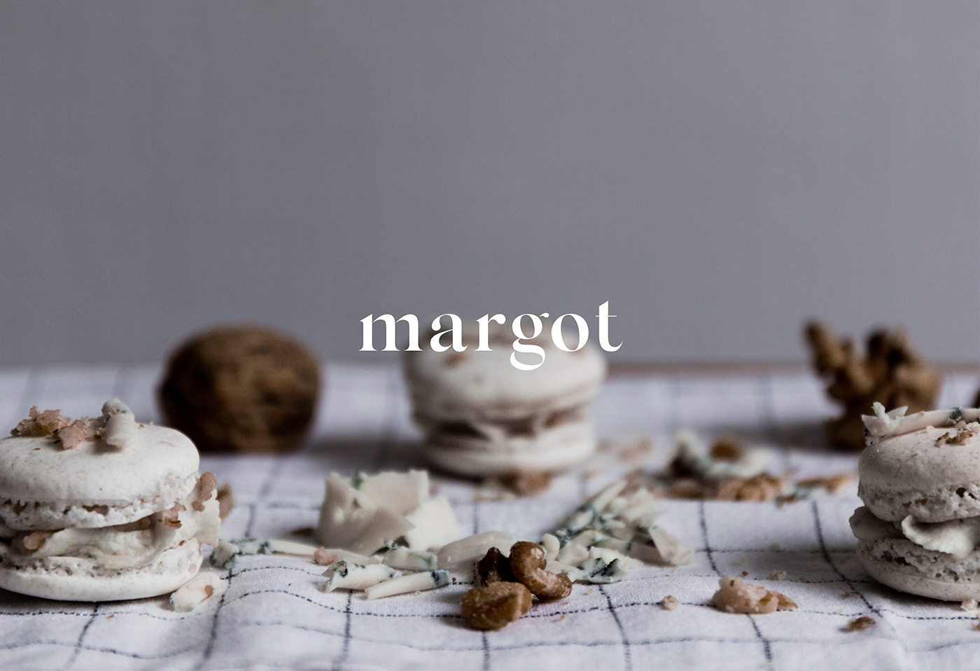
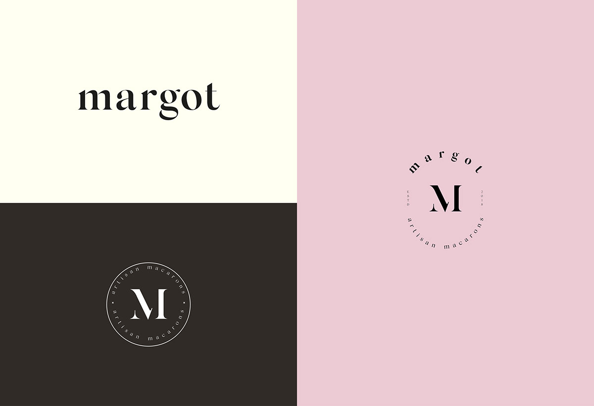
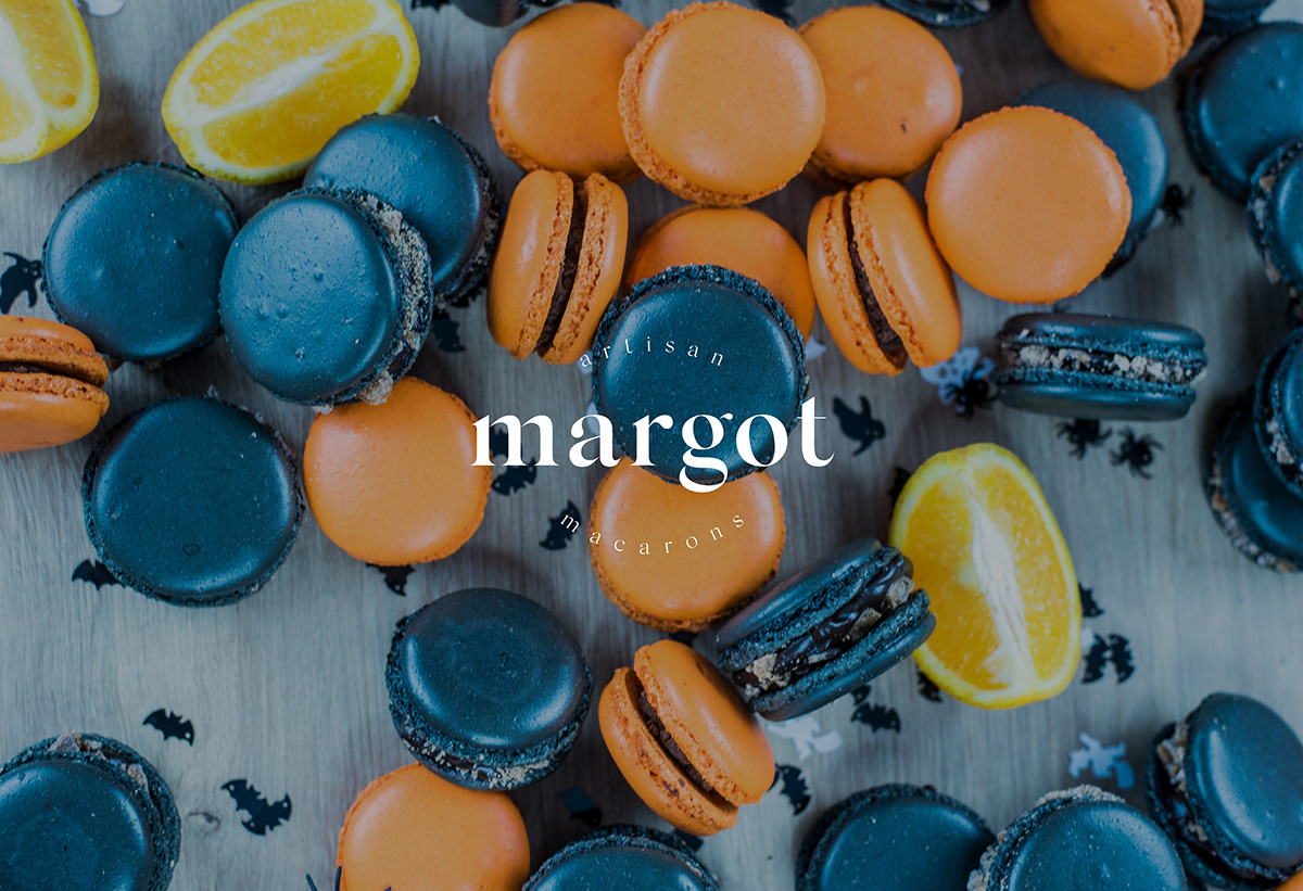
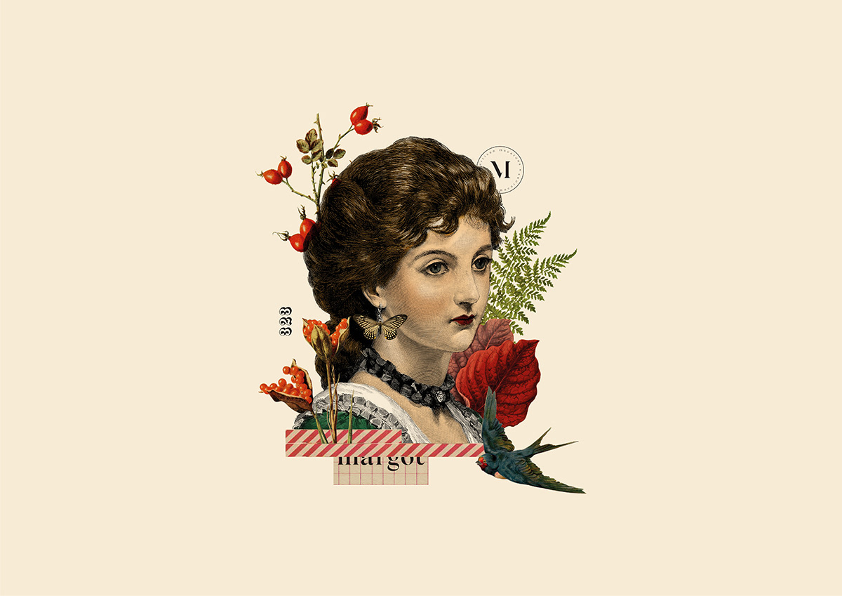
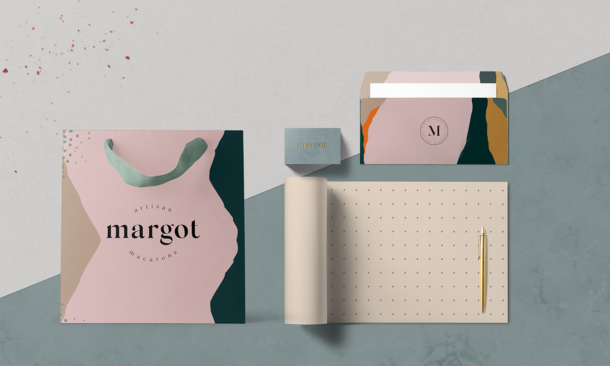
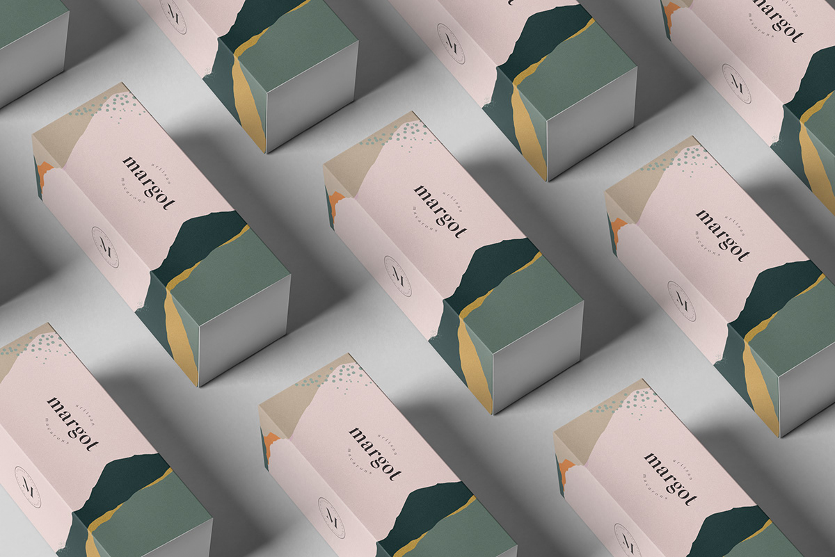
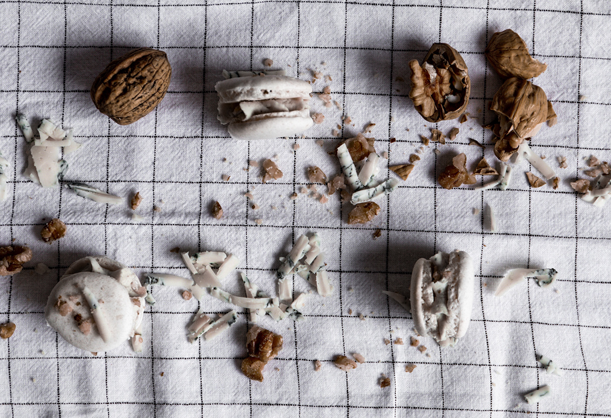
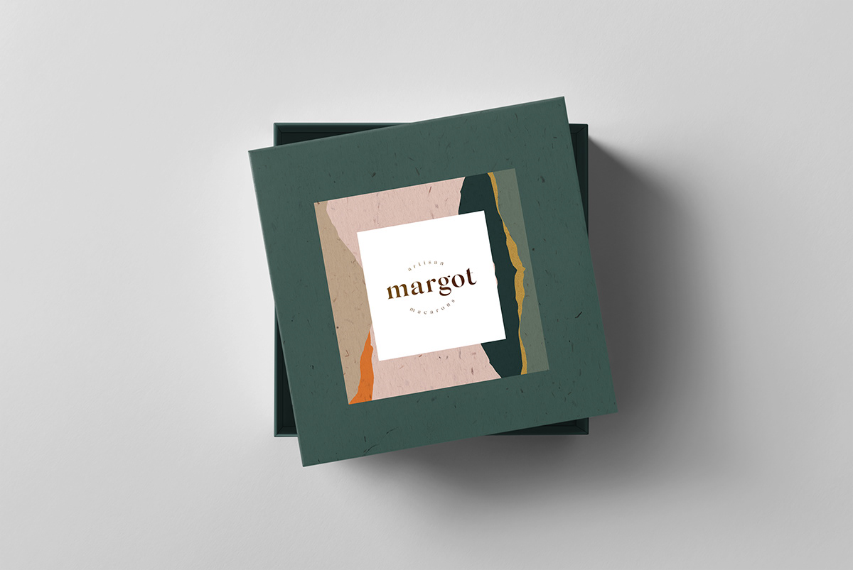
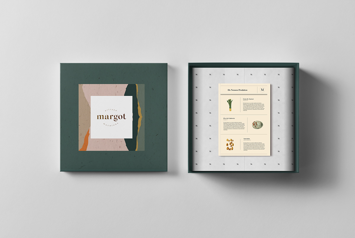
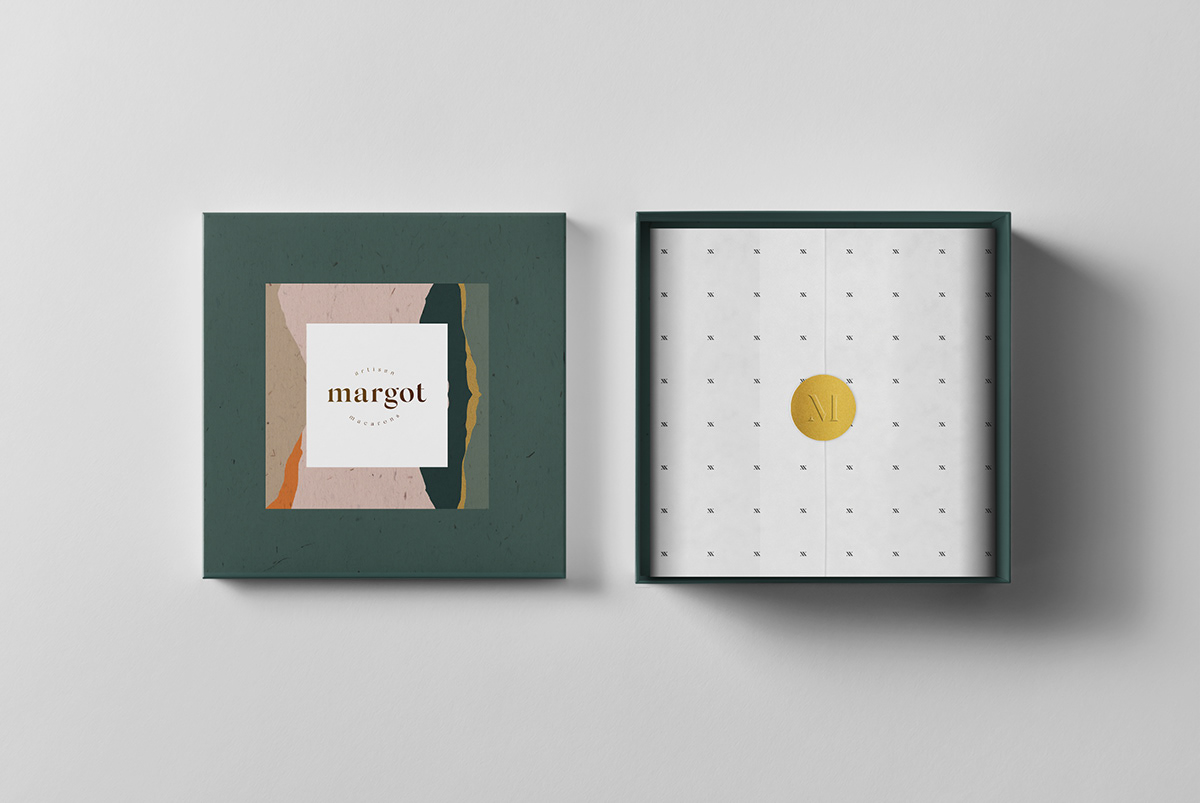
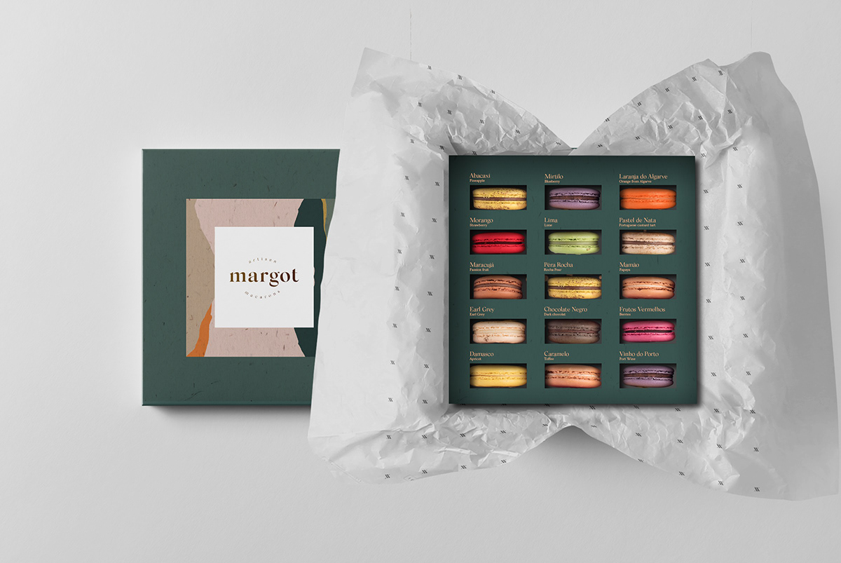
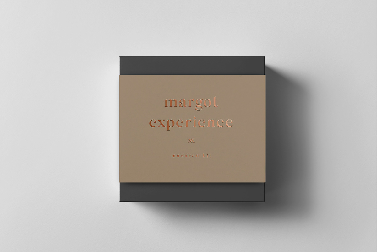
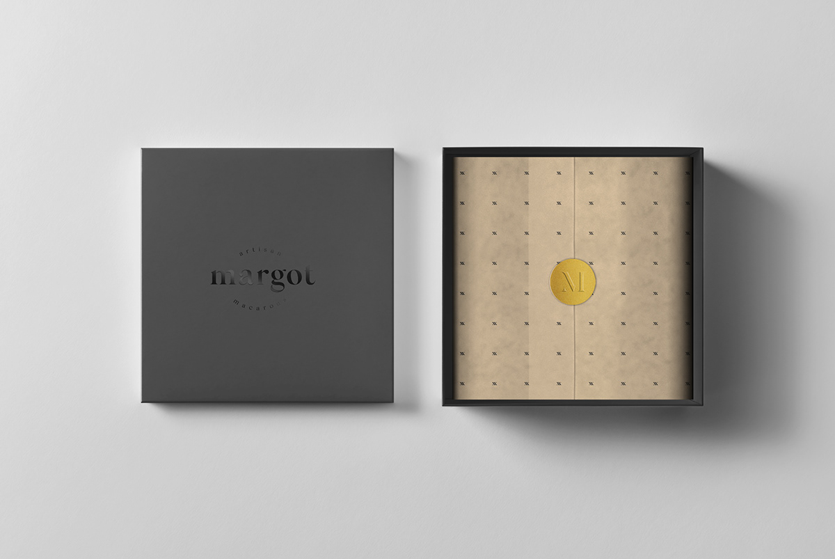
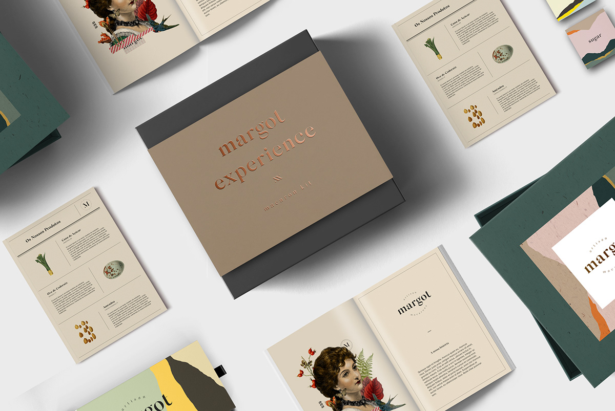
On late 2018, we were challenged to create a fictitious macaroon brand and this was our approach. The identity contrasts classic elements with modern notes, and has a delicate and minimalist logo, where the textures reflect the patterns from the terraces along the Douro river bankside and the different layers of a macaroon. Feminine and painted in the pastel colours very present in this delicacy, this identity has at its core a character and a story — roughly based on historical facts — created by our studio: Margot, (short for Margareth), a woman of English royal blood who lived in Porto during the great expansion of Porto Wine. In addition to the artwork, the packaging conceptualization was also a request, which resulted in three lines: basic flavours and small quantities; gourmet tastes limited to special occasions; and, at last, the Margot Experience, where the ingredients, quality and origins were enhanced to provide a savouring session.

Thanks for scrolling down. If you enjoyed it, don't forget to thumbs up. :)


