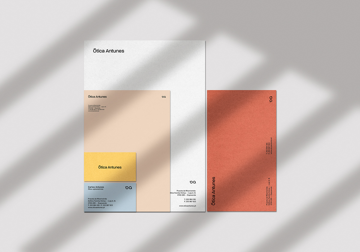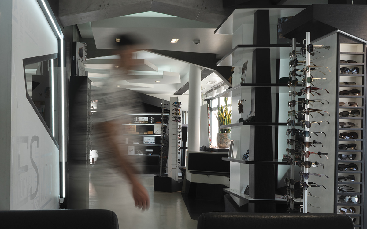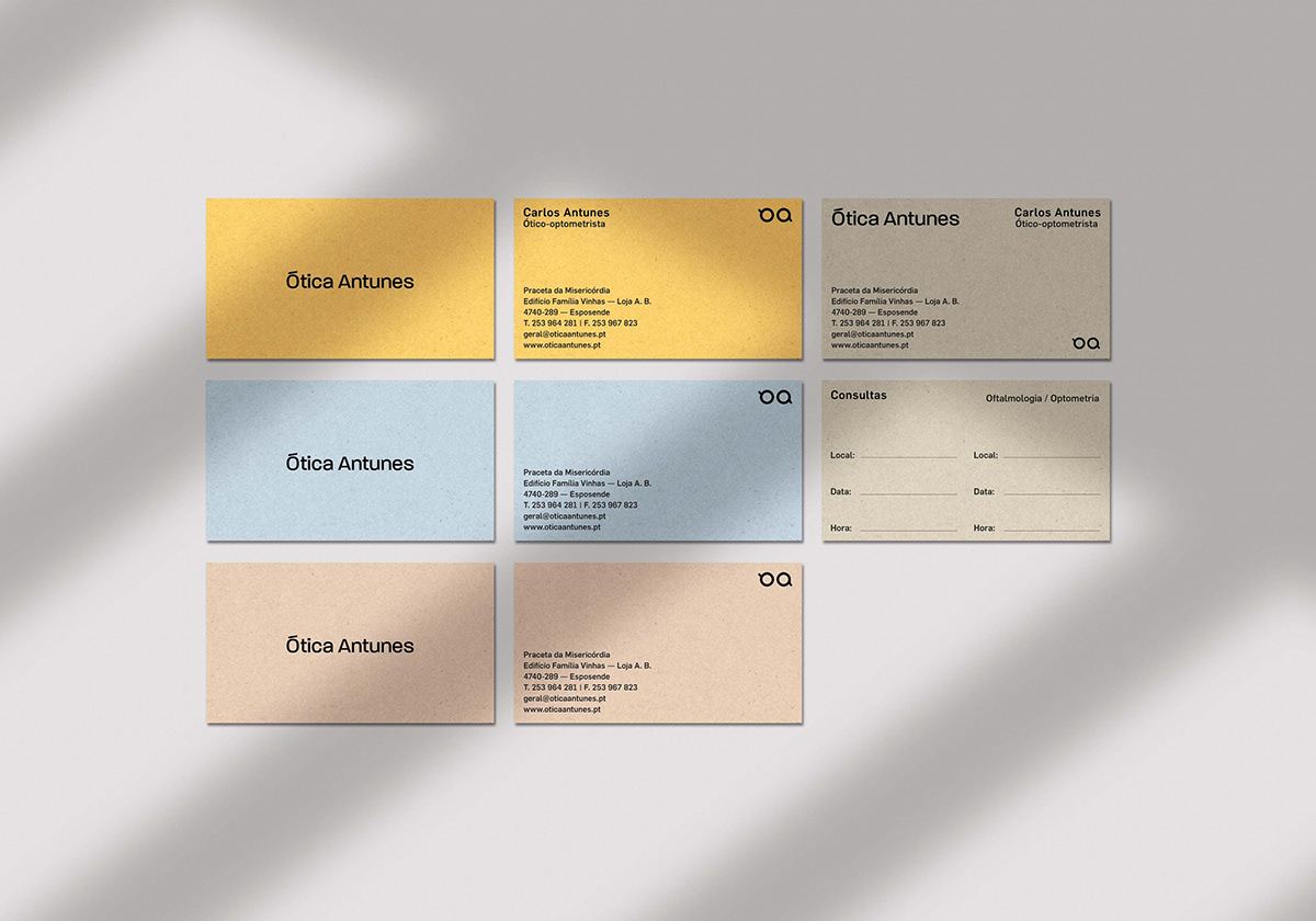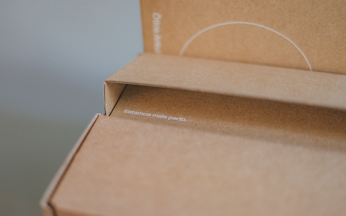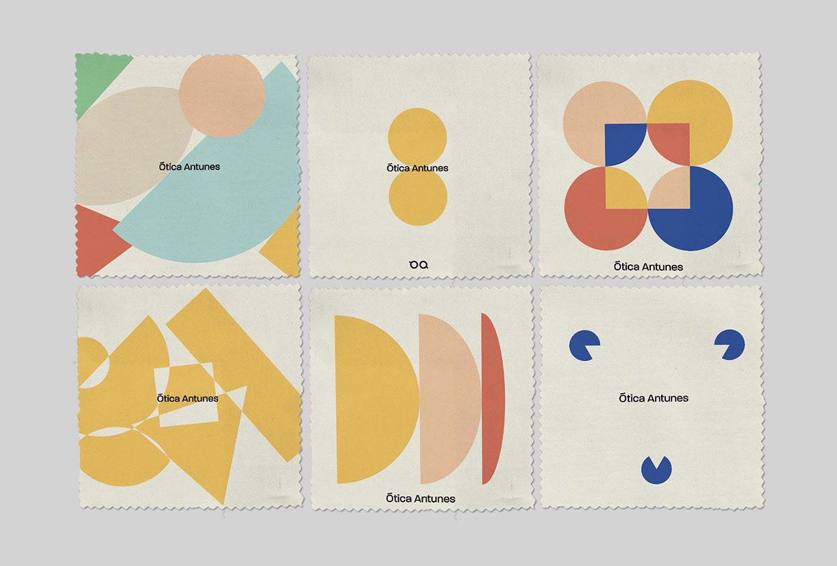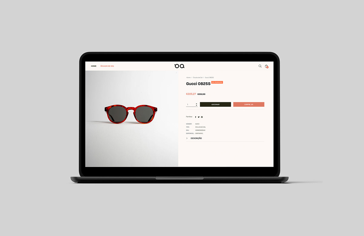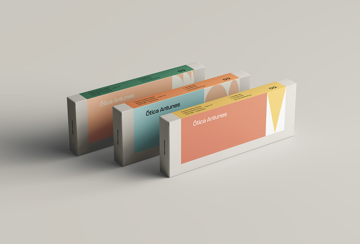
On the 30th birthday of its new location in Esposende, Ótica Antunes decided to embrace a new image and asked Antecâmara Studio to develop their identity and media in a light, young and fun approach, appealing to a younger crowd. For the brand’s new aesthetic we searched for constant dynamism and innovation. Following this thread, we came up with basic shapes and symbolisms as our base: the triangle symbolizing the sight and image perception, the circles for the glasses shape, the broken arches stand for the eyes and, at last, the square and rectangle represent the materials worked by the optician -- acetate, acrylic, and glass, amongst others. Finally, these forms were worked into optical illusions and games where they represent pathologies or the correspondent treatment, and other eyesight elements, for example, the retina and cornea. The shapes’ versatility allows us to make them responsive and adaptable to the space in which they are used.