


LogoShop
Logo Design Side Project
Have you ever seen a new logo and thought it didn’t look quite right? I sure have. As a designer and comic book fan, I’ve spent my life studying art and composition. And when a brand I know and love rolls out a redesigned logo, I’m going to have a few thoughts.
But. I won’t make a criticism without offering a solution.
LogoShop is a blog series where I refined or reimagined the logos behind some of the most iconic brands, with a special focus on comic book properties. I've summarized my thoughts on each below, but feel free to jump over to Medium to read the full backstory on each.
Disclaimer: This project was not endorsed or solicited by any of the brands I discussed, and was a purely speculative exercise.
* * *
DC Comics
When I first saw the latest DC logo in 2016, I had mixed feelings. I was encouraged by the return of the block letters and the circular enclosure that defined the most enduring, and in my eye, the most recognizable DC logo. But did they lose something along the way?
I decided to take a crack at improving the logo myself, starting with the letters. I reflected elements of each letter to create a clear symmetry between the “D” and the “C.” The circle created negative space that could easily fit a star above and below the letters, bringing back an element that defined the logo for so long. Finally, I made sure the angle of the outer diagonals (seen most clearly on the “C”) matched the diagonal lines of the stars.
With a little nudge, this new logo has a distinct look that builds on DC's long history while keeping it simple enough for its endless applications.


Character artwork TM & © DC Comics.
Justice League
The Justice League is the modern incarnation of the world's first superhero team. And though the team gets a new logo with every new volume of their series, a few elements are ever-present: The shield, representing the League’s authority. And stars, a reference to their origin as an American team.
In my attempt to find a single, definitive Justice League insignia, I was most attracted to the movie’s abbreviated logo. In the tradition of the DC logo, I mirrored the “J” and the “L,” and lined them both up with the enclosing shield. Finally, I added a top flourish to the shield, bringing it more in line with the traditional Justice League logos. This turned the entire mark into a badge, making it as classic as it is official.


Superman
If Superman’s logo is an alien symbol, why not take a few liberties? The idea was to keep the iconic diamond shape of Superman’s logo, and fit the “S” into it more completely, taking the decades-long evolution to its natural end. Taken as a whole, this logo speaks to Superman’s alien origins, coming across as a glyph that could be interpreted as an “S,” without being too obvious about it.


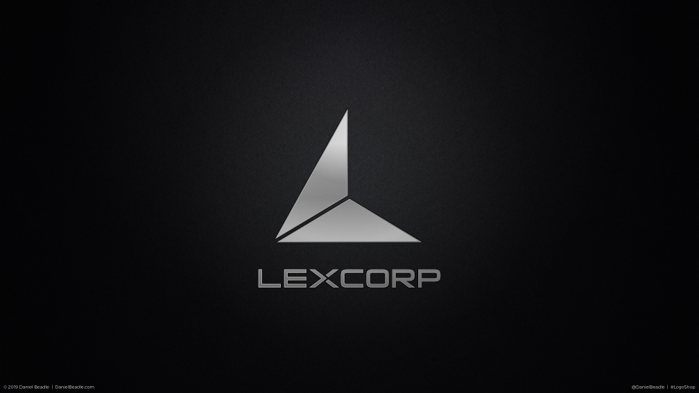
LexCorp
The LexCorp logo, as seen in Batman vs. Superman and its tie-in materials, had the perfect tone for the company it represented. It’s cold, sleek, and cutting edge. One major problem though. Lex Luthor’s brand has everything to do with the letter “L," not the letter "X."
To fix this oversight, I started with the triangle, a shape that signifies ascension and achievement, as well as an association with secret power. Turning the triangle into the letter “L” was a relatively simple task, splitting the shape into thirds and removing the top right portion. I then went to work on the typeface, turning the left half of the “X” into an arrow, pointing to the second half of the name. This subtly suggests forward motion, since the company builds the technology of tomorrow.
In the end, we have a corporate brand identity that is simultaneously classy and intimidating, drawing on the history and iconography of the character at its center.


Nightwing
Dick Grayson is one of the oldest comic book characters still in use today. He’s also been in the role of Nightwing for close to 40 years. For a superhero with that much longevity, he deserves a consistent and strong brand identity.
My task was to bring together the best elements of every symbol associated with Nightwing into a single, distinct and powerful insignia. I decided to marry Nightwing’s most enduring costume design with the bird logos introduced in the two animated series. I took a “V” shape, and added in the bird’s head and beak. I then cut out portions of the “V” to create feathers. Finally, to pull in another element from Nightwing’s longest-running costume design, I added wing tips that pointed inward.
The driving principle was to build on and enhance the best elements that came before. And with any long-running property, that’s the surest way to create brand continuity, and the continued loyalty of the audience.


Wonder Woman
Wonder Woman’s first film appearance in 2016 created a look that combined her Greek origins with her comic book history, and in the process, a logo that merged her original eagle insignia with Milton Glaser’s 1982 logo.
My challenge was find a middle ground between the straight-forward Glaser logo, and the more intricate cinematic logo. I began by taking the basic structure of the movie logo, including the overlapping shapes, and organizing it with more consistent widths and angles. In the end, I created a logo that distilled the more elaborate cinematic logo to its basic elements, making it more versatile and therefore easier to use across media.
Now we have an emblem that exudes strength, and serves as a tribute to and furtherance of Wonder Woman’s long history.


Green Lantern
In 1959, DC reinvented Green Lantern as a space cop Hal Jordan. His chest logo, and that of the Green Lantern Corps, was an abstract representation of his green lantern power battery, a circle between two parallel lines. But could it be better, while remaining simple and recognizable?
In order to create a modernized version of the Green Lantern symbol, I ultimately decided on a series of concentric circles, which gave added emphasis to the ring at its core. Taken as a whole, the logo feels more cohesive, with the top and bottom borders suggesting a lantern, and the side elements suggesting its shining light. The end result effectively merges past and present into one, while creating a sense of overall cohesion and balance.


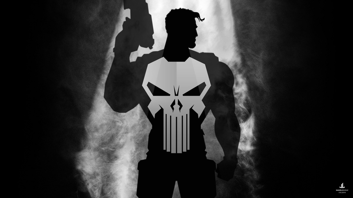
The Punisher
The Punisher’s skull brands him as a grim reaper, inspiring fear in all who see it. It also draws fire to his chest, which is the most heavily armored part of his costume. So, shouldn’t the Punisher have a logo that’s truly bulletproof?
So what should the Punisher skull look like? It should be threatening, but not creepy. It should have glaring eyes, and a few long teeth that extend into the utility belt. It also should look like body armor, following the lines of torso, and befitting a man with Frank Castle’s personality and background. So that's exactly what I created.


Bonus: Batman
After I finished the LogoShop series, I found an early draft of the Batman symbol I had previously created, and gave it some extra thought. Batman has had countless logos over the years, but I wanted to identify and refine my personal favorite.
The classic oval-shaped logo made famous by the Tim Burton movies was an obvious choice, but in hindsight, it veered too far into the abstract. Bats don't have oval-shaped wings, after all. By contrast, the Christopher Nolan movies used straight wings in their marketing materials, which seemed too rigid.
However, in Batman Begins, the logo used on the costume itself had a more natural shape, which I thought worked well. I used that symbol as a base, bringing in the curved upper elements seen in the comics. My changes were subtle enough that I didn't think it warranted a full article, but I now have a Bat symbol I can honestly point to as my favorite.


Logo designs and artwork by Daniel Beadle, except where noted.


