Serving up an experience for the soul that makes a difference on the inside,
GrainTraders engages people on a deeper level by serving more than just food for the body — it seeks to satisfy the human appetite for authentic food and relationships.
GrainTraders engages people on a deeper level by serving more than just food for the body — it seeks to satisfy the human appetite for authentic food and relationships.
The team wants to make guests feel good about eating good. They continually
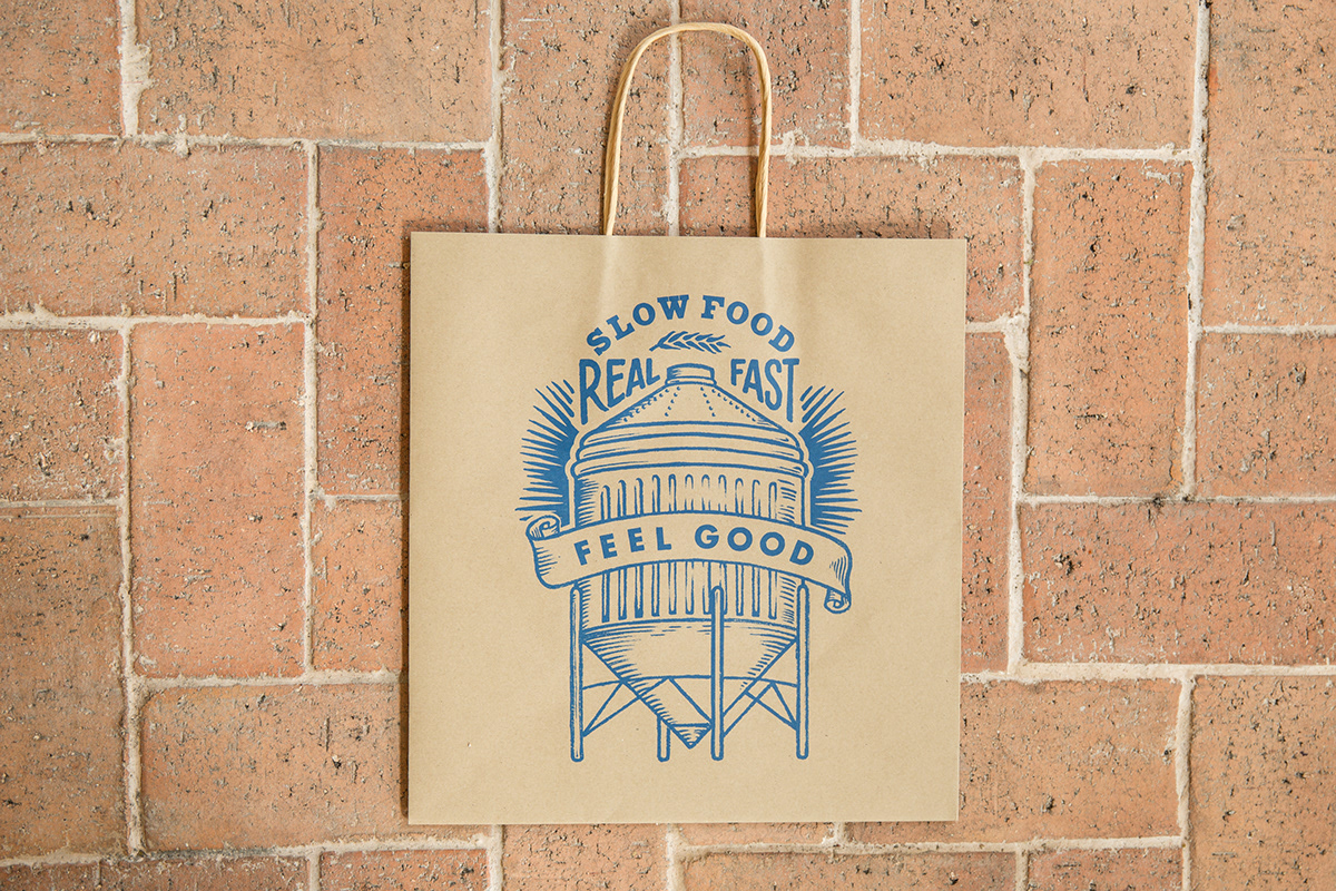
challenging themselves, their guests, and convention through the exploration of techniques, ingredients and seek to serve “Slow Food Real Fast”.
challenging themselves, their guests, and convention through the exploration of techniques, ingredients and seek to serve “Slow Food Real Fast”.


Our desire was to create complete experiences that make people feel good.
We believe food can taste even better with great graphics.
We believe food can taste even better with great graphics.
The look for GrainTraders is eclectic: we referenced from various sources — grain sacks, farmer advertisements and handwritten signage from yesteryears that continue the spirit
of craft and authenticity. The accompanying graphics were intended to be varied, spontaneous and unique. As much as possible, every new packaging item or
collateral fromGrainTraders should share the same spirit.
of craft and authenticity. The accompanying graphics were intended to be varied, spontaneous and unique. As much as possible, every new packaging item or
collateral fromGrainTraders should share the same spirit.
With time, we hope to build a deep repository of artwork that retains the same essence and personality of the brand as it evolves over the years. We drew inspiration from a variety of places and sources, but Anthony Bourdain’s food trips into the Bronx and Queens, alongside flour sacks from the Mid West and old Puerto Rican posters were key
in providing a base for the GrainTraders visual and spatial universe.
in providing a base for the GrainTraders visual and spatial universe.


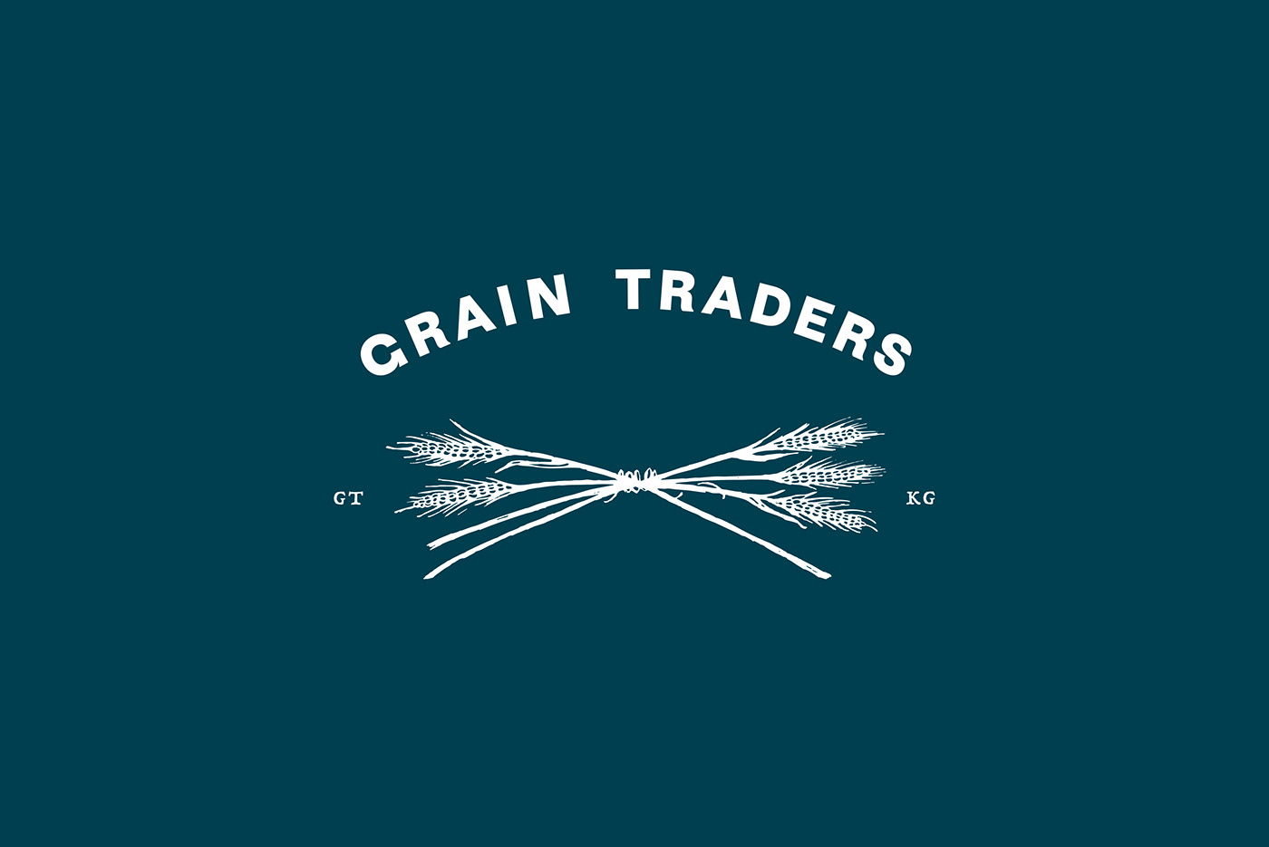
We felt very strongly that the brand should be built in a decentralised way.
The logo does not appear on every touchpoint; motifs change from item to item.
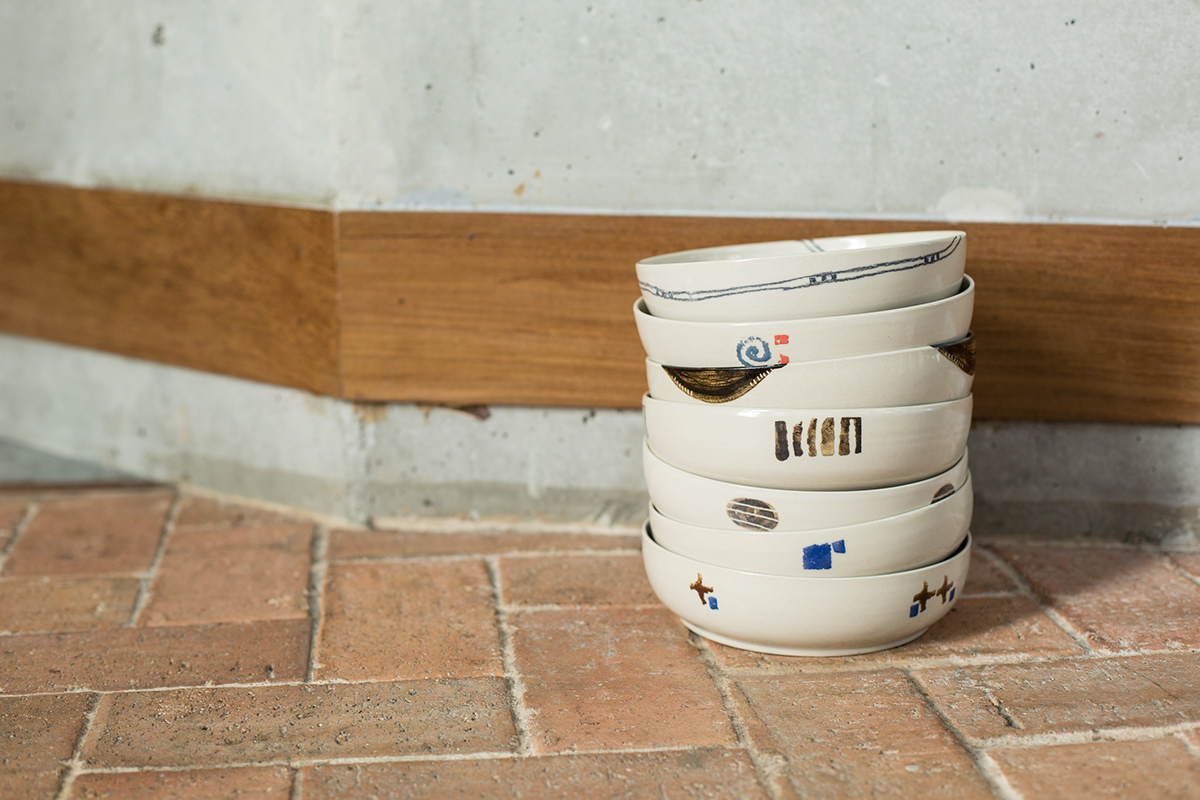
Painting and drawing by hand was crucial to keeping this flavour.
The logo does not appear on every touchpoint; motifs change from item to item.
Painting and drawing by hand was crucial to keeping this flavour.
To keep things from going too crazy, we kept to the brand
palette of two colours: navy and yellow.
palette of two colours: navy and yellow.